My logo system aims to capture the differences of each of the towers. The towers have identical construction, and the only difference between each is where they’re located and how the community interacts with each. The logo system I created imitates this by having the structure of the tower in the foreground and in the background includes an illustration of the surrounding area. I went with a diamond shape because I felt that it would give a more alien appearance to the marks.
Process Work: Images
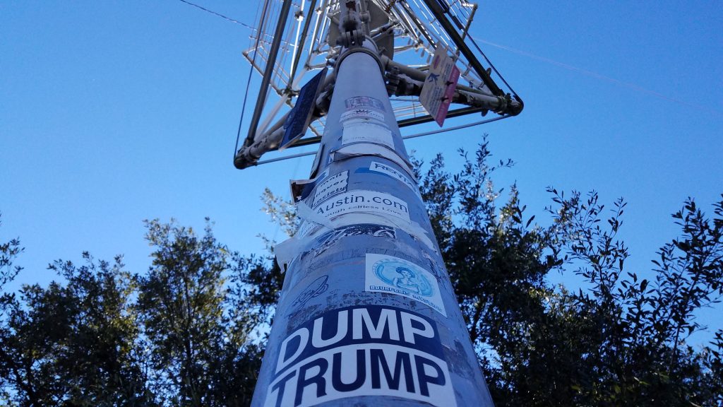
Taking pictures of the Moon Towers helped me the most when it came to figuring out an identity for them. I love how they’re structured, so I took plenty of pictures displaying the geometric nature of the towers. The major things I focused on as a result of these images were the tower’s structure and their size.
Interface Lesson
Portfolio App from Ellise Stokes on Vimeo.
With this project, I wanted a way to express how I am as a person using the colors and graphics. My main concern with this project was how it looked, however a lot of the motion ended up taking a backseat to the stylistic choices. At the time I didn’t realize how much Aftereffects slows down the animation when I’m working on it. This was my first time working with Aftereffects, and it was harder to learn than many of the other Adobe programs.
Plotter Lesson
This project is the result of a deliberate process with intent on creating results. My process was concerned on creating rapid character designs. I gave myself a few requirements:
- Shuffle my music player by pressing the shuffle button 5 times
- If the song is over a minute long, then I’ll listen to the entire song
- After that I have 10 minutes to create a character based on the song
These rules gave me a few constraints. If the song was slow and sad I couldn’t draw a cheery bubbly character unless there were a few conflicts in the song. In such a case, I’d also have to indicate the melancholic nature of the song. Another major constraint was time: I couldn’t nail the anatomy every time, but that’s the nature of a rapid character design. The main goal was to detail a loose idea of a character, which even included the color of the pen I used and the color of the paper.
Zine Lesson
This truism is based around how certain groups out there see academic intelligence as the most important factor to a person. However, being “intelligent” is hard to define, because it’s possible to be academically intelligent but also lack common sense or street knowledge. I wanted my zine to reflect this by stretching the word intelligent off the page, as well as having the “struct” part of construct fill the bottom of the page.
Style Lesson
This project was a way for us to examine the aspects of style. We were given prep as a style, and my partner and I decided to pick the Japanese mori-kei style as our second pick. After this we combined the two styles.
The prep style is extremely formulaic, whereas mori-kei is much more underground. The mori-kei style is based mostly online, with one person being the main say of what makes the style. At the same time, there is emphasis on personal enjoyment and subjective feelings. The prep style has a book that was published with multiple sections. The two styles are quite different in appearance, as well as their overall structure.
Object Lesson
This project is based off the movie Selma by Ava DuVernay. The idea was to create a matchbook that could fit into the setting of the movie.
When it comes to mine, I first researched the time period and what matchbooks looked like then. Since this movie took place in the 1960s I thought that it shouldn’t have been perfectly white, so I made it off-white. Many of the matchbooks of the time consisted of 3 colors: blue, red, and black. I also researched what type of logos and fonts were used by the SCLC. I incorporated each piece in the final design. I also made the white of the matchbook off-white because I felt it would fit well with the historical context of the matchbook. The bible quote inside is also a nod towards MLK’s role as a pastor, and the importance of religion to the Black community.
Cognitive Map
This map I created because I wanted to share my enjoyment of online multiplayer games in a way that people could understand. It can be hard for people to get into these types of games because there’s a great variety, and I felt this flowchart could make it easier to narrow down the type of game people would want to play.
Information Map
When it came to arranging this project I wanted to focus on making it into two pages that provided monthly and yearly information that functioned as a spread. I picked the colors based on the idea of apple pie, since I noticed it on one of the food lists.
Artifact Map
I wanted to make a map of places that were high in pollutants on campus. I have asthma, so lots of people smoking and dust irritates my lungs. The colors I related to each part represented the different elements of the school, like green for fine and gray for smoke.


