Writing in the Digital Age Promotion Video

For my Writing in the Digital Age course, we were tasked to create a promotional video for an organization or major in or around the St. Edwards community. Since the rest of my group were Video Game Development majors, we decided to focus in on that major. I was one of the editors on the team, and I made the final cut.

Over the course of the class, I honed my skills with Adobe Premiere Pro. I also learned how to connect with an audience in multiple ways, from making Youtube videos to promotional videos.

Posted in gdes | Leave a comment

Web Design

In my Advertising and Publicity course, we were given a client that needed help rebranding her company so she could expand her business. I was tasked with improving the website while incorporating elements of her identity.

The website initially looked like this:

1. The scroll bar took away from the effect of her design.
2. There is no emphasis behind her tagline given the current design.

3. By including the menu on the landing page, she wouldn’t be able to give each menu item the space it needs. In addition, she doesn’t have separate pages to emphasize who she is as a person, which we identified as a benefit to her brand.

Because of these factors, I made changes to the design of the website to expand upon her brand identity.

Posted in gdes | Leave a comment

10 Images

This video follows a narrative using only 11 unique images. It concerns my experience with depression and how that affects my ability to wake up in the morning. Sometimes, whenever I see that I’ve overslept or that I won’t be able to get somewhere on time I opt to continue sleeping so I don’t have to feel bad about being late. Of course, this isn’t helpful for myself or anyone else. I wanted to limit the amount of decisions for this video, so I gave myself a limited color palette and only used sound effects to convey movement and action.

Posted in gdes | Leave a comment

AR Experience

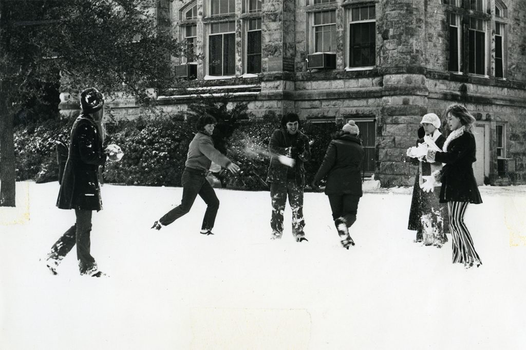
This project was interesting, since I had to find the exact spot where the photo was taken. The school has changed quite a bit since then, since the door in the corner wasn’t something I could use as an anchor point anymore. AR is very interesting, and it’s something I want to work more with as I continue my graphic design career, since it can create another dimension for us to work with when considering user experiences.

Posted in gdes | Leave a comment

Website

Link to site

For this piece, I wanted to create a website compiling the experiences I had with making stickers. The fact that there wasn’t a website that compiled much of the information needed to get into sticker making compelled me into creating this website. I wanted there to be a way to find everything you’d want to know about sticker making. As a result, I had plenty of pictures from my own sticker-making journey. The rest of the layout is based on conventions of creative blogs.

Posted in gdes | Leave a comment

Book

Link to PDF

This is one of my favorite projects since it was self-driven and I had plenty of time to work out any design problems with the book. Working on this project helped me remember my more artistic background, which influenced my attention to color psychology and reminded me about how color theory works. Up until this point I entirely forgot that I can use color theory and other art principles in my designs. I also wanted to use Japanese Stab binding, which is why the margin is so large in the middle.

Posted in gdes | Leave a comment

Animated GIFs

For this assignment, I wanted to give a personification to houses. Although the outside of a house implies a sense of personality, I wanted to attach a human form to each house. I’ve made simple looping gifs before, but I wanted to experiment with different styles and techniques of putting together the gifs. For example, I’ve never used Photoshop before to make gifs, and I think I like the way that works a bit more than other methods I’ve used.

Posted in gdes | Leave a comment

Conference Booklet

Link to PDF

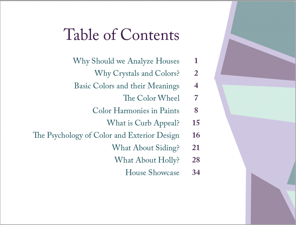
For this piece, I wanted to explore the triangle as a frame for images. I also found myself quite interested in purples and grays, and so I wanted to try out these features. However, I think the next time I attempt something like this instead of focusing on aesthetics I personally find interesting, I’ll do more research so I have a better idea of where I want to go with the design.

Posted in gdes | Leave a comment

5.0 End of Semester Wrap Up

So I’m sure you’re wondering, why is Ellise always so late all the time suddenly? It wasn’t so much of a problem last semester, but this semester it just keeps happening. And to tell the truth, I don’t know what’s going on with me either. I’ve felt exhausted for half the semester, and it’s affected every single one of my classes this term. And in turn, my designs. I’ve just gotten to the point where I’m struggling to do the most basic of assignments, and it’s unfortunate.

Of course, I can’t just quit now– I need to do better. I need to be prepared for the 2-6 part project instead of finishing my design and thinking I’m done. So I’ve been meeting up with people to try and figure out what’s going on and ways to manage my stress and anxiety so it stops affecting my ability to do work so much.

Posted in Uncategorized | Leave a comment

Weather Report

Weather Report from Ellise Stokes on Vimeo.

The goal for this project was to create a futuristic weather report for four cities. Since I relate light, sans serif fonts to the future I went with one for my typeface. I used a dull blue for the background, and bright colors for each of the states to create some contrast. I wasn’t drawn to any particular cities, so I randomly generated them. I picked the bright colors based on images of each of the places.

Posted in gdes | Leave a comment