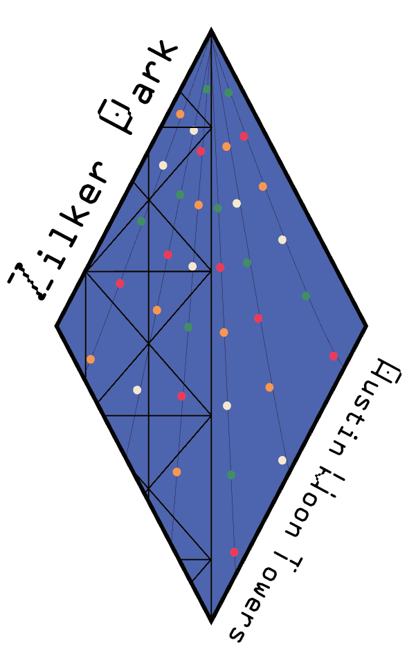
The program has been pushing me to discover what things I enjoy most in graphic design. Initially, I thought I was only drawn to overly minimalistic design, but that isn’t the case. I’ve learned that I enjoy projects where I play with colors or projects where I get to illustrate. These two pieces combined helped me create some of my favorite projects: the Wikipedia Reader, Symbol Methodology, and Visual Identity: Mark.
The Wikipedia Reader goes back to type one, and I still consider it to be a project that I’m proud of. It’s one of my first projects I felt comfortable with the design of. I enjoyed my choices of color and image placement the most, since it gave me a way to break up the monotony of the blocks of black text. However, I feel that I might’ve held onto some of my high school formatting, and gave the different paragraphs slight indentions. I feel like I could have gone in more with the indent on the first paragraph of each section, or increase the level of indentation for each paragraph so it looks more deliberate instead of like an accident. In addition, I could have incorporated the gray of the page numbers into the rest of the design more, or change the color so it fits better with the rest of the design. At the same time, I like how the light color looks alongside the much more saturated pieces.

My symbol methodology project is probably my favorite, because I got to experiment with illustration the most. My other projects give me opportunities to create illustrations, but not at the level of this project. My style is most highlighted in this project, and that gives it a degree of individuality that I’m comfortable with. I want to try using my approach to this assignment on more in the future, so I feel better about making interesting and different style decisions. At the same time, I feel this project could have been more carefully handled on a technical level, since not all of my pieces ended up as one object.

The final project I’ve chosen is the Visual Identity: Mark project. I enjoyed this series of stickers for the Moon Towers. Prior to this assignment, I didn’t know they existed. Now not only do I know that they exist, but that there’s many all around town. The idea behind the mark is that each one is different, perhaps not on a technical level, but on a personality level. Location makes each tower different, so they each get a version of the symbol. I feel I could improve the typography of the symbols to be more meaningful, since the “Austin Moon Towers” piece doesn’t feel as important or necessary compared to the names of the street the towers are located.
I’ve learned that design can’t be rushed. A lot of my projects I rush to finish, and every time they’re the kind I like the least. For each of my projects I chose as my favorite, I spent more time on and carefully thought through many of my decisions. I’ve learned that I need to go through each of my projects as a block of ice. I have to chip away at it if I want to make a design, but at the same time I can’t spend too much time fretting about what to do or it’ll just melt. I have to get better at pacing so I can spend more time on showcasing my personal style through design.
