Gestalt
noun. psychology.
A theory that analyzes that something made up of many parts is perceived as more than just its parts;
it is perceived as a “unified whole”.
Through its various elements and principles,
Grouping, Containment, Repetition, Continuation, Closure, Proximity, Figure/Ground,
we can attempt to describe the way humans organize and interpret visual elements into groups,
which can further allow artists and designers to have an understanding and control of how they create and truly read and decode an image, its mechanisms, and its potential relationships with the viewer.
(definitions derived from Spokane Falls Community College page, and Merriam-Webster dictionary…and our class handouts, of course!)
The principles of Gestalt have guided the works of countless artists and communicators throughout time, as well as the eyes and minds of many viewers. Understanding how an image obtains meaning (and the translation of an image’s significance from person to person) greatly contributes to the ability artists and designers have in developing visually and conceptually successful and purposeful works.
Applying these ideas towards my own photographs helped awake me to how I interpret an image, or, even simply, how I interpret occurrences of life. We experience the principles of Gestalt daily; for example, when we visualize shapes in clouds or other objects because of their proximity, or look a certain direction because of an arrow or pointed finger (continuation), we are internally utilizing natural principles of Gestalt.
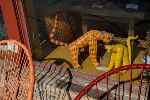
As I ventured down South Congress to take my photos, I first began to group scattered occurrences of color within a frame, such as the red flowers and bikes I captured (not a part of the final collection).
My images began to develop more complex interpretations of the environment into the frame as I searched for more dynamic lines, instances of repetition, and creations of unity and variety within spaces. I loved the different personalities that existed behind the windows of each store front and I began to capture their shapes and color within the frame. As I progressed towards the subjects at varied angles, I began to play with the reflections of the window in relation to actual objects in front of me. Through this manipulation of multiple planes, I was not only able to capture a unified image, but I was able to press together and layer lines and shapes. Proximity, and the development of instances of closure, containment, and repetition, became very malleable through capturing the different angles of the reflections and objects (I began to have interesting “control” over the image).
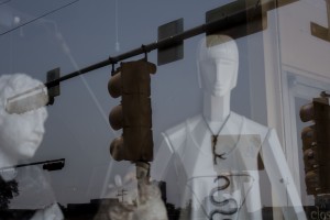
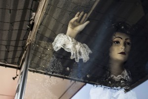
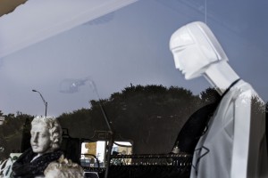
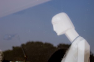
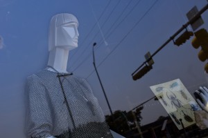
The lines of the reflections of traffic lights developed a continuation into the objects’ shapes in the window, which became my one of my final images, Basking in Traffic light). In an image I titled Release, the telephone pole lines developed a united continuation from the heart of the mannequin to the edge of the frame. The lack of continuation of the mannequin’s body (interrupted by the triangular reflection) in Irresolute highlights our ability to create closure and visualize the rest of the arm and body without it being visible.
Within these images, the extreme proximity (to the point of severe overlapping) that occurs through the visibility of both the objects behind the window and the window reflections allows for the formation of a united image and idea.
Overall, multiple worlds (the conceptual, physical, and visible) began to merge and interact with one another.
Conceptual Discovery and Analysis in Relation to Gestalt-thinking
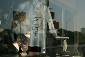
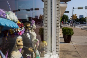
I noticed that as I began to dissect the image to find what made them “work”, I began to find other conceptual and emotional ties to the formation of the images. The objects themselves can symbolize different meanings to each viewer that interprets the image. This emotional and cognitive factor of interpretation also stems from the principles of Gestalt (as seen in class with the images of the repeated planes, crosses, and birds). The skeleton figurines (Mexican folk art) in the images “Basking in Traffic light”, “The Greeters”, and “Skeleton Woman” may have different connotations for different viewers based on their knowledge and experiences, which would in turn give the image a different sort of unified meaning for each viewer.
Some of the objects and “beings” behind the glass may seem that they desire to become intertwined and a part of the outside (they long to unify themselves with other objects in the world). Although they cannot physically become one with the outside because of the presence of the glass, the reflections, along with the principles of Gestalt, allow the objects (such as the toy cars and the geometric mannequin) to unite, exist, and blend together with the background…even if only temporarily, through just one, quick image. There’s almost a desire expressed throughout all of the images–a desire for unity, identity, and an identity related to the desired, but somewhat unobtainable togetherness (a sensation that occurs within nations, as well as within individual people…the longing to be wanted, loved, and a part of a group or idea).
However, with some of the images I do not sense this “desire” for unity; the unity seems to be being created, forcefully, by thee objects, linear reflections, and the elements of Gestalt. For example, in those where a window frame is not present in the image, and the objects and reflections merge into one, complete image (such as Basking in Traffic light and Attack!) and allow their shapes to contain them (rather than the lines of the window). Compared to the ones with a visible window frame (The Greeters and Concern), these that are defined by their own lines actually seem more unified, abstract, and free (the complete images evoke different emotions, depending on their unifying force of containment).
In all of the images that I chose, there seems to be a common thread of making the outside and inside of the shops as one in design and emotion. The use of finding a balance within a composition of overlapping reflections and objects became an exciting tie into the idea of naturally unifying an image and beyond–the very depth of Gestalt beliefs and practices.
Separate Togetherness
Interpreting the Outside and Inside as One in Design and Emotion…
(Note: must click on images in order to view them full-size)
Longing
Emma Drumright, 2015

The Onlooker
Emma Drumright, 2015
Contemplation
Emma Drumright, 2015
Array
Emma Drumright, 2015
Decoration
Emma Drumright, 2015
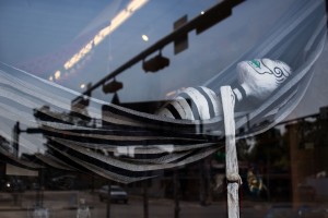
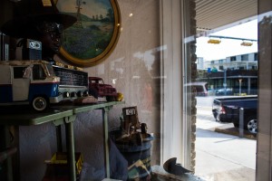
Basking in Traffic light
Emma Drumright, 2015
Irresolute
Emma Drumright, 2015

Skeleton Woman
Emma Drumright, 2015
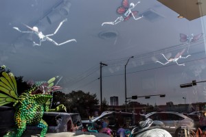
Attack!
Emma Drumright, 2015
Concern
Emma Drumright, 2015
The Greeters
Emma Drumright, 2015
Separate
Emma Drumright, 2015
Blurred
Emma Drumright, 2015
Release
Emma Drumright, 2015
Process and Requirements:
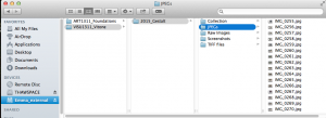
RAW images Folder:
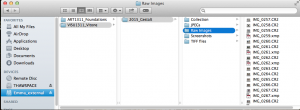
This screenshot was taken after I had began to group my images using keywords, which is why the RAW files are accompanied by the .xmp files (which have the denoted keywords saved).
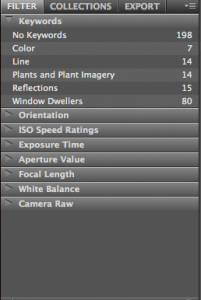
Keywords in Bridge, and Reasoning behind them:
(Note: must click on image in order to view in full size)
Keywords, Close-up of all
Keywords, All
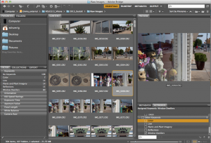
Keywords, Line
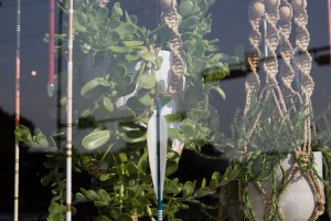
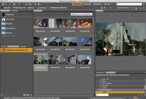
The keywords I developed as I looked over my images were “Color”, “Line”, “Plants and Plant Imagery”, “Reflections”, and “Window Dwellers”. The “Color” group was one of the first, simple groupings I created. Each of the images had a prominence or repetition of a certain color. The photos categorized in the “Line” group (shown above) each had either strong, subtle, or unique displays of line across the composition. I noticed that I photographed many plants and shapes/graphics of plants throughout my photo-shoot (however, only one plant photograph made it into the final collection), so I grouped these into a “Plants and Plant Imagery” group. “Reflections” were the images that developed the strongest relationships between the shapes reflected on the window and the objects inside (which soon became an integral idea within my final, Gestalt-fueled collection). Most of the “Window Dwellers” images overlapped with “Reflections”; however, this grouping was of images that were specifically of objects that had a human/animal-like form behind the windows. Grouping the images helped me further understand and shape my final collection.
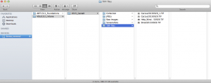
All Images Converted to JPEG:
The RAW files were converted to JPEG when the application iPhoto opened them up. I had to exit iPhoto and reach the and import the RAW photos as RAW from my SD card in a different way (through Finder). However, now I have copies of all of the images (even though they are only JPEG).
Beginning to Convert Images to TIF:
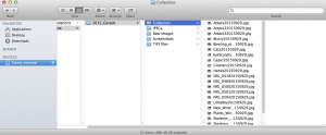
Beginnings of Choosing the Collection:
This is when I began to narrow down the images based on its relation to the Gestalt principles. Although I took many images in varied places and of varied objects when I went to South Congress, I found myself especially drawn to the multiple dimensions and complex images that the photographs of the reflections and objects in the windows created, both during the photo session and afterwards.
Some of the images I chose had the potential to further communicate the use Gestalt principles, and would become most effective after editing their contrast and color values in Adobe Photoshop.
Adobe Photoshop Editing and Comparison:
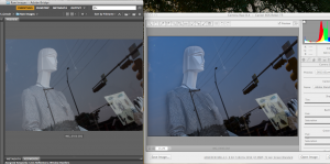
In many of the images, I wanted to emphasize the subjects, or figures, within the ground through the use of heightening contrast, manipulating color and highlights, and intensifying the shadows etc. For the image I titled Release, I found that by increasing the shadows of the angles of the mannequin’s face and the contrast of the shirt, its figure was able to stand out more. Although the mannequin is more emphasized, the viewer can still read it as a part of the whole image through the continuation created through the reflection of the telephone lines located near the mannequin’s chest.
Chosen, Edited Images Manually Converted to JPEG for blog:
Here I began to interpret the images and relate them to the different emotions I felt as I observed them, which led me to giving the images names in order to distinguish and connect with them more. The ISO date was integrated within the process of converting the images to JPEG after editing in Photoshop.


