Category: VISU1311 (page 1 of 2)

Blog #12: The Way Things Go

Rube Goldberg machines, like the one featured in this video, are products of planning, intention, and sequence. Essentially it is a lot of parts (sometimes fairly complicated) that lead to accomplish a small or singular task or tasks.

The first Rube Goldberg machine that I remember seeing was the one in the movie Pee Wee’s Big Adventure (along with the Danny Elfman’s score, this machine fascinated me as a kid!).

I really liked the description beneath the video and how it stated that the machine brings up thoughts of “cause and effect, mechanism and art, improbability and precision”. These elements and ideas are very compelling when thinking about different pasts of life and our personal endeavors/natures.

It will also help to keep the idea of sequence in mind while constructing our books. One idea leads to and may even build onto another in sequence.

Blog Post #11: David Blaine, TED

David Blaine’s devotion to his goals, his curiosity, and his positivity and wisdom was very inspiring and meaningful within his work and presentation. His thoughts were very strong behind his acts, and very purposeful, and they didn’t seem as bizarre as they might have if they weren’t supported by a personal purpose. The feat, he described, as “surviving with nothing…not even air” was such a bold and intriguing concept.

I was very inspired when he spoke about how, as a magician, he liked to communicate to others that “everything is possible”, and that he kept believing, while looking through his research, if one person can do it, others must be able to, too.

He did a lot of research and experienced multiple “failures” (most that were on television); however, he really kept coming back and thinking “How can I solve this?”.

He did a lot in preparation for the feat. In the end, although mishaps were even happening in the final round, it was interesting to hear his thoughts as he tried to accomplish the task. I liked how it was the audience that really motivated him in the end (sort of a reminder of the context of the situation, and how he had beat the time! It sort of gave him an extra boost to keep going, even though before he was overwhelmed with everything going on in his body).

The end of his speech was very moving when he spoke about “pushing through the pain” and working to be the “best [he] can be”.

Blog Post #10: Radio Lab, “Beyond Time”

When I first began to listen to this podcast I wasn’t too sure of what to think; they were discussing things at the beginning, I was in a mind set of “get it over with; it’s an assignment”. However, once I began to really listen and hone in on what they were talking about and exploring, it became extremely fascinating and engaging to me.

I really liked the first segment when they stated “time hates art”, and how Terry made his Diffusion sculpture in order to “collaborate with time”.

I also really enjoyed the segment with the painter David McDermott and how the reporter went into his home. McDermott had an extremely invigorating and beautiful outlook on the past and the concept of time as not a linear thing, but as a permanent collection of co-existing moments. I loved when he said believing time was linear was a “death trap” (…”and you will die.”) and that we can all time-travel practically.

The discussion about this concept further into the podcast, that discusses free-will, was also very interesting!!

I thought that the Mojave Desert segment that concluded the podcasts was magnificently beautiful and haunting. I especially liked the idea of how little we are; the freedom, the largeness of space and nature, and Noah Purifoy’s sculpture that takes on a life of its own.

Overall this podcast was very humbling!

Podcast-ing is such an interesting and immersive medium, and they sort of collage together sounds and ideas in order to create an auditory experience.

VISU1311 Project#2 Emma Drumright

Harmony 

Relationships among colors, shapes, elements, form, space, texture, value, proportion, time…

Changing meaning, creating rhythm, manipulating perception

Throughout the creation of my collages, I inherently pushed for repetition of color and shapes within the “frame”. I really enjoy the creation of different worlds, illusions, and ideas through imagery.

In the collage I placed first (titled Recognition) I began to repeat different elements in diverging directions in order to convert the flat space into a space of layered color and forms. I incorporated the scanned tin foil face and the South Congress bowling pins (which both have recognizable facial elements) in order to continue this idea of face throughout the piece. I noticed that by varying the contrasts and brightness of the background imagery, I could create an illusion of depth and movement.

In my second collage (titled Ascendance) I wanted to create a bright environment that delivers a sense of rotation and the main subject (the skeleton with the gigantic head and cigar) rising. I worked a lot on layering multiple elements and creating repetition through the cloning tool. I think the balance of this image may require a little more work (maybe through lowering the repeated pickle-like shapes more weight would gravitate towards the center).


Final Images: Compositions of Interacting Thoughts

VISU1311 Project #2 Collage 1 Emma Drumright

VISU1311 Project #2 Collage 1 Emma Drumright (Recognition)

VISU1311 Project #2 Collage 1 Emma Drumright

VISU1311 Project #2 Collage 2 Emma Drumright (Ascendance)


Process

Formal Exercises, Experimental Collages

2015-11-1_SundayYoungColdLonely copy 2

VISU1311 Project #2 Collage 3 Emma Drumright (Young, Cold, & Lonely Sunday)

Although this collage was the final collage I made, I call it an “experimental collage”, because during the process I was focusing not solely on the whole image, but more on the idea of creating the different elements in the image. Within this collage I experimented with the cloning  and selection tool in order to supply different makeup to the shapes. I also developed the background by cloning a sticker.

I didn’t put as much time into this piece as the other digital images, too, but I think this image may work with the addition of text and maybe a few more adjustments.

2015-10-29_FirstCollage

VISU1311 Project #2 Collage 4 Emma Drumright (Peace be with you)

Within the physical collage above (which was the first collage I created), I worked around cut-outs of an already-established backdrop of the outside of a restaurant. I wanted to manipulate the viewer’s perception of the space as well as of the people at the tables, so I switched out their heads with the skeletons’ heads. I worked to create a balance of direction, so I added the arm and different angular lines to add to the concept as well as composition. I titled it “Peace be with you” in order to evoke ideas of violence, peace, religion, weaponry, and the implementation of each within cultures and societies.

2015-10-29_FirstCollage(2)

VISU1311 Project #2 Collage 5 Emma Drumright (Musicians’ Feet)

Within the collage above, I wanted to utilize circular shapes in order to create depth, rhythm, and an overall unity. I worked to align the image of the shoes in the window with the picture of the silver cans underneath. I wanted to unite these two images because of their metallic, textural nature. I repeated the circles and reds through additional elements on the sides (these circles also mirror the pattern on the tights).

I also experimented through two other physical collages (which I have not scanned). Through those collages, I utilized a lot of paper bag material and I wanted to experiment with three-dimensional layering and form (making collages an object rather than an image).


Scanning Objects

The objects I scanned consisted mostly of trash and leaves. When I was choosing the objects I wanted to scan and incorporate into my collages, I wanted items that I could manipulate (such as the tin foil) and objects that had naturally and graphically interesting lines and shapes (such as the leaves and seed-like object in the scan titled “Three’s A Crowd”). I also chose objects because of their color (such as the bright yellow Starburst wrapper and the old, broken, plastic, pink pen cap).

2015-10-29_Three'sACrowd

Three’s A Crowd (Scan)

2015-10-29_Bust

Stern (Scan)

2015-10-29_Face (2)

Face 1 (Scan)

2015-10-29_Face

Face 2 (Scan)

Manipulating Form Scans

2015-10-29_Frustration (2) 2015-10-29_Frustration (3) 2015-10-29_Frustration (4) 2015-10-29_Frustration (5) 2015-10-29_Frustration (6) 2015-10-29_Frustration (7) 2015-10-29_Frustration (8)

In the scans above I moved the leaves, stick, and sculpted tin foil as the scanner processed the information, which created reverberating lines of distorted color.

2015-10-29_Leaf-Family

Family (Scan)

2015-10-29_Rowing

Rowing (Scan)

2015-10-29_Running

Running (Scan)

2015-10-29_Frustration

Frustration (Scan)

2015-10-29_Sticks

Disguise (Scan)

2015-10-29_Wind

Face of Wind (Scan)

2015-10-29_Yelling

Yelling (Scan)

I enjoy attaching names to my images in order to distinguish and develop different ideas, emotions, and concepts that I could further incorporate and merge into other things.


Work Flow

Color Profile (ProPhoto RGB) and Naming Properties:

Screen Shot 2015-10-29 at 18.13.32

File Extensions and Naming (ISO dating and Tifs):

Screen Shot 2015-11-02 at 09.55.57

VISU 1311: Creativity Blog #8

Synergy and Harmony in Dan Phillips’ Creations and Perspective

In this TED talk by Dan Phillips, Dan has such a resourceful, innovative, inspired, and intuitive energy within his approaches, and feels the potential of every object and material he incorporates.

He utilizes materials personally, uniquely, with a light-hearted seriousness (he’s purposeful while maintaining a great sense of humor and being).

I really was fascinated by his discussion of commodity, expectations, and the two different cultural perspectives. He even incorporates the Gestalt principles as sort of a reasoning and argument for utilizing innate creativity instead of conforming to conventional perfectionist ideals.

His outlook on the houses, and his creation of harmony through the pieces remind me of the collages we are about to make for our second project.

When constructing a collage from images, an artist can also waste material and time if they are set on meeting a specific idea in mind.

We can also utilize and think apart from what is expected of us. Like Dan Phillips says, by embracing human nature, the organic process, and what we would conventionally think as”blemishes”, we “reconnect with who we really are“.

VISU 1311 Project #1: Emma_Drumright

Gestalt

noun. psychology.

A theory that analyzes that something made up of many parts is perceived as more than just its parts;

it is perceived as a “unified whole”.

Through its various elements and principles,

Grouping, Containment, Repetition, Continuation, Closure, Proximity, Figure/Ground,

we can attempt to describe the way humans organize and interpret visual elements into groups,

which can further allow artists and designers to have an understanding and control of how they create and truly read and decode an image, its mechanisms, and its potential relationships with the viewer.

(definitions derived from Spokane Falls Community College page, and Merriam-Webster dictionary…and our class handouts, of course!)


The principles of Gestalt have guided the works of countless artists and communicators throughout time, as well as the eyes and minds of many viewers. Understanding how an image obtains meaning (and the translation of an image’s significance from person to person) greatly contributes to the ability artists and designers have in developing visually and conceptually successful and purposeful works.

Applying these ideas towards my own photographs helped awake me to how I interpret an image, or, even simply, how I interpret occurrences of life. We experience the principles of Gestalt daily; for example, when we visualize shapes in clouds or other objects because of their proximity, or look a certain direction because of an arrow or pointed finger (continuation), we are internally utilizing natural principles of Gestalt.

As I ventured down South Congress to take my photos, I first began to group scattered occurrences of color within a frame, such as the red flowers and bikes I captured (not a part of the final collection).

My images began to develop more complex interpretations of the environment into the frame as I searched for more dynamic lines, instances of repetition, and creations of unity and variety within spaces. I loved the different personalities that existed behind the windows of each store front and I began to capture their shapes and color within the frame. As I progressed towards the subjects at varied angles, I began to play with the reflections of the window in relation to actual objects in front of me. Through this manipulation of multiple planes, I was not only able to capture a unified image, but I was able to press together and layer lines and shapes. Proximity, and the development of instances of closure, containment, and repetition, became very malleable through capturing the different angles of the reflections and objects (I began to have interesting “control” over the image).

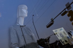
The lines of the reflections of traffic lights developed a continuation into the objects’ shapes in the window, which became my one of my final images, Basking in Traffic light). In an image I titled Release, the telephone pole lines developed a united continuation from the heart of the mannequin to the edge of the frame. The lack of continuation of the mannequin’s body (interrupted by the triangular reflection) in Irresolute highlights our ability to create closure and visualize the rest of the arm and body without it being visible.

Within these images, the extreme proximity (to the point of severe overlapping) that occurs through the visibility of both the objects behind the window and the window reflections allows for the formation of a united image and idea.

Overall, multiple worlds (the conceptual, physical, and visible) began to merge and interact with one another.


Conceptual Discovery and Analysis in Relation to Gestalt-thinking

I noticed that as I began to dissect the image to find what made them “work”, I began to find other conceptual and emotional ties to the formation of the images. The objects themselves can symbolize different meanings to each viewer that interprets the image. This emotional and cognitive factor of interpretation also stems from the principles of Gestalt (as seen in class with the images of the repeated planes, crosses, and birds). The skeleton figurines (Mexican folk art) in the images “Basking in Traffic light”, “The Greeters”, and “Skeleton Woman” may have different connotations for different viewers based on their knowledge and experiences, which would in turn give the image a different sort of unified meaning for each viewer.

Some of the objects and “beings” behind the glass may seem that they desire to become intertwined and a part of the outside (they long to unify themselves with other objects in the world). Although they cannot physically become one with the outside because of the presence of the glass, the reflections, along with the principles of Gestalt, allow the objects (such as the toy cars and the geometric mannequin) to unite, exist, and blend together with the background…even if only temporarily, through just one, quick image. There’s almost a desire expressed throughout all of the images–a desire for unity, identity, and an identity related to the desired, but somewhat unobtainable togetherness (a sensation that occurs within nations, as well as within individual people…the longing to be wanted, loved, and a part of a group or idea).

However, with some of the images I do not sense this “desire” for unity; the unity seems to be being created, forcefully, by thee objects, linear reflections, and the elements of Gestalt. For example, in those where a window frame is not present in the image, and the objects and reflections merge into one, complete image (such as Basking in Traffic light and Attack!) and allow their shapes to contain them (rather than the lines of the window). Compared to the ones with a visible window frame (The Greeters and Concern), these that are defined by their own lines actually seem more unified, abstract, and free (the complete images evoke different emotions, depending on their unifying force of containment).

In all of the images that I chose, there seems to be a common thread of making the outside and inside of the shops as one in design and emotion. The use of finding a balance within a composition of overlapping reflections and objects became an exciting tie into the idea of naturally unifying an image and beyond–the very depth of Gestalt beliefs and practices.


Separate Togetherness

Interpreting the Outside and Inside as One in Design and Emotion…

(Note: must click on images in order to view them full-size)
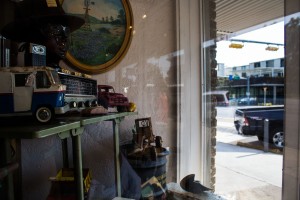
Longing Emma Drumright, 2015

Longing
Emma Drumright, 2015

The Onlooker Emma Drumright, 2015
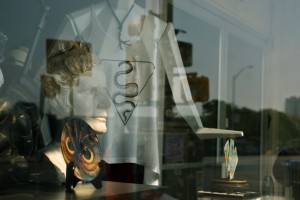
The Onlooker
Emma Drumright, 2015

Contemplation Emma Drumright, 2015
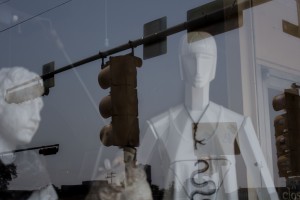
Contemplation
Emma Drumright, 2015

Array Emma Drumright, 2015

Array
Emma Drumright, 2015

Decoration Emma Drumright, 2015
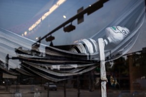
Decoration
Emma Drumright, 2015

Basking in Traffic light Emma Drumright, 2015
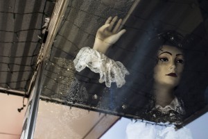
Basking in Traffic light
Emma Drumright, 2015

Irresolute Emma Drumright, 2015

Irresolute
Emma Drumright, 2015

Skeleton Woman Emma Drumright, 2015
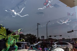
Skeleton Woman
Emma Drumright, 2015

Attack! Emma Drumright, 2015
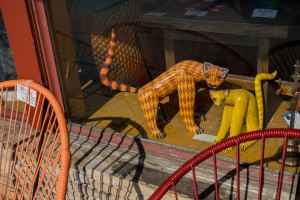
Attack!
Emma Drumright, 2015

Concern Emma Drumright, 2015
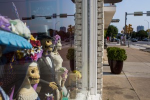
Concern
Emma Drumright, 2015

The Greeters Emma Drumright, 2015
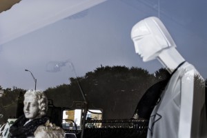
The Greeters
Emma Drumright, 2015

Separate Emma Drumright, 2015
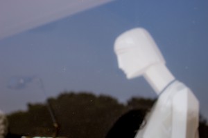
Separate
Emma Drumright, 2015

Blurred Emma Drumright, 2015
Blurred
Emma Drumright, 2015

Release Emma Drumright, 2015

Release
Emma Drumright, 2015


Process and Requirements:

RAW images Folder:
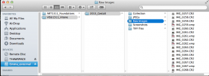
Raw Images Folder 2015-09-29 at 16.12.12

This screenshot was taken after I had began to group my images using keywords, which is why the RAW files are accompanied by the .xmp files (which have the denoted keywords saved).


Keywords in Bridge, and Reasoning behind them:

(Note: must click on image in order to view in full size)
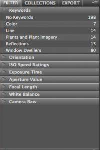
Keywords 2015-09-29 at 16.26.24

Keywords, Close-up of all

Keywords Full 2015-09-29 at 16.26.15

Keywords, All


Keywords Line 2015-09-29 at 16.27.13

Keywords, Line

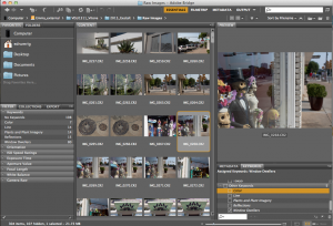
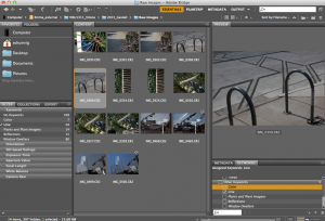
The keywords I developed as I looked over my images were “Color”, “Line”, “Plants and Plant Imagery”, “Reflections”, and “Window Dwellers”. The “Color” group was one of the first, simple groupings I created. Each of the images had a prominence or repetition of a certain color. The photos categorized in the “Line” group (shown above) each had either strong, subtle, or unique displays of line across the composition. I noticed that I photographed many plants and shapes/graphics of plants throughout my photo-shoot (however, only one plant photograph made it into the final collection), so I grouped these into a “Plants and Plant Imagery” group. “Reflections” were the images that developed the strongest relationships between the shapes reflected on the window and the objects inside (which soon became an integral idea within my final, Gestalt-fueled collection). Most of the “Window Dwellers” images overlapped with “Reflections”; however, this grouping was of images that were specifically of objects that had a human/animal-like form behind the windows. Grouping the images helped me further understand and shape my final collection.


All Images Converted to JPEG:
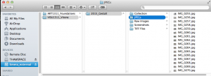
JPEGs 2015-09-29 at 16.11.12

The RAW files were converted to JPEG when the application iPhoto opened them up. I had to exit iPhoto and reach the and import the RAW photos as RAW from my SD card in a different way (through Finder). However, now I have copies of all of the images (even though they are only JPEG).


Beginning to Convert Images to TIF:
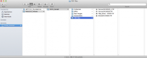
Screen Shot 2015-09-29 at 7.53.25 PM


Beginnings of Choosing the Collection:
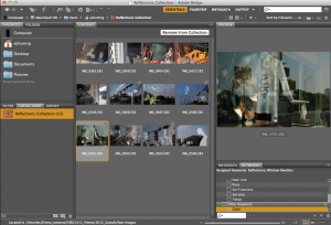
Reflections Collection 2015-09-29 at 16.24.27

This is when I began to narrow down the images based on its relation to the Gestalt principles. Although I took many images in varied places and of varied objects when I went to South Congress, I found myself especially drawn to the multiple dimensions and complex images that the photographs of the reflections and objects in the windows created, both during the photo session and afterwards.

Some of the images I chose had the potential to further communicate the use Gestalt principles, and would become most effective after editing their contrast and color values in Adobe Photoshop.


Adobe Photoshop Editing and Comparison:
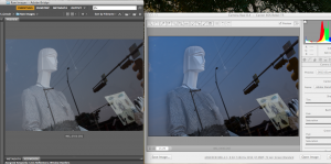
Editing in Photoshop 2015-09-29 at 16.04.54

In many of the images, I wanted to emphasize the subjects, or figures, within the ground through the use of heightening contrast, manipulating color and highlights, and intensifying the shadows etc.  For the image I titled Release, I found that by increasing the shadows of the angles of the mannequin’s face and the contrast of the shirt, its figure was able to stand out more. Although the mannequin is more emphasized, the viewer can still read it as a part of the whole image through the continuation created through the reflection of the telephone lines located near the mannequin’s chest.


Chosen, Edited Images Manually Converted to JPEG for blog:

Screen Shot 2015-09-29 at 7.50.26 PM

Here I began to interpret the images and relate them to the different emotions I felt as I observed them, which led me to giving the images names in order to distinguish and connect with them more. The ISO date was integrated within the process of converting the images to JPEG after editing in Photoshop.


VISU 1311: Creativity Blog #7

A reflection on Mashall McLuhan and Quentin Fiore’s “The Medium is the Massage–An Inventory of Effects”

McLuhan and Fiore mix pounding prose and a deliberate, repetitive, rhythm of bold and ghostly imagery, which questions personal existence, the interconnections of social forms that exist outside ourselves, and the heavy effects social things have on our inner core.

McLuhan, a media analyst, and Fiore, a graphic designer, expand and define the impact of media on humankind. They combined their ideas and talents to produce this work.

I found the energetic circling and underlining of paragraph intriguing, as well as the name of the piece (“message” would make more sense, but “massage” provides more of a sensory effect).

One part of this piece began remind me of an episode of The Monkees, a show that was filmed in the years 1966-1968 about a group of young musicians who get into all sorts of situations. Although on the surface the Monkees were quite goofy, their material often dealt with serious and thought-provoking subjects about culture and meaning.the monkees all

In this particular episode, titled “Monkee vs. Machine”, the Monkees had to confront a computer-like machine that was taking jobs away from people at a toy factory. The toy-makers had become obsolete and no match for the computer’s intelligence and efficiency. the monkees 2
the monkees

One by one the Monkees have to have a meeting with the computer, with the computer greeting them officially and powerfully. However, one of the Monkees charmingly defeats the computer through quick-witted, silly puns and mind-games that the computer could not comprehend. They soon succeed in giving back the jobs to the workers, despite the hard-headed boss’ adamant push towards replacing every job with technology.

I think this episode provides a rather triumphant ending of humans over technology and the influence of hype and media. It contains a similar theme that the phrase “Come into my parlor,” said the computer to the specialist”  in “The Medium is the Massage”.

While writing this reflection, I researched more into the context of “The Medium is the Massage”, and it turns out that it was released in 1967 (in the same era as the Monkees, the Beatles, and others!!). It’s funny that I connected the two without knowing the time period that “The Medium is the Massage” was created in; its so interesting there’s a consistent theme of challenging images and objects present among these minds and culture.

In a review of the audio pieces and book I read online, by Brett Milano on AllMusic.com, Milano discusses the intellectual era of “trippiness” and “surreal humor” that came about during this time. He also talks about the origin of the title, which McLahun stated was an spelling error from the editor, which he decided to keep because it seemed to be very fitting.

This opens my mind more to the power that this combination of talent has; it’s pounding, intricate, challenging, and gives off a restless, unsatisfied energy. I would love to do more research on other pieces produced within this time period.

This piece created developed a united message, conceptually and aesthetically. The images evoked various emotions through their manipulation in space. They played with motion, rhythm, and depth through the variation of photograph and text placement. For Project 2 (the collage project) I would also like to create this energy and unity by placing my photographs and textures in deliberate and interesting directions and meaningful places.

Note: I just realized that the colored “underlining” and “circling” that I talked about in the reflection may have not been a part of the work, but digital notes from the copy that we were provided. They did add a certain emphasis and severity to the book, even if they may not have been a part of the original.

Images taken from (links given):

“Monkee vs. Machine” shots  and group picture

VISU 1311: Creativity Blog #6

Out of all the assignments for this week, I think I gained most from listening to the musician and producers of Spoon talk about their thoughts, inspirations, and processes as they generated their song “Inside Out”; it was an inspiring and informative way to look into the purposes beneath the rhythms and notes that we hear—to truly meet the artists’ intentions and their experiences with their creative processes.

I wrote down many points that the speakers came to, such as that they would just “throw down ideas” even if they weren’t sure if they’d be used; they would “mess with it” until they found an “emotional connection”. I also liked when they even mentioned how even intuition plays a role in their decisions (for example, when one of them mentioned, after he could “hear something in [his] head”, and that they should try something unique at a certain point of the song because “it’s be cool”!).

The cooperation for a common and exciting goal throughout inspired me as well because they all seemed to have an understanding and an open mind for exploring into the “unknown” and unfamiliar in order to produce something remarkable and purposeful.

This help me understand that music is not just an “art” (there to express emotions and other intentions of the artist), but also heavily a “design”. The producers of “Inside Out” focused strongly on the effective design and incorporation of different layers, inspirations, and elements. The comparison, evaluation, and dedication to the product (and its transformation through this process) is a major part of the art of music (and of any piece of human creation).


VISU 1311: Creativity Blog #5

As I first watched Stan Brackage’s STELLAR [1993], I took down adjectives in order to describe what I was seeing and feeling:

Dark, rich, deep, quick,

Ominous, haunting, repeated,

Splattered, no rhythm chosen or catchable,

Erratic (but purposeful), pounding

Distorted images…

I watched the film a few more times, and after reading the end credits (where it states that it is composed by a “visual musician”) and after reading the reactions in the Youtube comments (some questioned, “Is this art?!”, while others described it as the “visions” of Brackage), I saw this spectacle as more of a piece than a random assortment of images.

One user who commented on the video recommended music to be played along with it (such as the band Joy Division, which I played along with it one of the times). But there is something about the silence that accompanies the onslaught of visual imagery that gives it its purpose and edge. It is its own music, in a way, composed of film, color, distortion, and speed/movement. I interpret it as music for the eyes.


VISU 1311: Creativity Blog #4

Amy Tan’s TED Talk that focused on the origins of human creativity and mental associations/discoveries reminded me of the importance of becoming a part of the creation and staying mentally and emotionally active and curious about life experiences. Tan made many points throughout her presentation that made me rethink the way I thought about creativity.

I really enjoyed the way that she related and compared Quantum Mechanics (used it almost as a basis of explanation) to explain the human experience while creating. “The Observer Effect” was one issue that stuck with me; if we only search for what we hope to find, we will not discover anything deeper than that. Creating, then, almost presents an opportunity for the creator to have an inner transformation.

I currently believe that we all can become creative if we push ourselves to reflect on our experiences and to go in challenging directions. Humans can create and think of new ideas through inspiration and cultivated knowledge over time (which means I would  agree mostly with the “nurture”  side of creativity). However, Tan also discusses that there may be things that happen inexplicably by nature (but this may also be a case of experience and inspiration).

Her focus on the balance of the universe and her own beliefs that formed while she was writing and planning her novels made me grasp onto that one of her central ideas: we must take on the beliefs of our creations in order to answer the questions we have concerning their placement in the world. Creativity happens through “questioning” and the understanding that “there  are not absolute truths”.  I believe it takes someone to open their mind (to the past, present, and future), and cultivate a steady, curious, determined spirit as they work for them to create to the best of their ability.

Older posts

© 2024 Emma D

Theme by Anders NorenUp ↑

Skip to toolbar