Category: VISU1100 (page 1 of 2)

Blog Post #12: VISU1100

Faculty Presentations, Part 2:

Kim Garza Assistant Professor of Graphic Design, 5 years at St. Edward’s

Kim Garza took us through the common procedures of different areas of the graphic design field, and she used personal examples and projects in order to specify the journey of a product. She stated that she loves the field of design because of the many, many opportunities that come through it. “Design”, she quoted, “is liberal arts for life”, and a designer is always involved in new learning.

The app she worked on and described, titled Eventurist, came to be through interviews and research, where they were able to identify and justify a need and types of users. I found it interesting that in order to fully understand the user experience and take their personal focus out of the picture, they created personas based on the research. From 15 ideas came 4 prototypes, and those prototypes went through 8 user tests, which eventually

Her “creative pursuit” (the video with musical and visual elements and manipulation) with her husband was brilliant, transporting, and multi-dimensional. I really enjoyed it, and I found it funny that their ability to use the old film “Till the Clouds Roll By” was a result of a copyright error. Once we began to watch and listen to it, it revealed a more eerie and ghostly tone due to the music and visuals created to replace the originals. It is also amazing that this has been a project of theirs for 6 years because it shows that one can put their passion anywhere and, usually, at anytime. I enjoyed how she shared multiple sides of her career and passion for design.


Tammie Rubin Art Department

Tammie Rubin noted the influence of the term “chimera” and its importance of the interpretation of the term (as mythological creature and as something that is wished/hoped for) throughout her work, which I thought was very fascinating because I was then able to see this influence as she further shared her work and delved into new concepts.

She also was influenced by her upbringing in the urban, nature-controlling environment of Chicago. She had a “specific and guided relationship” with nature because of this environment, which changed when she moved to Seattle. Although she thought this change of interaction and scenery would help her develop new behaviors and feelings towards nature, she realized that she wouldn’t change, and that she was even more interested in the idea of “manufactured nature” and the contrasts of waste and beauty (rather than solely focusing on the beauty of nature). She liked looking at the details and intricate textures of the plastic and how it would all be waste someday (only used for a moment).

I liked her thought process behind her choice of using the acrylic paint; it gave her pieces a plastic feel that delayed the viewers’ definitions and perceptions of the pieces. They would have to get closer, and, in turn, focus more mentally on her pieces. She had so many interesting insights towards things, such as the observation that we ascribe power to simple objects and sort of create an imagined contraption beyond our world.


James ScheurenPhotography and Photo-communications

James Scheuren’s work was also heavily inspiring (like Tammie and Kim’s!) towards the different possibilities and interpretations that can exist in and, in some ways, shake perceptions of the world. I like his focus on human things done by accident with no aesthetic intention or purpose. He described it as a “very human” intention, however, and places the beauty within this fact and through the capture of the act within his camera frame. The photograph itself “conveys the importance”.

I also liked the idea that sort of repeated throughout his works (such as “Red Room”, “Sticker”, and the piece with the painted over constellations) of what we are willing to put up with and live with. Many of these ideas wove in and out of his pieces, and really pull at the essence of human natures and behaviors (“channeling the unconscious”).

I really enjoyed when he began talking about the personal connections of leaving childhood (“Childhood’s over, asshole”) as seen through the crickets caught in the sticky trap. While I wouldn’t have known this connection as directly without him telling us, I would sense that feeling of loss and preservation at once.

What I love about these artist/faculty talks is that they introduce the building connections that they’ve noticed and briefly explain their personal interpretations before, during, and after making their pieces. Their words expand our understanding and allow us to not just look through their eyes, but to view it through a perspective of heightened senses and comprehension.


Blog Post #8: VISU1100

Drawing/Painting Time (using portraits), Martin Lam Nguyen, C.S.C


When first viewing the works of Martin Nguyen (within Drawing/Painting Time, using portraits), I observed pounding dots supplemented with detail that met the eye when you walked in closer.

In 1979 Martin Nguyen immigrated to the United States from Vietnam. During his presentation he expressed his great interests and concerns with technology, language, presence, time, and caring for/knowing one another (passions and ideas he had developed during his travels and experiences). Nguyen is also a priest of the Congregation of the Holy Cross and “joined the Department of Art, Art History and Design of the University of Notre Dame in 1995” (background information found via). St. Edward’s had the great pleasure of welcoming Martin and his pieces to our art gallery, and I am so glad that I worked up the resolution to attend his gallery opening and artist talk of Drawing and Painting TIME (using portaits).

Within this specific installed exhibit, there were two distinct pieces: one an array of faces and expressions from different people of different ages at different times portrayed in a warm palette; the other, “365 Faces of Lucy”, focused on one young girl, depicted in gray-scale drawings, every day for one whole year. The lines that depict the faces within both pieces are thin and depict the faces rather realistically.

The pieces have a very grid-like form that creates repetition and a uniform rhythm. The subtle differences in the faces on both the large piece and “365 Faces of Lucy” also develop a sense of variety as the viewer rotates their eyes from one image to the next.

They interact with the space subtly and profusely through this varied yet united rhythm of faces, and create an atmosphere of great reflection and care. The tenderness within the captured, sequential expressions relates greatly to the deep purposes of Nguyen’s processes and pieces.

While listening to Martin Nguyen speak about his works, he brought up many intriguing and sensitive ideas, and in doing so, I struggled to keep myself from jotting almost everything he said down. His ideas expressed prior to me viewing his pieces helped inform my interpretation and further perceptions of the pieces and his expressions overall.

 “Time is the heart of existence…”

Time acts as a noble platform of his purposes within his works. Nguyen acknowledged the difference of perceptions of time throughout cultures, as most notably observed through the language we use in expressing it. Through the portraits he captures moments of existence in a way that we mark time: through portraits and documentation. There is such great care in that he utilizes hours and hours of his time in order to replicate a brief moment.

“I cannot know you; I’m not God.”

Language also differs when denoting what it means to look. Like Nguyen noted, in the English language  we glance and scrutinize and gaze (a spectrum of different forms of looking). With technology, this spectrum of viewing sometimes causes us to miss the specialties of people and moments in time.

 Through his processes of examining and duplicating a photograph, focusing on one at a time, he is almost able to feel what it is like to have the ability to create and care for someone in continuous moments so, so much—as if he is God…but not quite.

He and the viewer will never know the complexities of the individuals depicted, but they can rest in the unknown, knowing that we are all within the same space and channels of existence. We can take comfort in this understanding that we can never absolutely understand.

“Artists…lonely with an idea”

Martin Nguyen’s work is complex, astounding, and continuously working to present life in a pure, careful, strong form. As if each image is a moment, a breath—resounding so quickly to the viewer’s eye, yet it took hours to replicate.  Like I stated before, I am so glad that I was able to see his works and speak with him. They were very emotional, thought-provoking, and effectively.

I began to sense that feeling that he discussed within his presentation…that feeling of noticing a likeness of himself in the little girl. I recognize myself in others and their slick moments in time—united and as individuals.


Blog Post # 11: VISU1100

Part 1, Description and Responses to Faculty Presentations (“Our work…and whatever”)

Tuan

Tuan structured his presentation around the various purposes that he creates his work for: family, friends, and the community/school. His designs ranged from designs for thank you gifts, book layouts, tattoos, bags, identity, packaging, and more. I really enjoyed his stories about his family and the journeys of his different designs (and whether they were used or not!). I also was intrigued by one of the first pieces he showed, titled “500 Doodles” (mainly because I love to doodle and I also love seeing other peoples’ thoughts expressed on paper).

Hollis 

In Hollis’ presentation, she displayed her works while discussing the significance, techniques, and processes. Hollis’ work contained many dynamic, haunting personal threads and themes of memory, consumerist culture, disposability, monsters, childhood, and the mind (among many others!). I loved the language she used within her explanations and descriptions (such as when she described the attic smell as “seductive”, as well as the idea of “collective consciousness” when referencing different sources and imaginations for one image).

Bill

Bill’s presentation was very chronological, as he outlined how he had “changed over time” and developed a love for photography. He highlighted the importance of body awareness and work ethic (“you really have to pay your dues to get good at doing this”). I really enjoyed when he spoke about how he challenged himself by moving from landscapes to studio, and how he had almost been avoiding doing portraits (blank environment, filtered people). Each of his ideas and professions merged and lead into the next, and each took him on various, contrasting paths filled with unique and building lessons. This is in line with his first statement: “Life is not linear”!


Part 2, Five Year Plan:

It is difficult for me to directly state what I want to “do” during and beyond college, but I’ll do the best I can (I’ll go year-by-year)!

Freshman Year, 2015-2016:

  • Take the prerequisite courses required for Graphic design while keeping an open mind
  • Explore other courses and take part in other interests (Jazz band!)
  • Go to artist visits and presentations
  • Currently interested in a Graphic design major and possibly English Writing minor

Sophomore Year 2016-2017:

  • Figure out major/minor (define it more!)
  • Become more involved with clubs (Command-G, Art clubs, possibly theatre)
  • Possibly start and internship and look into studying abroad (summer or semester)

Junior Year 2017-2018″

  • Focus on school work and major, and possibly live in an apartment (?)
  • Take classes required for graphic design, and figure out minor

Senior Year 2018-2019:

  • Finishing up requirements for major and minor
  • Research and become more involved in community and projects with classmates

Year after Graduation 2019-2020 (<—WOW “2020”!!!):

For my career beyond college, I know I want to help people and learn/create in the process. It would be interesting to work for a design firm, but I also think further down the line I am also interested in children’s education and illustration. I hope to work to tie together all of my interests and passions into creatively  (whether on the side along with another job, or as a full-time career).


Blog Post #10: VISU1100

Recent Work!

VISU1311:

Unity Collages, Project 2

2015-11-1_Boom copy

Recognition, Emma Drumright Collage #1

VISU1311 Project #2 Collage 1 Emma Drumright

Ascendance, Emma Drumright Collage #2

Throughout the creation of my collages, I inherently pushed for repetition of color and shapes within the “frame”. I really enjoy the creation of different worlds, illusions, and ideas through imagery. I enjoy creating a rhythm and atmosphere through the disjointed images.

In the collage I placed first (titled Recognition) I began to repeat different elements in diverging directions in order to convert the flat space into a space of layered color and forms. I incorporated the scanned tin foil face and the South Congress bowling pins (which both have recognizable facial elements) in order to continue this idea of face throughout the piece. I noticed that by varying the contrasts and brightness of the background imagery, I could create an illusion of depth and movement.

In my second collage (titled Ascendance) I wanted to create a bright environment that delivers a sense of rotation and the main subject (the skeleton with the gigantic head and cigar) rising. I worked a lot on layering multiple elements and creating repetition through the cloning tool. I think the balance of this image may require a little more work (maybe through lowering the repeated pickle-like shapes more weight would gravitate towards the center).

I learned from the critique that I should present my work in a better manner (really consider the paper) and, when I am given a soft-critique or opinions prior to the official critique, I should take it into high consideration and really think deeply about what is said and apply it to my own perception of my work.


FOUNDATIONS IN ART AND DESIGN:

Orbit Book: The Circle Book from Outer Space

IMG_4875 IMG_4876

While this book may not appear to have the distinctive qualities and form of traditional books, its definition resides in that it consists of sequential visuals for the reader to transition through and become a part of mentally as well as physically.

Looking through books acted as a very interactive and imaginative experience for me when I was younger, and it was common for me to push myself into the narratives and images that I received through books. I wanted to mirror this feeling of placing oneself in a story by having the reader inserted within the pages–self-placed in an orbit of images.

The design of the book also takes inspiration from the creation, purpose, and reception of science-fiction and monster movies. Within my designs and through the nature of my book, I sought to evoke the sensations of attachment, wonder, and isolation that may occur when people undergo cinematic experiences.

The strange form of the book seems to correlate with the thees of uncertainty with outer space and the future, as well as the genres that merge together imaginative characters and humankind’s fears towards things that are unfamiliar.

A video taken from within the Orbit Book: IMG_4877

(***The video is not rotated the correct way, and will have to be downloaded in order to be viewed!)

A video observing the Orbit Book:

Blog Post #9: VISU1100

Alumni Presentations: Descriptions and Reflections

Lynné Bowen Cravens, Graduated St. Ed’s 2009

She described school as an “artificial environment” which I found very insightful. When she was talking about choosing to go to graduate school, she recommended not to go straight through immediately after undergraduate. She took a three year gap in between, and she said that she felt a hunger to go to other levels and truly improve and focus through grad school.

Her work contained such personal themes that encompassed family and identity (which really fascinated me). Her processes and methods were also very interesting, exploratory, and effective in their ability to accomplish and fulfill the concepts she was developing.


Miranda Pertrosky, Graduated St. Ed’s 2013

BA in Graphic Design, Minor in Fine Arts

Miranda first emphasized that although she has a major in “graphic design”, she and others don’t have to “box themselves” into a specific category of discipline. Her presentation was very informative and extremely helpful; she explained the different areas and industries of design and what they entail, such as the professions in digital, print, and areas in between.

She emphasized the importance of learning the core principles of design in order to adapt to the ever-changing tools. She also mentioned that “[you] can’t be a unicorn, but it’s good to have a basis in everything”. I took this statement as an invitation to explore and dip your feet in anything and everything (and eventually become closer to a rainbow-unicorn-like form!).

Dustin Meyer

Wedding Photography

Dustin’s presentation sort of talked about how education is not the most important element to obtaining a fulfilling occupation, but it makes a noticeable difference in quality. He also spoke about how “passion is not enough” and that you really have to develop skills and plan in order to start a career.

I also like how he described the process of photography shoots and how it is extremely important to be prepared. A photographer/artist shouldn’t experiment, but he/she owes the client to be focused and in the “flow” of the event. It was interesting to reflect on the different variables that different specializations (such as a wedding photographer) have to face when performing their hired job work.


Possible Internships:

 Midi Soliz  costume and fashion designer, celebrity stylist (film and music industry, Austin, TX)

We have contacted each other and I hope to meet her soon. I have told her that I am very interested in an internship and  She has been a family-friend for a long time, and it was my dad suggested for me to at least get to know her and possibly do an internship with her!

Midi Soliz Black Cross, Midi Soliz 11265174_10206191486447407_380030733811990947_n


Her work that I have seen on her Facebook page is very playful, glamorous, unique, and very inspiring. She evokes many attitudes and elements through her designs that excite me, and I know I could learn a lot from this internship.

Art Museum of South Texas (summer internship program, Corpus Christi, TX) 

I grew up exploring this museum in my hometown, and I one of my family-friends works as a guide and runner of the gift shop. Last year she suggested that I apply for an internship, and I am still very interested!

wwlrn_corpus-christi_art-museum-of-south-texas_400x220 t5jpk0e4


More info. from site:

Internships support the Museum’s commitment to encouraging emerging professionals not only in the museum field, but in other areas such as administration, public relations and education, by providing professional growth and development opportunities

The AMST internship program offers part-time, unpaid internships by academic semester each year. Students may be eligible to earn college credit for their internship hours, however, credit programs are managed through the individual student’s academic institution.

A wide range of opportunities and experiences are provided through our Museum internship program. Experiences may include researching artists, exhibitions, and programs; conducting market research or writing press releases; developing workshops and tours and/or prepping materials for installation of exhibitions.

Please note that Museum internships can be very competitive. AMST offers limited numbers of internships each semester and may be unable to place all applicants. Internship time commitments may vary between 8 hours per week minimum to 30 hours per week maximum.


The Contemporary Austin (Seasonal internships, Austin, TX)

I have never been to the Contemporary before, but it offers a wide variety of unpaid internships (from education, communications, curatorial, visitor services, public programs, development/membership, and more).

Internships-featured VRSInternships-featured

Deadlines for submitting applications for internships:

SPRING 2016: MONDAY, NOVEMBER 30, 2015

SUMMER 2016: MONDAY, APRIL 4, 2016

More info. from site:

All inquiries

internships@thecontemporaryaustin.org

All internships are unpaid.

Please submit a cover letter, résumé, and application form to apply.

Internships at The Contemporary Austin are ideal for expanding one’s understanding of the functions of contemporary art spaces and nonprofit organizations, as well as a great way to become an active part of the visual arts community in Austin. Our internship program is organized into fall, spring, and summer sessions and features opportunities at both of our locations. ”

Note: many internships in Graphic design seemed to require a Bachelor’s degree and/or extensive knowledge in the Adobe creative suite)


Blog Post #7: VISU1100

Alumni Speakers, Descriptions and Responses:


Nick Swift

Art major, graduated 2009; Now runs Swift Distillery 

Nick not only the steps he took to develop his own profession, but he highlighted the different creative professions that work with him. I thought it was interesting that although he was working in a field that some may not consider art or design-centered, his life and work continuously has to interact with the visual arts in order to succeed and grow. He works with web designers, package designers, food photographers, and food and beverage PRs in order to develop the thematic concepts, the flow, and the presentation of his products.

One point of his that really stuck with me is that research and detail are highly valuable. He noted that whatever industry, in order to be a part of the conversation and sound intelligent, and build credibility, you must have knowledge of the industry and the historical details beneath it.


Rebecca Marino

Photo communications major, graduated 2010; Gallery director, artist, co-editor

I thought it was amazing that she is involved in so many areas and has so many occupations at once. This shows that a person does not have to be one slot of an occupation in a field, but he or she can balance and incorporate different parts of things in his or her life. Rebecca directs a gallery for the Pump Project, but also makes art of her own as well as acts as co-editor for an online magazine (many different hats, but all correlated and what she loves to do).

Rebecca Marino emphasized that students can put themselves into the action by volunteering (along with internships); the main thing is that students are involved. She also advised to dip your feet into things, but to not overload, and that a main objective is to find what you are interested in and where you fit in.


Alex Roka

Graphic design major, alum

Alex Roka described the atmosphere of different types and sizes of design agencies, which was interesting to me because I was unsure of the potential work environments for designers. He said that in larger agencies the role of the designer is to execute ideas and sort of compete for the final design. Working in a smaller design agency (in which he is the creative-director and co-starter) he is able to have more of a hands-on experience and vision of the work they produce.

Throughout his talk, he discussed a large variety of projects that he had worked on (identity, research-based) as well as the thought processes behind developing these projects.

One story of his that was very compelling was the one of how he was working on a personal project of his own that he put online. A company saw his work and asked them to actually create them for their company; something rose out of Alex simply sharing his own work.  Through this Alex pointed out that designers don’t have to wait to be told to do a project, but should be working on the side on what they believe to be exciting and interesting because they never know if it could develop into something larger.


Taylor Browning 

Art major, alum 10 yrs; art curator of education at Artpace San Antonio 

At the beginning of her presentation, Taylor noted all the different titles of the roles she played within different aspects of her career (ex. administrator, media representative, accountant).

She talked about her study-abroad trip and how it expanded her world view. I found it fascinating and inspiring that after painting her first piece after studying abroad (the one of the water), Hollis mentioned that she should continue to paint water. This element of water was expanded amazingly throughout her works after that.

She emphasized that artists must take any jobs and gigs they can, show anywhere they can, persevere, and keep trying.

Blog #6: VISU1100

Skills Inventory:

My greatest strengths in Visual Studies I are my willingness to put in time, thought, and effort into projects, as well as my interest in personal work and interests outside of class (which help and inspire me in class).

For greater success in this course, I should gain more knowledge outside of class of the specifics of what we are doing, as well as staying more organized and aware of the schedule and submission of assignments online.


My greatest strengths in my Rhetoric and Composition II are my ability to think critically through different topics, my attention to detail, and my high expectations that I have for my the work I produce (as well as for my writing and communication overall).

For greater success in this course, I will need to read the assigned readings more thoroughly while reflecting on how they relate to the work done in class (rather than just reading them because they are assigned).


My greatest strengths in Sex, Drugs, and Counterculture are my listening skills and my growing ability to connect ideas across subjects (in this case, literature and neuroscience).

For greater success in this course, I need to be more organized with my note-taking and spread out my time when studying for exams.


My greatest strengths in Visual Studies Seminar are my note-taking skills and my listening skills.

For greater success in this course, I need to keep up on submitting my blog posts on time each week!! I also think I just need to get more comfortable with engaging, asking questions, and communicating with classmates/professors.


My greatest strengths in my SEU Jazz Band Steady are my ability to adapt quickly and listen with the band, as well as my optimism (even though it sometimes dwindles) when my limitations/lack of experience are noticeable!

For greater success in this course, I need to examine the given music outside of class in order to be better prepared when for our rehearsals.


My greatest strengths in Foundations in Art and Design are my approach to my projects with determination and enthusiasm, and my open-mind towards learning skills and as well as towards different varieties of projects.

For greater success in this course, I need to focus more on the quality of pieces outside of class, as well as the conceptual backdrop/threads for my ideas to be a part of.


My greatest strengths in my Public Speaking class are my organization and listening skills.

For greater success in this course, I need put more time into planning and rehearsing my speeches, as well as more time into reading the material and being aware of the schedule.


My greatest strength in my Applied Piano class is my determination and my interest in improving my piano skills.

For greater success in this course, I need to take time outside of class to really think through the music as well as music theory.


Computer Skills: 

My computer skills include:

  • basic understanding of the formats of both PC and Mac computers (however, I am currently more familiar with PC)
  • I received a Microsoft PowerPoint certification in high school, and I have experience creating PowerPoint presentations
  • Typing speed

I still have many things to learn about computers (the terminology, functions, formats, Adobe Programs, etc.). Especially in relation to my major in graphic design, I have a lot to become familiar with in the programs and tools available).

Research and Writing Skills:

1) My greatest skills as a researcher and writer include:

  • putting a lot of care and thought into my researching and writing
  •  understanding proper formatting for citations and usage of information in writing

I need to work on understanding and following through with all steps of the planning process, critically examining sources and my own work, and sentence structure/diction/prepositional phrases/tenses for more clarity in my writing.

I learn best and accomplish most when I sit down and work with myself to connect the small details of material to the “bigger picture”. I also learn best by actually doing and visualizing (muscle memory and practice). I learn best when I discover what makes the subject important and special in comparison to and connection with others, and when I sit down and work to thoroughly understanding the information/concepts.

ACTION PLAN:

SEU Jazz Band, Applied Piano

1) Make sure to go to the piano lab at least twice a week in the evening to practice on my own

2) Speak with my professors about my concerns, limitations, and receive advice on ways I can improve

3) Designate time outside of class to looking through the music and simplifying the chords

4) Take time outside of class to think through musical theory and background information

5) Do not wait until class to begin looking at a new piece, and concentrate on certain sections I need to work on

6) Be patient with myself while I’m practicing by myself/with the band

7) Communicate more with members of the band

8) Speak up more in rehearsals, and focus more during rehearsals (instead of contemplating so much on what I’m going to have for dinner!). Think about what really matters (the music) at that moment!

9) Listen to the music charts online in order to be more familiar with what we are playing, and go over certain ideas in order for it to stay “fresh” in my head

10) Don’t become distracted when planning to practice (follow through with each time I plan to practice), and stick to it!


Blog Post #5: VISU1100

Part 1:

1) The images below are two images that I photographed for my Visual Studies 1311 class. The main question centered around this assignment was, “How do we create an image?”. Our assignment was to create a collection of photographs were required to be related to the Gestalt theory, which states that something can be perceived as more than its parts, but as a unified whole. This theory contains principles and elements, such as grouping, containment, continuation, and proximity, which were to be within our images. These images were also limited to be taken on South Congress Avenue.

The assignment also entailed technical components: we had to shoot in RAW, convert our files to TIFF and JPEG, and use Adobe Bridge (where we categorized by keywords and narrowed our images down by collections) and Lightroom.  We could also utilize Photoshop to edit the images.

Communication and rationality was also a component of the project. We had to present and explain our images in front of the class for our in-class critique.

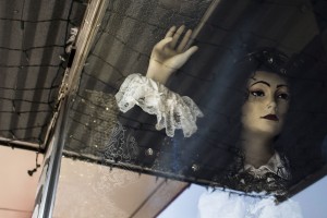
Basking in Traffic light Emma Drumright, 2015

Basking in Traffic light
Emma Drumright, 2015

Irresolute Emma Drumright, 2015

Irresolute
Emma Drumright, 2015

2) I first approached answering the question with an open mind throughout the shoot; I wasn’t exactly sure of where my concepts would be placed or created. However, once I began taking pictures of the merging of reflections and objects in the windows I found that I could express character, emotion, and the achieve the principles of Gestalt. I continued to develop my ideas in the post-production phase, and I worked closely with editing contrasts and clarity.


Part 2, Self-Critique:

For this part,  will be critiquing the work titled “Irresolute”.

1) I believe the strongest aspects of this work are the interesting shapes and angles created within the image. The lines of the lights and the reflection of the lights also move the viewer’s eye across the image.

2) The weakest aspect of this image may be the images darkness and lack of simplicity (there is a lot “going on”). The viewer may become lost with the competing elements within the image. Although the angles of the image are a part of what makes the image interesting, they also may not be as dynamic as they could be.

3) Through photographing the image from a wider angle, the composition may become more complete (with the bottom part of the reflection taking up more of the image and the mannequin becoming more centered, contained, and united in the composition).

4) As an overall project, I tried to integrate and develop conceptual depth within all of my images. However, I could definitely improve the selection and order of my images by editing which images to put in with a more critical and direct mindset. My concepts overlapped one another through each image; however, they did not tie in together  as influentially as they could have because of the number of images I had. (Professor Joe Vitone even posed the question, “How many words do you need to tell a story?” in relation to images during my critique, which helped me grasp the significance of editing).

5) My camera and post-production techniques and knowledge are sort of limited, and some of my photographs may reflect that. The angles of images and the formation of the visual elements within a frame could use work.

6) Additional Notes: The blog post where I explain, analyze, and reflect on my work can be reached via. This post also contains all of my photographs.


Blog Post #4: VISU1100

Part 1, VISU Department Student Presentations:

Many of the students who presented brought up similar, important points and threads of great advice, such as “take every opportunity you can to go see art (it’s everywhere!)”. However, they also each discussed and incorporated their  own thoughts according to their field and personal experiences, too, which I will determine and expand on in this post.


ART

Rachel

One point that Rachel made that really stuck with me is when she said that art takes a lot of time and that it’s “visual language”. Sometimes I do put art to the side; I sometimes just think it will just come naturally and I give it less time than what it needs to reach its full potential.

Caelan 

Caelan emphasized how we should we should maintain an outside practice of art while building the best experiences we can through internships and classes. We don’t need to wait for ourselves to be “ready” or “perfect”; the employer will “exploit” any talent we possess. We all have a lot more to offer than we realize.


GRAPHIC DESIGN

Shelby

Shelby talked about finding our passion, to the point of us losing track of time as we work on the passion. What we do should be something we love so much that putting time into it is not a chore, but a goal and a part of our lives. Her examples of her influences and inspirations incorporated throughout her work (such as Wes Anderson’s style) really inspired me to reflect on what excites my creativity. Shelby also discussed her life outside her major, and how we should participate in other activities (networking outside the art-field, “set up doorways”). This reassured me about my participation in other things I love to do (music, literature, theatre, other interests) and their potential to connect with my other passions as well (leading to unpredictable opportunities).

Paul

Paul’s work was very, very interesting (especially the logo for the first year writing program!). I also liked how he shared his concept for his senior project (a graphic novel/book that catalogs his dreams through representational, graphical means). He emphasized the importance of a portfolio, and how “a better portfolio means a better job”, because that is your presentation of what you can create. He also passed on advice that he received: “HUSSLE”. I took this as maintaining your “grit” (as we talked about before), pushing on with determination, and doing all that you really want to do.


PHOTO COMMUNICATIONS

Christin

I really loved Christin’s discussion of her work and how she became interested and involved in her subject matters. Her work was very dynamic, and her website that she showed us was also very developed and compelling. One point that she made that stuck out was that we must “learn how to talk about [our] work”. We have to provide the concept, intention, and credibility in order to finalize and support our creations through our words and overall attitude. Another idea that she expanded on was that once we go outside our “comfort zone”, we may find what we truly love to do (we never know until we try!).

Juliana 

Juliana’s expression of her development and change of interests through time really helped me put into perspective how this is not just a presentation of skills we already have, but an exploration and development among ourselves and the world of art. She expanded on how she used to take fashion portraits and that she increasingly was not truly satisfied by them. She expressed that she was frustrated with herself; but then she slowly figured that she could apply the same process to a number of different things. This approach allowed her to realize that she was not as lost as she felt, and that through this struggle, she was getting even closer to doing what would truly inspire her in the end.


Advice from Bill and Tuan (they made some really great points as well that I thought I should mention, and that I would like to remember!)

  • As a student, you set yourself apart just by being there
  • Keep an attention to detail
  • Have good manners
  • Hand-written notes and physical portfolios are as important as (and possibly even more important than) electronic presence
  • With experience (on computers, with materials, with programs) comes muscle-memory (a integral part of learning, improving, and mastering anything)

Out of all the advice given, I really took to heart Bill’s assurance that you should definitely go, and you should be yourself. “It’s okay to be quiet…if you’re shy, be shy! As long as you’re there.”

I notice that I inadvertently put a lot of pressure on myself in my head to be a certain way (more talkative and “outgoing”), because I am a relatively quiet person. We are all unique, have different perspectives and interests, and we all communicate and take in things in interestingly different ways. I tend to respect that idea towards other people, but for some reason every so often I lose this patience and understanding with myself. However, I’ve been realizing more recently that by being however I am (true to myself), I can take off that unnecessary worry and really marinate in, discover, and focus on what is truly important and exciting.


PART 2, Compelling Websites:

  • Threadless Threadless is a website where designers and artists can submit designs for people to purchase (anyone can submit). They regularly have different themes for people to enter in, and the public votes on the designs that will be printed. The web design of the website is also very engaging, easy to navigate, and fun to look at. I have ordered many of my favorite clothes from this website, and I might enter in a design of my own one day!
  • 1000 Chrome Experiments -My roommate just introduced me to this innovative, entertaining, and interesting website! Launched in 2015 by Google, this site contains 1000 “unique web experiences” developed by coders overtime on their previous site, “Chrome Experiments”, which was launched in 2009. Once they had 1000 different creations, they created this website to further celebrate their innovation and creativity.
  • PicMonkey – I used to use this website frequently back in middle school when it was called “Picnik”. We didn’t have Photoshop or other programs on our computer, so I edited photographs using this website. You can adjust color, contrast, exposure, and many other things for free! You can also add stickers, frames, and other creative filters.
  • Cute Overload -Yes, this has been my go-to website for images and videos of adorable animals. However, past the overload of cuteness that this website usually supplies, it also has a great maintenance and personalities behind it.
  • I Look Like Barack Obama– I added this extra one on because I found it just the other day…and it’s hilarious! The web design and presentation of the site is not too sophisticated, but it fits perfectly with the material of the site. The presence of comedy the creator of the website has put throughout the organization of the pages and site is brilliant, and never fails to make me smile!

Blog Post #3: VISU 1100-01

The Art of Kikyz1313 

Bhayanak Maut, 2015

Album cover for Hindi-metal band, Bhayanak Maut (2015)

The first time I saw the works of Mexican-based artist Kikyz1313, I felt the delicate visceral energy and grotesque beauty of her lines, subject matter, and color palette; however, it was not until later (when I read her interviews where she discusses her influences and purpose) when I began to comprehend the intensity that her works portray on a social and conceptual level.

When first confronting her works, one sees a circus of details and a mirage of anatomical and natural elements. Her subjects consistently are children (either alive or deceased) among environments of decay and natural creatures. In her work to the right, an album cover for a Hindi-metal band “Bhayanak Maut” (which translates to terrible or horrific death), a young boy is centered in a circle of bones and fleshy forms. He holds a severed head squarely, which remotely stares into nothing. Two black birds chew at the fleshy circle with their beaks.

The severe detail which exists in this work contrasting with the stark simplicity of the boy’s skin develops a balance to the piece and emphasizes the boy as he glares out of this gruesome circle.

The colors of her works consist mainly of a variety of values of pinks, browns, and blacks, which give a lightness to the dark subjects–a welcoming, familiar nature to something we rarely observe. In most of her pieces, she uses thin lines in order to express the forms, which also contributes to this lightness.

I believe her works are phenomenally evocative and powerful; each of her works greet the viewer with beautiful imagery, yet pull them into a realm of grave and disturbing content. She synthesizes ideas of death, neglect, and innocence with the deliberate thin lines of her pen, and livens the dimensions of her delicate creatures through the use of pastel flesh-tones and dark contrasts of dingy blacks.


In context of her own words…


Why do we ignore the very intimate contents of our own bodies? Why isn’t there a balance between the mundane, tangible world, and the unfathomable cosmos of our fleeting existence?

-Kikyz1313, interview with Samanta Levin of beinArt Collective, via.

I’ve read one full interview of Kikyz1313 (published online at beinart.org, via) and an excerpt from another interview (published online an in print with Juxtapose magazine, via). Within these interviews, she reveals her thought-out concepts that hover very closely to her works, and which gives them such a deliberate and new moving edge.

Aberaccion (2010, detail), ink

Aberaccion (2010, detail), ink

step by step detail of Why So Lonely, 2014

Process and Detail of Why So Lonely?, (2015)

Why So Lonely, 2015

Why So Lonely?, 2015

The Disaster's Heiress, (2014), graphite, watercolor, white pastel

The Disaster’s Heiress (2014, close-up), graphite, watercolor, white pastel

Within her pieces, she continuously captures the mannerisms of children, from the placements of their hands, to their expressions and actions. In many of her works, disease and deformities also act as a major theme within the piece. In “Aberaccion”, an earlier piece from 2010, Kikyz exaggerates an infant’s cleft lip to the point of unrecognizable deformity. This dramatic expression of line moves the eye up and around the shapes of the infant’s head, and allows the viewer to gaze and feel the infant’s placement in space.

In her interview with Samantha Levin, she says that her pieces help her to express not only what the viewer takes in at the surface, but also her own beliefs towards humankind’s protection against abnormalities and death in societies throughout time. In her interview with Juxtapose magazine’s Hannah Stouffer, she says that death is more a part of our lives than we acknowledge, and that deadly events are something “we usually live through but…we never give them the significance they deserve”. Mortality is something we are confronted with every second of our lives, as well as every living creature, which she resoundingly addresses within her pieces.

“I don’t think I could ever imagine dark artwork with positive or encouraging purposes. Dark artwork is, at its essence, blatantly raw, and to attribute positivity to it is an incongruity that undermines dark art’s very definition.”

-Kikyz1313,  interview with Samanta Levin of beinArt Collective, via.

Her upbringing in Mexico has acted as a nurturer of these contradictions between death and innocence, as she describes…Although tying her poses as a dismal outlook on her country, she chooses to “be aware…and embrace [the disadvantages and blessings of Mexico] somehow” through her life and work.

She challenges people to do the same among art, as she argues that “people find it easier to stick with art that is purely aesthetically pleasing rather than step out of our comfort zones with more intellectually challenging and visceral art expressions.”

 Numbed Pallor, 2015, 9.2x7.7 in

Numbed Pallor (2015, close-up), 9.2 x 7.7 in

Lethe's River, 2015

Lethe’s River (2015, close-up)I am excited to see her further works and what other grueling and vital emotions she will inspire within her viewers next. Her works have greatly influenced not only my own drawings, but also my ideas towards art and its ability to synthesize and evoke countless (whether deliberate or non-deliberate) ideas and emotions at once. 

For more information about Kikyz1313 and her personal descriptions of her technical and conceptual processes, visit, like, and follow her Facebook page, via.

For more high-resolution viewings of her full portfolios as well as information about purchases, visit her website, via.


Older posts

© 2025 Emma D

Theme by Anders NorenUp ↑

Skip to toolbar