Project 1 Reflection: Production, Presentation, Critique!
Production
I learned a lot about my own abilities and interests (what excites me and what I’m good and not-so-good at) as well as the expectations of quality and thoroughness for projects within this class. This project also acted as a great introduction to photography and the essential ideas behind creating and decoding an image. This also provided a great reason for me to actually understand the different types of files, sizes, and programs.
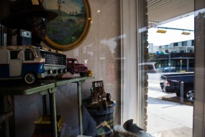
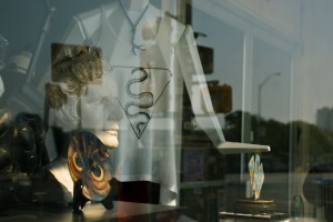
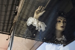
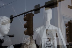
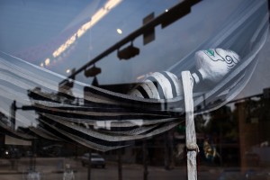
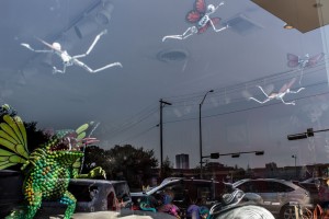
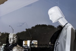
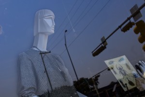
When I began to focus on the combination of objects and window reflections, multiple “worlds” (the conceptual, physical, emotional) began to merge into and interact with one another, which created quite a “separate togetherness”. Overall I really loved and learned a lot technically and conceptually from this project.
Presentation
I think I did a good job communicating the purpose, importance and development of the images; I had planned out ideas of what I wanted to say, but there was a point in my presentation when I began to describe things to the class in a way I hadn’t planned. I was able to capture and create a new understanding within myself this way (I felt really “in the moment” while presenting!) and Joe and Juliana described my speaking as “eloquent” (which was awesome!). My presentation of my images did go overtime, and this may have been in part of the number of images I had.
Critique
Both Joe and Alex strongly suggested editing the selection of images for the collection (which I will attempt further down in the post!). For the individual images the comments were very positive. I was told that my images were like “little poems”!
Both Joe and Alex thought that “The Onlooker” was one of the most visually appealing, and Alex thought it was interesting because it was essentially a “picture of nothing” but color, emptiness, and a few surrounding objects which framed the “nothing”. Joe also said that he really liked “Irresolute” as well as my quirky titles for each image (“that I seemed to take very seriously”)!
The major criticism was that there were some images that were much more intriguing and effective than others, and some of the images could be taken out (“You think, Why aren’t they ALL fantastic?“). They also suggested that I pay attention to the order of the presentation of images (I think I subconsciously placed them in a order that made sense to me the first time, but I didn’t put a lot of mental energy into it).
One point of the critique that really stuck with me was when Joe asked rhetorically, “How many words are necessary to tell a story?”. This question will be replaying over and over in my mind as I edit and grow more in the art field.
Editing and Re-submission of Image Collection:

Longing
Emma Drumright, 2015

The Onlooker
Emma Drumright, 2015

Contemplation
Emma Drumright, 2015

Irresolute
Emma Drumright, 2015

Array
Emma Drumright, 2015

Basking in Traffic light
Emma Drumright, 2015

Attack!
Emma Drumright, 2015

Separate
Emma Drumright, 2015

Release
Emma Drumright, 2015
For this renewed collection, I removed five images and left nine (I didn’t realize I had so many because at the time I was more focused on them individually and thematically, rather than putting a lot of thought into them as a concise collection). I’ve possibly kept more than necessary still, but I currently like these images and how they progress and recede from start to end. I ordered the images by composition as well as by the emotions I believe they evoke. I still think the two images at the end are effective together in telling the “story”, and both supply a variety and sense of unity of lines.
I think this has really become a reflection of me longing and attempting to break a “window” of personal inhibitions, while addressing the emotions that blur in and out of us as we are either physically or emotionally separated from something or someone. I’ve noticed through this that I enjoy intertwining language with visual images and concepts to create a sort of poetic image of layered meaning and motivation, and I hope to continue growing out these interests I have while taking into great account the need for self-critique and editing as I go into our future projects.


