Reading2_ARTS1311

QUESTIONS:

1. Based upon the reading how are priorities set for specific projects? Or in other words, what is it that determines the guidelines for given projects?

Priorities for designers and artists are set for certain projects based on the artist or designer’s constraints, guidelines for production, and ethics. According to N55, art can be given purpose only after the assumption that the purpose of political action is to uphold and create human rights. The artist must be conscious of large concentrations of power and the potential for them to cause damage. The artist must be concerned with creating consciousness about this and focus on organizing smaller concentrations of power to encourage protection of human rights. Art must first and foremost be structured to respect all human rights. According the Superflex, art offers possibility for public debate and discussion of social, economic, and political issues. Projects operating on a variety of platforms and drawing from multiple readings and points of view are the most effective at stimulating conversation. The priorities for an artist or designer is given within the guidelines of their own ethics and the ethics of those who commission their work.


 2.
 How does the artist/ designer approach decision making differently or do they?

Each artist approaches decisions based upon their own system of thinking and their own ethical considerations. This is shown in the differences and similarities of decision-making with each artist and designer. According to N55, decisions are made based within human behavior and experience, and therefore must be focused within political action to uphold human rights. According to Lind, artists make decisions based on each other’s work, effectively “cannibalizing” each other’s work. Some approach decision-making through the aesthetics of a piece, while others approach decision-making through the political, social, and economic implications of their work. N55 and Superflex both approach their decisions from a political and social perspective, while Coupland and Lind approach decisions through more philosophical and aesthetic reasoning.


PERSONAL REFLECTIONS:

1. How do you make decisions? Are they based upon anything substantial? Why or why not?

I make preliminary designs influenced by social, political, and philosophical perspective, but as the process continues I base craft on the aesthetics of the project. However, my artistic process is fluid and not based on a substantial set of reasoning and decision-making. I tend to view art as a cerebral process that must be thought through without relying on a set of substantiated rules and dogma. Much like Lind, I agree that art is a multitude of philosophical, emotional, psychological, and societal questions that one person cannot create a solid process around.


2. How do you know when something is “good” or working?

The idea of “good” art is, I believe, subjective. While art can be judged on objective standards such as craft, balance, and attention to detail, no one can objectively judge whether or not something is “working” or good art. Art is, I believe, governed by the people, and they have the final say on whether an art piece is “good.” Despite any sort of political system or era in time, art has existed in a vacuum of political or economic influence, though it is inspired by both. Art and it’s value cannot be defined as “good” or “bad” by any political, economic, or social dogma. Instead, it can only be defined as good or bad by the independent viewer and their emotional reaction to it, which is subjective, despite archaic psychological themes in our consciousness, such as mythology, religion, and storytelling.


 3. How do you rework projects to make them work?

Projects can be reworked through a careful series of edits and analysis. I personally agree with Elliman, who states that, as an editor, one can be just as justified in adding things as well, working out new relationships between elements of the content. Artistic editing can be adding or taking away things. Because the quality and value of art is subjective, editing art is highly philosophical. Some artists and designers edit from within, finding authenticity and detail for their craft by focusing on their own reaction to their work. Others edit from outside influences and collaboration, both by physically working with another person or people or by using archaic themes and influences in their work to improve upon it.
 

ARTS1311_VisualDictionary

Within my group, I was assigned to define and find pictures of asymmetry as a form of balance, invented texture, shape, plane, space, unity/variety, and emphasis.

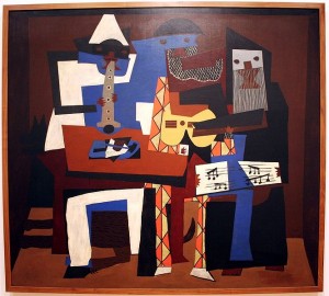
Shape: A shape is the area within a  2D space that can be defined by edges, either soft or hard.  Shapes are defined or aided by other elements of art such as color, value, texture, and lines.

666px-picasso_three_musicians_moma_2006

(Pablo Picasso, “The Three Musicians”)

Within this picture, shapes are utilized by putting together blocks of color, which creates edges for each block by contrasting colors being placed next to one another. Shapes are put together to create the emphasis of the subjects of the piece.


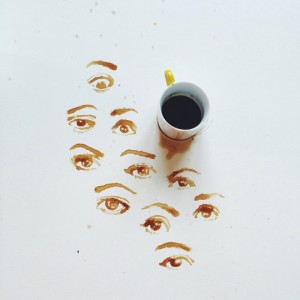
Asymmetry: Lack of equality between different aspects of an art piece across horizontal, diagonal, or vertical planes.

tumblr_noaqhkO4EQ1r3y74po4_540

(Giulia Bernardelli, “Untitled Coffee painting”)

This picture has asymmetrical qualitities because the design mimics random coffee splotches which don’t create a coherent symmetrical pattern over a horizontal, vertical, or diagonal line.


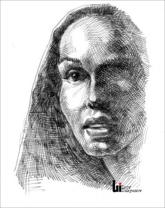
Invented Texture: The addition of different materials or artistic techniques to create interesting, obvious texture.

Woman_portrait

(Igor Lukyanov, “Woman Portrait”)

The use of crosshatching creates an implied texture, but the right side of the woman’s portrait has wide and obvious crosshatching which gives the picture interesting texture.

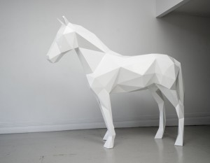
Plane: An area of a 2D surface having a determined spatial direction and extension.

benfoster_thewhitehorse03

(Ben Foster, “The White Horse”)

Different planes on the art piece creates facets along the piece that connect to create a 3D effect in the shape of the object.


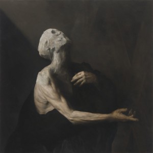
Space: Distances around and within an object in relation to other components within the art piece. Space can be negative, positive, dimensional, etc.

tumblr_mxmuy4jrfa1seuch9o1_500

(Nicola Samori, “L’Occhio Occidentale”)

Negative space contrasted to the paleness of the object creates a gaunt tone shown in the subject. The lack of other objects in the picture provides focus towards the central subject – a gaunt and mutilated person.

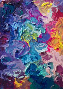
Unity/Variety: Unity provides a sense of wholeness in an art piece by pulling together similar elements in a work. Variety is done by contrasting elements within an art piece to create a sense of difference.

tumblr_nv09k3pnYO1uo7ripo1_500

(Tanya Shatseva, “Untitled Abstract Painting”)

Texturally this picture has unity by the artist using similar brush strokes, and variety is provided with color and shape of paints and brush strokes.

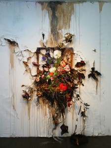
Emphasis: An area or piece of an art piece that becomes the focal point of a work and that grabs attention from the viewer.

tumblr_n6wlo1XxEU1shwpofo4_540

(Valerie Hegarty, “Flower Frenzy”)

Emphasis is provided with texture and color within the center of the picture, which provides a focal point to the viewer, drawing the eye to the center of the picture.

ARTS1311_4DLineProject

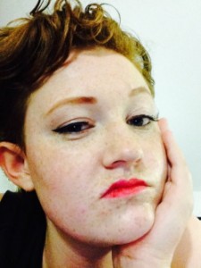
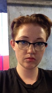
For my 4D project, I took a series of selfies throughout a week to represent the linear aspect of time as we experience it from day to day.

tumblr_nvh8sh4vfq1tvrdyqo7_540tumblr_nvh8sh4vfq1tvrdyqo5_250tumblr_nvh8sh4vfq1tvrdyqo4_250tumblr_nvh8sh4vfq1tvrdyqo3_540tumblr_nvh8sh4vfq1tvrdyqo2_400tumblr_nvh8sh4vfq1tvrdyqo1_400

Within each picture, I played around with lighting, makeup, and expression, to examine how those aesthetic changes shifted our perception of linear time as it relates to aging.

Readings#1_ARTS1311

Reading Questions:


  1. What is the purpose of the designer, do they always work for the stakeholder?


The purpose of the designer, according to Potter, depends on the cultural context of the designer and the cultural significance of their work. Because different cultural backgrounds dictate different stylistic aesthetics and different importance placed on those aesthetics, the designer has many different purposes and roles depending on where they are in relation to the world. Foster offers a similar view (though he comes primarily from a French and German design perspective, referencing Bauhaus and Art Neauvou as focal points of modernist design), claiming that designers, depending upon the movement, try to transform utilitarian objects into art and vice versa. In doing that, design pervades identity and the role of the designer morphs into a philosophical and biopolitical one, creating the individual through the individual’s choice of design and aesthetic. According to both Potter and Eames, design is most always for the stakeholder or influenced by the design’s commodification, though both are wary to state that design is purely industrial, instead both stating that design is conducive to a commodity-based economy and industrialism. Foster offers a more nebulous view, simply stating that design is used in the postmodern world to inflate a commodity based market.


  1. Is the artist always a self-expressive narcissist?


All articles treat design as the focal point and reference art as a different school of thought, though there is much overlap. Dorst claims that the artist craves to influence the feeling and thinking of the audience, imparting his or her biases into the viewer. Art has an emotional connection to the audience created by the artist. The artist, because they want to influence the viewer, is either consciously or subconsciously narcissistic. Scanlan also takes a critical eye to the point of intersection of design and art, perceiving either lack of utilitarian use from a work or a lack of aesthetic consideration. Artists, most authors agree, carry more freedom than designers, which allows them to become narcissistic, though the two are not necessarily guaranteed to come together.


  1. Can the designer/artist exist?


The different authors offer varying opinions of the subject of the existence of a designer or artist. Scanlan and Dorst come at the question from the intersection of design and art, contemplating less the existence of the artist and designer, and more the ability to execute work in a way that is both design and art. Foster seems to have more of an answer on the question of an artist’s or designer’s existence, seeing as he comes to the question of design from a philosophical perspective. Foster sees design as a tool of the “sign exchange value” and that design and art have become artificial and inflated in the commodification of our economy. Eames asserts that no original art or design exists because of the influence that others have on our work. Many of the authors avoid the existential question of design and art altogether, not sure if the artist or designer exists.


Personal Reflection:


  1. What is your personal view of the difference between the designer and artist?


In my opinion, the designer carries utilitarian purpose with their work, whereas the artist does not have constraints of utilitarianism in their work. The artist works in a framework of self-expression and emotional bias; while the designer may express themselves and have emotional bias within their work, it is not part of the essential framework of the designer. Because the designer has utilitarian intent, design may in all actuality influence our lives more than pure art because of the combination and intersection of aesthetic and versatility.


  1. Which are you, why?


I am probably an artist. I do not believe that I am far enough into experimentation with either design or art to know definitively. I am partial toward design because of its close relation to identity and desire-based economy, as put forward by Foster. I follow the philosophy of Jean Baudrillard (as referenced by Foster) of design as a tool of sign exchange value. Because design carries such a predisposition toward capitalist thought (which I personally reject, at least on a theorectical level), I believe art’s power to influence on a level that is not market-based is important to my value as a human on a level that design does not have.

100Solutions_ARTS1311

The object that I chose for the 100 Solutions Project was a simple tube of red lipstick. I was instantly drawn to the idea because of the inherent symbolism behind it: a symbol of sex appeal, fashion, feminism, and rebellion. The malleability of the object was interesting too; it could be worn, smeared, written with, carved, or mushed. My favorites therefore took on diverse forms with different uses of color, lighting, and allusions to pop culture and sexuality.


8D9923F9-E662-46CC-A9C9-BABF7D737D5E

Yes, that is a grape flavored condom. After going to Austin Pride, I had way too many to use for the semester. But the connotations of a lipstick smear on a flavored condom seemed well… raunchy in the most humorous sense. The brightly colored wrapper lent this picture a playful feel, which I liked.

31BF2D05-0E4C-4C34-B00D-96C08275654C

Another sexy picture. Lipstick is often used to write on napkins in place of pens when there are none available. We’ve all seen movies where the bar hussy gives out her number to the playfully misogynistic protagonist, right? I liked this picture for the creative quality, as well as the texture of the napkin contrasted to the uneven texture of the lipstick.

33AD64D1-4500-4B2C-8D36-ABA8B95C0978

“Kiss my knee and make it better, Mom!” is what came across in this photo. I liked this photo based on the more wholesome connotations of a red lipstick kissing stain, and the way the red and blue colors contrasted to each other.

88F2428F-76D0-4A26-A516-EAFE51416C15

I thought this was both a cute idea and that it conveyed the rebellious connotations of lipstick. Besides often being seen as a symbol of sexuality (itself a taboo subject), anti-war protesters during the Vietnam War wore red lipstick in solidarity. In the 17th century, women wearing lipstick could be accused of witchcraft, many Puritans claiming that lipstick was a tool of witchcraft used to enslave men. Feeling rebellious yet?

707FF069-DA24-4C2F-A5F7-E31EDA3EFB56

Bummer! I liked this picture because it was one of the first ones I took that had lots of yellow and turquoise color in it, which made it seem pretty happy and sunny… despite the sad face in the corner.

957DC688-B943-4035-8A73-675AC7581943


I liked this picture because of the contrast between the three colors: yellow, black, and red. The boldness of the type on the package seems to convey the danger of smoking, and the yellowness of the filter provides a dimensionality to the grimness of the photo.

2234A37E-DF53-4480-AB12-D315F97DB309

I liked this one purely on how relatable it is for me. The number of times my lipstick has come off on my coffee cup is probably higher than my tuition. The yellow lighting in the background combined with the coolness in the shadows of the lid of the cup also provide an interesting angle on the photo.

34138E81-847D-4021-9A86-4C7FB3659021


I played around a lot with the idea of red lipstick as a symbol of blood and ended up giving myself a bloody nose with it. I liked the way it came down to my lip and the contrast of the red against the cool tones of my naked and kinda chapped lips. The connotation of rebellion also came through in this picture through the violence portrayed in it.

AA45C329-3FF1-4426-BFE2-EBB01D282743

This was one of the pictures I took after hitting a roadblock. After scribbling with it for a little bit though, I thought this picture looked nice, lending a more romantic connotation to the object with the use of the white flower and silver glitter.

C25C65B4-9793-46DE-822A-6F1A18BDAA22

I ended up doing a lot of graffiti for this project (which I promised I cleaned up! I have half a bottle of Windex left if anyone needs it.). After playing around with different symbols, I chose the Anarchy A. I liked this picture because of the texture of the lipstick on the brick, and the contrast of bright to dull colors.