Taking on the project of a website redesign is not an easy task, no matter the size of an institution. The project consumes numerous hours of work while writing, designing, and finding the right partner to develop/host. These factors can make the redesign process a daunting task, but one that’s worth every penny. Let’s explore what to consider while navigating through your website redesign process.
Look at non-banking sites.
Sometimes our first instinct when redesigning is to quickly go to our top competitor’s site and look to them for direction. I have found myself guilty of this, but I’m here to tell you, there are more cons than pros to this. Most websites in retail banking are lagging behind other industries by at least five years. The experience is often clunky, and the design is typically dated (Streeter, 2018). By just looking at competitor’s sites, it can create an environment where you’re just trying to “beat” them. This will not have an end result of a website that’s built for the modern consumer. Look to retail sites like Nike; challenge yourself to think outside of the box and generate ideas from them.

Keep it simple.
Simplicity is key not just because it’s the latest design trend, but because it’s timeless. One of the biggest problems with websites is that they become outdated quickly. It seems like, as soon as you’re about to finish with one update, it’s time for another. Busy designs lose their allure and become dated-looking; simple design does not.

Simple pages on sites are also easier to read for users. To maximize the number of people who see the most important parts of your content, it’s vital to strip down your design to the bare essentials. By removing unnecessary elements, you can draw the reader’s attention to what matters most (Patel, 2021).
Search engine optimization (SEO)
Search engine optimization is a tactic we all know we should be doing, but don’t invest enough time and resources to carry out the method that should never end. The redesign process of a website presents the perfect opportunity to start an SEO strategy at your credit union. As stated by the CEO of Extractabe, a digital strategy company, creating a digital experience without utilizing SEO is akin to throwing a party no one will attend. Your site may be beautiful, but who will see it if it doesn’t rank well in search engine results? (Streeter, 2018). Thankfully, there are many free tools that can take some of the pressure off of writing optimized content. Utilize sites like Google Trends to learn what people in your target market are searching for information about. Writing about trending topics can help drive traffic to your site. As we see below from my inquiry about savings accounts, crypto and reward savings are trending searches.

Don’t be afraid to make more of an investment.
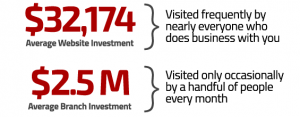
When thinking of a website, it should be viewed as the digital branch that most, if not all of your members, will utilize. Consider the cost of $2.5 – $5 million to build a physical branch location that only a certain percentage of members will use, and will also cost thousands to keep in operation year after year. Even though we realize this, the average amount a financial brand will invest to build a new website, according to our year-over-year studies, is only $32,714. There’s not any correlation with website investment and asset size: many larger asset institutions are also underfunding their website investments because their websites are still being viewed internally as just an information source (i.e., glorified online brochure), not a driver of growth (Lay, 2020). The classic saying “You get what you put into it.” can be noted here. Holding potential back potential funding can make this strenuous process potentially worthless. Invest in your credit union’s digital footprint.

Source: The Financial Brand
A redesign that’s done with merit can present an extremely bright light at the end of the tunnel. A refreshed website that’s built, written, and designed to perform digitally will give you incredible opportunities to market better through digital channels. I again challenge all of you to think about the topics above while going through your redesign. We all want bragging rights of who has the best website, right?
References: