Gen Z: How they find your credit union’s website.

Generation Z (aka Gen Z, iGen, or centennials), refers to the generation that was born between 1997-2012, following millennials. This generation has been raised on the internet and social media, with some of the oldest finishing college and entering the workforce. This technology-driven generation will soon become the largest cohort of consumers—and credit unions who want a piece of this opportunity will need to understand their tendencies and digital expectations. Let’s explore how Generation Z finds, uses, and what they expect from your credit union’s website. 

Generation Z searches long-tail keywords. 

A long-tail keyword is a phrase that is generally made from three to six words. Since these keywords are more specific than generic terms, they allow you to target niche demographics, like Gen Z. As a side note, these keywords are less competitive than generic keywords because they are designed to better reflect how people make queries. An example of a long-tail keyword would be “credit union home loan rates” rather than trying to rank for the highly competitive keyword “mortgage.” Even if you aren’t interested in targeting Gen Z just yet, you should still optimize your website and content for long-tail search keywords. While Gen Z most commonly uses this search tactic, millennials aren’t far behind. 

Taking this point further, with voice assistants like Siri, Alexa, and Google Assistant, Gen Z and millennials also regularly use voice assistants and smart devices. This means that when a person verbally asks questions or gives full commands to voice assistants, the AI algorithm will recognize the long-tail phrase and perform search queries for them (Bump, 2020). 

At this point, long-tail is getting more and more common across the board. Optimizing your website to cater to Gen Z search queries will only help you gain traffic from all age groups as this search tactic becomes more common throughout age groups. 

Generation Z includes “best,” “cheap,” or “how-to,” in search queries. 

Fractl study found that Gen Zers are most likely to begin searches with the word “best.” For example, when asking for results related to the “best restaurants in Boston.” While 30% to 32% Baby Boomers and Gen Xers used the term in searches during the experiment, 56% of Gen Z used it (Bump, 2020). 

The commodity of “best” searches could suggest that Gen Z is more interested than other generations in using search platforms to get recommendations or suggestions for the best possible experience.

Other phrases that Gen Z searches more than other generations include “cheap” and “how to.” Being a member of the Gen Z generation myself, I can attest to this statistic. When conducting a Google search, they always start with a “best” or “how-to.” 

Gen Z searches for video over other content types.

According to Think with Google, 85% of teenagers within Gen Z use YouTube to regularly find content; while 80% of Gen Z says YouTube videos have successfully taught them about something. Aside from using video for entertainment, both millennials and Gen Z prefer to watch videos for information gathering purposes. Even when it comes to learning about a new brand or product, these age groups prefer video explainers, product demos, or other marketing videos to simply reading about a company online (Bump, 2021). 

This brings light to the statement I made in my first blog post when I said, a website should not be a digital brochure. It should have content that comes to life. While creating video content for a site can be time-consuming and costly, there are beneficial aspects. Having videos explaining the mortgage process, how to raise a credit score, or how to start a retirement fund will bolster your website views and traffic to all audiences, leading to new members and loans. 

New generations will always present new opportunities for innovation in the ways they prefer content and the overall experience desired. As we can see from above, Generation Z is no stranger to this. I encourage all to further research aspects of Gen Z and how they work. It gives a fresh perspective on everything!


References:

Bump, P. (2020, April 22). Gen Z Searches For Online Content Differently: What Marketers Need to Know. Retrieved September 27, 2021, from https://blog.hubspot.com/marketing/how-gen-z-searches-for-content
Bump, P. (2021, June 10). 52 Gen Z Stats Marketers Need to Know in 2021. Retrieved September 27, 2021, from https://blog.hubspot.com/marketing/gen-z-stats
Bump, P. (2021, February 04). How Video Consumption is Changing in 2021 [New Research]. Retrieved September 27, 2021, from https://blog.hubspot.com/marketing/how-video-consumption-is-changing

Metrics To Monitor On Your Insitutions Website

Website Metrics

Your credit union could have the best-designed website in the world, but without tracking the proper metrics, it can be related to the old saying, “You can lead a horse to water, but you can not make him drink.” The digital space a website creates allows you to put data behind what is working and what is not, making it crucial you pay close attention to your metrics. Let’s explore the top three metrics to pay close attention to on your credit union’s website.

Users

In Google Analytics, “Users” are unique visitors that come to your digital branch. This metric offers information pertaining to the type of visitors frequenting your website. Looking at the picture below, there are two caveats of information to dive into:

The number of users indicates the popularity of your website and the loyalty of your visitors. Over time, you’ll want this number to continue to grow, as that means you’re creating more traffic to your site. 

New vs Returning Users is tracked by Google Analytics through cookies. If you have a large number of returning visitors, it means that your site is performing well. If you have a considerable number of new visitors versus returning ones, you can safely assume that your online branding and SEO tactics are working well. If not, view this as an opportunity to improve on. 


User Report in Google Analytics

Figure 1


Traffic Source/Medium

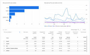
Diving deeper into your website traffic, we can analyze traffic sources. The traffic sources metric allows you to examine how users are getting to your website. There are several ways traffic is directed to a website: direct, referrals, organic and social. Direct traffic comes from people who type the URL in their search bar – for example, navyfederal.org. Referral traffic can be from a linked site. For example, you were featured on the news or sponsored an event. Organic referrals are those who got to your website via a search engine. Social referrals are people who clicked on a link through social media platforms like Facebook, Twitter, and LinkedIn. 

Looking at Figure 2 below, we can see this site’s traffic is mostly coming from direct, shown as (none), and organic traffic. As we go down the chart and analyze the next two traffic sources, that’s where the real power of this metric kicks in. It allows us to see how our digital marketing channels are performing. Looking at these results, we see that search advertising (CPC) is outperforming display advertising (Audience_Targeting_Display). Taking this in, it may be worthwhile to invest more in search, rather than display for this given site. It should also be a goal to increase referral traffic to keep new users coming to the site. 

Screenshot of Traffic Source/Medium

Figure 2


Keyword Tracking

Keyword tracking is essentially the activity of monitoring the position of your website on a search engine results page for specific keywords. It’s a process that allows you to get important data and metrics about specific keywords and shows how well your website ranks for those exact keywords (Amando, 2020). In the financial world, example keywords we’d all love to rank for are words like mortgage, car loan, credit card, savings account, etc. Although these words are competitive to rank for, keeping an eye on keywords, in general, can help you move up in rankings for terms that are not as competitive and boost your new visitor traffic organically. 

Looking at Figure 3 below, you’ll see an example keyword ranking report from the online visibility management platform SEMrush. Looking at the report we can make note that this particular site could better rank for the terms “upper peninsula credit union” and “up credit union.” Through some SEO optimization, this site could improve rankings from spot 11 and 13 to number 1. Without keyword tracking, we would not know this opportunity existed. 

SEMrush report

Figure 3


The three metrics above really only scratch the surface of the possible website stats you can track. I highly recommend diving into the Google Analytics Academy to learn all the resources available for your website. The more you know, the more informed decisions you can make. 


References:

Amado, F. (2020, October 12). What is Keyword Tracking? Retrieved September 21, 2021, from https://snowball.digital/blog/what-is-keyword-tracking

Potential Fintech Partners For Your Credit Union

Consumers are constantly evolving expectations from their financial institutions – especially so over these last few years – they expect next-level services in a small amount of time, all the while being able to do it in the palms of their hands. For credit unions, it can be challenging to stay in tune with these demands because of hurdles like lack of development capabilities, outdated systems, and, of course, costs. Luckily for us, rather than viewing them as competition, we can seek out fintechs to partner with to help us stay competitive and better serve our membership. Let’s explore potential fintech partners for your credit union’s website.

Flybits

Flybits empowers institutions to engage an audience of one, at scale. Through their leading customer experience platform, you can deliver data-driven, personalized recommendations and advice, inside your mobile app or website. Create value beyond your financial assets, and inspire your members to live their best lives through your credit union’s website/app. Imagine if you could push personalized offers for local businesses while members are shopping downtown, or while shopping online they are reminded of their credit card benefits. This experience platform connects with your members in real-time with their always-on, privacy-preserving collection of experience modules. Help members buy a home, save, travel, and more with their end-to-end solution that integrates data and analytics, experience design, and channel delivery, without the technical lift.

Flybits logo

Blend

Streamline the end-to-end digital mortgage process with an intuitive application for borrowers and a dedicated workspace with data-driven workflows for loan teams with Blend. The fintech delivers instant pre-approval, asset verification, income and employment verification, real estate agent matching, homeowners insurance options, and automated title search. Implementing a cohesive process like Blend’s, on your credit union website can set your institution up to compete with large online lenders like Quicken. A new survey on borrowing and lending by ICE Mortgage Technology finds that the pandemic has permanently changed the way consumers utilize technology, and those looking to buy or refinance a home are seeking lenders who offer online tools to complete their mortgage loans from home (Richardson, 2021). 

blend logo

Mantl

Digital and mobile banking have become the norm, rather than the exception. One survey of more than 5,000 consumers found that 69% wish to perform all their banking and financial actions through online and mobile channels. Consumers expect to be able to open an account, take out personal loans, transfer funds, and check their balance from any device, on-the-go (Civic Team, 2019). Taking this static in, on top of the digital transformation spearheaded by the coronavirus, credit unions should seriously consider implementing digital account opening on their site. MANTL helps your bank or credit union grow deposits and streamline back-office tasks with an omnichannel account opening platform that integrates with your core. The fintech set up your institution to offer consumers an account opening experience in just 2 minutes and 37 seconds on any device. This will allow your credit union to compete with top neobank, Chime, who in November 2020 alone it opened 400,000 new accounts digitally (Streeter, 2021). 

Mantl Logo

In this post, we touched on fintechs that offer personalized experiences, digital mortgage journeys, and digital account opening, but there are many other offerings from fintechs that can give your members a more streamlined membership. These include P2P payments, budgeting tools, digital consumer lending, and many more. I recommend looking at Forbes Fintech 50 to generate more ideas and potential partnerships at your credit union. 


References

Bill Streeter, E. I. (2021, June 08). Is Challenger Bank Chime the Future of Retail Banking? Retrieved September 13, 2021, from https://thefinancialbrand.com/106322/challenger-bank-chime-future-retail-banking-trend-mobile/
Civic Team November 11. (2020, April 29). The State of Digital Account Opening and Future of Identity. Retrieved September 13, 2021, from https://www.civic.com/blog/the-state-of-digital-account-opening/
Richardson, B. (2021, June 29). How Digital Technology Changed The Face Of The Mortgage Industry. Retrieved September 13, 2021, from https://www.forbes.com/sites/brendarichardson/2021/05/13/how-digital-technology-changed-the-face-of-the-mortgage-industry/?sh=3916a6862856

4 Things To Consider During A Website Redesign

Website Redesign Image

Taking on the project of a website redesign is not an easy task, no matter the size of an institution. The project consumes numerous hours of work while writing, designing, and finding the right partner to develop/host. These factors can make the redesign process a daunting task, but one that’s worth every penny. Let’s explore what to consider while navigating through your website redesign process.

Look at non-banking sites.

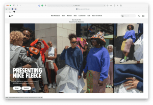
Sometimes our first instinct when redesigning is to quickly go to our top competitor’s site and look to them for direction. I have found myself guilty of this, but I’m here to tell you, there are more cons than pros to this. Most websites in retail banking are lagging behind other industries by at least five years. The experience is often clunky, and the design is typically dated (Streeter, 2018). By just looking at competitor’s sites, it can create an environment where you’re just trying to “beat” them. This will not have an end result of a website that’s built for the modern consumer. Look to retail sites like Nike; challenge yourself to think outside of the box and generate ideas from them.

Nike.com

Keep it simple. 

Simplicity is key not just because it’s the latest design trend, but because it’s timeless. One of the biggest problems with websites is that they become outdated quickly. It seems like, as soon as you’re about to finish with one update, it’s time for another. Busy designs lose their allure and become dated-looking; simple design does not.

Simple Website Design

Simple pages on sites are also easier to read for users. To maximize the number of people who see the most important parts of your content, it’s vital to strip down your design to the bare essentials. By removing unnecessary elements, you can draw the reader’s attention to what matters most (Patel, 2021).

Search engine optimization (SEO) 

Search engine optimization is a tactic we all know we should be doing, but don’t invest enough time and resources to carry out the method that should never end. The redesign process of a website presents the perfect opportunity to start an SEO strategy at your credit union. As stated by the CEO of Extractabe, a digital strategy company, creating a digital experience without utilizing SEO is akin to throwing a party no one will attend. Your site may be beautiful, but who will see it if it doesn’t rank well in search engine results? (Streeter, 2018). Thankfully, there are many free tools that can take some of the pressure off of writing optimized content. Utilize sites like Google Trends to learn what people in your target market are searching for information about. Writing about trending topics can help drive traffic to your site. As we see below from my inquiry about savings accounts, crypto and reward savings are trending searches.

Google Trends Snapshot

Don’t be afraid to make more of an investment.

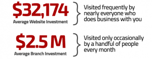
When thinking of a website, it should be viewed as the digital branch that most, if not all of your members, will utilize. Consider the cost of $2.5 – $5 million to build a physical branch location that only a certain percentage of members will use, and will also cost thousands to keep in operation year after year. Even though we realize this, the average amount a financial brand will invest to build a new website, according to our year-over-year studies, is only $32,714. There’s not any correlation with website investment and asset size: many larger asset institutions are also underfunding their website investments because their websites are still being viewed internally as just an information source (i.e., glorified online brochure), not a driver of growth (Lay, 2020). The classic saying “You get what you put into it.” can be noted here. Holding potential back potential funding can make this strenuous process potentially worthless. Invest in your credit union’s digital footprint. 


Website Stastic

Source: The Financial Brand


A redesign that’s done with merit can present an extremely bright light at the end of the tunnel. A refreshed website that’s built, written, and designed to perform digitally will give you incredible opportunities to market better through digital channels. I again challenge all of you to think about the topics above while going through your redesign. We all want bragging rights of who has the best website, right? 


References:

Bill Streeter, E. I. (2018, September 08). Design Ideas Banking Execs Can Use to Amp Up Their Websites Now. Retrieved September 7, 2021, from https://thefinancialbrand.com/77285/website-mobile-design-ideas-banking-credit-union/
Lay, J. R. (2020). Banking On Digital Growth. Retrieved September 7, 2021, from https://www.digitalgrowth.com/banking-on-digital-growth-book
Patel, N. (2021, August 28). 17 Reasons Why Your Website Should Have a Clean and Simple Design. Retrieved September 7, 2021, from https://neilpatel.com/blog/website-clean-simple-design/