Artist of Interest: Nunzio Paci

Artist Nunzio Paci, born in Bologna but working in Italy, focuses on the “relationship between man and Nature” in order to “explore the infinite possibilities of life.” His work combines images of humans and nature to demonstrate this relationship. Many of his paintings use a mixture of sepia, gray, and white colors on canvas.

Anatomy of a winged (2013) - pencil, oil, bitumen on canvas

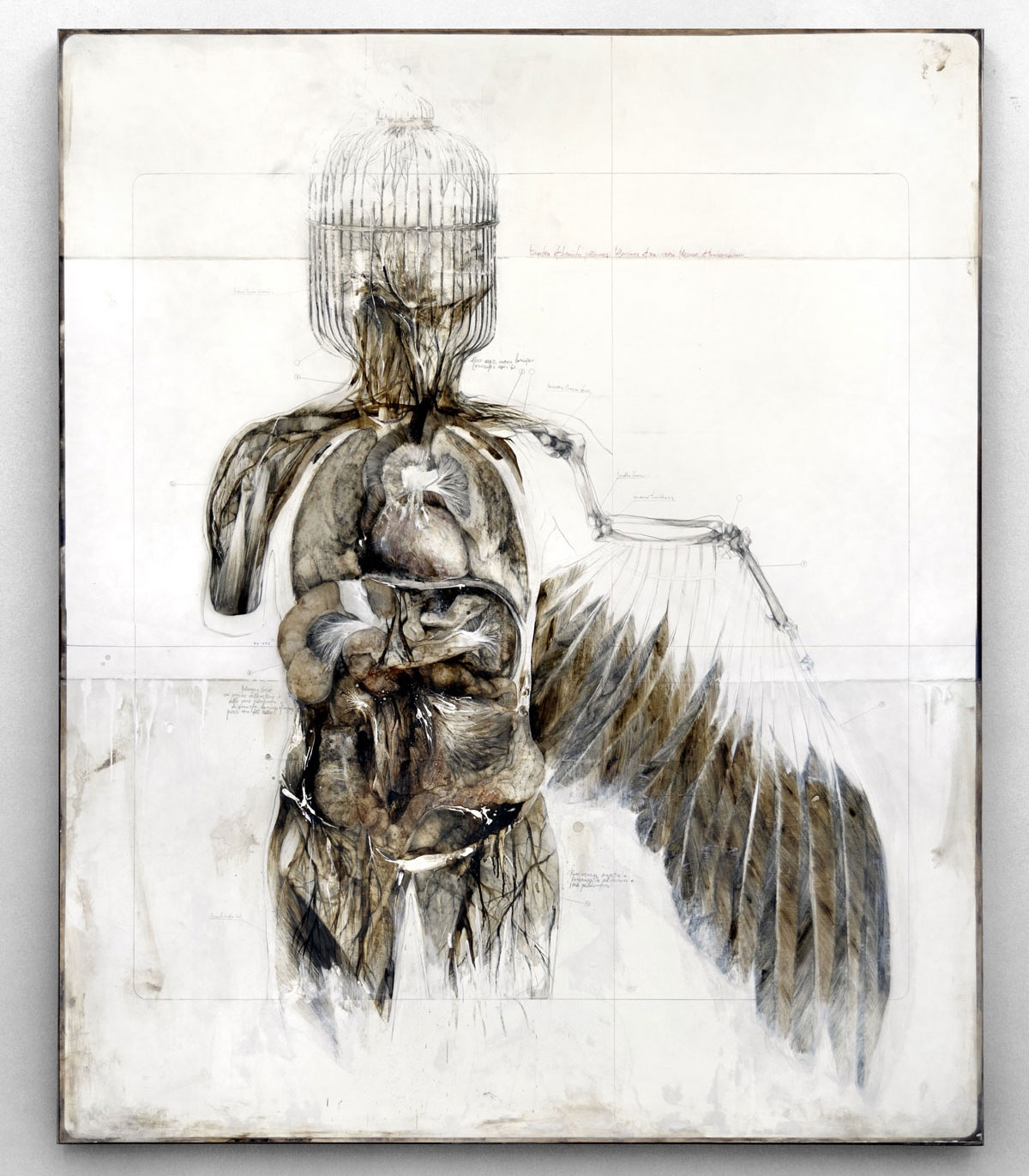
Anatomy of a winged (2013) – pencil, oil, bitumen on canvas

One of the paintings that first caught my attention was Anatomia di un alato (Anatomy of a winged), which combines representations of the human body with physical characteristics of a bird. What I find to be the most interesting in the cage that takes the place of the human head; perhaps this is a symbol of the “winged” or a representation of what humans do to winged creatures. The painting appears to be mimicking an anatomy book (in the way that it includes small scribbles about the parts of the figure) while breaking the conventional through depicting a fantastical mix of human and animal features. I thoroughly enjoy the way in which Paci combines realism with a sense of fantasy, suggesting, perhaps, that a bigger story lies beneath the surface.

Another piece that caught my eye is The Wind that sculpts your veins. The fact that both human forms and nature co-exist in this composition fascinates me; the intertwining of the veins and what appears to be branches pulls the viewer in. Once the eye wanders to the small bird perched on top of a branch stemming out of the head, it is easy to see that Paci intended for the relationship between human and nature to be somewhat literal here. The limited palette of color that Paci uses does not distract but draws attention to the forms that intermingle. Again, Paci mirrors the pages of an anatomy book by including writings on features of the figure, and he demonstrates an understanding of human anatomy and components of nature in the piece.

The wind that sculpts your veins (2014) - pencil and oil on canvas

The wind that sculpts your veins (2014) – pencil and oil on canvas

I admire Paci’s ability to create unique fantastical creatures combining features of nature and the human form. I would like to step out of my box of realism and try out new forms of human representation, which Paci does masterfully in his paintings and drawings. Each painting initiates conversation about the relationship between nature and man that Paci strives for in his compositions.

Artist of Interest: Carl Krull


Olmec_1_-172x118cm_Carl_Krull_2014

Olmec #1 (2014)

Carl Krull, an artist who was born and works in Denmark, creates a variety of varying line drawings (in addition to paintings of seemingly wildly erotic amalgams of human bodies) that have captured my attention. Recently, I have been stuck on capturing depth through creating lines with different spacing between them, which is what Krull appears to be doing very well.

Olmec #1 is the first piece in the series of 8 similar compositions that appear to have faces hidden within them. Olmec #1 seems to be hiding a skull inside of the lines, which sway and create interesting contours suggesting this figure. It is interesting to think how much simple lines can create depth in this sense. Krull uses implied as opposed to real value that is created through the convergence of lines (that do not touch, however); this implied value leads to the illusion of depth and the supposed image of a face. Perhaps this piece (and the many more that employ the use of differently-space lines) was quite cathartic or meditative to create since it involves an obsessive repetition of lines across a flat plane.

Plate #4 (2007)

Plate #4 (2007)

Another noteworthy piece includes a piece from the Plate Series. Plate #4 seems to be portraying someone in a perpetual state of confusion; the dark figure starts off by running through a door, up some stairs, and through another two doors that leads him to yet another room. This piece initially caught my eye because of the stark contrast of the colors and the continual movement that the eye does throughout the piece, starting with the ghost-like rendition of the man at the far left corner. The piece has an otherworldly feel to it; the eerie faceless figure seems to be trying to escape something, yet he can only go so far until he has to go through the maze again.

It is interesting to think how different yet similar these two pieces are. On one hand, both convey an illusion of depth and space on a flat plane; yet the line drawing uses line to create value whereas Plate #4 uses paint and straighter lines to develop the scene. Nonetheless, Krull’s compositions captured my attention for their illustrious use of the 2D space and line to create depth. I have made similar drawings to Krull’s Olmec #1 and hope to make them of a larger scale like Krull has done. I also admire the illusion of depth created within these pieces, which I hope to emulate in paintings I am making currently.

Artist of Interest: Do Ho Suh

Do Ho Suh, a South Korean artist, focuses on creating installations that “question identity“. His work is featured in several places, including the Museum of Modern Art (New York) and the Museum of Contemporary Art (Tokyo). Do ho Suh pushes the boundaries of space in order to create unique location-set installations, such as Home Within Home.

dohosuh1

Home Within Home, Installation view (2012)

Home Within Home demonstrates a keen understanding of the structure and foundation of a structure such as a home. However, instead of rendering the house with the standard building materials (such as brick), Do Ho Suh utilizes silk in order to create the feeling that we are peering at a three-dimensional version of a building “blueprint.” Do Ho Suh’s unique ability to create these massive yet ethereal-like structures (through the use of a nearly transparent medium) is unlike anything I have ever seen before. The piece almost seems to be reminiscent of a time that is long gone but that still haunts the artist.

In contrast to the artist’s silk-laden installations, High School Uni-Form is comprised of more opaque materials. This piece appears to be questioning identity; there are 300 of the same uniforms standing side by side, yet no individual faces to be found. This piece may suggest that individuality becomes crushed (in a sense) in such an environment in which following guidelines and rules is the most prominent goal. Similar to the ghost-like structures of houses and items that Do Ho Suh has created, this piece has a familiar sense of eeriness. It seems like a more modern rendition of the large group of terracotta warriors of early Chinese history; yet this piece does not show individualization but uniformity (in the literal and ideal sense).

High School Uni-Form (1997) - fabric, plastic, stainless steel, casters,  300 parts

High School Uni-Form (1997) – fabric, plastic, stainless steel, casters,
300 parts

Overall, I find his work strange yet utterly captivating. I want to be able to entrance viewers as much as he does with my own work and hope to utilize materials besides the regular media (like graphite) in order to convey conceptions. Do Ho Suh stands as a testament to the great lengths that humans can go in order to convey ideas, both tangible and abstract. His amazing ability to render subjects in purely silk and string first captured my attention. Nonetheless, all of his work are extraordinary because they challenge gravity, space, and question how we produce and see art.

Artist Talk: Pamela Winegard

On September 19th, artist Pamela (Pam) Winegard gave an artist talk before the opening of her exhibition, “Narratives,” at the St. Edward’s Gallery. In her talk, Winegard explained how each of her unique pieces were created, including those which were not made through encaustic, which is composed of pigments mixed with wax that can be applied to canvas in layers.

Welcome Wagon I (2010-11), encaustic & mixed media on wood panels

Welcome Wagon I (2010-11), encaustic & mixed media on wood panels

Winegard told us the meaning behind her show’s title. In essence, she explained that she is and has always been interested in what we (humans) leave behind, either commercial and/or discarded materials. She includes many architectural references in her pieces as a way to refer to the “push and pull” she sees between what exists and what doesn’t. Winegard also stressed the notion that we need stories and storytellers to keep who we are alive; in essence, she believes that her work tells stories about what humans leave behind, which is a very important reality that needs to be addressed.

During her talk, Winegard displayed some of the compositions that she had completed, including some that were not showcased in the gallery. One such work was entitled the “Welcome Wagon Series” (2010-14), which is a reflection of the Holocaust and genocide; the piece becomes very engaging and encourages conversations on genocide through the interesting amalgamation of mixed media and encaustic. Many of her works, she explained, are in a series because each is a chapter of information that she wants to convey to the viewers.

Community Series (2011)

Community Series (2011)

In the show, Winegard presented several enticing compositions, including two that caught my attention upon entering the gallery. One is entitled “Community Series” (2011). This piece includes four panels composed of a mixture of encaustic and mixed media (especially photos transferred onto encaustic); it seems to be commentary on what happens to the environment as a result of human impact. What first drew me to this piece, though, was the image of a group of people dressed in white (most likely the KKK uniform)  placed next to a large building that looks like a factory; I wanted to know if they were actually symbols of racism juxtaposed to a literal representation of harmful industrialization. The surface texture of the panels, starkly contrasting colors of highlighter green, orange, and black, and muddled appearance of each scene pulls the viewer in and incites dialogue about what the series brings to the forefront as a crucial social problem.

The other piece, entitled “Paths to Nowhere” (2014), caught my attention before I had even seen it. In the talk, Winegard mentioned that she had had a dream that she wanted to depict, so she dropped all her other work in order to capture it. I have always been interested in the dream world and the many ways it can be represented, so I was immediately drawn to the concept of Winegard visualizing her dream through encaustic, a medium that I have come to love as a result of the workshop she had done with my painting class. I found that the combination of cardboard-looking pieces placed over top of photo transfers, and images of an angel, water towers, and an upside-down flag on top of a sky blue background encouraged me to look deeper into the piece. Many of her pieces are social commentaries, so I immediately began analyzing the scene, keeping in mind what Winegard regarded as symbols of the U.S. (water towers) and all of the anomalies (such as the upside-down flag); perhaps this piece is addressing the ways the U.S. has fallen from grace (hence the upside-down flag and/or the cardboard medium that looks like rubble). Unlike many of her pieces, though, the diptych seems ethereal (in the sense that it was not as serious and up-front about the social problem it was addressing) and, yet, still engaging because although it is capturing a dream (something impermanent), it is still bringing a social issue to the viewer’s attention.

Paths to Nowhere (2014) (Diptych)

Paths to Nowhere (2014) (Diptych)

Winegard defines art as a very intimate form of writing for the artist; she has put into words what I have been trying to communicate all these years as an artist myself. I thoroughly enjoyed getting to work alongside and view Pam Winegard’s pieces in encaustic. She has inspired me to experiment with encaustic and to push myself to try more mediums that can allow me to express what I desire more thoroughly.