Having Second Thoughts: Richard Fruth

On a cold Friday, November 14th, I was fortunate enough to listen to artist Richard Fruth discuss his work, which includes illusory landscapes and scenes developed from a sculptural background. Fruth is a sculptor who has taught at several educational institutions and provides people with workshops in which they can physically explore 3D arts. He pointed out that his initial plan was to become a furniture maker, which led him to access to materials such as wood, which is an integrative part of all of his work. He explained that many of his pieces were comprised of remnants of past projects; he even said that one of his pieces had gone through five different renderings. Then, he went on to go into depth about the process of creating his pieces, which mainly involves the recycling of ideas, shapes, and pieces.

One of the main points Fruth wanted to make was that “nothing in life is definitive.” He also explained that his pieces were meant to draw people in and were very nature-based, as he usually spends a lot of time outside. Additionally, many of his pieces received their title from lyrics of songs that have stuck out to him.

One of the pieces that really struck me was Losing Sight of Proportions, which includes a combination of bright and natural-looking pieces of wood that are counterbalanced by horizontal renditions of platforms (one is gray). Fruth mentioned that much of his work in this exhibition mirrored the way portraits hung up on a wall. This sculpture appears as if it came out of a surrealist painting’s representation of a mountain, yet it lacks a clear frame. Additionally, the playful quality that Fruth kept mentioning about his work is manifested through his use of small ladders and a part that seems to represent a small house. There is also an interesting balance created by the juxtaposition of plain wood and colorful earth tones on opposite sides of one another (in addition to the organic versus straight-edge forms) in the piece.

Richard Fruth, "Losing Site of Proportions" (April 2013)

Richard Fruth, “Losing Site of Proportions” (April 2013)

Additionally, Fruth’s Swimming in Shark Infested Waters initially drew me in not because of the actual sculpture but the positioning of the piece on the wall. The sculpture actually juts out of the wall and, in doing so, greets the viewer. Fruth seems to incorporate details of shark fins in addition to half of a boat’s hull in order to convey the idea that the subject is entrenched in shark-infested water. Many of Fruth’s pieces in the gallery also included the minor detail of the ladder, which he described as confusing because the viewers do not know whether they are entering or leaving a scene. The bright colors make the viewer feel safe, in a way, except for the fact that there are sharks looming over (or, in this case, under) the scene.

Richard Fruth, "Swimming in Shark Infested Waters" (Dec. 2012)

Richard Fruth, “Swimming in Shark Infested Waters” (Dec. 2012)

Fruth introduced me to a whole new world of art: sculpture especially through wood. I haven’t really paid much attention to sculpture made in wood because I haven’t really found them very appealing; but, I found Fruth’s work very playful and challenging to understand (which is a quality in art that I treasure). I hope to expand on the range of mediums I use throughout my art career in such a way that I will be able to create more 3D art, which I believe is always a great way to get the viewer interested in your work.

Artist of Interest: Ben Sack

Ben Sack is an artist that focuses on creating incredibly detailed representations of city-scapes in ink. Many of his pieces appear as though they were pictures shot from a bird’s-eye view or with a fish lens.

One of the works that immediately caught my attention was his Song of Pan, which includes a wide array of shapes and an interplay of negative and positive space that draws the eye towards the center. In the center appears a fictional metropolis and, as the viewer’s eye travels out towards the end of the beam-like arms of the city, the viewer takes in other city-scapes that appear to represent real-life city-plans. The piece includes blank spaces ingrained in floating circles and a mix-match of city-scapes that create a feeling of uneasiness (for me, anyways); the mix of shapes and detail can be overwhelming to take in all at once.

Ben Sack "Song of Pan"

Ben Sack “Song of Pan”

The other piece that I found quite interesting was Quantopolis, which also provides the viewer with renditions of detail city-scapes, yet, here, Sack places the cities within what seems like 3-dimensional rooms created with checkerboard patterns. Sack creates a feeling of confusion through the utilization of both strict lines (conveyed in the pattern and the city-scapes) and soft, dark (ominous-looking) pockets of darkness.

Ben Sack "Quantopolis"

Ben Sack “Quantopolis”

What really fascinates me about Sack’s work is the amount of excruciating detail he goes into to create beautiful renditions of cities and imaginative worlds. Though he does not tend to use color in his pieces (and every now and then works in a bit of sepia into his work), the lack of color creates an overwhelming feel of his compositions that invites the viewer to observe the detail close-up for the full-effect. I would like to incorporate the level of detail Sack includes in his work into my own portfolio because I am very detail-oriented and tend to work in monotone colors, which would push viewers to focus on the subject and wonder at the meaning of my work.

Artist of Interest: Steve Spazuk

Steve Spazuk is best-known for his work with flames when creating his work; he has perfected the art of what he calls “fumage,” in which he uses a flame to, essentially, paint with soot. Then, he uses tools such as needles and even feathers to make marks (or draw) in the soot. He explains that bodies intrigue him and that his compositions express “how every one of us is a constituent fragment of the human community.”

Ornothotem is a piece from Spazuk’s bird series. The ethereal feel of the piece is expressed through the wispy lines created by the soot. The fine details found in the birds contrast well with the uncontrolled mass of soot floating around the figures. What I find most captivating is the unearthly quality of the piece and the emotion that is conveyed through the use of soft yet heavy soot on a plain background.

Steve Spazuk, "Ornothotem" (2014)

Steve Spazuk, “Ornothotem” (2014)

Another noteworthy piece includes The nozzel, which is from Spazuk’s “Ornithocide” collection of soot paintings in which Spazuk attempts to convey to his viewers the harmful nature of using pesticides that has begun to permeate through the food chain and kills birds. This piece seems to commentate on just that by including a stark contrast between a symbol for the pesticide and a bird, which is a symbol for nature. It almost appears as if the nozzle is a man-made rendition of a bird and the fact that it is juxtaposed with a delicate bird makes the nozzle seem like a threatening force. Additionally, the soot adds to the overall feel of the piece, which is that of foreboding and uneasiness.

Steve Spazuk, "The nozzel" (2014)

Steve Spazuk, “The nozzel” (2014)

What initially drew me to Spazuk was a video that showed the process he goes through to achieve these wonderfully-crafted pieces; it seems as though Spazuk makes every mark so effortlessly yet skillfully. I want to experiment with this technique and see what my results will be; perhaps I can find a way to create massive compositions on canvas, paper, or even cloth through “fumage.” Spazuk is one of many artists who have fascinated me and encouraged me to mess around with different non-traditional mediums when creating work.

Artist of Interest: Nick Gentry

British artist, Nick Gentry, explains that he focuses especially on the use of recycled materials such as film negatives and is concerned with the “development of consumerism, technology, identity and cyberculture in society.” Gentry reuses items such as floppy disks and, in the process, challenges the preconceived notions of the original function of these objects.

In Fade, Gentry utilizes floppy disks as a backdrop for the portrait of a woman. The eyes draw the viewer in, as they seem so blank and yet so captivating in their stare. Similarly, the features of the woman become so pronounced as Gentry emphasizes the contrast between the color used to create depth and the flat background (which is ironically 3D) of the floppy disks. Additionally, the stern and somewhat questioning glance of the subject pulls the viewer in. The viewer’s attention travels outward from the eyes to various points in the portrait, and the negative space created by the white background lets the viewer know (even more so) that the face is the point of focus in this piece. I love the way Gentry recycles these old objects in order to create something so far-removed from the floppy disks’ initial intended use.

Nick Gentry, "Fade" (2014)

Nick Gentry, “Fade” (2014)

Gentry’s piece entitled Lost Moments challenges the preconceived uses of materials such as film negatives and x-rays. The subtle yet powerful lines and depth created through the use of oil and differently-contrasting film and x-rays make the piece so eye-grabbing. Again, Gentry plays with positive and negative space in order to focus the viewer on the subject while emphasizing the usage of these unique materials to achieve the effect he has achieved. The composition would appear to be a photo manipulation if not for the small hints of information left behind about the materials’ previous usages. Also, the stare of the subject seems to create a feeling of uneasiness, as the person seems to be apprehensive about something in the distance. This may be part of Gentry’s goal to question the rise of technology that makes items like film negatives obsolete.

Nick Gentry, "Lost Moments" (2012)

Nick Gentry, “Lost Moments” (2012)

Overall, I found Gentry’s use of these unusual objects to paint on to be very informative; now, I understand what oil or other mediums on top of found objects such as film and floppy disks appears. Gentry inspires me to continue experimenting with different materials and challenges me to question why certain items are used (like whether the use of a found object translates to commentary on the state of society in this day and age).

Artist of Interest: Cayce Zavaglia

Cayce Zavaglia utilizes embroidery to render images of family, friends, and other artists; although originally a painter, Zavaglia uses her skills in needlework in order to create intricately deceptive photo-realistic portraits.

The composition that drew me in was Florence, an image of a little girl that appears to stare through one’s very soul. For many of her pieces, Zavaglia makes sure that the gaze of the subject meets the viewer’s eyes, which is one of the reasons this portrait is so powerful. Zavaglia’s use of materials like silk and cotton entrance the viewer with the slight shifts in light and color all around the composition, while the very gaze of the subject makes the piece seem almost confrontational. The contrast between the flat background and the rendition of the subject also emphasizes the focus on the image. I was initially drawn to the composition since it appeared as though Zavaglia has taken a photo and simply distorted the image through computer manipulation.

Cayce Zavaglia, "Florence" (2014)

Cayce Zavaglia, “Florence” (2014)

Yet another important rendition that caught my eye was Teo Verso, which demonstrates Zavaglia’s background as a painter. Unlike her compositions created solely through embroidery, this piece is comprised of a more two-dimensional medium. Nonetheless, it appears as if we are observing the process she goes through to create her pieces of silk and cotton; it seems as if there are strands of these materials hanging out of the portrait. What drew me in was the unusual combination of lines and color to create an obscure effect. The subject of the portrait no longer meets the viewer with a clear gaze but seems to blankly stare at the space ahead. The void of white that replaces the eyes in the boy’s eye sockets and the arch of his eyebrows confronts the viewer and creates an uneasy feeling that pulls one in.

Cayce Zavaglia, "Teo Verso" (2014)  [Gouache on Arches Hot Press Paper]

Cayce Zavaglia, “Teo Verso” (2014) [Gouache on Arches Hot Press Paper]

Zavaglia creates interesting compositions centered around various portraits that capture the attention of the viewer through her wild use of seemingly tame materials. Her pieces are unlike painting in the traditional sense. I would like to expand my usage of materials to depict subjects in various ways, and create emotion through the uncommon usage of mediums such as string. Zavaglia encourages me to continue to test the boundaries of materials in order to create one-of-a-kind pieces.

Artist of Interest: Zhao Na

Zhao Na, "Drunk in Autumn" (2014)

Zhao Na, “Drunk in Autumn” (2014)

Zhao Na, an artist who mainly focuses on the utilization of acrylic paint and ink, along with colored pencil and graphite, creates several pieces that focus on characteristically unique renditions of subjects that may remind one of very detailed comic book scenes. Currently, Na works and lives in Beijing, China and has displayed her work in several exhibitions since 2003.

The piece that particularly drew me in was Na’s “Drunk in Autumn,” a beautifully intricate rendition of a tree bearing apples. Within the tree is an amalgam of creatures that are “drunkenly” hanging out, strategically entangled within the branches. The piece almost takes on a humorous mood and quality, as each of these creatures appear to be the same size (which is not true to reality). The artist pairs muted and bright colors in order to create an interesting interplay between various aspects of the composition. I admire the sketchy yet fulfilled quality of the piece; there is an interesting balance of positive and negative space (which seems to bite into the tree itself). Additionally, the tree appears to be composed of a mixture of organic shapes and items such as moss and leaves.

Zhao Na, "Rest" (2012)

Zhao Na, “Rest” (2012)

The other piece worth noting includes “Rest,” which, similar to “Drunk in Autumn,” includes a depiction of a tree along with a creatures. Na seems to hide the owls and various types of birds within the branches of the tree; Na utilizes similar muted colors in rendering both the branches and animals. What is interesting is that Na includes dabs of green within the tree along with muted colors such as gray, which creates an unlikely balance within the work. It almost appears as if the tree, near the bottom, is opening its trunk, ready to swallow up any unsuspecting bird (perhaps a baby chic) that loses its balance on the fragile branches. Again, Na creates an interesting interplay of negative and positive space while drawing the viewer into the seemingly uneasy piece by adding so much detail and unique combinations of colors and renditions of the subject.

Overall, Na’s work reminds me of a highly-developed style of animation (almost comic-book like) that involves the portrayal of whimsical ideas through the use of painstaking detail. Though I have not made any pieces that involve so much detail, I would like to work towards creating a wider array of work that creates an interesting interplay of unique colors and space.

Artist of Interest: Michael Gregory

Michael Gregory is a painter who mainly focuses on realist renditions of different subjects, such as landscapes. In many of his compositions, he demonstrates an (almost) obsession with silos and old barns. Additionally, in each of his pieces, he demonstrates a keen mastery of the use of color in order to achieve the affect of what seems to be a surreal reality. For instance, the first piece that drew me in was Emmigrant Flat, a painting of an old, battered barn that lies in the middle-ground between a mist-laden mountain and what appears to be grass that has just experienced the morning dew or frost. This piece draws the viewer in, who immediately becomes entranced by the mood the piece evokes; it seems that the barn, which is most likely abandoned, hints to a time long gone and the mist creates an air of mystery to the scene.

Michael Gregory, "Emmigrant Flat" (2013)

Michael Gregory, “Emmigrant Flat” (2013)

Another noteworthy piece is Gregory’s Barger, which is a hyper-realistic rendition of a close-up of a barn. The absence of color, alone, adds to the overall serene yet troubling mood of the piece; the scene is seemingly peaceful yet the white contrasts so much with the dark that the viewer is forced to focus on the barn. Additionally, the barn appears somewhat ominous, with its small dark openings alluding to a mysterious world inside of it. The sky also seems to demonstrate that the scene occurs near the time of night before the moon completely emerges, which adds to the veil of mystery that already exists in relation to the illumination of a barn that appears empty but that could be filled with a myriad of items and/ or beings. Regardless, it seems as though Gregory simply framed a black and white photo of a barn.

Michael Gregory, "Barger" (2014)

Michael Gregory, “Barger” (2014)

Overall, I found Michael Gregory’s paintings of these peculiar subjects very intriguing. In an effort to expand my application of oil paint in the various rendition of different subjects, I can observe Gregory’s pieces to understand, for example, how the use (and absence) of color can affect the mood of a composition. I especially admire the realism and a touch of surrealism that Gregory manages to achieve through his careful use of color that brightens his work and makes his pieces eerily peaceful.

Artist of Interest: Nunzio Paci

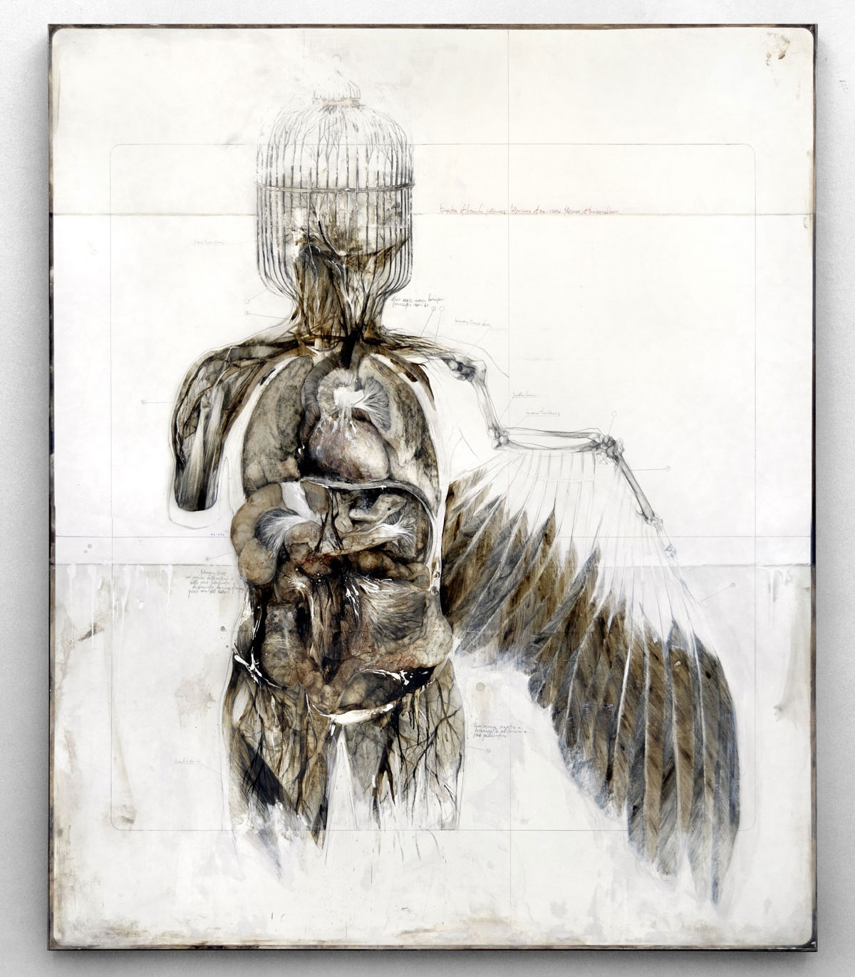
Artist Nunzio Paci, born in Bologna but working in Italy, focuses on the “relationship between man and Nature” in order to “explore the infinite possibilities of life.” His work combines images of humans and nature to demonstrate this relationship. Many of his paintings use a mixture of sepia, gray, and white colors on canvas.

Anatomy of a winged (2013) - pencil, oil, bitumen on canvas

Anatomy of a winged (2013) – pencil, oil, bitumen on canvas

One of the paintings that first caught my attention was Anatomia di un alato (Anatomy of a winged), which combines representations of the human body with physical characteristics of a bird. What I find to be the most interesting in the cage that takes the place of the human head; perhaps this is a symbol of the “winged” or a representation of what humans do to winged creatures. The painting appears to be mimicking an anatomy book (in the way that it includes small scribbles about the parts of the figure) while breaking the conventional through depicting a fantastical mix of human and animal features. I thoroughly enjoy the way in which Paci combines realism with a sense of fantasy, suggesting, perhaps, that a bigger story lies beneath the surface.

Another piece that caught my eye is The Wind that sculpts your veins. The fact that both human forms and nature co-exist in this composition fascinates me; the intertwining of the veins and what appears to be branches pulls the viewer in. Once the eye wanders to the small bird perched on top of a branch stemming out of the head, it is easy to see that Paci intended for the relationship between human and nature to be somewhat literal here. The limited palette of color that Paci uses does not distract but draws attention to the forms that intermingle. Again, Paci mirrors the pages of an anatomy book by including writings on features of the figure, and he demonstrates an understanding of human anatomy and components of nature in the piece.

The wind that sculpts your veins (2014) - pencil and oil on canvas

The wind that sculpts your veins (2014) – pencil and oil on canvas

I admire Paci’s ability to create unique fantastical creatures combining features of nature and the human form. I would like to step out of my box of realism and try out new forms of human representation, which Paci does masterfully in his paintings and drawings. Each painting initiates conversation about the relationship between nature and man that Paci strives for in his compositions.

Artist of Interest: Carl Krull


Olmec_1_-172x118cm_Carl_Krull_2014

Olmec #1 (2014)

Carl Krull, an artist who was born and works in Denmark, creates a variety of varying line drawings (in addition to paintings of seemingly wildly erotic amalgams of human bodies) that have captured my attention. Recently, I have been stuck on capturing depth through creating lines with different spacing between them, which is what Krull appears to be doing very well.

Olmec #1 is the first piece in the series of 8 similar compositions that appear to have faces hidden within them. Olmec #1 seems to be hiding a skull inside of the lines, which sway and create interesting contours suggesting this figure. It is interesting to think how much simple lines can create depth in this sense. Krull uses implied as opposed to real value that is created through the convergence of lines (that do not touch, however); this implied value leads to the illusion of depth and the supposed image of a face. Perhaps this piece (and the many more that employ the use of differently-space lines) was quite cathartic or meditative to create since it involves an obsessive repetition of lines across a flat plane.

Plate #4 (2007)

Plate #4 (2007)

Another noteworthy piece includes a piece from the Plate Series. Plate #4 seems to be portraying someone in a perpetual state of confusion; the dark figure starts off by running through a door, up some stairs, and through another two doors that leads him to yet another room. This piece initially caught my eye because of the stark contrast of the colors and the continual movement that the eye does throughout the piece, starting with the ghost-like rendition of the man at the far left corner. The piece has an otherworldly feel to it; the eerie faceless figure seems to be trying to escape something, yet he can only go so far until he has to go through the maze again.

It is interesting to think how different yet similar these two pieces are. On one hand, both convey an illusion of depth and space on a flat plane; yet the line drawing uses line to create value whereas Plate #4 uses paint and straighter lines to develop the scene. Nonetheless, Krull’s compositions captured my attention for their illustrious use of the 2D space and line to create depth. I have made similar drawings to Krull’s Olmec #1 and hope to make them of a larger scale like Krull has done. I also admire the illusion of depth created within these pieces, which I hope to emulate in paintings I am making currently.