Blog Post #5

Part 1

The first assignment for my Foundation Art & Design class was a photo project in which I had to take 100 photos of one object and create different purposes for the object exist in each compositional frame. I chose a clear container used for desk storage because it had three sliding compartments to hold materials and I knew I could manipulate it and fill it however I wanted to create variation throughout my photos. This object was on my desk holding clothespins and scraps of paper, and I decided that it would be interesting to put other small objects inside the compartments and photograph it in different situations. As I began taking photos, I noticed the unique way light reflected off of the layers of clear plastic and how, in combination with the materials, it distorted the light coming through the plastic, and added dimension to each photograph.

For some of the photos, I put small mementos and meaningful trinkets in each compartment and hung it from a tree to get different perspectives as it rotated and reflected the sun. In others, I experimented with putting LED lights inside and found the reflections and the light that traveled through the container very fascinating. I attempted to display both the functional qualities of the object as well as its adaptable physical qualities. The transparency of the plastic and the way it distorts the objects behind or inside it made it easy to place on a shelf full of color and focus on the refraction of the reality behind the plastic.

I liked that this container was both versatile and rigid in structure, but also that it reminded me of a capsule or a looking glass in which the layers of its contents define it and give it meaning. I felt that these few photographs embodied the reasons why I chose the object, and also captured a tendency I have to create art that is related to preserving memories and building onto the layers of the past that make up our existence.

Layers

LED

Web

Unplugged

The purpose of the second assignment in my Foundation Art & Design class was to explore the different uses of line and to get a better understanding of how lines make up everything in the 2D and 3D worlds. As a whole, the project was a process that helped me wrap my mind around thinking about lines as able to create 3D space. I created 75 different representations of lines in a grid format, used lines to create contour drawings of 3D objects, made a 3D sculpture based off of my contour drawings, and then used the shadow of the sculpture to combine the aspects of my process into this one final drawing. My contour drawings and sculpture based on those drawings were of the same tree trunk, so exploring the different ways of representing that tree using only lines was an interesting process.

Throughout the project, I tried to continually focus myself back on the purpose and function of lines, and how planes and space can be created from lines even in a 2D situation. I learned that lines are what decides continuation and texture and form and I tried to convey those qualities, while using a variety of lines to translating the of a 3D aspects of a sculpture into a 2D space.

Shadow Line Drawing

Part 2

Personal Critique of the Shadow Line Drawing:

1. I think the strongest aspect of this drawing is the definition and detail that the use of different lines brings to the existing shapes. There is also depth created by the negative and positive space that is constituted by the variety of line and materials I used.

2. The weakest aspect of this drawing is, in my opinion, is the craftsmanship and ability to be concise in keeping my work clean.

3.To improve the composition or form of the drawing, I could have used the initial outline of the shadow to create a better plan for the drawing, instead of staying within the confines of the lines I drew on the very first day of working on it. I need to be more open minded when it comes to borders and the open spaces within them in order to not conform to the predictable methods of filling them.

4. Conceptually, this project was fairly lacking. The only concept I was working with in my head while creating this was the translation between 3D objects and their 2D shadows. The sculpture I made was of a tree, so when I traced the shadow, I included my hand holding it up to make a sort of trunk like attachment to the bottom of the paper. I felt that this rooted the branchy tangled apparatus to create a form similar to that of a tree.

5.The project could have been improved technically if I had not ben messy with the pens I was using. The paper I was drawing on had some faint ink smudges and finger prints around the subject. By the time I was done, the surrounding white of the paper looked a little sloppy, and my paper had a few small creases in it by the time it was displayed for critique. I need to work on preserving my work and taking time to make sure it is clean when I present it.

VISU 1311: GESTALT Project #1

2015-09-29-3686

     2015-09-29-3870


2015-09-29-3822 copy                                2015-09-29-3691    2015-09-29-3859

2015-09-08-2631


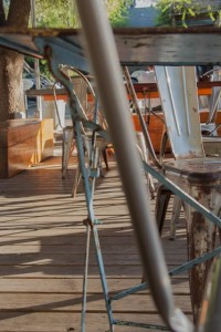
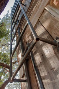
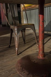
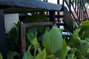
Since the guidelines for this project required me to stay on South Congress while taking photos, I used the Gestalt principles to place emphasis on the different kinds of rusted metals. I wanted to displace the viewers perspective and make them unaware of the location of the photos. The most prevalent principles throughout my photos are Closure, a suggestion or implication that the human mind completes on based on context, Proximity, the distance between visual elements, and Continuity, the fluid connection among compositional parts. While the viewer may devise that the first image is of a bike from the small part that is represented in the image, there is closure in the presence of the wheel’s shadow on the sidewalk, assuring the viewer that the object is, in fact, a bike. There is also continuity throughout the image in the curved and straight lines and shadows that guide the eye from left to right. Similarly, in the second photo, there is closure implied by the metal chairs in the background because the rod going diagonally through the image is unidentifiable, until one realizes it is part of the frame of a chair. This photo also displays proximity through the decrease in the chairs’ size as they get farther form the camera. The combination of shadows, ridges in the wood, and the metal structures bring continuity and guide the eye from top to bottom and from right to left. The third photo is a demonstration of continuity as the ladder ascends and leads the eye toward the light, and there is repetition in the sequence of rungs. Proximity and continuity combined guide the eye, in the fourth photo, from the closer part of the rusty pipe to the farther end that curves up and around to the left. In the last two images, proximity and containment are the two leading principles. The base of the table is closer to the camera than the chair, making a frame in which the chair is not completely contained. In the same way, the framing created by the stairs and the rusted car window form a sort of boundary for the plants to stay within, demonstrating containment as well. As a collection, my images consist of related content and multiple Gestalt principles that work together to create a cohesive sequence of photos.


Screenshots:

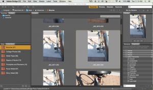
Bridge collections and key words

Screen Shot 2015-09-29 at 11.12.52 AM


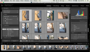
Lightroom collections, keywords, and metadata

Screen Shot 2015-09-29 at 4.37.46 PM


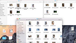
Folders of RAW, JPEGs, and TIFFs

Screen Shot 2015-09-30 at 2.19.56 AM

VISU 1311: Defining Elements and Principles

Line-element that starts at a point and continues and doesn’t always end

Line 1

Line 2

Line 3

Line 1

Line 2

LINE 3

Shape-defining outline of an object

Shape 1

Shape 2

Shape 3

Shape 1

Shape 2

Shape 3

Texture-visual or physical quality of a surface

Texture 1

Texture 2

Texture 3


Texture 1

Texture 2

Texture 3

Value- Shade within a range of shades

Value 1

Value 2

Value 3

Value 1

Value 2

Value 3

Color-pigment, the eye perceiving light

IMG_6715

IMG_6811

IMG_6717


Plane-different places for things to exist in a given space

IMG_6706

IMG_6729


IMG_6734

Volume-a quality that gives things dimension, length x width x height

IMG_6724

IMG_6738

IMG_6804


Mass- the 3-dimensional space an object takes up

IMG_6750

IMG_6767

IMG_6773


Space-a place where something can exist or not exist, can be positive or negative

Space 4-yess

Space 2-yess

Space 3-yess

Space 1-yess


Light- the opposite of black, enables us to see color, value, shade, and texture

Light 1-yess

Light 2-yess

Light 3-yes

Light 4-yes

Time-measurement of existence, continuation, and discontinuation

Time 1-yess

Time 2-yess

Time 3-yess

Motion-the way things move within time, release of potential energy

Motion 1-yess

Motion 2-yess

Motion 3-yess

Motion 4-yess

Balance- a medium or middle point

Balance_1

Balance_2

Balance_3

Balance_4

Emphasis- focus is placed on a subject

Emphasis_1

Emphasis_2

Emphasis_3

Emphasis_4

Rhythm- how things flow in time

Rhythm_1

Rhythm_2

Rhythm_3

Rhythm_4

Scale/Proportion-comparison of size between objects in an image

Scale_1

Scale_2 Scale_3

Scale_4


Blog Post #4

Part 1.

The six presenters in our seminar last week had a lot of positive and encouraging tips for the students coming into the St. Edward’s art department. The first two presenters, as Fine Arts majors, both placed emphasis on going to see as much art and exhibits as possible during our time as a student because we have resources and opportunities that our teachers and faculty make us aware of. Rachel, the first student speaker made a point that has been prevalent already in my first few weeks in college, about the time and consideration art takes. In this short period of time, I have discovered the truth of this statement because the time I spent working on projects is directly related to the quality of my work, and my professors will be able to judge how much effort I put into what I made. The two main pieces of advice I decided to take from these two students presentations is to be looking at artists online and also to be developing the concepts I would like to develop over the four years that I am a student here. Caelin put a lot of emphasis on thinking about the conceptual aspects of the art I make inside and outside of class.

The two Graphic Design majors, Shelby and Paul, talked mostly about developing portfolio work and making connections by attending extra-curricular events. I liked how Shelby encouraged is to find our passions. Often, we get caught up in the work required of us and only focusing on fulfilling our assignments, when we need to be paying attention to the mediums and concepts that interest us and keep us hungry to make work. Paul’s presentation focused more on making connections because networking and making yourself known in situations usually results in more success. I realized that I should be constantly producing work so that my skills and ideas develop and I can explore my motivations for creating on a more personal level.

Christin and Juliana also encouraged us to be creating outside work. Christin advised that we utilize professors and juice them of all the information and advice we can while we have them as a resource. She also said it is helpful to utilize a sketchbook and reference our drawings and recordings when we need inspiration for other art work. Juliana made it a point to say that craftsmanship matters and that we should pay attention to details. Eventually, being considerate of the details that show forth effort and careful crafting of work will become natural and will be part of our muscle memory through practice. I took away from their talk that I should look forward to critiques and not fear them because critique is important for improving the quality of my work and will only make me a better artist.

Part 2

http://color-clock.com/#

The color clock is a hexadecimal clock that changes color every second of the day and converts each RGB value into hexadecimal numbers ranging from 0 to 235959. I find this website very intriguing because it encompasses various dimensions by assigning a visual quality to a method of measuring time. The slight color difference in between seconds truly shows how many seconds go by without us thinking about them, and assigning a value to each one seems to make them mean something other than a very minuscule unit that measures our every day lives.

https://soundcloud.com/logout

Soundcloud is a website that lets people all over the world share their original music as well as use music from other profiles to create playlists. Listening to my friends’ original music and other musical artists on soundcloud has compelled me to write music and experience the sounds being created and posted from around the globe. I have listened to various artist podcasts that have been particularly intriguing and inspiring, as well as shared music and use my personal artwork for the cover photos in my profile and on my feed of music. Having access to a large playlists and artists is very helpful for someone who likes creating and places a large emphasis on music to inspire creativity.

http://crumpledbelle.loveliftstheload.com

Crumpled Belle is my mom’s blog that was part of a website my family had while living and traveling on a school bus. I find inspiration and recover memories from our family experiences and my mothers words about her point of view. The text accompanied by pictures, art, and videos, reminds me of where I come from and forces me to make connections with my past. Through sifting through my mother’s recordings of thoughts and feelings, I am reminded that I have an archive of information within myself to use in creating meaningful work.

http://www.ravenandlily.com/blog/why-we-produce-with-artisans-and-not-factories/

Raven and Lily is a company that makes clothing and accessories that does not mass produce in factories, but teaches women who are in unfortunate positions around the world the manufacturing skills necessary produce handmade items and make a living for themselves. The company offers health care, education for both women and children, as well as an overall nurturing and caring community. Raven and Lily focuses on including the uniqueness of each woman’s culture into the articles they produce. Their products are diverse and are made to be sustainable so that their legacy and individual value lasts for years.

VISU 1311-02: Creativity Blog #7

I was very interested in the audio clips and how they seemed to represent an audio collage of elements that were layered and built over time to create an image in the mind. Many messages were conveyed and the evolving of media, the necessity of understanding these changes, and using the mediums of communication we’ve developed over time seemed to be several overarching themes throughout the audio pieces and the text. The main speaker in the audio clips seemed to be breaking down a valuable and vital form of media, printing words, and taking it back to the basic human function of writing. Words are strung together to create meaning as whole, but they are first strung together. The linear connectivity makes words into static symbols that are first arranged in a line before they hold meaning. I was intrigued by the layered voices and clips of music because I felt that there was a message being conveyed through those pieces even when they were covering up some of the speaking. As humans, we tend to try to listen to one thing or the other, and listening to several things at one time can be extremely overstimulating. This overlapping of different pieces seemed to create different planes or places in time for the listener. The media is the message was a clear idea to me in the way writing and printing was described because it made me think of print more visually rather than conceptually. The physical existence of the print began as more of a visual piece, then followed by meaning in the text.

I also enjoyed how the artist was described as pointing out things that society doesn’t want to acknowledge. The understanding of cultural change is only possible because the ways media changes and influences our environments. The concept that the things we create are only extensions of ourselves and our qualities makes the dynamic of our work very reflective and interesting to look at. This is what the pieces meant by us shaping our tools so that they may shape us. Often, we are unaware of how reflective we are of ourselves in the things we create. Sometimes, we are the medium and we are able to create based on the things we know and acknowledge in the world that others refuse to see. I enjoyed the audio and visual collage and saw it as a representation of harmony, which helped me think about the second project and gave me some new ideas.

Blog Post #3

Timothy Hyunsoo Lee originates from Seoul, Korea, butwas raised in New York and stayed in America to study drawing, developmental biology, and neuroscience at Wesleyan University in Connecticut. His website describes him as a man who has suffered from anxiety and panic attacks since a young age, and he uses his degree in combination with his creative skills to create work that explores the double identity of a foreign person in America, struggling to fit in while remaining a member of another culture at heart. His vast collection of paper sculptures, laced with intricate cell-like patterns and delicate water color faces or features, seem to convey this kind of inner monologue that goes on in a foreign persons mind, specifically those of a Korean, when they are learning how to hold on to their identity in another culture and how multifaceted the human mind can be.

The sculptures themselves are astounding in the amount of detail they have and the stark white flow of light that seems to be radiating from them. Lee’s scientist side comes out in the construction of these cell-like structures, which look like computer generated 3D models of some type of organism. Varying cut-outs and folds create smooth shadows and add a sort of fluid feeling to the paper. The expressions on the faces of the Korean faces can be described as strained or fatigued. It seems that Lee painted his Korean figures with open mouths and noses in the first two photos, giving the impression that these people are trying to get a breath. Not being able to breath is commonly associated with hyperventilating when having a panic attack, and the faces in addition to the flexibleness and curling over of the paper gives the pieces a common theme of breath, or the lack there of. Each piece in the third photo seems to be dealing with a different Korean identity, because there is a pair of eyes painted on each piece of paper, and eyes are usually affiliated with truth or the soul of a being.

I was personally inspired by Lee’s concept and visual representation because, not only were they visually pleasing, but their striking aesthetic instantly screamed identity to me. The concentration for my AP Drawing portfolio was centered around identity, and how the experiences and fears we have are subconsciously shaping who we are all the time. The fact that one of my favorite mediums is cut paper also drew me to these pieces because of the intricacy of the patterns and the beautiful three-dimensional form the paper takes on when suspended under white light. I found the form of shading with the grey and purple water color cells very subtle and soft on the eye, while the reddish pink features of the skin was somewhat disturbing and fleshy against the pure white paper. I immediately felt the sense of panic or gasping for air that the Korean faces express, and I found Lee’s manifestation of his personal experience with anxiety and identity very effective in representing a broader spectrum of people who have been through similar struggles, and know how important it is to breath in places and times of high pressure.

water color on cut and folded aquarelle arches paper
“296.61 Mania Edition”, Timothy Hyunsoo Lee, 2013, water color on cut and folded aquarelle arches paper
Timothy Hyunsoo Lee, 2013, water color on cut and folded aquarelle arches paper
“Halo”, Timothy Hyunsoo Lee, 2013, water color on cut and folded aquarelle arches paper
Timothy Hyunsoo Lee, 2012, water color on crumpled and dried bristol
“gookeyes”, Timothy Hyunsoo Lee, 2012, water color on crumpled and dried bristol

More of Lee’s work can bee seen at his website: http://www.timothyhlee.com
or at: http://www.booooooom.com/2015/09/21/amazing-hand-cut-paper-sculptures-by-timothy-hyunsoo-lee/

Blog Post #2

Part 1

Looking at my Time Tracker, I realize how sporadic my schedule is. Outside of my scheduled classes,the order of each day was different and some led me to be up later because of the procrastination or exhaustion from staying up too late the night before. This seems to be a vicious cycle that is hard to break, especially when I underestimate the time I will need for certain assignments, or simply get distracted and allow myself to drift from the focus of my work. I recognize that this is an issue I will most likely deal with as a student because of the amount of sleep or focus I lack when I am overwhelmed with work and tasks. However, as an art student, I noticed that I have been waiting to tackle my art assignments until the night before they are due, causing me to be up late at night working on projects. The more tired I get, the more my creative juices stop flowing and I am working solely to finish the assignment rather than to learn from the creation of it. I am resolving to try and spread out the periods of time I work on art projects, and even complete homework for my other classes before I lose sleep over them and get myself deeper into the tiresome cycle.

Part 2

I wanted to focus on using various mixed mediums to show that weakness, experience, and threats to our security are the things that form our true identity. Identity is not only who we are, but also the way we reveal ourselves to the world, and I felt that creating pieces that appeared processed and layered would give off the idea that gained experiences and trials are the constant defining factors of who we are.

Broken
Broken Unspoken: Glass and pastel on cardboard, 8″x9″, 2015

Shooter
Shooter: Xerox print, colored pencil, and shoe polish, 10″x10″, 2015

Time Ward
Time Ward: Tempera and india ink on cardboard, 19″x24″, 2014

Phoenix
Phoenix: Shoe polish, colored pencil, and collage on vellum paper, 8″x10″, 2014

Oblivious and Oblivion
Oblivious and Oblivion: Collage, shoe polish, 10″x8″, 2015

Head in the Clouds
Head in the Clouds: Pencil, shoe polish, 11″x11″, 2015

Gabrielle
Gabrielle: Paper, cardboard, transparencies, 22″x23″, 2015

VISU 1311: Creativity Blog #6

The podcast on the song “Inside Out” by Spoon was enlightening and enjoyable. I have heard the song many times and liked it before every really taking the details of it into account. I found it interesting that the band drew influence from genres all across the board, like the catchy riffs from Dr. Dre’s album, 2001. This seemed to say that music is music, and the aspects of songs that are pleasing to the ear are constant across genres, no matter what kind of music you are creating. I liked the idea of contrasting sounds, like the dry bongos that the drummer suggested. Artists are constantly altering their work and looking at it from different angles, which is what the producer did when he messed with the beat and placement of sound until he felt an emotional connection with it. Among the comments of the producer and drummer of the band, the mention of balance stuck out to me, as it did in Amy Tan’s TED talk about creation. The band sat in the studio and altered the balance of the song’s parts, removing layers of the track and adding them back in until it sounded just right. I learned that everyone who creates begins with a plan for communicating their idea that changes during the process, and that I shouldn’t be afraid to veer off and try out different ideas that may fail or lead me to a better idea.

The song itself was very relaxing and seemed to glow with swelling sound and constant notes. There was scarce harmony, a constant ringing of similar notes, and a steady drumbeat that kept it fairly simple throughout. The first keyboard solo consisting of falling notes created a sort of behind the beat feeling, one that is not constricted by the drum beat, adding a laid back feeling to the song. The repetition of words and melody created a mood and a point of view for the vocalist to take on. I noticed how the second keyboard solo was made up of rising scales that were sweet but slightly dissonant. This element of the song created a sense of hope and anticipation, questioning and infatuation that leaves the listener hanging. The intro and fade out are both reminiscent of the glowing affect the song has on the listener, and the rising and falling of sound throughout the vocal and instrumental piece.

VISU 1311: Creativity Blog #5

Stan Brakhage’s piece, “Stellar”, was both unsettling and beautiful. The pace of the images appearing, transforming, and disappearing creates an essence of rhythm, and therefore a concept of time. The slow-paced beginning of the sequence creates a little bit of anticipation and drama before the images start to flash closer together. The first time I watched it, obviously influenced by the name of the piece, I looked at it as a setting in outer space. I felt like I was traveling through a tunnel of nebulas, stars, and vividly colorized matter and that the short periods of time represented the dark sky before the next colorful array zipped by. These aspects of the piece caused me to think of Stellar as a chronological sequence that a viewer traveled through from one end to the other.

The second time I watched it, after reading the commentary at the end, I thought about it in the form of music. I was half way there when I saw it with fresh eyes because I thought of the piece in regards to time and rhythm, which is what music is based on. In order to think of it as a silent song, I created music in my head that went with it and imagined the sounds the different images could make if they were able. I found that the more drawn out one image was, the longer it held a note or certain sound that swelled in my mind. The fast-paced sequenced of colors that often looked rough and scratched up represented more of a distorted noise. During these panicky flashes of color and light, I thought of sirens, extremely distorted electric guitar, running scales on a keyboard, and the creaking of a metal swing. When it slowed and showed certain slides for a few more seconds than the others, the mental music seemed to slow down and hold its resonance until the speed picked up again.

After seeing it twice and interpreting it two different ways, I watched it a third time and thought about the ways the piece could have been physically made. I was not at all aware of how Stellar was made, but I decided to assume that the images were made out of paper that was transparent and let light through to a lens. In this mindset, I saw the paper crumbling, letting light in through the parts that weren’t doubled or layered to create light and shadowed areas. Other possibilities were that the color was made from chemicals or paint on transparent film, that a light was turned on and off and the video was sped up at different times, or even that the video was made up of individual images pieced together. Looking at the physical qualities of Stellar, as well as the conceptual and visual qualities helped me to see very different perspectives on a very complex work of art.

VISU 1311: Creativity Blog #4

In her TED talk, Amy Tan expands very profoundly on the ability to create and on the means by which we do it. I found her comment on the “about” of the story very enlightening and something I identified with as a writer and artist. My mother, an English teacher and writer, used to tell me, “Show, don’t tell!” as instruction for writing, and that I needed to “explode the moments” that were merely descriptive. I feel that, in a more complex way, Tan was trying to communicate that authenticity and uncertainty are both required to create. She mentions becoming the story and taking on the beliefs about a certain situation in order to create a fictional reality based on it. If we, as creators, only look at the aspects of the story, the qualities or characteristics, there is only an observation to be made, not a creation. I gathered from this that making observations is, indeed, how we learn from others and from the things being observed. However, in order to create, we must let the story or piece of art be the reality of our idea and become the very thing we want it to represent.

I liked the expression that creative people are multi-dimensional. Artists, especially in the age we are in today, are required to be multifaceted and have a mindset that allows them to multitask in their work. “How do I make things happen?”, Tan asked. I think we, artists and writers and musicians, create by letting ourselves be created. Creators are shaped and formed by their real life experience and create real, tangible work from who they are and what they have seen. These things translate to a viewer, listener, or reader in a way that differs among every person, and that is where imagination in both the creator and the audience is necessary. In creating, the artist imagines a way to communicate a certain idea or concept they have, and the audience imagines their role in the world and how the piece of art affects them and causes them to question certain aspects of their life.

Still, Tan claims that there are no absolutes in creating. I personally, believe that the universe holds several absolute truths, but that they do not originate from man. Therefore, it is understandable for there to be uncertainty in what man creates because there is a constant questioning going on in the imaginative mind. Though we may be tortured and unable to repress our emotions, if we can find the balance and be compassionate when interacting with other people’s work, we will be able to identify with the creator, and create as a result.