Blog Post #10-Beyond Time

The podcast, Beyond Time, produced by Radio Lab consisted of quite a mind-boggling discussion. I found the concept of time making two or more things one very interesting to think about. The piece the speakers described in the beginning of the podcast where the two metals would eventually defuse and become one. This made me view art as a sort of unnatural force that constantly swims up the stream of time. Many ideas and other theoretical concepts arose from this first discussion. The points that stuck out to me the most about time were the ideas that moments always exist and that they never go away, even after we encounter them. I found the contrasting opinion interesting as well, because it was in favor of free-will as opposed to this rigid idea of predestined moments that “denies the poetry of change.”

I was interested in these various theories and contradictions about how time effects the human existence, or if it really effects it at all. The belief that parallel universes exist in which every human choice is represented and has the potential to happen grew from a study of quantum physics and begins to break away from the common sense of chronological events as we know them. In a sense, the idea that all choices and occurrences exist simultaneously destroys the norm of a linear narrative like we are used to. I imagine us hopping from universe to universe and picking an action or thought that waits there for us before we move on to the next. Yet, at the same time I realized how outlandish that would be because of how constrained my mind is to a ordered time sequence. This discussion seemed to redefine narrative as something that constantly exists, but that we experience at different times due to the previous things that occurred in our lives.

These concepts are really interesting to me because I believe in a God, an eternally existing higher power who lives outs idea of time, and I have had to think about the concept  eternity and free will a lot in my life. I was reminded of the argument about predestination and free-will that has gone on for years in the church, but I also remembered that no one has ever really come to a conclusion because the ideas are mostly above tangible human understanding. I found it really interesting that these theories were produced and being explored by scientists because science and religion often take different sides.


http://www.radiolab.org/story/91504-beyond-time/

Blog Post #9-Memento

Memento is a movie that speaks very loudly in style and technique. Director Christopher Nolan had a very distinct way of telling a story using the perspective of someone who suffers from short term memory loss and has to work through memories to solve the mysteries in his life after brain damage. Although the order of the plot seems very confusing and jumbled, the audience is given a clue from the very beginning in the representation of the polaroid picture. Shaking a polaroid usually makes the  picture show up and become clearer, but the Nolan uses this action to defy the natural order of things and have the picture disappear, which keys the viewer in on how information will be presented to them. Nolan’s use of images as a replacement for memory is really cool concept because they are each vital to his success in finding out information and they serve as an archive of the things he isn’t able to retain in his mind.

I thought that the use of black and white film along side color was a very interesting way to portray different places in time and indicate the change in perspective. The black and white scenes seemed to be more of a concrete depiction of what actually happened in order to help the viewer make sense of the color scenes, in which they  are led by the unreliable mind of Leonard, the man with the memory loss. I think it would be interesting to create a narrative with images where they alternate between stating truth and discovering those truths because I am really interested in making work that preserves memory and shows how fear of the unknown can build someones identity. In Leonard’s case, the viewer roots for him because of his seemingly innocent search for what happened to his wife and the things he can’t remember that cause him to inquire and try to solve it.

What is sort of tragic and intriguing about this non-linear narrative is that the viewer watches him lose sight of the truth again and again and be manipulated by the lies and behavior of others. The movie is truly a work of art, and Nolan’s use of a sort of non-narrative narrative is incredibly unique. Watching it and trying to solve things with visual clues and piecing together stories inspired me to think differently about the definition of a sequence, and how traditional or abstract they can be.

Blog Post #10


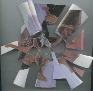
Collage: paper, thread, latex

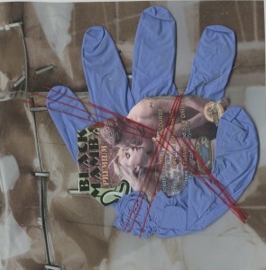
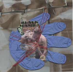
Black Mamba

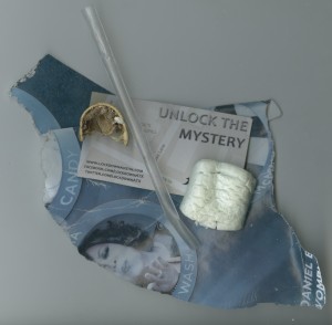
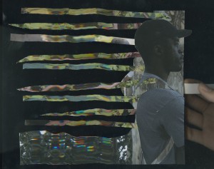
collage: paper, thread, latex, photos

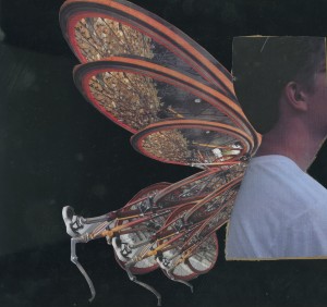
I found objects on South Congress for our visual studies collage project and stitched and glued them together in a way that I felt would communicate the icky feeling of human consumption and carnal desire.


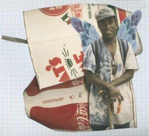
All Black Everywing

All Black Everywing

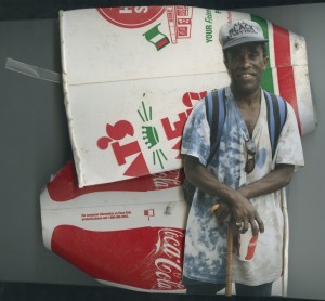
collage: paper cups, photos

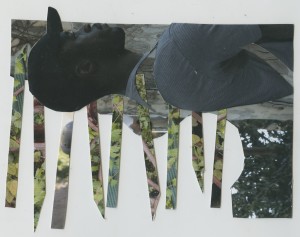
Another concept I was thinking about was how the things people consume can change their mood or even give them character. This man asked if I wanted to take his picture on S. Congress, and he sipped from his Coca-Cola cup cheerfully, so I felt placing him on that substrate really tied the color and visual elements together.

Chloe Curiel-VISU 1311: Project #2

 Harmony in Collage

scan 10

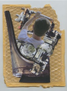
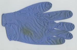
For there two collages, I focused more on using the found things and trash I picked up on South Congress. When making these image, I was thinking of human consumption and how what we take into ourselves often define who we are. I used the glove, thread, and found advertisement to show carnal consumption and give the image a kind of creepy gory movie feeling. I felt that these different materials really worked together despite their varying textures and connotations.

All-Black-Everywing-2-1gw5swz-300x273

Another concept I was thinking about was how the things people consume can change the mood of a person, or even give them character. The cup the man was holding matched the cups I found on South Congress, and the image of the cup really communicated consumption to me because the cup is a vessel for consuming things and can serve as a representation of intake. I was also thinking about how when people consume things, they gain power, energy, and ability to do extraordinary things. Using the cups as a substrate seemed to tie the image together through color and content.

SCANS

3 starting collages:

scan 9

scan 7

scan 1]

The rest of my scans:

scan 8

scan 10

scan 4

scan 3

scan 2

scan 6

scan 5

 SCREENSHOTS OF PROCESS

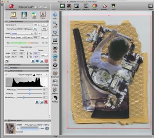
Scanning

Screen Shot 2015-11-03 at 18.07.34

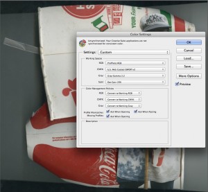
Color Settings

Color Settings


screen shot color setting


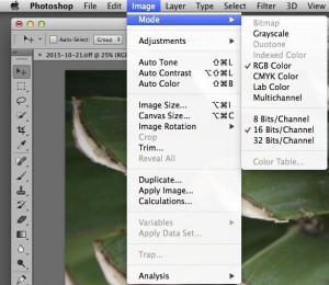
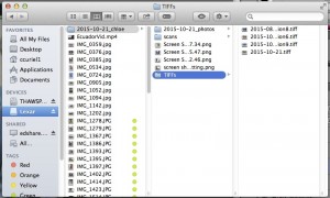
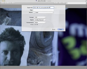
Exporting as TIFFS

Screen Shot 2015-11-03 at 20.46.23 

Exporting as TIFFs

Blog Post #9

Part 1:

The encouraging words Lynne Cravens had to say about study abroad reassured my desire to be immersed in another culture and gain experience. I also really liked how she said making work in your daily life is not an easy task, but a necessary one in order to find if you still have the drive to make work.

Miranda Petrosky’s presentation was really interesting because of the information she included about the design industry and how many niches there are for people to find. She really stressed that having various internships is what got her the position she has now, which encouraged me to continue seeking internships after the one I have now and keep building my skill level and value as an artist.

Dustin Meyer had a different approach to his practice. He was kind of humorous and sarcastic in explaining the wedding photography industry. Although it’s not something I want to do, his explanation of his failures and disappointments leading up to his success were inspiring to me because it shows that perseverance pays off. He also stressed that being prepared adds to your professional appeal and makes you a more marketable option in the sea of other creatives.


Part 2:

Double Toasted is a movie review and podcast hub. I’m really interested in film production and set design so I am hoping to find opportunities to surround myself with people who are knowledgable in those areas.

http://doubletoasted.com/faq/


Since I don’t have very much experience with actual film editing and producing, it might be a cool experience to work on something social media related that still includes the use of film. It would be cool to be involved in the creation of something to get experience with marketing as well as design thinking and problem solving.

http://www.internships.com/marketing/10Tales-next-gen-social-video-platform-College-Paid-Internships


It would be cool to get some hands on experience editing an actual film. Their requirements aren’t very specific so I’m not sure how equipped I would be to help, but I think it would be an interesting way to get involved with film production and be around film makers.

http://www.internships.com/film/Documentary-editing


Blog Post #8

Time is something so intangible that humans are constantly trying to find ways to represent and understand it. Martin Lam Nguyen, a Vietnamese artist who became part of the order of the Holy Cross at St. Edwards, had his on ideas for how to visually express moments in time. What better way to help humans understand time, than by using the human image itself? When I first walked down the long strip of Nguyen’s work, “Drawing/Painting TIME: (using portraits)”,  I merely passed by absorbed the most eye-catching pieces as quickly as I could, I found that each face seemed like a work of it’s own and that these paintings or drawings merely shared a common substrate. Then, after sitting down and taking more time to look at the two bodies of work, I began to see them each as one large repetitive image that contained a pattern made up of space and small faces.

In the first piece of the exhibit, there are a lot of warm tones and skin colors, as the paintings are small portraits of peoples’ faces, but there are some contrasting areas made up of soft black and white portraits. These areas are less dense and softer on the eye, but a little harder to focus on because they are largely overpowered by the colored faces that contain more contrast and detail within them. The space between faces in both pieces is distributed evenly which makes a certain rhythm for the eye to follow as it travels down the lines formed by the repetition of faces. There are also orange lines drawn between the faces in the white piece, and the edges of the paper in the graphite piece creates a kind of grid to contain each image in it’s own space.

Later, after examining the closer details of the painted piece, I noticed there were little dates painted by each image, telling the viewer what year the image was from. The highlights in the faces really drew my attention, as well as the grey scale faces that differ from the majority of colored ones. I found that these faces painted in black and white looked like old photographs, which I thought was interesting placed in the midst of all the fleshy copper tones surrounding them. One of the aspects that puzzled me about the painted piece is that the distance between the faces are the same throughout, but the sizes of the faces are not. This variation in size isn’t as noticeable when looking at glance, but when the eye seeks out specific details, it is a little off-putting that some of the faces are smaller than others. In addition to size, some images contain more detail than others, which makes more variance than is originally observed. These aspects cause the viewer to notice proportions between images and the different skin tones create emphasis and draw the eye across the piece in constant motion.

My original thought when I saw these pieces was that the theme had to do with identity. The expression on each face was slightly different from the one beside it, but just enough to notice some sort of change throughout the columns. After I realized that there were dates under each painted face, the meaning changed to more of a time-based idea that these faces represent individually and as whole. I thought maybe it was a historical exploration of some sort, in which each face represented a place in time, but in no particular order since the dates seem to have little to do with the order and placement of the images. I felt that Nguyen was trying to convey the idea that, in an image, people are not allowed to change because it was captured at a set time under unremovable conditions. I also got a feeling that each image, as they represent a unique identity, shows that time forms identity and reveals things to us about ourselves and others, moment by moment.

One of the visual elements that led me to this idea of identity is the circular form around the photos that sort of contains them, because it made be think of profile photos on a social media or online profile. Profile pictures are constantly being updated to display what the person looks like currently, in the present, which is a defining factor that helps others understand who they are. The black and white graphite faces scream identity more than anything else because every drawing is of a young vietnamese child. I felt that Nguyen was trying to express a sense of commonality between them, whether it be culture, appearance, or thought process, because they are all fairly young and express similar emotions. One thought I had was that, because the graphite piece is in black and white only, that it represented how limited the children connection is with the rest of the world due to their age and level of understanding about the society they live in. This contrasted greatly with the colorful and multi-racial paintings that seemed to represent diversity and networks between races and places.

As a whole, I think Nguyen communicated his ideas about time very well with images that serve as symbols for moments in the past. Human expressions and qualities can show how a particular moment felt and can communicate those feelings to others. By using the sort of floating icon of a face, Nguyen’s portraits created a timeline for the eye to follow and gain information from. as you stroll by and lets your attention be grabbed by the difference in scale, color, and use of detail. I think the works are both unique captivating because they contain many parts that make up a larger picture. I also found it very successful because of how simple the formatting is and how clear the subject matter becomes after the viewer takes a few seconds to assess the lines and forms that make the pieces cohesive and whole.

I took away from this artwork that it is not necessary to have just one focal point, and that putting smaller images together can form very interesting pieces of art that keep the viewer thinking and attentive to the content and subject matter. The use of color and variations of lighting added depth and time to the piece that made it less of a flat design, and more of a piece of art that speaks through the strategic use of placement, details, and human expression.


Blog Post #7

I really enjoyed the alumni’s encouraging words and inspirational presentations. It’s helpful to see artist’s working in the professional field, especially because they were students who went through the same department and took similar courses that aided them in becoming the successful members of society that they are now.

I think the person I related to the most was Rebekah Marino because she works for a non-profit, and her job description includes a lot of different tasks. As an artist inside and outside the university, I want to be multi-faceted and use all of the knowledge and skills I develop to aid me in any position I encounter. I really liked that she writes about art and current events and artists in the community because I think writing is an extremely important aspect of every profession and it helps explore ideas and encourages research and creativity. Overall, I felt that I have various skills that could make me useful in various work places, and I hope to develop those skills and use them in various creative avenues like Rebekah has done since her time at St. Ed’s.

I was surprised by the fact that Nick Swift’s whiskey business is what sprouted from his background as an art major. Although he oversees a lot of the aesthetic design aspects of the business, he is not the main producer of the visual materials within the company. However, I know several people that were art majors and ended up creating small businesses, which can most likely be attributed to the creative and entrepreneurial mindset necessary to be a successful working artist.

The amount of design experience Alex Roka has had in the short amount of time since his graduation from St. Edwards was a little surprising as well. This could have possibly been because he began by designing for a large company and had the chance to develop his style and own personal interests in design, which eventually led him to work for a smaller design firm and work closely with a team of designers. I was impressed by how many design commissions he had and I was interested in how he got his name and work out into the public for clients and companies to see.

Taylor Brownings presentation was specifically inspiring because of how involved she became in her community through her background in art. She encouraged us to study abroad which is something that I’ve been considering because I want to immersed in different perspectives. I liked how her work is about educating children and teens and cultivating the arts in the younger generations. Of course, she advised us to seek out internships and dive into the things we like because developing those things will lead us to unexpected but wonderful places.

The most valuable piece of advice from the four alumni that spoke I think was to take as many opportunities  to learn and work as possible because I will discover what I like to do and what I’m good at. The more experience gained, the more chances to collaborate with other more experienced creatives and network with people who have similar, or different exciting interests. As a student, discovering new things and co-existing with other artists in a  space can be really important and influence my preferences and future career decisions.


VISU 1311: Project #1 Reflection_Chloe Curiel

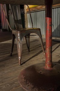
Based on the critique I received in class on the Gestalt project, I have a better understanding of what it means to “edit” the collection of photos I am presenting and choose a set that compliment each other but that also are effective when they stand alone. I noticed, after Joe pointed out the industrial rustic feel of the first three photos below, that the other three I chose in the first blog did not have the same warm weathered tones that the other three did. Because of this lack of connection between all six of my photos, my presentation and final product were not as effective as they could have been. I also got a better idea of the language I need to use in presenting my projects and that I need to be prepared to speak confidently about my work. Although it was hard being the first one to present, I learned how to think quickly and attempt to speak clearly so that I could communicate the thoughts being generated, while ignoring the jittery nervousness from put on the spot.

Below are three of my original photos that seemed most cohesive in the collection. The other two are images that I felt complimented and fit better with the first three in terms of content and color. The last two that I added were not edited because the last day of my trial was due today and I didn’t sign up in time to edit them, but I think their presence and content blends more nicely with the other three photos than the ones I had in my collection before.

Proximity, Closure
Proximity, Closure
Proximity, Closure
Proximity, Closure
Continuity, Repetition
Proximity, Closure, Continuity
Figure and Form, Continuity, Closure

One of the main insights I gained from the critiques was that I should be generating work that I like and am interested in, or my indifference will show when I present my final product. I found that going out and shooting things of interest and seeking out compositions and imagery resulted in the inherent use of many of the Gestalt principles without intentionally looking for examples of each one. Those principles of design are what make the image possible and real to the eye, and without them there is nothing but empty, dead space. Overall, the critique was very helpful and gave me a few different ways of thinking about class projects in the future.

Blog Post #6

My greatest strengths in Visual Studies I include: having a lot of experience and practice with collaging and cut paper, and my ability to follow instructions to use the software. I feel that my writing skills are strong in writing reflections about others’ work, and also in explaining my purpose in the various projects I have completed so far.
For greater success in this course, I need to: practice certain tasks within the Adobe software using the handouts we are given in class, and take notes during the demos so I can recall the most important aspects and of the class each day. Communicating more with my teachers might also be helpful and give me a clearer idea of how I should go about assignments.

My greatest strengths in Foundation Art & Design include: paying close attention to the crafting of each assignment, being concise and detailed in the way I fulfill the requirements while also being creative and putting my own personal taste and perception into my work.
For greater success in this course, I need to: pay more attention to why I make certain decisions in my work and be able to identify my purpose in completing projects in a certain way. This class is very process based, so I am being forced to think more deeply about my process and cohesion of the parts of my project and how they represent one unified concept. This is a cool way of learning, but it has been a little challenging.

My computer skills include: A basic understanding of Photoshop, Lightroom, Bridge, Camera Raw, and Premiere, the ability to import and export photos, printing in the labs, and using GarageBand and iMovie as tools for small music and film projects
I still need to learn: the layering features in Photoshop that allow me to collage digitally, and the features in PremierePro so that editing might be a little less frustrating in the future.

My greatest strengths as a researcher/writer include: being able to write over a broad spectrum of genres, ranging from creative writing to research papers. I am pretty strong at writing analytically in both visual and literary settings, and I am usually intuitive when it comes to finding information and looking for specific resources.
I need to work on these aspects of research and writing: Organization and cohesion of thoughts, and conducting research about art and processes that interest me, or that will be helpful to me in my studies.

I learn best & accomplish most when: My teachers and classmates are encouraging and holding each other accountable to constantly create. I accomplish more when I am submerged in a positive learning environment and also when I am pushed to be the best I can be through positive and negative criticism, and when I am urged to constantly make work that I am interested in and can learn from.

ACTION PLAN

I am struggling more with my Visual Studies class because I am being introduced to so many new concepts and resources that I am a bit overwhelmed. I think I can improve my performance in this class by:
1. Improving my time management skills
2. Getting on Photoshop and walking through the class demos to gain experience
3. Staying organized and writing my assignments down in my calendar so I don’t get overwhelmed and forget
4. Thinking about the process I go through to complete my assignments and how I can use it to gain knowledge and skill
5. Taking notes in class so that I am more attentive and remember the important things from the class periods
6. Utilizing teachers as resources and getting information about my interests and struggles
7. Taking advantage of the equipment and resources available for visual studies students
8. Talking and sharing with classmates and teachers about my interests and the things I want to learn more about pertaining to the things we learn in class
9. Getting more sleep so that I can be fully present and devote my attention to what we learn and discuss
10. Learning from criticism and improving based on the weak areas in my work

VISU 1311: Creativity Blog Post #8

Some of the most pressing themes Dan Phillips presented in his talk were breaking conventions and disregarding expectations. If there is a cliché, Phillips tells us not to follow it because that is when the design fails. I found this very insightful because it in every aspect of life, society seems to follow major man-made constructs that are just unnecessary. The action Phillips takes on this issue is using the thrown away “stuff” that has blemish by removing things from landfills and letting them function in a building. I took away from this aspect of his work that an object still has a function, and the idea that certain blemishes make it unusable should be done away with so that we are not constantly wasting resources and doing harm to our planet in the process.

Phillip’s talk also made me think about the cause of waste. For every single thing we perceive and understand, there is a pre-existing archive of information that helps us identify each one. Because we go through data banks to categorize things into functioning and non-functioning, the objects that we see as not fulfilling their intended purposes are done away with and replaced by something that fulfills our expectations for that particular thing or situation. We generally strive for continuity and closure in all things, but Phillip’s art form rattles the expected pattern by using the deemed useless products that are rejected by the conventional constructs popular culture has built.

I liked Phillip’s work because it features blemishes and functions organically without the need to fulfill any expectations. I have always been taught to use the materials I have to create purposeful work, so I connected with Phillip’s and his resourceful methods. He doesn’t seem to force his resources and materials to fit the perfect idea of a house because he believes that we shouldn’t be living life according to what we are expected to do. Personally, I feel the need to break out of the conventions and clichés that lie between my ideas and the results of my creative process. I was encouraged to make my own decisions in my work, and attempt to reconnect with the primal parts of myself that drive me to create.