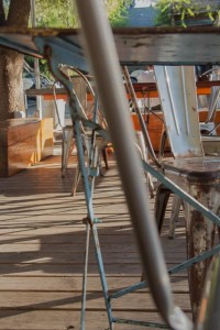
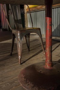
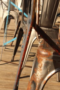
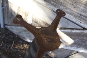
Based on the critique I received in class on the Gestalt project, I have a better understanding of what it means to “edit” the collection of photos I am presenting and choose a set that compliment each other but that also are effective when they stand alone. I noticed, after Joe pointed out the industrial rustic feel of the first three photos below, that the other three I chose in the first blog did not have the same warm weathered tones that the other three did. Because of this lack of connection between all six of my photos, my presentation and final product were not as effective as they could have been. I also got a better idea of the language I need to use in presenting my projects and that I need to be prepared to speak confidently about my work. Although it was hard being the first one to present, I learned how to think quickly and attempt to speak clearly so that I could communicate the thoughts being generated, while ignoring the jittery nervousness from put on the spot.
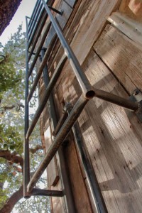
Below are three of my original photos that seemed most cohesive in the collection. The other two are images that I felt complimented and fit better with the first three in terms of content and color. The last two that I added were not edited because the last day of my trial was due today and I didn’t sign up in time to edit them, but I think their presence and content blends more nicely with the other three photos than the ones I had in my collection before.
One of the main insights I gained from the critiques was that I should be generating work that I like and am interested in, or my indifference will show when I present my final product. I found that going out and shooting things of interest and seeking out compositions and imagery resulted in the inherent use of many of the Gestalt principles without intentionally looking for examples of each one. Those principles of design are what make the image possible and real to the eye, and without them there is nothing but empty, dead space. Overall, the critique was very helpful and gave me a few different ways of thinking about class projects in the future.