VISU1311: Creativity Blog #2

I found the two articles interesting and was glad we read them together. High Concept, High Touch helped me appreciate and reflect more on What is Design? Originally, I did not like the What is Design article. I always understood design as a more production-based art and with the use/customer viewed as higher than meanings. To me, the article just reinstated that belief with the added background and history. I think I felt this way because I have discussed this topic in many classes before this one.

High Concept, High Touch made me think more while reading it, and included more new information. I never heard of the idea of the conceptual age before, and, frankly, am not sure how much of it I buy into, especially with the development of a creative class. I like the ideas presented, but they are hard for me to apply to the world. People my age have grown up with such an emphasis on STEM; it is hard to imagine anything being considered more important or valuable when it comes to careers. I can understand creativity when it is matched with STEM knowledge. For example, I interviewed a designed my freshman year, and he encouraged me to pursue digital art only if I supplemented it with web design. In this sense, the “creative class” is only useful business-wise if their creative skills are paired with a STEM specialty. I will admit that my view is influenced by the fact that I am constantly around engineers and people who study STEM.

 

20 Drawings in 20 Hours

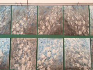
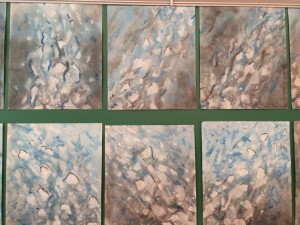
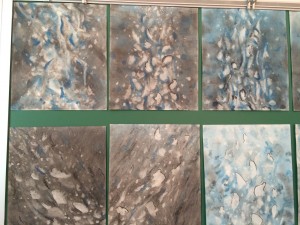
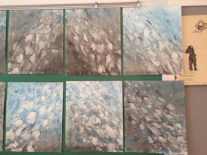
This project required making rules to create 20 drawings in 20 hours. These drawings are modeled after the bubbles/disturbances in water after someone falls in. Charcoal, one blue pastel, water, a paintbrush, an eraser and a blue bottle of nail polish were used for these drawings. The drawings all began by layering the pastel and charcoal and erasing into it in layers.

IMG_2984

IMG_2988 IMG_2987

IMG_2986 IMG_2985

Principles and Elements with Andrew Lueker, Brittany Fucik, and Daniela Reyes

Elements of Art and Principles of Design


Line Any literal or implied connection between two points

Shape Any enclosed space or outline of a form or object

Texture The use of linear shape to create the appearance of a feel to the subject

Value The lightness or darkness of a space to create a different tone

Color Hues, shades, and tones used to represent how the object reflects light

Plane Literal or implied space/surface

Volume Amount of space something takes up

Mass When something gives a sense of weight

Space Where the form occupies or lack of representation

Light Using brightness to allow objects and different perspectives to be seen

Time/Motion The ability to force the viewers eye to move across a piece

Unity/Variety Differences and similarity used to create visual effects

Balance Equality throughout a piece

Scale/Proportion Sizes and size relations

Rhythm Usually involves repitition to create a visual beat

Emphasis Draws attention to a certain point using other elements

Line Inventory: Final and Process


lineinventory1 line inventory 2

The first step of the process was to create a line inventory, which included 75 squares showcasing different kinds of lines made with the supplies. After in class critique, I redid the line inventory, making 75 new squares.

lampsketch phonesketch

Next, I did gesture and contour drawings of a lamp from two points of view.

In class, I did the same thing to a phone, but this time made sketches of four different views.

sculpture2 sculpture

Using my sketches as a reference, I made a wire sculpture. The sculpture is weighty at the bottom and has a vertical extension like both drawn objects. The phone wire and phone itself influenced the vertical extension, while the plastic bottom of the lamp influenced the geometric shapes hanging in the base.

Shadows from the sculpture were used to create lines on large paper. Then, those created shapes were filled in using lines from the earlier lines inventories to create the final, edited product:

final line inventory

Reading Response: WTF is Design & Art Anyways?

The product of an artist and designer are very similar. Good design and good art have similar visual qualities. George Nelson briefly touched on this idea in his chapter “Good Design: What is in for?” Although both create work using similar elements –  such as line, value, and rhythm – the purpose of the art and the method is different. As Norman Potter wrote, “the designer works… for other people” (29). Designers create with practical purpose and for others. Although creativity is involved in the process, the emphasis of their work is on public perception and the use of the final product. In contrast, the artist has more of a focus on expression and creativity for their end work. Art can involve a group effort, but in the end, art is still an expression of this group.

Just like Kees Dorst mentioned in the chapter “But, is it Art,” I agree that the line between art and design is slightly blurring. Design is becoming multifaceted and heavily relies on artistic expression. When I think about this transition, I think about architecture. Most architecture today would fall under the category of design, but the same architecture is studied as art in the accepted art history canon. I find this interesting, because it shows that there is a grey area between art and design.

Currently, I consider myself more of an artist. The work I produce is done out of expression and creativity. It is done for myself (even if it is part of a class assignment) and not for a larger goal. My work does not exactly have a practical use, but, rather, is focused on being well-made visual pieces that can generate responses from audiences.

Book reference: Design and Art; Edited by: Alex Coles

Class: Foundations of Art and Design