Blog Post #6

SKILLS INVENTORY

My greatest strengths in Rhetorics and Composition II would have to be my experience and willingness to continue to learn about writing.
For greater success in this course, I need to continue to learn from class discussions, reading assignments, and by communicating about my work with my professor.

Computer skills:

My computer skills include experience with Microsoft Office, internet exploration, and alight knowledge over Adobe Applications.
I still need to learn how to master Adobe applications to elevate my skills  as a young Graphic Designer.

Research & writing skills:

My greatest strengths as a researcher/writer include my past experience in past college-level rhetoric courses and knowing more or less about the elements that are composed for making an apt writing.
I need to work on these aspects of research and writing though more practice and learning from class.
I learn best & accomplish most when I collaborate with others and review books/notes pertaining for that particular class.
ACTION PLAN

Although I am not struggling in any classes, I would have to say my most intimidating class would have to be Visual Studies.

1.) Clarify directions for an assignment with my professor.

2.) Invest more time towards my work.

3.) Work on spacing time for project throughout the week instead of towards the ending of the week.

4.) Learn from peers and collaborate my ideas with theirs

5.) Research other artists and their work.

6.) Read instructions more clearly.

7.) Learn Mac commands and shortcuts.

8.) Self teach myself about applications.

9.) Review notes from past concepts.

10.)  Get familiar with technical terminology.

Photoshop Collage

img_0605 img_0606

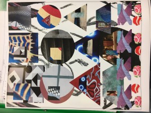
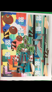
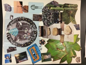
I was glad that I was finally able to get my hands on a project that had to do with Photoshop. Although I have had a little bit of experience prior to this course, I am no where near being close to an expert. Although I had a few moments of confusion and uncertainty, I feel that I will have a slightly clearer vision and some more quality practice with this application when dealing future projects. For one collage, I tried going for more of a chaotic and meshy approach, while the other collage is a bit more focused. These collages are not the best, but I feel that only time and effort will allow me to improve my skills.

Blog Post #5

img_0587img_0568

Part 1:
1.) The first picture is a collage on Photoshop composed of photo’s I took on South Congress for Tuan’s Visual Studies class. The second is the concept, except on a physical analog. The goal of these projects were to make a completely abstract and unrealistic collage from the pictures we took on South Congress from past class projects.

2.) I was more confused on the physical collage, which is why it is considerably less abstract than the Photoshop one. While working on the Photoshop collage in Trustee, Tuan was there to help guide me in terms of making it more illogical and abstract. I tried reaching this goal by making it nearly entirely abstract and unrealistic as possible through unusual geometric cuts.

Part2:
1.)The strongest aspect I felt towards my own work would have to be the color spectrum and paradoxical chaotic organization that is displayed in both pieces.

2.) The weakest aspect on the physical analog would have to be its lack of abstraction and focusing on instinctive logistics.

3.) Conceptually, it can be fixed by focusing my attention on making it more ambiguous or abstract instead of whether it is realistic or believable.

4.) Technically, I could have just simply cut into the pictures more so that way they are less evident as to what they are– leaving the viewer to see a more abstract piece of work.  For the digital collage, I could just use more practice and experience with this application to gain more knowledge on how to properly work it.

5.) Overall, I enjoyed working on the digital collage and I look forward to working with more of those application in the near distant future.

SoCo Collages

img_0566

img_0567

img_0568

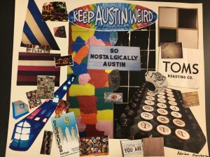
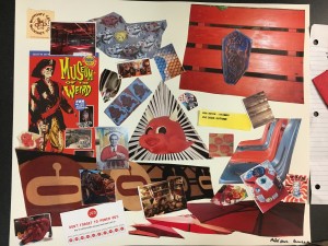
Personally, I enjoyed working on these collages and making them each have a certain focal point. In the first collage, the main color associated with most of the pictures would have to be red. Red is such a vivid color that is found on pretty much every corner of South Congress. The second collage’s theme deals with nature. The top part of the collage is blue which is a solid representation of the sky, while the bottom color is predominately green with elements of dirt such as stones. The final collage is in some ways scattered, but that is partially what I was going for. Both side show alliteration, but the right side is more subtle, black-and-white, organization while the left side is more whimsical and colorful. At the center, “So Nostalgically Austin” is the center piece; ultimately related both sides towards this amazing city.

Student Presenters/Future Website

Part A:
Faith: From all of the presenters, I knew Faith’s presentation would be the most appealing to me because of my familiarity with her. Not only is she a TA for the Visual Studies class but I also have another class which has given me an opportunity to see how her personality can light up the room. As for her presentation, she did a great job projecting her voice and experience through photography. Her photographs were some of the best photos I have ever seen by a student which really impressed me. Faith mentioned how she learned much of her knowledge from Bill, so I am extremely excited to learn as much as she did from him, Tuan, Hollis, and the other visual professors.

Mary: As a graphic design major, I was particularly excited to hear more about it through a student’s perspective. To be honest, recently I have been wishy-washy about whether this major is for me or not, but after her presentation, I certainly felt more comfortable about my major and I can’t wait to learn more about graphic design. Although her presentation was not as strong as Faith’s, her creativity spoke volumes to me and the overall organization of her website impressed me.

Art Education: I felt like this presenter and what she had to say did not really pertain to me, however, it was interesting to see what she went through to end up where she ultimately wanted to be. She spoke very fluently and she to know a lot about art.

Johnathan and Omar: Seeing these two incredibly enthusiastic people present something that fascinated them was truly enjoyable. I don’t know much about gaming, but this find seems so fun and down to earth. But what really stood out to me was when Jonathan stated how he ultimately wanted to work for Disney because that is the same exact goal that I have. Although Annotations isn’t required for my major, I definitely would like to take it because it would not only interest me but add further credentials to my resume when it is time for me to apply to Disney. These two really emphasized how great the art program here at St. Edwards was which was definitely something I needed to hear.

Part B:

Front Page


This website is very accessible for the user and is a great and organized website for many different types of artists.

https://www.behance.net
This is a website where artists are able to upload their portfolio in a very organized manner. This may be useful in my future.

https://www.myportfolio.com
This is a portfolio website distributed by Adobe which is an application that I am slowly but surely learning how to use through my visual studies classes. That being said, when gain familiarity with Adobe, this website might be very useful when its time to make a portfolio.

http://www.thisiscolossal.com
Like the first website I shared, this website is very a clean, composed, and very user friendly website that allows me to see other people’s expression through art.

VISU 1100 Blog Post #3

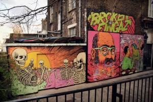
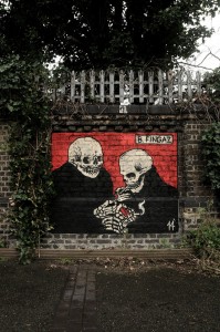
broken-fingaz39 broken-fingaz45 broken-fingaz25 broken-fingaz28Street artwork from Israelites that go by Tant, Deso, Kip and Unga, or better known as “The Broken Fingaz Crew”.

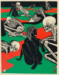
Some of the artwork that stood out to me came from a four person art crew located in Israel known as the “Broken Fingaz Crew”. As I researched some online articles about this group, I came across one fromhttp://www.israel21c.org/drawing-the-street-with-broken-fingaz/ , that says how Broken Fingaz drew inspiration from “American comic-book covers, old-schoolskateboard graphics and tattoos” which, for the most part, I personally find extremely interesting. Visually, a lot of their artwork deals with totally abstract and rather strange concepts, yet, highly intriguing. The same article states that a lot of their other inspiration comes from their surrounding environment, pop culture, drugs and sexuality which is a different approach to art which is a boundary some artists won’t dare to explore. Death and morbid metaphors are another element that is often portrayed in their street art, however, it isn’t necessarily in a gruesome way. In some aspects, that particular type of work is appealing and lively with their use of vivid color and attention to detail. As I mentioned earlier, the mixture of intensity and whimsicality is what initially drew me in from Broken Fingaz crew’s works and I personally have always been a fan of this style of drawing. Some of my own favorite drawing involve skulls or comic-book related characters, so learning and researching from these particular and successful artists that share common interests have allowed me to feel for expressive throughout upcoming projects. An entertaining video of the crew and their work can be found here https://www.youtube.com/watch?v=P0Tp3TRQbhw .

SoCo Gestalt

img_9141 img_9101 img_9144 img_9125 img_9148 img_9135

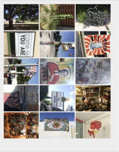
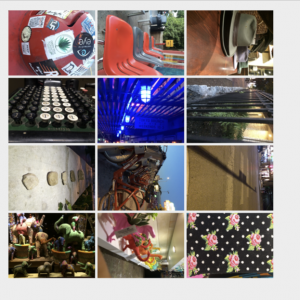
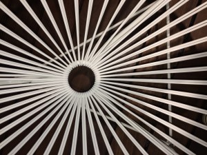
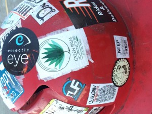
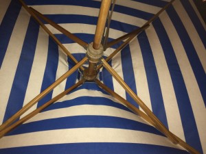
As I embarked on my third exploration to take my photos throughout South Congress, I went in with a clearer mind-frame as to how I would take each photo. I decided to continue the Law of Similarity because of how fun it was for me to capture objects with similar patterns or characteristics. The six pictures I preferred all deal with repetition along with also having a general focus towards the center of each of them. I realized that I wanted to continue working with this particular law because of how organized of a person I am in the sense that I like for things to always focus on following a clear and common structure.

SoCo Gestalt

img_9107 img_9108 img_9110 img_9112 img_9114

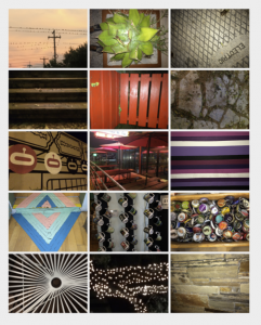
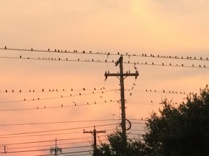
Because alliteration is my favorite rhetorical device I often use throughout my writings, I thought that it would be interesting to see how it would turn out photographically. I felt that the Law of Similarity was an interesting element that would be pretty cool to capture. Although I did not take as many pictures as I did last time, I felt that by keenly focusing on one specific element, my skills and photos drastically improved in quality.

Hello world!

Welcome to your brand new blog at St. Edwards University Sites.

To get started, simply log in, edit or delete this post and check out all the other options available to you.

For assistance, visit our comprehensive support site, check out our Edublogs User Guide guide or stop by The Edublogs Forums to chat with other edubloggers.

You can also subscribe to our brilliant free publication, The Edublogger, which is jammed with helpful tips, ideas and more.