VISU 1311: Blog Post #11

The sheer amount of ways that David Blaine tried and researched in order to hold his breath for 17 minutes was insane.  Obviously, at the beginning, he tried to get away with not doing it at all, but eventually the solution just became clear to him; he just needed to do it, not find ways around it.

I think that from there, his research on the subject of holding one’s breath did the most for him, not the fancy gigs that he wound up with along the way. He found out how to purge himself, and did so every morning; he found out that movement cut down big time on his oxygen supply; and he found out the different ways that made his goal of holding his breath significantly more difficult. Finding the first steps of slowing the heart rate and calming the whole body down really allowed him to move into the part of holding the breath that took willpower.

His sheer will to reach his goal, I think, also had a LOT to do with his success. The trials that he mentions beforehand – standing on top of a 100 foot pillar for 36 hours, freezing himself in a block of ice, being buried alive for a week – all had to do with his taking medical impossibilities as a personal challenge, and rising up to meet the obstacles. Obviously, this didn’t always work, according to his first failure to stay underwater, but he tried again, and pushed himself more and more not to fail. When he was being filmed on Oprah, he realized that there was “100% chance” that he would not be able to make it to 17  minutes, and that was at the 8 minute mark. But he stuck it out for another 9 and a half minutes, and he made it! If that’s not sheer willpower I don’t know what is.

Overall, I just really have to respect his ability to try and try and try, reforming his process and keeping with the basics, just to reach his goal. That kind of temerity is something that I’ll have to try for myself.

VISU 1311: Blog Post #9

Memento’s sequencing was really interesting, and incredibly interesting. You only see the convergence of the past and the present into a single moment at the very end. I’m not sure if the directors wanted the entire movie to make sense at the beginning, or at the end. They string the audience along with barely enough information to get by on the sequence of the time, because they’re learning over and over again, just like Leonard. However, by seeing the past, and going backwards from the future, gives the audience this confusing idea of how it all started without the benefit of knowing that they’re all connected. Maybe that disconnection was something that they wanted to emphasize, until the big reveal at the end, when we find out that, oh, it was all because of this one thing at the very beginning. There was no single part of the story that wasn’t important to how it ended, but by showing the end of the whole thing first, there was no way for the audience to be anything but controlled by the memory fragments.

This kind of goes along with the first impressions idea that I took away from the whole movie. People always make first impressions; it’s human nature, and it’s something that is significantly taken advantage of in this movie. For every single character, we get a first impression that, had the movie been sequenced in a way that we’re used to, would have been the very last impression that we ever got. Leonard in particular is a figure that we see changed through our first impressions. In the beginning, or the sequential end, he is only a victim of a crime that ruined his life. Natalie is a stranger who is helping him out of the goodness of her heart. Teddy is the guy who committed all of the crimes. But by the end, or the sequential beginning, Leonard becomes the, technically unwitting, killer/bad guy. Natalie becomes someone who is so anguished over the loss of her boyfriend that she uses Leonard for her own gain. Teddy becomes the person who happened to be the person that Leonard pointed his gun at because he needed someone to blame for his loss. I think if the entire story had been played out in the actual sequence of time that is typical, it wouldn’t have had nearly the same effect. In regular order, we would have simply seen a grief-stricken bunch of people committing multiple crimes together, ending the movie with a very mentally sick guy who is so focused on revenge that he doesn’t care who he kills. With this kind of sequencing, the audience is left completely in the dark, and only slowly begins to realize the real ugly truth that works behind everyone’s actions. At the very end, the audience gets to see that everything that happened, happened for a reason, and that it was all connected to this one point at the sequential beginning. The big idea was connection. And I think that point was so poignant because a guy with no short-term memory can’t make connections like that, but they all happened anyway. It almost seemed inevitable.

VISU1311 Project #2: Alex Clarke

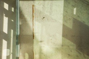
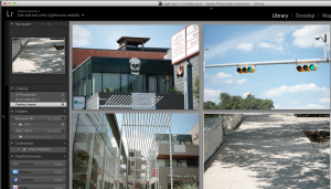
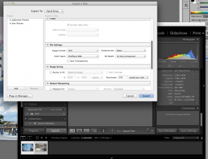
Since my Gestalt project focused around South Congress after the rain, my final two collages focused more on the theme of water, as well as the play on continuity and negative space creation. I “took” all of the images with their formal qualities in mind, as well as the perceptual qualities of water in the final two images. I liked interchanging between solid shape and abstract motion, much like you would see in ripples in a water puddle.

Screen Shot 2015-10-29 at 21.25.41

Trash scans

Screen Shot 2015-10-26 at 10.23.53

Screen Shot 2015-11-01 at 21.53.45

Screen Shot 2015-11-01 at 20.42.50

VISU 1311: Blog #8

I really enjoyed how Dan Philips started off with his project, by explaining his various houses, and what he’s done to make each one recycled and reused. I think that this was a brilliant segway into getting into his main idea: the sheer amount of waste in the building industry, that comes from this mindset in the global age of materialism where everything must be perfect. I loved hearing about the different things that he’s made, or what ideas he’s gotten, and by accessing his audience through this fascination that I personally felt, he is able to continue into the large problem area extremely easily. He makes it relatable for the audience.

He first explains that the housing market today is a commodity, because of the human perception of continuity. If one little thing in the house doesn’t align with that continuity, then it gets thrown out, and it’s no big deal; it doesn’t affect the buyer’s life at all. He also blames these two different mindsets for this waste: Dionysian and Apollonian. With the perfectionist Apollonian mindset, it creates “mountains of waste”, and this cycle of perfection where everyone wants these things that must look perfect or it’s garbage. Having a Dionysian mindset would create mountains less of waste, because it focuses more on the gut instinct that all of us have.

We also tend to create this wasteful cycle of perfection through our ideas of how we think other people expect us to live. This happens to everyone; we all in some way are bothered by how other people think of us, and so we try to live up to their imagined expectations. In reality, that’s impossible, but we still do it. I thought that this living up to expectations was a really interesting point in the cycle of waste. I’ve never thought of it as such before, but it makes perfect sense: if there’s something wrong with your house, you fix it so that your neighbors don’t talk about it. And that’s called waste. It’s a hard thing to move past, but if we want to fix our environment, we need to stop throwing away all of this material just because we can. The amount of consumerism that occurs globally only helps this cycle along, and so the only solution we really have at the moment is reusing all of that broken material. It’s there, what else are we going to use when it all runs out? We need to stop living up to each other’s expectations in order to preserve our global environment.

VISU 1311_Project 1 Reflection_Alex Clarke

There were a huge variety of different points that were made throughout everyone’s different pieces, and I thought that a lot of them were really good, and connected in some way to my own work, particularly since the presentation of it was nowhere near what I had hoped. Overall however, there were several that kept popping up in multiple presentations, and so I believe them to be the most pertinent to the reflection.

1) Editing the grouping of all of the photos. I admit it, I did not give myself enough time to fully edit all of my photos. I was not the only one who wasn’t so great at editing though. Looking at all of the images together is really important to make all of them cohesive. It can have a lot of different purposes, like all of the different versions that I saw in many presentations, such as emphasizing a certain group of photos. Two pictures may work together to make each other stronger, or maybe some of the photos cannot be viewed without being grouped together, because when alone they are just too visually boring. Honestly, I wasn’t entirely sure how some of the photos were able to work together, but I suppose that that would really depend a lot on the viewer’s own aesthetic, and how well the images speak to each other.

2) Explaining your purpose is important. It gives the photographer the benefit of the doubt, particularly if they are able to articulate the different functions of their photograph well. A lot of presenters had some difficulty in talking about their work, including myself. The idea was to explain how each of the photographers took the theories of Gestalt and applied them to their photographs, and it was hard to define just how and what principles were at play within each photograph, or what allowed one group of photos to work when compared to other pictures. If anything, we as a group really need to learn how to speak about a larger idea that all of our pictures are trying to convey.

3) Composition of the photographs is really important during editing. Some people simply were too close in their frame, and were unable to see the big picture of the assignment in every photograph. Because of this, many of their pictures were disconnected, or simply claustrophobic. In some cases, the composition just wasn’t clear enough in displaying one type of Gestalt principle, and would have needed many more examples to get the point across.

Overall, I think there were some pretty great photos from everybody. If I were to change my own post though…


VISU 1311 Project #1: Alex_Clarke

My project was based solely around the idea of South Congress after the rain. I really liked having the different surroundings that we are used to seeing, with the fresh lens of rain that was everywhere. Unfortunately, a lot of it dried up pretty quickly, but I still got some really cool images that brought a whole new meaning for me to the Gestalt that’s all around us.

Grouping:

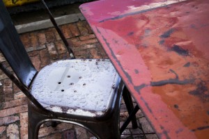
Since grouping looks at the overall composition and the different objects that are placed inside, I looked for images that had some similarities in the objects, but that obviously had some other variety that took the focus away from the repetition. The umbrellas and the picnic benches have this sort of ideal, with the Texan flag and the various shadows on the ground taking away from the main repetition. The rain-soaked chair and table were different because they formed based more on the unity/variety principle. These two objects aren’t really the same, but by grouping them together in the photograph, they can suddenly compare and contrast with each other’s characteristics.

_MG_9494.CR2 _MG_9476.CR2 _MG_9532.CR2


Containment:

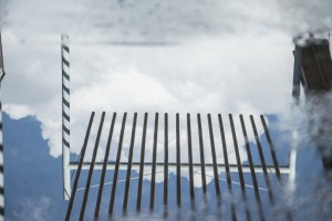
All of the images that I thought had containment had very defining negative and positive space created by various lines. The reflective surfaces from the recent rain, and the shadows made perfect examples of how a line can contain a space. The reflective puddle on the bottom left was my favorite, because it demonstrated how there didn’t need to be exact lines; the edges of the puddle contained the image of the sky within without having defining lines.

_MG_9535.CR2 _MG_9506.CR2 _MG_9505.CR2 _MG_9519.CR2 _MG_9522.CR2_MG_9508.CR2

Repetition:

Repetition, as can be guessed, is the occurrence of one object within an image, over and over again. This occurrence wasn’t a hard thing to find on South Congress, with all of the trees and sidewalks and multiple picnic bench spots. I tried to look at the repetition as either being the entirety of the photo, like with the tree-lined sidewalk and the stairs, or as relating more to proximity, which is elaborated on more below. All of the repetition that I found worked very easily towards a number of the other concepts as well, which I thought was interesting.

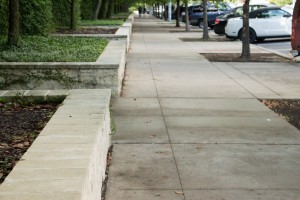
_MG_9520.CR2 _MG_9555.CR2 _MG_9540.CR2 _MG_9512.CR2

Proximity:

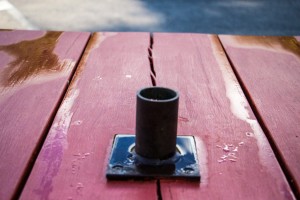
When I typically think of proximity, I tend to lean towards ‘perspective’. I added a couple of pictures with this idea in mind, primarily the umbrella stand in the red picnic table, and with the rusty chair at the bottom. In these photos, the nearness of the objects is in relation to the viewer, not the other objects in the composition. However, with the rest of the photos, I tried to look at the main object – the further most reaching leaf, the benches in the front, the parking stops, and the foremost umbrella – in relation to its surroundings, and how much bigger or smaller it appeared in comparison. Clearly, the closer something is to the viewer, the bigger it is within the composition, but in relation to the other objects, it may only appear slightly larger, or even the same size.
_MG_9516.CR2 _MG_9496.CR2 _MG_9532.CR2_MG_9520.CR2_MG_9512.CR2_MG_9494.CR2 _MG_9552.CR2

Continuity:

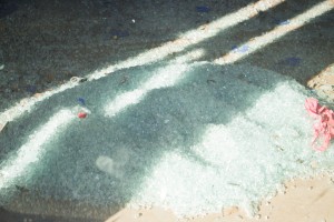
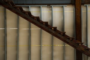
I thought that continuity was definitely one of the harder things to find, until I looked through my pictures and found all of these photos that in some way had a fluid connection between the objects within. The lines on the back of the wall behind the stairs, the sidewalk and tree planters, the shadows over the glass pile, the shadow over the green chair, the sidewalk reflections, the leaves, and the reflection of the stoplight on the rainy window were all examples of continuity. The variances within each photograph, such as the streaks on the rainy window, did not prevent the continuity of lines between each object. The reflections on rainy sidewalk were interesting, because the reflections collided to where they might almost disrupt each other’s continuities, but didn’t, and instead emphasized each other. This same idea happened with the leaves, and the lines that each of their edges made.
_MG_9540.CR2_MG_9555.CR2 _MG_9535.CR2 _MG_9534.CR2 _MG_9503.CR2 _MG_9491.CR2 _MG_9470

Closure:

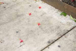
Closure was definitely an interesting principle to find. I definitely think that it goes hand-in-hand with continuity more than any other principle, and so I’ve made the appropriate inter-lap with some of these photos. The stoplight’s continuation is automatically completed in the mind, as is the shape of the flowers on the sidewalk, the shadow on the green chair, the various lines of the shadowed on the wall, and the ‘M’ on the ATM sign. These shapes are easily continued in the mind despite the various shapes, shadows, reflections, and placement off other objects that causes the closure.

_MG_9470_MG_9544.CR2_MG_9534.CR2_MG_9530.CR2_MG_9487.CR2


Conclusion:

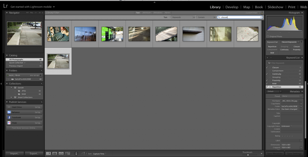
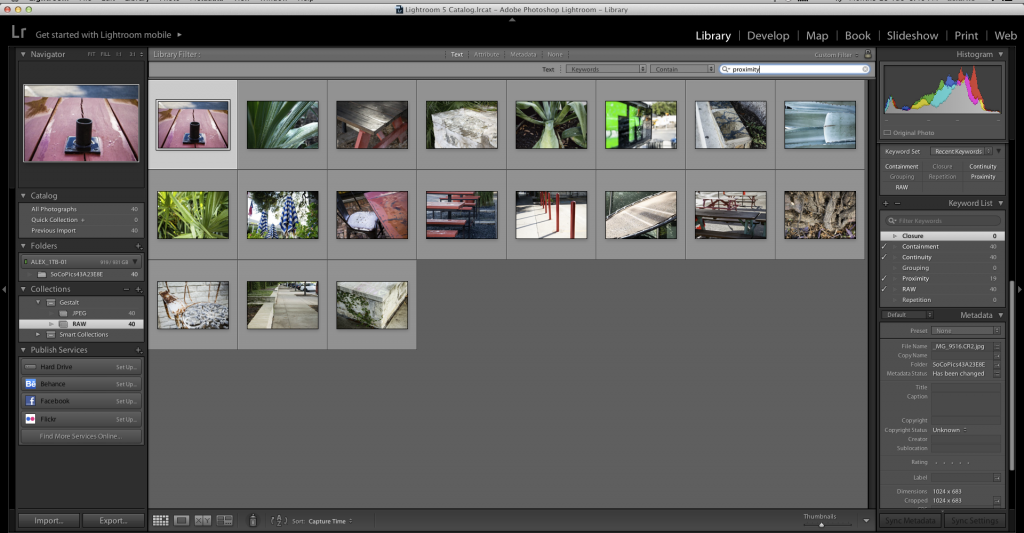
A lot of these pictures overlapped quite a bit. This was both interesting, and confusing for a while. However, as I came to look at all of these pictures through the ideals of Gestalt, I began to see that all of  the concepts within Gestalt are simply variations of each other in multiple ways, and that I would be hard-pressed to find one example of a Gestalt principle that didn’t in some way exemplify another principle. The keywords below show just how overlapping some of the principles ended up being.
Screen Shot 2015-09-29 at 20.46.28

Keyword: proximity

Screen Shot 2015-09-29 at 21.00.08

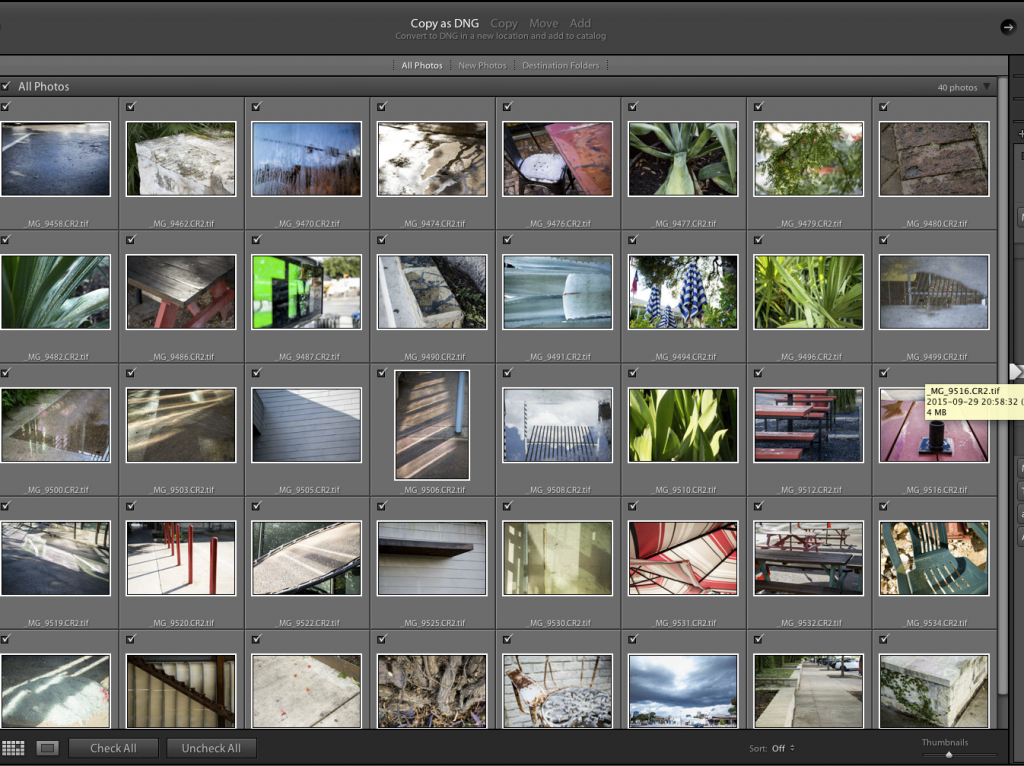
Tiff imports

Screen Shot 2015-09-29 at 20.53.33

Keyword: grouping

Screen Shot 2015-09-29 at 20.53.07

Keyword: closure

 

VISU 1311: Creativity Blog #7

To be completely honest, “The Medium is the Massage” was presented in a completely bizarre format that made it incredibly difficult to focus on and take seriously. The abstract pairing of pictures, words, and sound all together perhaps contributed the most to the confusion that McLuhan is trying to create, I suppose. He’s trying to distance himself from the idea of completing today’s jobs with the technology of ‘yesterday’. He wants to use the technology that he has – in a completely new way for us, but a completely normal way for him – to convey his ideas. It is certainly a step-back from the “linear, or sequential, thought” that the invention of text supposedly created.

In a way, the entire text serves as its own “massage”. The text itself is the environment that McLuhan believes we create ourselves, and he alters it in multiple ways the way that the media all the time. Much like the extension of our feet is cars, and clothes an extension of our skin, and electric circuitry an extension of the central nervous system, he extends his own ideas in multiple combined mediums that all affect our personal selves, through our extensions. The mix of images itself conveys a completely mixed message that overall become McLuhan’s major idea, but when put side by side with no context, make absolutely no sense. For example, the mixture of political cartoons, and surrealist photographs that are sprinkled commonly throughout the pages. And let’s not forget the repetitive patterns and backwards text. The only way these images can really be seen together in a cohesive structure is through the small packets of text that string these pictures along and make them somewhat coherent to the overall idea.
The idea of the environment-forming was definitely thought-provoking. The fact that electric communities have a far greater influence these days than our parents is definitely something that’s the case these days, and the school system is suffering for it. Not to mention actual familial relationships. All of this online interaction is creating what McLuhan calls “the global village”. Where literacy once separated us, technology brings us together, where nothing is private, and everything is a google search away. With this new environment, the idea of imposing old technology simply doesn’t communicate anymore. Humor itself is an example of the new methods of communication that we as a society prefer. The role that government and education also has some influence, where one instills certain values that citizens have to live up to, and the other is busy using outdated forms of communication for its students who are frustrated with the lack of reconciliation between old and new technologies, respectively. All of these factors combine to create an environment where many people struggle with this reconciliation, and the media is there to massage, or perhaps exacerbate, the effects.

Perhaps if we focused on using this new technology somehow to combine both old and new technologies to influence our personal environment so that we can “gain perspective” that was taught to us through the making of text. Since people no longer felt included in the conceptual discussion of the text, they were suddenly allowed to keep opinions to themselves, which felt itself in the divide that readers and writers still tend to have today. However, having a “global village” may certainly change that, and may challenge the users of technology today to gain perspective in other ways, or perhaps mingle into one single mindset, like a gigantic media-fed gelatinous mob.

VISU 1311: Creativity Blog #4/5/6

I really enjoyed what both Amy Tan shared about her creative process, and what Jim Eno relates about the musical process for the songs from the band ‘Spoon’. They both speak about experimenting with subjects that they aren’t entirely comfortable with, and with that experimentation comes a new sound, or a new twist in the plot of a story that wasn’t there before. They both describe creativity in relatively the same way: as incorporating already existing things in such a way that alters it into a completely new and original idea. In the case of Amy Tan, she explores the different ways in which creativity comes about, and Jim Eno provides us with his specific way of creating.
What struck me about both was how original Amy Tan and Eno viewed their own creations. Of course, they both admit to there being some sort of already existent basis; for Amy Tan, she talks about different settings in her books, and the coincidences that she encounters during her writing process. For Jim Eno, he refers to other bands who have a very distinct sound, that Eno simply used to approach his own work from a different angle. Both used these basises to create their own original work, and even though without these basises their work could have gone a completely different direction, they are able to, at least in some part, take ownership of their work. (While Tan did at one point mention that at the end of her stories the book was no longer her own, that in no way pointed to the idea that it wasn’t an original work. More likely the interpretation of the saying was that the story took on a life of its own through the coincidences that she encountered during her writing.)
The two articles also help me to reflect on how I myself create. Sometimes my creations are part of an experimentation that I decided to go with, but more often than not I find myself drawing much the same thing. Hopefully these talks will help me to expand my drawings a little bit more. I also have to keep in mind, like Jim Eno said, that I can come at my work through different angles that were already presented by someone else, in order to make it completely new both for my work and for theirs. Nothing is completely original; it is all just one alteration after another.

VISU 1311: Creativity Blog #3

Before I dive into Kenya Hara’s “What is Design?”, I feel the need to answer that question from my own perspective before recapping on theirs. Design, to me, is a way of putting images together to communicate a certain idea; it can contain many purposes, among them propaganda, persuasion, information, or simply the sharing of an emotion.This is not the passive capturing of a gorgeous landscape that is the exigence of photographers today, but the active planning and creation of images and text in order to shape them to the artist’s intention.
Hara, in some way, agrees with this hasty explanation. The design that is discussed in their book involves the reawakening of everyone’s mundane life and forcing everyone, not just the artist, to look at it from a fresh perspective. Remaining open to the variety of life around the world is key to making this type of design work for the artist.
To better understand design, Hara references the very beginnings of design, back from when the caveman first picked up sticks and used his hands to shape his environment, to the introduction of “industrial mechanism” (Hara 417) in manufactured goods evoking backlash from some of Europe’s finest artisans. The workers who put so much effort into protesting the mass production of goods in turn produced a huge amount of objects that could only be shaped with human hands, and in doing so produced the foundations for concept of modern design that society is familiar with today.
The one other movement that Hara believes also contributed to modern design is the Bauhaus movement, in 1930s Germany. This movement actually embraced the new industrialization of the economy, seeing chances in it that could help improve many of their ideas. Design, in this movement, was pulled along with industrialization to a point where design simply became a part of the economy, in order to fuel the huge wave of consumption. In some ways, it seems as if Hara believes that the concept of design cannot be separated from the concept of the world economy. The two have become too entangled together as the world became more connected, particularly in countries such as the United States and Japan, where marketing is a huge part of the economy.
Today, Hara intertwines the ideas of modern design with the incredible boom in information technology. Hara also introduces the idea that society is looking at design in a way that is actually harmful to its development: as a constant evolution that is perpetually shaming the designs of yesterday. Instead, Hara encourages the readers to view design, and the materials of the modern age, as something that can be conceived from the normalcy of our everyday lives, not as a concept that can only come from entirely new material. “The old accepts the new” (Hara 435), in other words, and can then form a myriad of new ideas from that combination, and so on and so on.
In light of this exploration into the history of design, I see that my perception of design at the beginning failed to include much of the depth that context can bring to design’s origins. Since I myself plan to become a designer, I should attempt to look at the everyday events in my life from a completely new perspective. Only then, I think, can I begin to view design the way that Hara sees it: through the eyes of history, and with the possibilities of the future at hand.

VISU 1311: Creativity Blog #2

In “High Concept, High Touch”, Pink examines the growth of third world societies from a farmer society from the current transition into a thinking and empathetic society, and features even more closely the value that today’s citizens have in this new age. Without the ability to provide novel ideas in an already knowledgeable society, people are not able to compete with the rest of society in “mere survival” (Pink 51).
The basis for his argument with socieety becoming more right brained happens to coincide with his three arguments for present-day evidence, and one in particular stood out to me: GM motor’s as a business in art. Evidence of this new approach from GM has been seen not only in this one car company, but in all car advertisements that can commonly be seen in normal everyday life. This singlee example by itself proves just how visually oriented the world is becoming today. Corporate businesses have begun to incorporate more disciplines into their work–primarily art, because it grabs their customers’ attention. Again, workers who aren’t able to produce products that are physically and emotionally appealling are left out in the rain, because they were taught knowledge, not empathy. The knowledge is now available to everyone, so what use is it to any one person unless they can create something entirely new out of it?
On the other side of the coin, those who are able to create must be able to continually do so. And this new “artsy” side of America cannot be explained in the traditional sense, which is what readers would tend to belive at first. Art, for many people of the right-brained persuasion, goes hand-in-hand with the idea of new creation. Those who understand this new creation can make it; those who make it must continue to make it.
So that brings us to how to teach our children this new kind of culture. A test-happy America is sadly outdated in its teaching techniques, which gear children’s minds in a direction more applicable to the past society of knowledge. Teaching creativity is now more vital in order to promise the next generation of children a happy future, but the system simply is not having it. Too much trial and error is required in order to create this new system, and the age of creativity is just around the corner. Unfortunately, this means that many people will simply be left behind, unless they learn to adapt to these new global conditions.
There are several examples of some trial in creative teaching. For example, Professor Robert Sternburg of New Haven, Pennsylvania is developing an augmentation for the current SAT, called the Rainbow Project. It measures the reactions to humor and real-life situations, which are better able to determine how well a student will do in college, when compared to SAT results. It may also open up new roads to people who’s creativity and empathy were not measured in the SAT, and who have had many roads to success closed to them. This new test could potentially decrease both the wealth and racial gaps that many people feel today.
Overall however, the real question with the coming of this new Conceptual Age is: what exactly are we supposed to do to prepare ourselves for this society of empaths and creators? Pink focuses on the answer to that question in the rest of his book; being unable to read this book currently, I am forced to create my own answer. Creating alternatives for our current schooling system seems the most immediate answer. It does not solve every problem however, and perhaps the creation of a new system that is completely untested would result in more problems. Other solutions may include granting further liberal education for those who were not able before, due to various circumstances. Whatever the future solutions may be, the result is that our future society will be much more focused on right-brain thinking, a movement that may change the way that the word itself thinks.