There were a huge variety of different points that were made throughout everyone’s different pieces, and I thought that a lot of them were really good, and connected in some way to my own work, particularly since the presentation of it was nowhere near what I had hoped. Overall however, there were several that kept popping up in multiple presentations, and so I believe them to be the most pertinent to the reflection.
1) Editing the grouping of all of the photos. I admit it, I did not give myself enough time to fully edit all of my photos. I was not the only one who wasn’t so great at editing though. Looking at all of the images together is really important to make all of them cohesive. It can have a lot of different purposes, like all of the different versions that I saw in many presentations, such as emphasizing a certain group of photos. Two pictures may work together to make each other stronger, or maybe some of the photos cannot be viewed without being grouped together, because when alone they are just too visually boring. Honestly, I wasn’t entirely sure how some of the photos were able to work together, but I suppose that that would really depend a lot on the viewer’s own aesthetic, and how well the images speak to each other.
2) Explaining your purpose is important. It gives the photographer the benefit of the doubt, particularly if they are able to articulate the different functions of their photograph well. A lot of presenters had some difficulty in talking about their work, including myself. The idea was to explain how each of the photographers took the theories of Gestalt and applied them to their photographs, and it was hard to define just how and what principles were at play within each photograph, or what allowed one group of photos to work when compared to other pictures. If anything, we as a group really need to learn how to speak about a larger idea that all of our pictures are trying to convey.
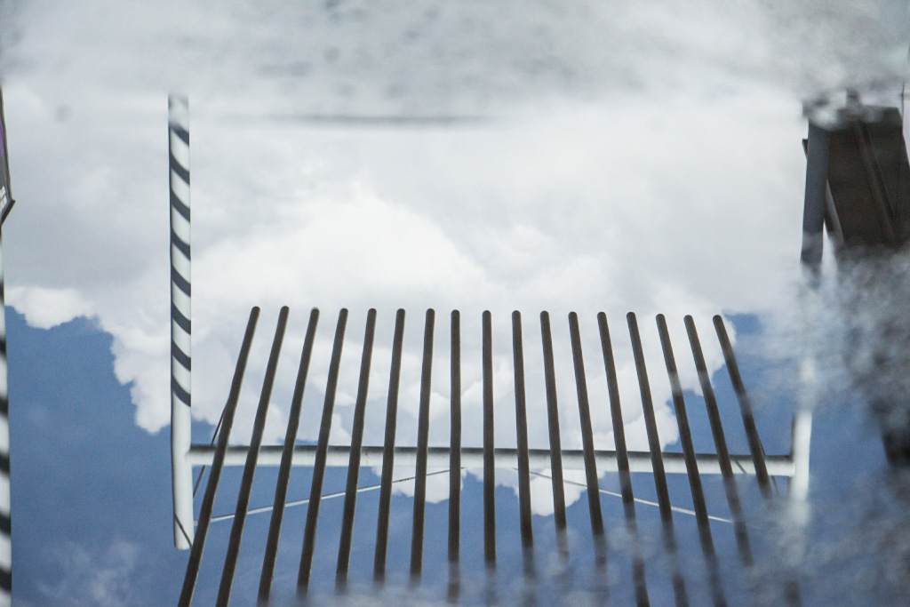
3) Composition of the photographs is really important during editing. Some people simply were too close in their frame, and were unable to see the big picture of the assignment in every photograph. Because of this, many of their pictures were disconnected, or simply claustrophobic. In some cases, the composition just wasn’t clear enough in displaying one type of Gestalt principle, and would have needed many more examples to get the point across.
Overall, I think there were some pretty great photos from everybody. If I were to change my own post though…