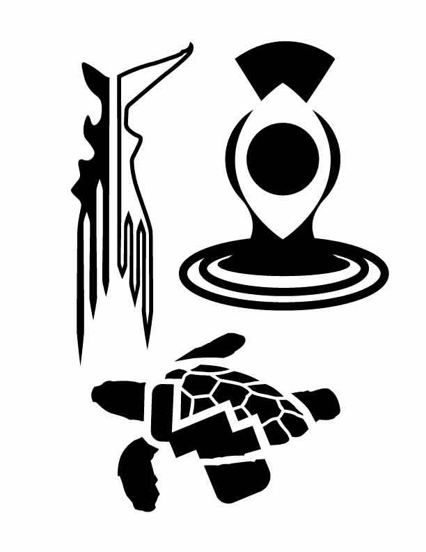
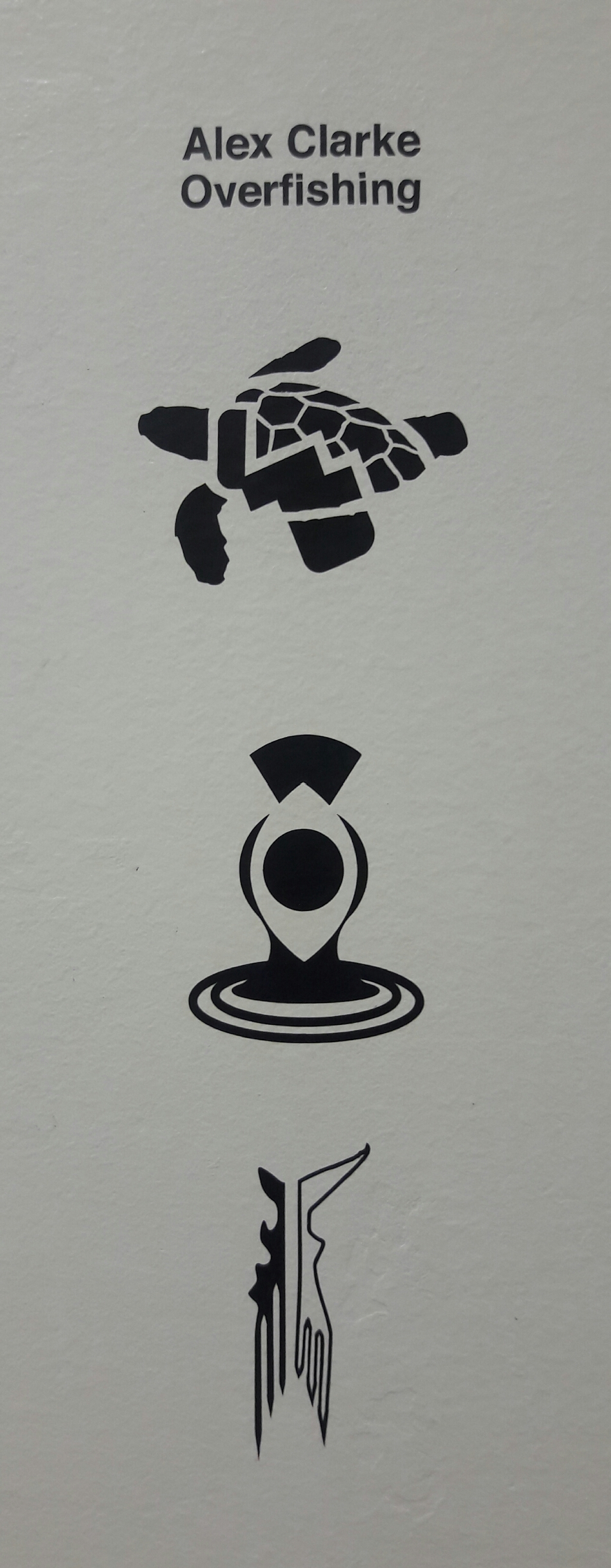
- Seeing as the symbol project required 9 different base factors, I spent a lot of time at first just coming up with the photos and drawings that I needed to trace, not to mention the actual tracing part on the computer, where I had to put in a little extra time to make sure there were no kinks that could lead to problems later. After that, I spent a really long time coming up with combinations, especially with the idea of integration between symbols in mind. I think here is definitely where I spent the most time, and perhaps it wasn’t enough to truly integrate a lot of my ideas, but I definitely got more comfortable cutting apart my symbols during this time. Unfortunately I can’t boast constant work put into my symbols, as might be pointed out when I forgot to fill in my photo tracings, but I put a pretty significant amount of time into my integrated symbols and their iterations.
- Sophistication of my work came the easiest, especially since I’m usually pretty nit-picky, with my work more so than anyone else’s. I spent a lot of time smoothing out the connecting areas, especially in the shark’s tail and its varying degrees of thickness due to ‘unite’ defaults. The turtle’s shell also took a lot of time to get right, and I had to put in a lot of work just uniting and ungrouping, and then tweaking, and then uniting, and then inversing again and again to get the end result. In the end there was a lot of work making sure that all of my symbols fit into one cohesive whole, which was pretty difficult with my widespread/bycatch symbol, since it was made up of so much false negative space and separate ovals. All of the time really contributed to the solidity of my symbols, the balance, the simplicity, and the technical work that was the criteria for the project, and so I feel as if I got pretty sophisticated results.
- A lot of the feedback that I got from other students was pretty spot on: a lot of them suggested that I thicken or thin up lines, especially in my shark’s tail and in my turtle’s shell. I think the biggest contribution I got from everyone though was how much they really liked my combination of ‘widespread’ and ‘bycatch’ symbols (the alien head). If multiple people hadn’t pointed out how weird it looked and how much they liked it, I probably would have dismissed it. I’m really glad I took everyone’s advice though, because it really helped me focus on how I could make that symbol in particular a lot better.
- The biggest challenge I think I faced was trying to integrate two symbols into one seamless whole. My default reaction is definitely a lot more like the “default design” that anyone can do with a couple of clicks in Illustrator. So when it was pointed out to me that a lot of my symbols were just two things put next to each other, it was challenging to think of them in any other way. I’m not entirely sure how well I was able to resolve a lot of it, so while the challenge level was intense, I feel as if I wasn’t able to fully rise up to it, partly due to lack of continuous work, and partly because of lack of time.
- I’m not entirely sure what other expert experiences is supposed to mean, so I just interpreted it as the amount of playing around and experimenting within Illustrator to get different results with my symbols. I would probably classify my expert experiences as somewhere in the middle range, since I did a lot of playing around with pathfinder and ‘divide below’, as well as with shape-maker and the pen tool. So while I feel as if I have a pretty good grasp of those tools now, I admittedly might not have gone as far as I could have with a bunch of other tools, and so my other ‘expert experiences’ were limited.
- I would like to think that this project, in addition to all of the others that I’ve had throughout my freshman year, has contributed to a more mature social emotional development by forcing me to stop thinking of all of my work as precious. It also helped to remind myself that any comments made against the direction I wanted to go with a symbol was not a commentary against me as a person, and was only directed at my work as a suggestion. I think having a more mature outlook on critiques helped me to take more people’s advice and suggestions and apply them more efficiently to my work to help better it. I also just had to be more mature in order to fit in the time to work on this project, which took a lot of discipline to get it done along with all of the hours it took to work on my other big class, printmaking.
- I would like to argue that I contributed to a fairly warm classroom climate. Have I been a little grumpy at times during class? Yes. But I generally hate to just tear people down, so I really worked at consciously looking at people’s designs and ideas in ways to make them better, with the direction of their personal projects in mind. I think that I definitely responded best to the people who were really enthusiastic about their work though, and so it was really hard to help those people who clearly were just inventing up topics to get through the project. But overall, I think I gave fair feedback, and wasn’t a person that drags the whole climate down.
Author: aclarke
Symbol Methodology
This symbol project was one that I really enjoyed; I had to create a series of three different symbols around a certain theme, which for me was overfishing. The first step in the process involved tracing three different photographs of easily recognizable objects: a shark, a turtle, and a shrimp. The second step was coming up with drawing and tracing shapes for three different concepts, which for me were “illegal”, “bycatch”, and “fishing methods”. Finally, we had to abstract three other concepts and create random symbols from them, which ended up being “domino effect”, “endangered”, and “overfishing”. From those nine different symbols, I had a possibility of 81 different combinations, and ended up with the final three below. These three symbols contain some recognizable elements, but have a new meaning when combined together with other shapes.
Stop Motion Animation
Not only was this project supposed to act as an introduction into Adobe After Effects, it was also meant as an exercise in construction over time. I had to create an object in my animation, and then create motion with it; that meant that the object might change throughout the animation, or something might happen to it. I decided to construct this 2D tesseract gradually through the explorations of a little stick man, and then reveal the entire shape at the end. By creating my object through hand drawings, I wanted to give the animation a story-like feel, and to be something fun to watch.
Design Elements Sequence
This project introduced me to the six principal elements of design: shape, space, size, line, texture, and value. This project had me take six different pictures, each of them with one of the elements of design as the most prominent characteristic. I then had to sequence my photographs in a way that connected them through the elements of design. In order from top to bottom, my photos are sequenced in order of line, size, shape, texture, space, and value; they in turn are linked by space, shape, texture, line, and value, from top to bottom. There were a lot of different photos taken in the process of making this sequence, because the photos had to clearly demonstrate one element, while also connecting to others in some way. This connection really made me think about the composition of my photos in a new way, and so I had to decide to retake a lot of my photos to get the elements just right.

Line
Connects through space

Size
Connects through shape

Shape
Connects through texture

Texture
Connects through line

Space
Connects through value

Value
Wikipedia Reader
This was the first project in which I had to format a large amount of text that included pictures and captions, as well as sub-sections within the text. We also had to display a lot of extra information, including the page number, the title of the Wikipedia article that we chose to reformat, the url of the article, and our names. I chose a font that could be read easily in both large and small sizes, as happened in the footnotes included on every page. I also decided to have a lot of the extra information formatted sideways, which made the layout of the text more interesting and conserved a lot of space. I think that if I were to redo this project though, I would formatted my grid with more space for that extra information, leaving the text more room to breathe visually.


VISU 1100: Blog Post #12
Kim Garza was the graphic designer who showed us how her app “Eventurist” evolved from its beginning to its end, as a result of user stories and research that she and her team did to figure out what clients would be looking for in a travel app. She was also working on a personal project called “Till the Clouds Roll By”, and I thought it was really interesting because she decided to make a whole bunch of new footage, and music to go along with this scene in a musical. I’m not sure if the song itself had any emotional value for her, but the whole idea was really cool.
Tammie Rubin(?) worked with the idea of the chimera, a “thing that is hoped or wished for but is, in fact, illusionary”. She began taking all of these objects and turning them into these mystical pieces of ceramic artwork that keeps the viewer wondering about what the object is, since it is made up of recognizable objects, but is not recognizable as a whole. I really liked this idea of putting objects together to give each of the pieces more power than was their previous function, and it kind of makes me want to pursue ceramics, just to see what I could do with it.
Shuren(? I’m not sure what his name was) took a whole bunch of images that all focused on the idea of coincidental accidents. He doesn’t take his time to frame a shot or to put everything up just right; he looks for the random happenstances of everyday life because those single moments are what demonstrate how people choose to live, what they put up with, and how they deal with life. All in all it channels the subconscious humanity in the viewer. I really liked his comparison of his photography to ‘spandrels’ in architecture: something that is always there, but is overlooked because of the ornate arches and domes that the spandrels support as a background figure.
I really liked this course! It gave me a lot of opportunities to look at my own work, get advice from previous graduates in the same field, look at what my teachers are doing, and think about what it is that I want to go into after I graduate. I also really appreciated all of the chances that the alumni gave for students to contact them if they were interested in an internship.
VISU 1311: Blog Post #11
The sheer amount of ways that David Blaine tried and researched in order to hold his breath for 17 minutes was insane. Obviously, at the beginning, he tried to get away with not doing it at all, but eventually the solution just became clear to him; he just needed to do it, not find ways around it.
I think that from there, his research on the subject of holding one’s breath did the most for him, not the fancy gigs that he wound up with along the way. He found out how to purge himself, and did so every morning; he found out that movement cut down big time on his oxygen supply; and he found out the different ways that made his goal of holding his breath significantly more difficult. Finding the first steps of slowing the heart rate and calming the whole body down really allowed him to move into the part of holding the breath that took willpower.
His sheer will to reach his goal, I think, also had a LOT to do with his success. The trials that he mentions beforehand – standing on top of a 100 foot pillar for 36 hours, freezing himself in a block of ice, being buried alive for a week – all had to do with his taking medical impossibilities as a personal challenge, and rising up to meet the obstacles. Obviously, this didn’t always work, according to his first failure to stay underwater, but he tried again, and pushed himself more and more not to fail. When he was being filmed on Oprah, he realized that there was “100% chance” that he would not be able to make it to 17 minutes, and that was at the 8 minute mark. But he stuck it out for another 9 and a half minutes, and he made it! If that’s not sheer willpower I don’t know what is.
Overall, I just really have to respect his ability to try and try and try, reforming his process and keeping with the basics, just to reach his goal. That kind of temerity is something that I’ll have to try for myself.
VISU 1100: Blog Post #11
Tuan’s work was focused primarily on the practical side of design, and tried to rethink things that are typically taken for granted. I think my favorite example of his work was the moving boxes, where he remade them in order to be used again, instead of thrown away or tossed to the side.
Hollis has a lot of works that tend to focus more on memory, particularly her own biography that describes her childhood. She also creates images of natural disasters and waste, pointing out the huge problem that is American consumption, and its consequent mass production of waste. These natural disaster and waste works also result from memory, of the places and things that have been destroyed by the fury of nature. Her sculptures also embody this idea, and emphasize some of the paintings and drawings that she did beforehand.
Bill’s photography went through a lot of phases, and the experimentation with his photography eventually led him to the abstract side of it. His Photoshop works were particularly interesting to me, because they took the entire image and pretty much just summarized it using two or three primary colors. I really liked his transition from “narrative” photography to “lyrical” photography over the years.
Five Year Plan:
The next 3 years will go along the lines of the suggested plans that St. Edward’s offers for graphic design, because the structure of the whole plan is pretty inescapable. However, I’ve got a lot of elective credits, so I’m going to try and take as many other courses in a whole bunch of other majors too. Primarily digital media management and interactive game studies, and maybe a little marketing, because I want to learn all about those. The next 2 years after graduation really depend on whether or not I’m offered a job within the first year; if not, then I’ll either continue my education at ACC, studying engineering or architecture, or go up to Washington to major in Digital Art and Animation. Or maybe I’ll do both! I really just want to continue learning for as long as I can, but the big issue is money.
VISU 1100: Blog Post #8
Instances in life often seem random, out of focus, and confusing. However, all of these small, seemingly unrelated parts work to develop into everyday life, a phenomenon that Martin Lam Nguyen is fully aware of, and takes advantage of in his work. Originally from Vietnam, immigrated in 1979, Nguyen paints incredibly detailed and tiny portraits of numerous people, and connects them all via lines that run through the portraits. In this particular work, all of the portraits are lined up on one wall, half depicting a huge number of different faces, and the other depicting one little girl 365 different times. The half with the little girl are all done in graphite, with no color, and are done with incredible detail to shading and lighting. The other half, with completely random and different faces, are done with different mediums; many are done in light watercolor, and vary from many different ages and genders. However, a few are done in black and white, and stand out among all of the other colors. All of these faces include hair, but not the rest of the body. There is a lot of negative space between all of the portraits, but that seems to make all of the faces pop just a little bit more, and gives them a distinct feeling, despite all being up on the wall together.
The thing that catches the eye the most, I think, is the amount of portraits that are actually up on the wall. The repetition of the faces, all within precise and equal lines, creates both a pattern with the faces of the different people, and of the faces of the little girl from the whole year of her life. Obviously the pictures of the little girl are sequenced according to specific days, but the portraits of all of the random people aren’t sequenced at all it seems. The various, and few, black and white faces that are a part of the second sculpture don’t seem to have any rhythm or pattern either, which probably contributes to the whole idea of life’s random and seemingly unconnected moments.
I think that Nguyen is trying to convey the idea that all of the moments in life are connected, if only by a single thing: the fact that one person is experiencing these moments in their lifetime. In particular, the portraits of all of these random people seemingly have no relation to each other, and are spread amongst each other randomly. However, they are all connected by the lines along the wall, and by the fact that Nguyen at some point took their picture and recreated their portrait for his sculpture. Perhaps some of them met during the duration of his project, and found that they connected in more ways than that. I personally get this feeling of nostalgia from both pieces. I think about how all of the people in these portraits will have changed in some way by now, and how these portraits only capture one moment within their small universe that they’ll never get back. Maybe they don’t want to get it back. Who knows? I think Nguyen might feel that same nostalgia, because he left his homeland so early in his lifetime. He’ll never get back to that same Vietnam, but perhaps in the portraits, he has found a way that he can capture that one moment in time. It personally reminds me of this part in one of my favorite books. One of the characters is an artist who believes that she should never try to paint or draw the people who are the closest to her, because she believes that it wouldn’t capture them perfectly. She was aware of the fact that the picture can only capture so much and that people constantly change, and she didn’t want to figuratively imprison the people she loved by the portrayal in a painting. Nguyen just has the opposite philosophy. I also think that the black and white portraits are important, since they were taken from the very last photographs of that now deceased person. It makes people think about how these dead people are connected to us, even when we can’t talk to them. We’re all related via the technology that took the pictures of these people.
I think that the whole piece is very effective in showing the connected fragments that make up all of our lives. I also think that Nguyen succeeds in making the viewer think about how they’re connected to all of the portraits, even if they may never speak with each other. It’s certainly unique in its setup, although I have seen plenty of skilled portraiters out in the world. I certainly don’t think I could have drawn these portraits as skillfully as Nguyen. I think I’ve learned a little more about how Nguyen tries to relate to his viewers, and it’s something that I’ll try to think about when reviewing my own artwork.
VISU 1311: Blog Post #9
Memento’s sequencing was really interesting, and incredibly interesting. You only see the convergence of the past and the present into a single moment at the very end. I’m not sure if the directors wanted the entire movie to make sense at the beginning, or at the end. They string the audience along with barely enough information to get by on the sequence of the time, because they’re learning over and over again, just like Leonard. However, by seeing the past, and going backwards from the future, gives the audience this confusing idea of how it all started without the benefit of knowing that they’re all connected. Maybe that disconnection was something that they wanted to emphasize, until the big reveal at the end, when we find out that, oh, it was all because of this one thing at the very beginning. There was no single part of the story that wasn’t important to how it ended, but by showing the end of the whole thing first, there was no way for the audience to be anything but controlled by the memory fragments.
This kind of goes along with the first impressions idea that I took away from the whole movie. People always make first impressions; it’s human nature, and it’s something that is significantly taken advantage of in this movie. For every single character, we get a first impression that, had the movie been sequenced in a way that we’re used to, would have been the very last impression that we ever got. Leonard in particular is a figure that we see changed through our first impressions. In the beginning, or the sequential end, he is only a victim of a crime that ruined his life. Natalie is a stranger who is helping him out of the goodness of her heart. Teddy is the guy who committed all of the crimes. But by the end, or the sequential beginning, Leonard becomes the, technically unwitting, killer/bad guy. Natalie becomes someone who is so anguished over the loss of her boyfriend that she uses Leonard for her own gain. Teddy becomes the person who happened to be the person that Leonard pointed his gun at because he needed someone to blame for his loss. I think if the entire story had been played out in the actual sequence of time that is typical, it wouldn’t have had nearly the same effect. In regular order, we would have simply seen a grief-stricken bunch of people committing multiple crimes together, ending the movie with a very mentally sick guy who is so focused on revenge that he doesn’t care who he kills. With this kind of sequencing, the audience is left completely in the dark, and only slowly begins to realize the real ugly truth that works behind everyone’s actions. At the very end, the audience gets to see that everything that happened, happened for a reason, and that it was all connected to this one point at the sequential beginning. The big idea was connection. And I think that point was so poignant because a guy with no short-term memory can’t make connections like that, but they all happened anyway. It almost seemed inevitable.