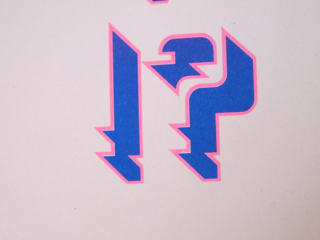
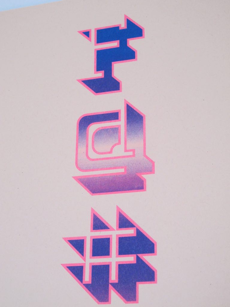
After creating our fonts, we had to showcase them the way that all typographers must display their fonts: through type specimens. This project called for posters, and the process involved creating thirty different posters that showcased four categories: the entire type set including the alphabet and extra glyphs made, single letters or numbers, a set of letters and numbers, and then a phrase. All of these posters were then narrowed down to four posters that were worked on further, and paired with a paper choice for the risograph printer. This was my first experience working with color combinations and digital coloring on physical paper, and so several of my posters didn’t turn out quite the way I imagined on paper. This was such a bold typeface that I wanted the physical colors to reflect that, and while on screen that may have been achieved, it was a different story on paper.


