Mid Term Assessments

Change within yourself via expert hours?

There has been a massive change within me personally this semester. I’ve noticed that all of my free time is spent messing around on Photoshop, browsing design boards on Pinterest, and making ink drawings. It’s become a slight addiction. I’ve become so much more confident in my knowledge of programs and design principles–what makes “good” art has become clearer and easier for me to understand (and thus produce). As a result of this art addiction, my homework has felt less like work and more like fun. (Leading to me stressing whether or not that means I’m really “working”…but that’s a crisis for another time.) Working with design programs was something completely foreign to me until taking this class. Up until this point, I could see myself only in the “art world” in the strictest sense of the world — being a museum consultant, art historian, dealer, gallery director, etc. But after learning how addicting design is (not to mention how satisfying when a project really seems to “work”) it’s opened up my eyes to what other creative possibilities are out there. I’ve decided to pick up graphic design as a minor.

How I used practice time… I feel like I best fit under “I achieved my practice times very easily. 8 pts”

My largest regret thus far with this class is that I cannot seem to find more time in my week to rework assignments fully. Between my 5 other classes, internship, out-patient therapy, and 3 brand new kittens that my roommate decided to surprise me with (did I mention they have to be fed every 3 hours? Even during the night?) I felt as though I only had about 3-4 hours per week that I could dedicate to this class outside of the classroom. To make up for this, I ensured that I attended every class and actively listened to demo instructions and critiques to absorb as much information as I could in the time that I had. And despite these time constraints, I made sure to submit all assignments in a timely manner and to print out my assignments on good matte paper rather than “cheaping out” on copy paper to save time.

How I dealt with feedback… I feel like I best fit under “I understood crits of other students and knew how it applied to me and I constructively gave out plenty of it. I could teach this class if I had to. 10 pts”

I did my best to apply knowledge where I was able to, and warmly welcomed other’s knowledge in aiding me to be more successful. When working on critiques in groups, I often felt like the only one speaking. I’m not afraid of critiques–I thrive off of them. Without constructive feedback, I’d be sitting in the same lackluster spot I was in August. Critiques allowed me to recognize mistakes or areas I had not seen (or considered). Hearing multiple points of view helped me considerably in understanding how to work and re-work projects efficiently. I’ve begun using these different points of view in making my own personal projects better (I was recently inspired to open an Etsy shop).

The level of challenge I gave myself… I feel like I best fit under “I had to put some deodorant on.6 pts

I was rather ambitious in my project concepts / plans, and I often felt as though time constraints hindered my end results. (See earlier comment..) After seeing this in effect during the first photo project, I decided to stick with simpler ideas where I could spend more time on my craft to ensure it was well-done. I figured that hyper-attention to detail on a smaller project would present better than an awesome, out of the world….half-done project.

My inventory expert experiences… I feel like I best fit under “I experienced so much extra stuff. So hyped to put that energy into the projects! Even my classmates can feel my aura of enthusiasm! 10 pts

I went to all of Jenn Hassin’s workshops (and learned how to make paper, too!) and scored a paid internship with her along the way. I’ve spent time in her studio and have learned a lot about the business of studio art / commissioned art. I was able to take that high energy and feel inspired in my courses as a result. I also attended a few art talks around Austin and pursued a volunteer opportunity at Pump Project after Rebecca Marino’s talk in my VISU seminar. Nevertheless, it seems as though I’m now noticing design elements everywhere. The other day, I was in Trader Joe’s and it suddenly made sense to me why one of the tortilla chip bags looked “better” than the other–there was a complementary color scheme working effectively! The others were boring!! Mind. Blown.  In fact, I think I’m starting to bother my boyfriend, Luke, with all of my seemingly-constant “art talk.” (He’s a business major…) He kind of understood the tortilla chip situation, but oh well. It’s my addiction, not his. But this is an example of the kind of change I’ve had from all these expert experiences– I’m so pumped to start homework that it’s no longer feeling like work. I’m actually Instagramming a LOT of it.

 

Gestalted Images: Phase 03

Screen Shot 2015-09-13 at 3.31.54 PM

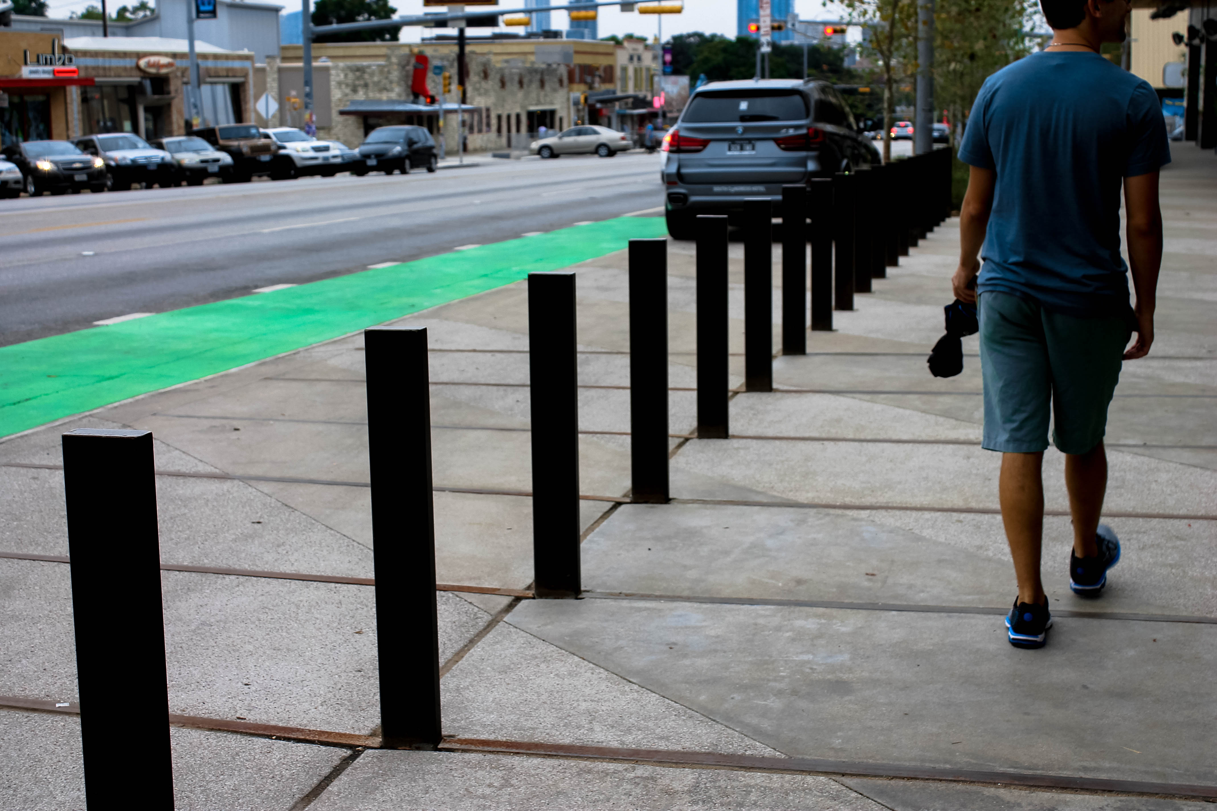
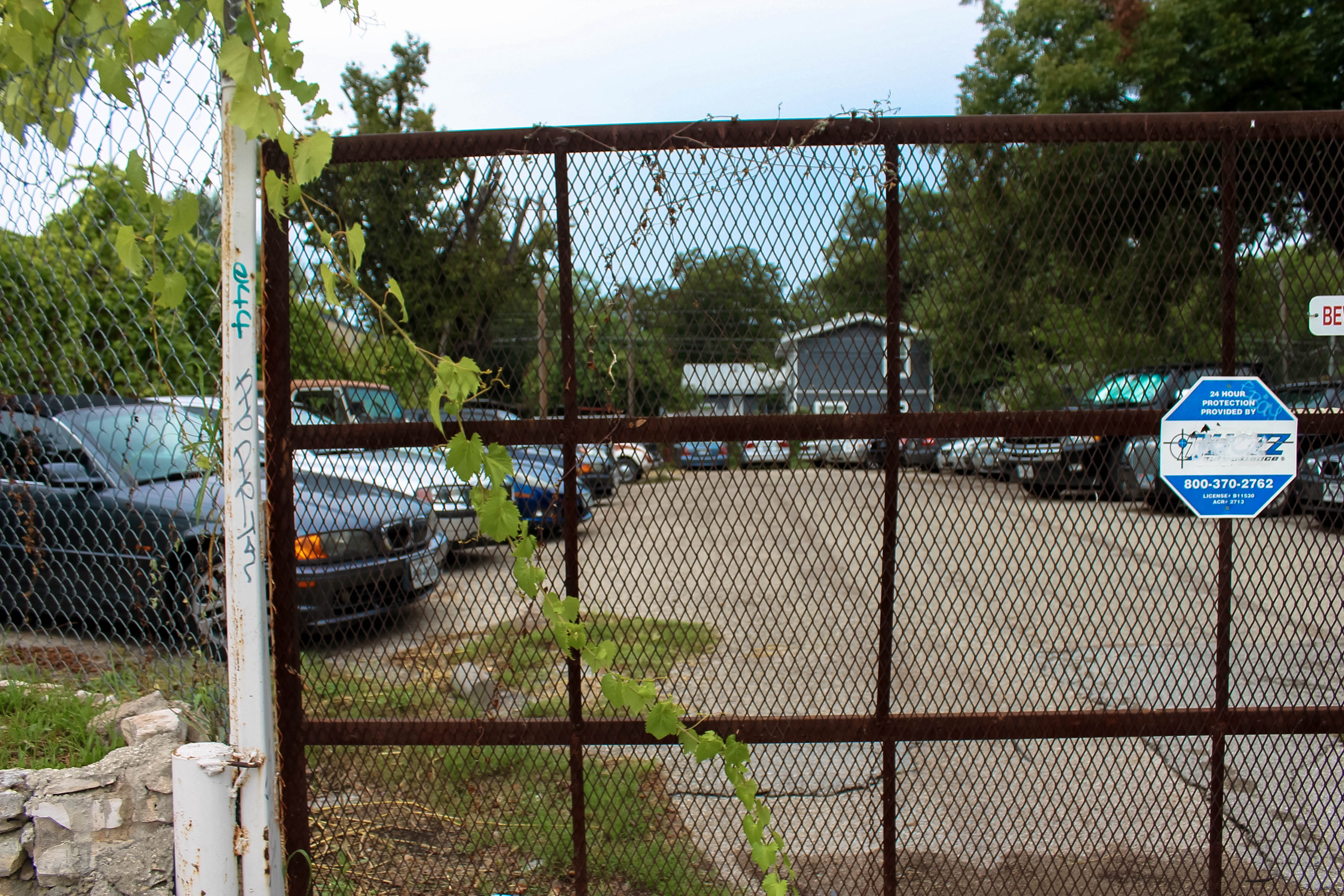
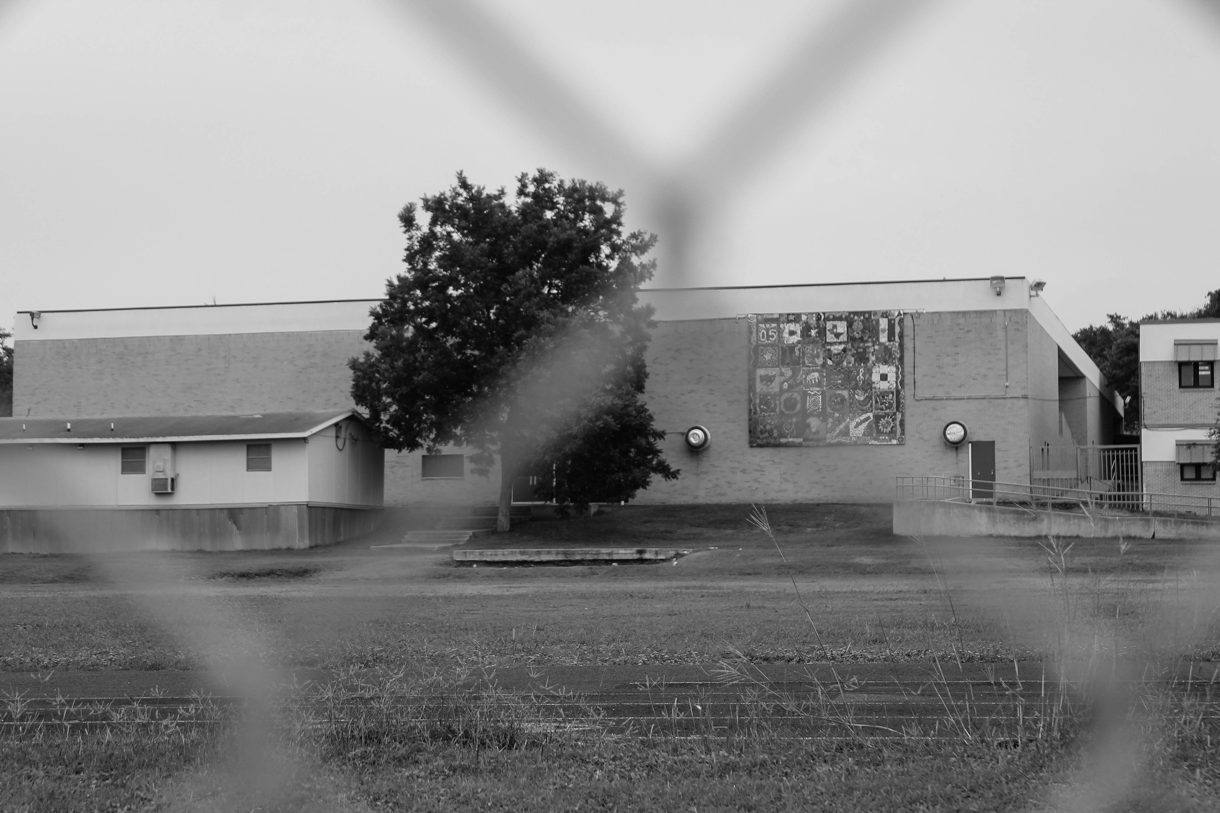
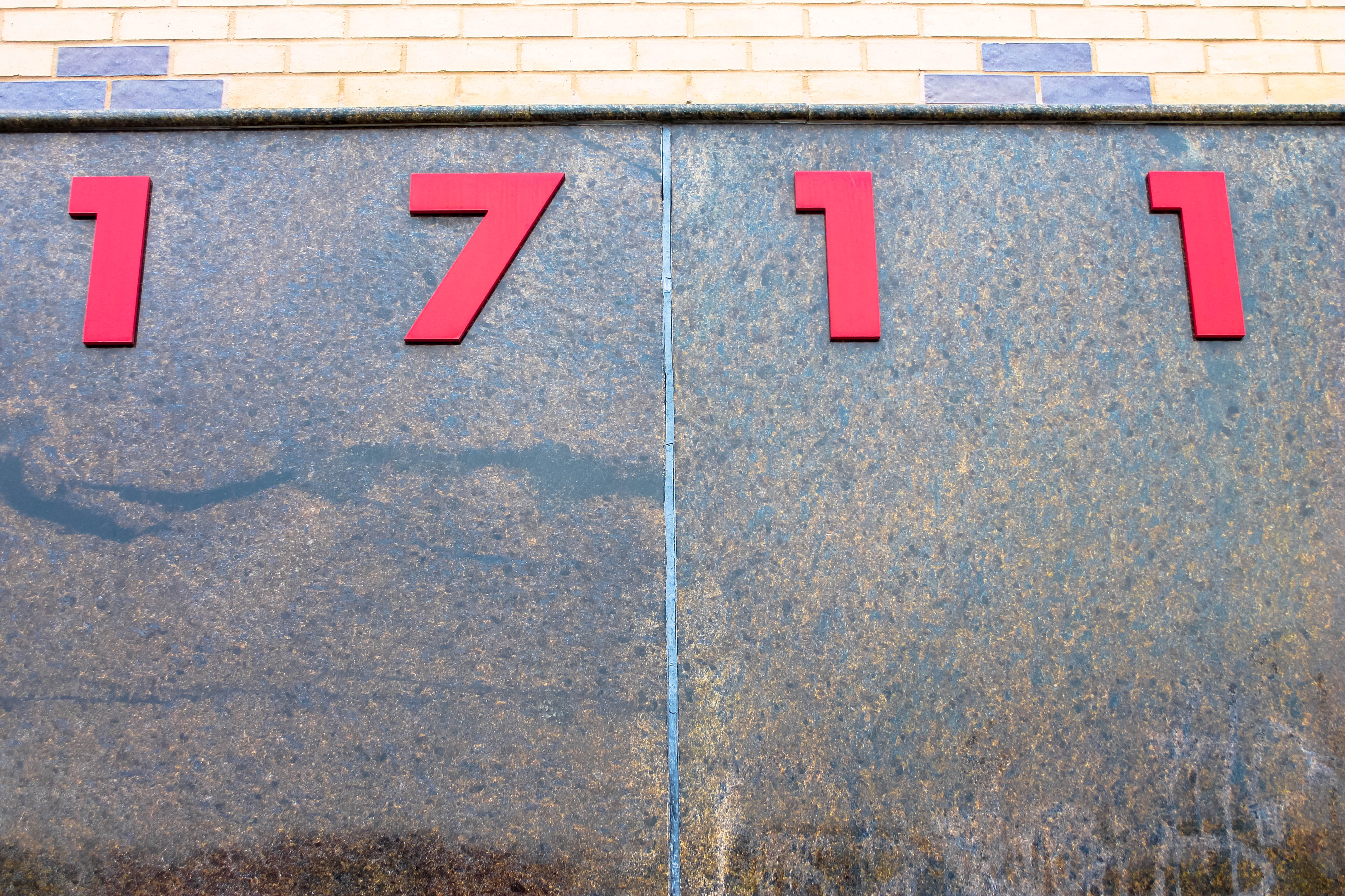
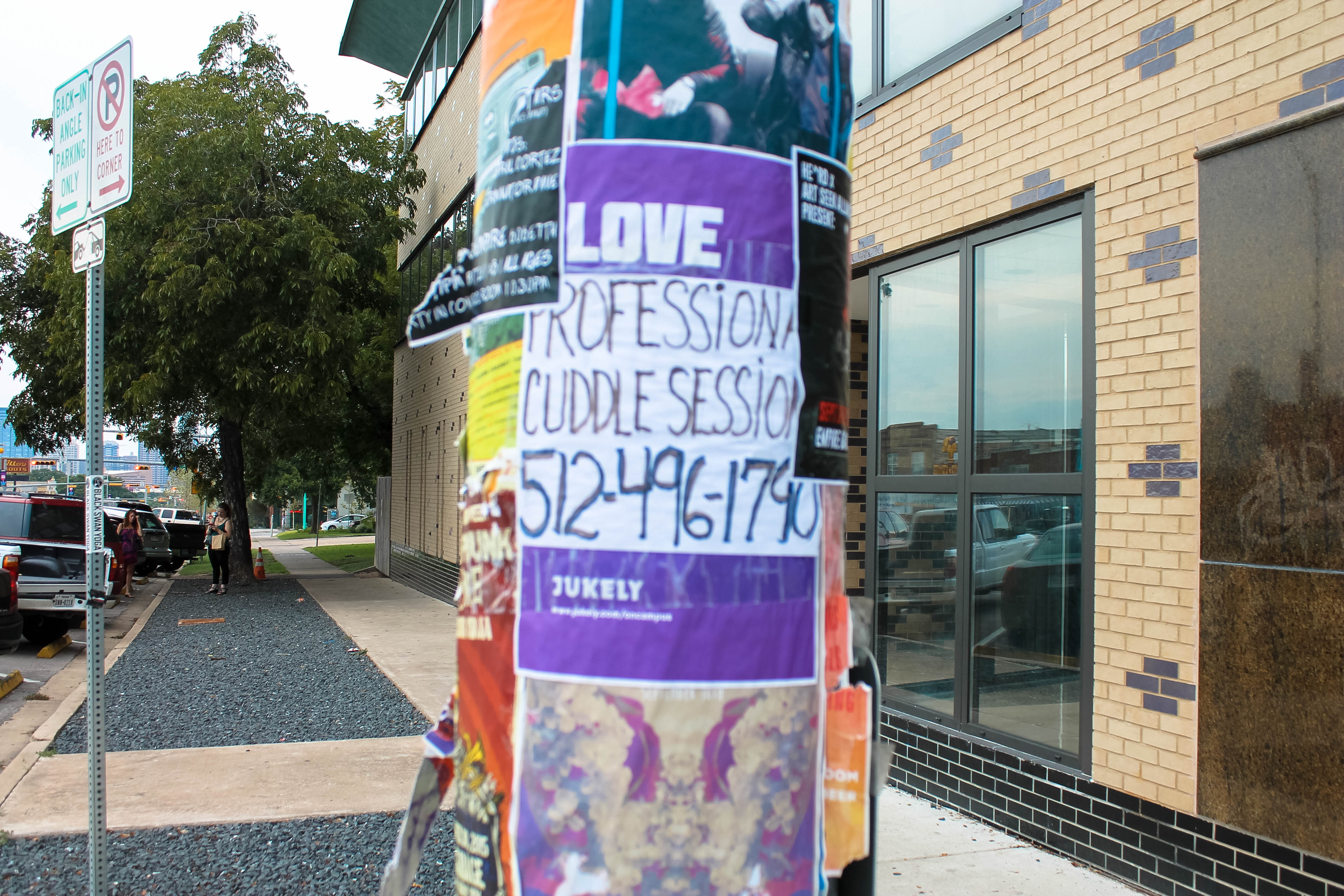
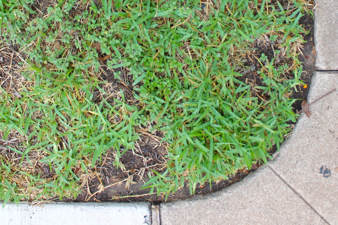
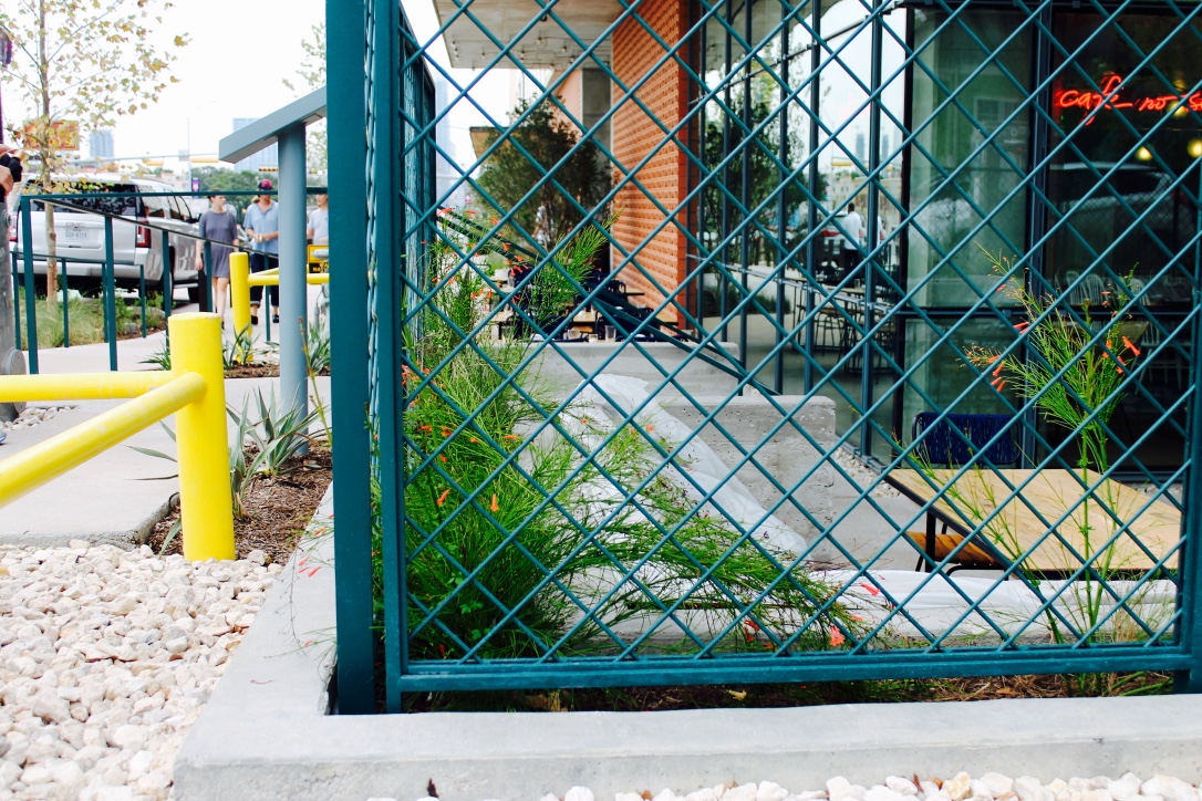
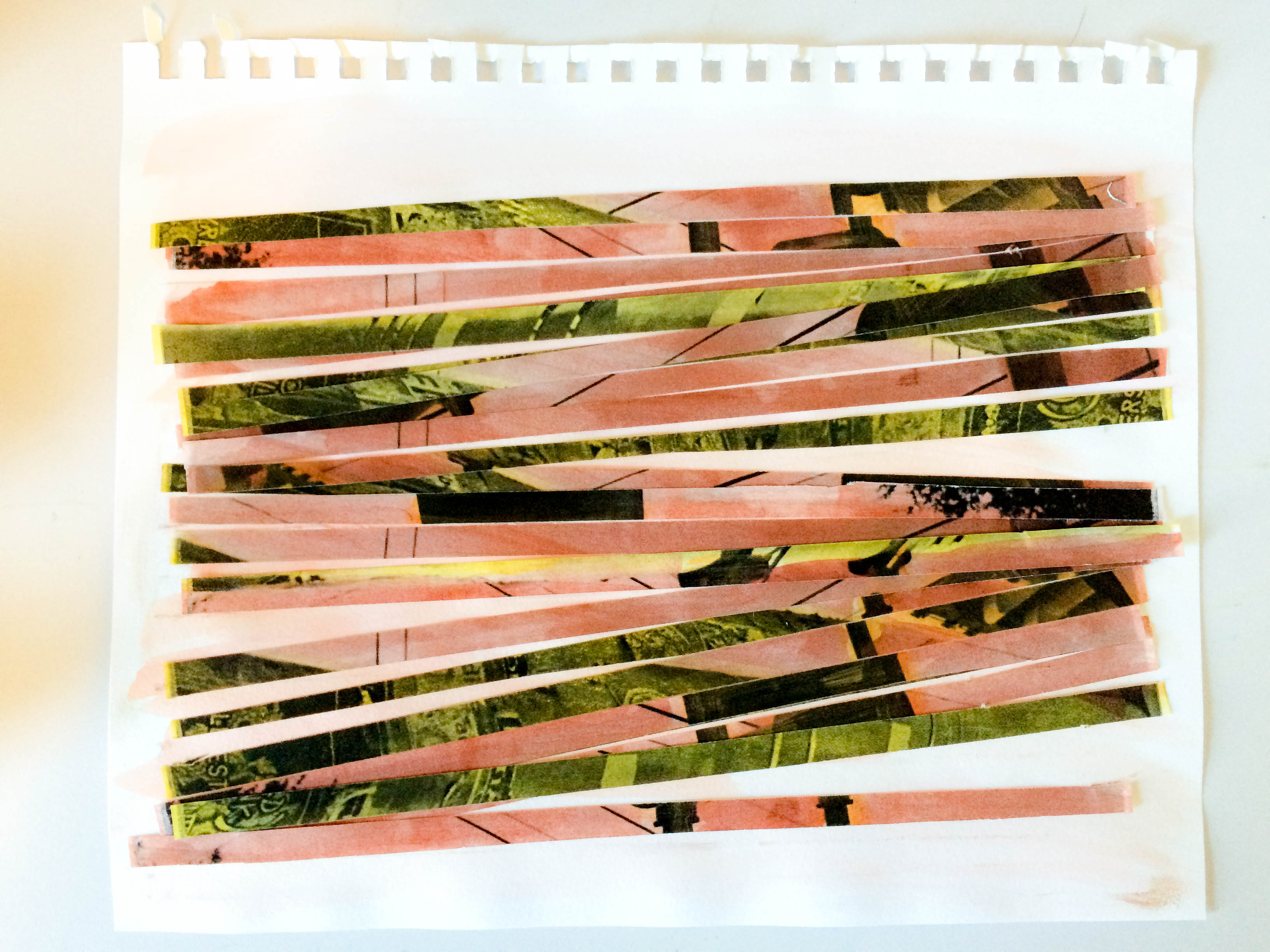
My overarching Gestalt principle was containment. In each image, I sought to capture an angle that, when all six photos were put together, made a complete rectangle.  There’s a level of coding present in these compositions–all the photos show varying sides of a walk down South Congress. South Congress is, at times dirty, earthy, living, thriving, building, and resting. I strove for these images to showcase all of these sides of South Congress Ave. There are images of the new hotel construction, a rusting fence, a dirt-covered strip of road, a patch of bright grass, and a fresh scene of plants and people walking, all along SoCo.  In this way, the viewer can see my personal experience of South Congress—the multifaceted, quirky street I live on.


thumb_IMG_9819_1024 thumb_IMG_9823_1024 thumb_IMG_9834_1024thumb_IMG_9828_1024thumb_IMG_9817_1024thumb_IMG_9830_1024

Gestalt Photo Study

After applying a series of Gestalt principles to my photo-taking ventures, I noticed immediately a marked improvement in all the shots I took.  It almost seemed a guaranteed outcome of balance and aesthetic appeal in my photo results.  I strove for a careful combination of unity and variety in each of the six photos taken and edited for my second blog post assignment.  Overall, there is a theme of foliage and an earth tone palate in my compositions.


IMG_9763

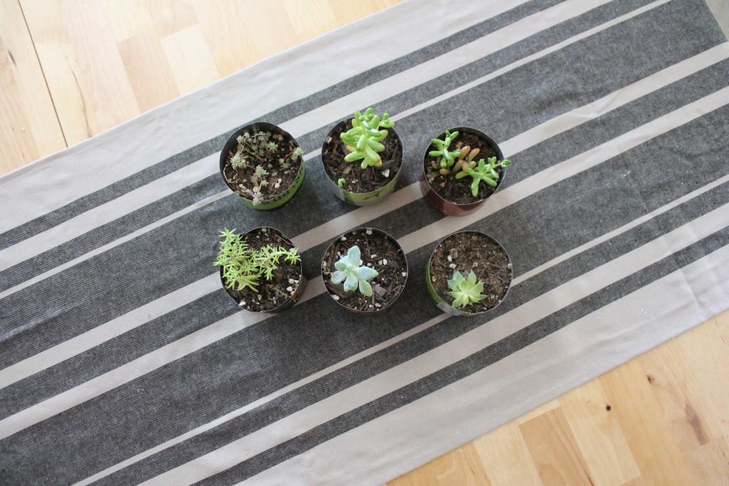
In the first image, we encounter the law of containment. The tablecloth serves as a natural frame for the composition, and the diagonal lines are dynamic, adding interest to the piece. They highlight opposing corners and draw attention to the exposed wood grain in the opposite two corners.  There is unity to be found in two rows of equal numbers of succulents, yet variety in types of succulents.


IMG_9783

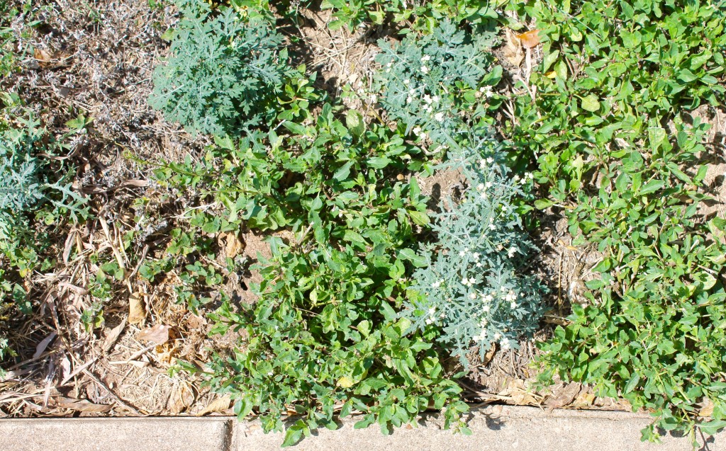
Here we see the law of similarity in this grouping of different grasses in one composition. At first glance, our eye thinks “grass” but upon closer inspection, it’s found to be a grouping of weeds, dirt, grass, clover, and small white flowers.


IMG_9778

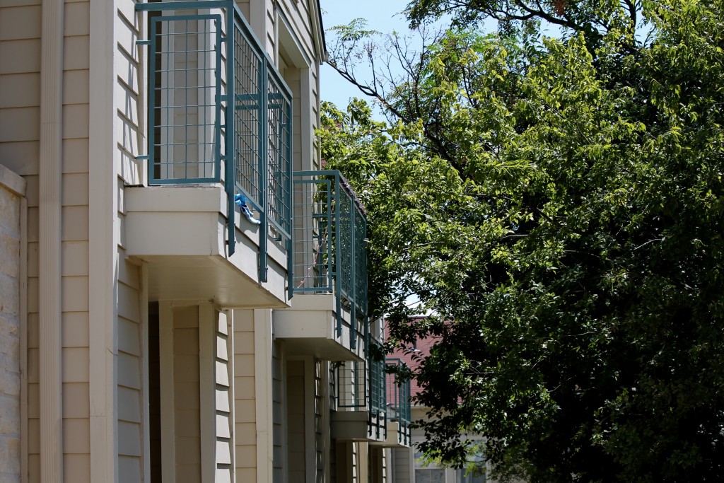
This view of my apartment complex showcases the law of continuity; the tree is brushed up against the second balcony, and although it is intersecting the wire fence surrounding the balcony, it is still distinctly separate from the balcony.   There’s a sense of repetition in form here, yet the tree brings in some variety here to avoid monotony.  We find a  gentle balance between nature and building, creating a subtle diagonal.  The diagonal here also provides dynamism in composition.


IMG_7265

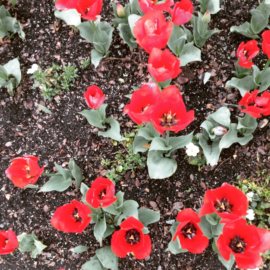
In this image, we see the law of closure at work.  While some of the flowers are photographed completely, others have been “cut off” at the petals and leaves.  But rather than seeing these as being chunks of red flowers, the eye interprets these as being full flowers, based on past experience with viewing healthy living flowers.  It is thus more engaging visually.


IMG_9773

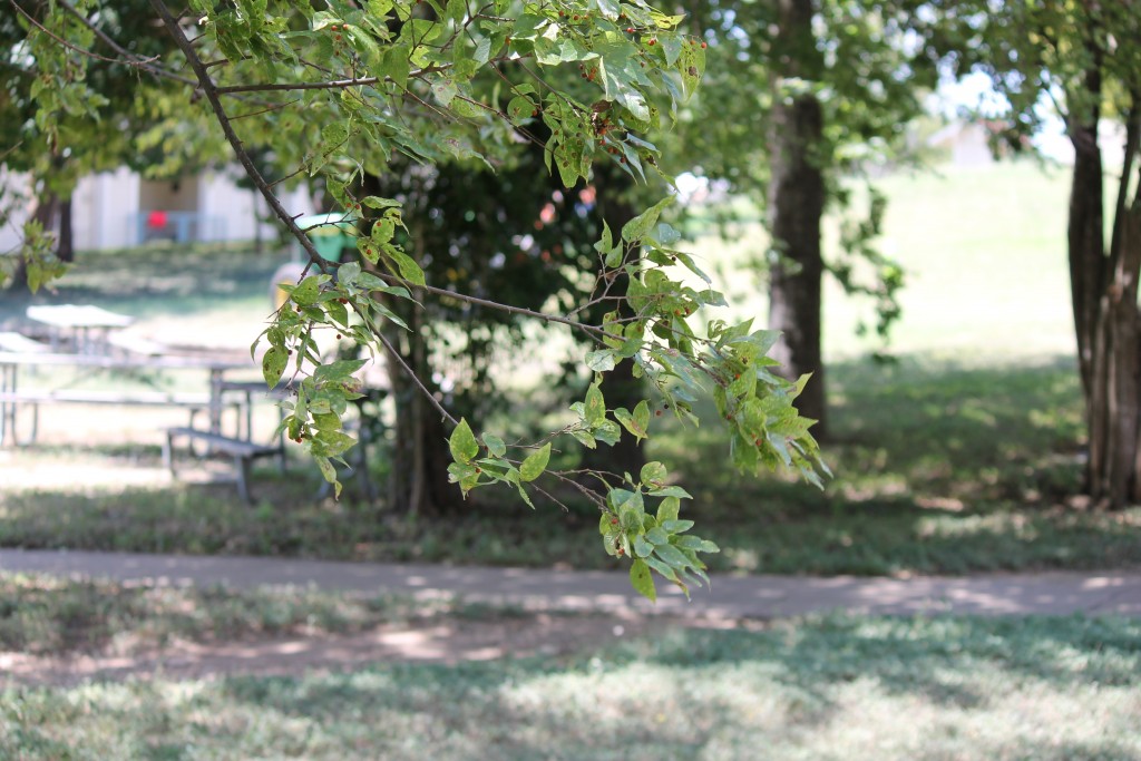
This focused image of a tree branch illustrates the law of figure-ground.  The tree branch seems “separate” from other trees, fuzzier than those in background.  Its importance in this photograph is thus being highlighted.  Despite the entire image containing shades of green and an abundance of leaf-like shapes, this tree branch can clearly be identified from the rest, due to this Gestalt principle.


IMG_9787

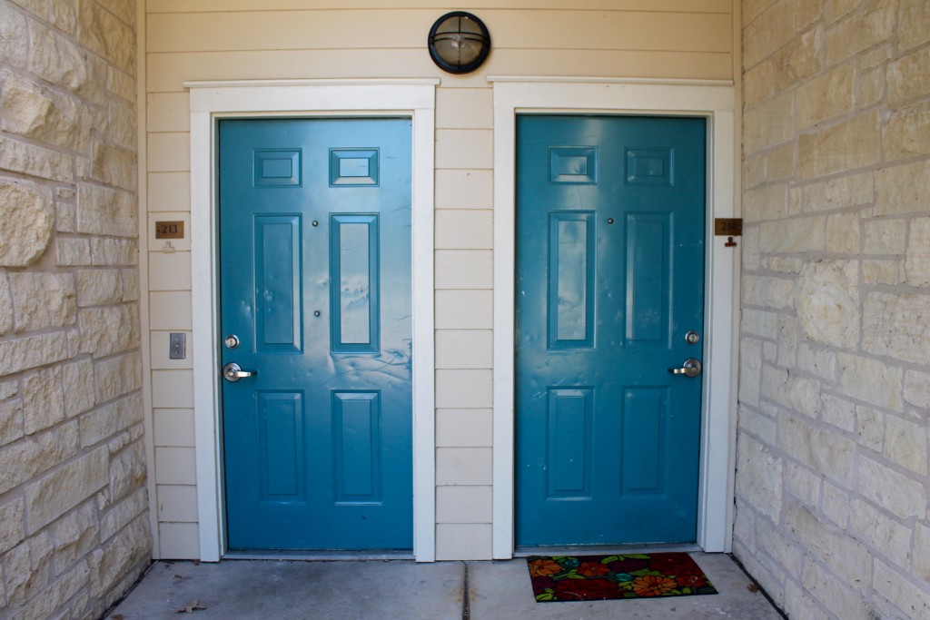
This final image uses the law of symmetry.  Two glossy blue doors are reflected in this photograph, each with doorknobs, locks and numbers that mirror each other.  Two white brick walls play to this effect as well.  Variety is achieved in the different patterns of dings reflected in each door panel, as well as the placement of  single flower-patterned rug at the foot of the right-hand door. The wooden frame around the two doors also serves as a sort of frame, which contains the picture. The striking blue color draws the eye towards the center, bringing attention to the white surrounding areas of negative space.

Reflections on Pink & Tan

After reading Daniel Pink’s A Whole New Mind excerpt and watching Amy Tan’s TED Talk, Where Does Creativity Hide? I have come to some optimistic conclusions on the current state of the working creative.

As an art major, I’ve grown accustomed to the seemingly-constant questions of “How are you going to get a real job?”, “Why aren’t you studying something important?”, and my personal favorite, “You’re wasting all of your parents’ money.”

Yikes. It’s a verbal battle that can often feel disheartening. As a young millennial, I’ve grown up in a different world than former generations. I grew up on the Internet–and creative skills are increasingly in demand as the world becomes faster, cleaner, and sharper. Taking in information reflecting this observation from both Pink & Tan had a near-emotional impact on me. Both sources highlight the importance of creativity, and how harnessing this skill is the future of not only the US, but of a larger global community as well.

Pink’s chapter three, aptly entitled High Concept, High Touch, addresses a revolutionary phase we are now entering, that of the Conceptual Age. He explains that in previous ages, left-brain processors were in hot demand, but no longer. The Conceptual Age is experiencing a rise in demand for designers, artists, and other makers. This is inspiring for a young art student such as myself–the nights spent up worrying about my future have dwindled considerably since taking in this new insight.

Tan’s video does much of the same in terms of emotional impact. In her 22 minute Talk, she investigates the creative process, discussing her own methods of becoming inspired and finding deeper meaning in her works. This video engaged me on several levels. I found myself hitting the pause button multiple times to take a step back and evaluate my own process. I began to wonder: What drives me? Where does my own creative process begin? Why?

These questions helped me dig into my own deeper truths. Questioning not just the what, but the why as well was particularly beneficial in understanding how I make personal meaning between myself, others, and my work. Pink’s and Tan’s commentaries on creativity have inspired in me hope, a deeper level of thinking, and a deeper need to create.

In other words, the future for creatives is bright.

VISU 1311 Project 1: 600

For my first blog post assignment, I chose a theme of “600 feet” to take my photos.   Each photograph of the 6 posted here was taken 100 feet away from the last on W Oltorf St, totally up to “600 feet” of photos. In each shot, I strove to capture an object that best exemplified the vibe of their “100 foot” block. I chose to leave the photos unedited to showcase the street in its most raw form.

thumb_IMG_9609_1024


At my starting point, I stood near a recycling bin outside a large red H-E-B. I crouched next to a filled Capital Metro bus stop for this shot.

thumb_IMG_9610_1024


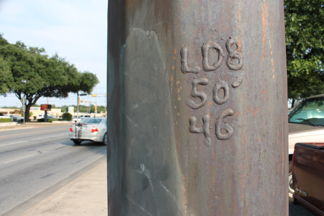
I then walked 100 feet further, and came upon a pole with some interesting engravings.

thumb_IMG_9614_1024


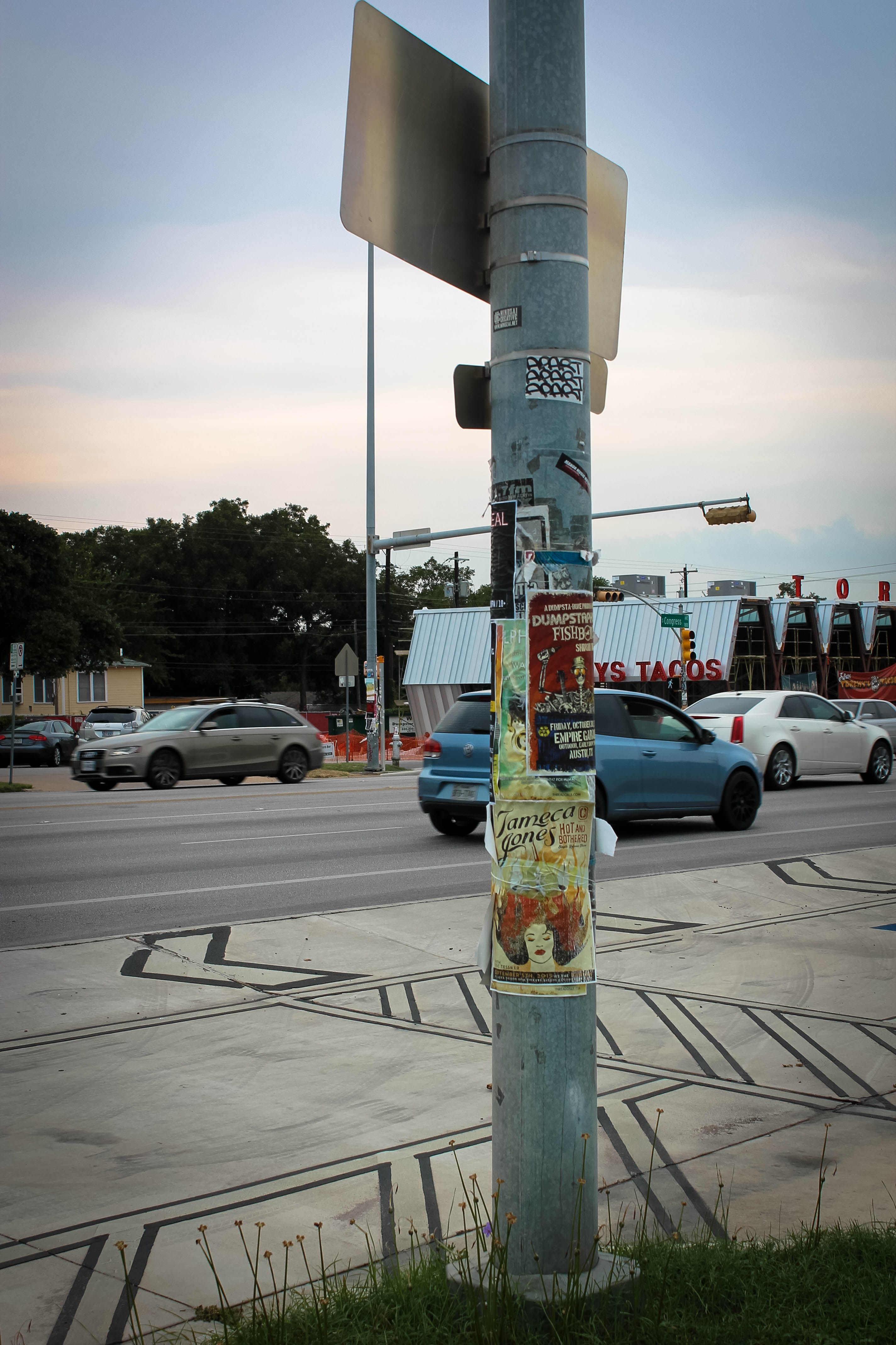
At 200 feet, I came upon a pole at the intersection of Oltorf and S Congress. Covered in old stickers and new flyers, the shot felt so classically Austin.

thumb_IMG_9618_1024


At 300 feet, the scenery changed dramatically. I came upon a strip mall with many well-known vendors. I stopped next to a fire hydrant to mark my spot and took my fourth photo.

thumb_IMG_9620_1024


At 500 feet, I found myself under a telephone pole. Upon further inspection, I noticed a massive bird nest with two green canaries resting inside.

thumb_IMG_9622_1024


For my sixth and final photo, I snapped a shot at the structure my companion and I found ourselves at. This shot brings the project back to its first shot. We came to a stop, literally, when we came head to head with a local Taco Bell, painted red on the outside. It felt a natural end to the photo project, which began another large red building.

Photographing 600 feet of Oltorf was an interesting adventure. The time itself seemed to fly by in assigning each “stop” with the nearest structure to mark it.

Hello world!

Welcome to your brand new blog at St. Edwards University Sites.
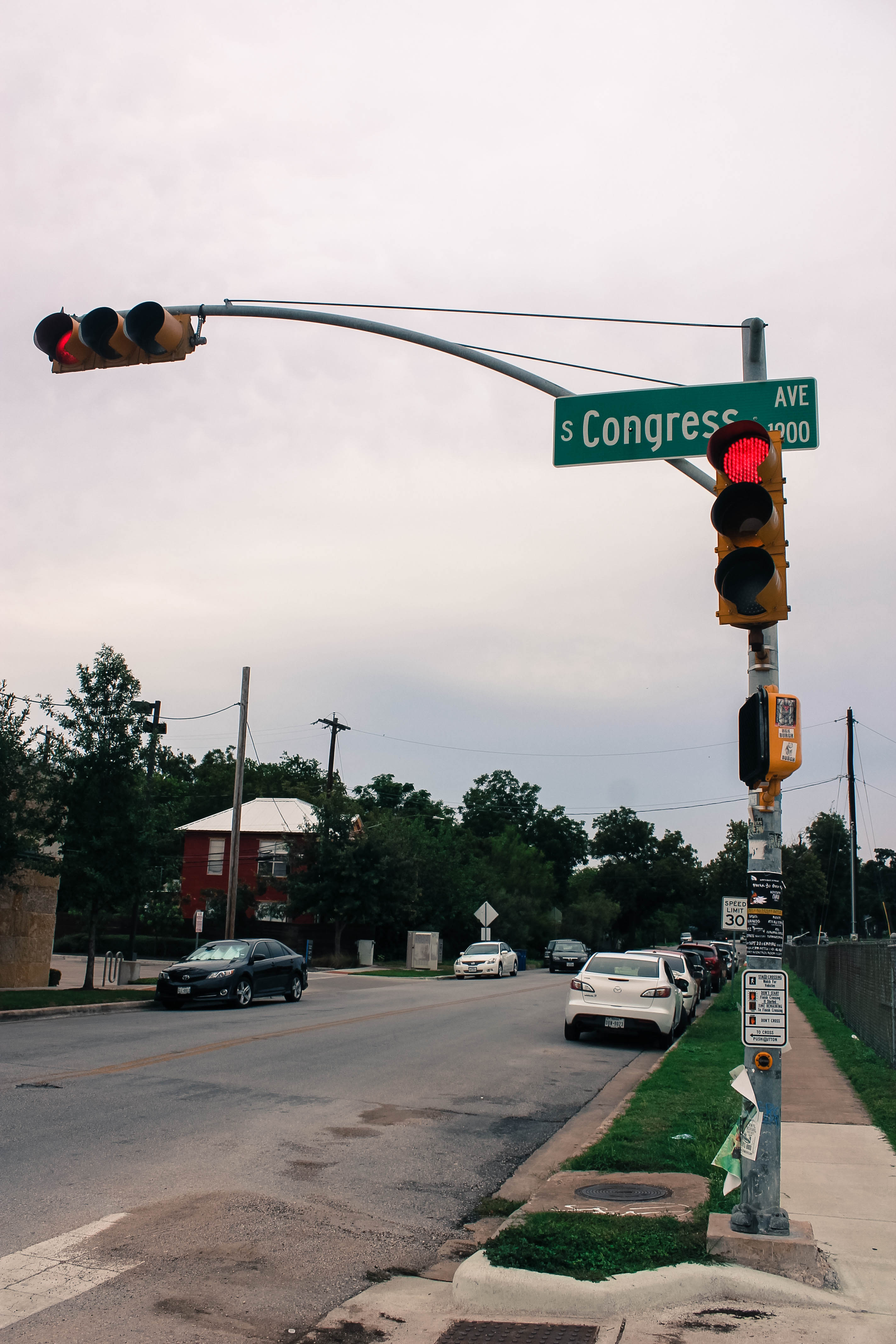
To get started, simply log in, edit or delete this post and check out all the other options available to you.

For assistance, visit our comprehensive support site, check out our Edublogs User Guide guide or stop by The Edublogs Forums to chat with other edubloggers.

You can also subscribe to our brilliant free publication, The Edublogger, which is jammed with helpful tips, ideas and more.