Blog Post #12

Part 1: Based on the notes you took during class, write a brief description and response to each of the Faculty presentations.

Kim Garza

Kim spent 14 years as a graphic designer before becoming a professor. She’s currently working on two projects: an app and an experimental film. The app, Eventurist, was created for client FareCompare, by company Handsome. She was the UX designer on this project. She conducted 15 interviews with people who loved travel. She made a journey map and found a pattern people tend to go through when traveling. She then identified some “personas” of people who’d be motivated to travel, which kept the user in mind. She came up with 15 ideas presented to the client, and this led to 4 prototyped ideas. Then, some wireframes were made of Paid Time Off (PTO). These 4 prototypes were then user-tested with 8 individuals to see which made the most sense. The app went into production in Russia, and is now in the App Store. Her film project is an ongoing project she’s worked on for six years with her husband, who is a singer / songwriter. Her husband wrote original scores for the movie Til the Clouds Roll By and she created new footage for the music.

Tammie Rubins

Tammie is a ceramic sculptor. She thinks about chimera in art–a thing that is hoped / wished for, but is in fact illusionary. Her work is this idea between real and the imagined. She’s from Chicago, an urban grid-like environment (thus has a very managed relationship to the outdoors). She often uses cake piping tools to create her intricate works, the most recent being a series of cone-like shapes, implying communication (much like children do with tin-can telephones).

James Lam Scheuren

James is a photo professor at St. Edwards’ and went to grad school at UT. He’s interested in what people do without aesthetic intention, and created a photo series exploring this idea called Objects of the Lazy. He likes to think of his photographs as spandles. He uses a 4 x 5 field camera, as it produces a very large negative. He often photographs remnants of things — like many hands created something over time. He also uses pink, black lights to create more interesting images. In a recent gallery exhibition, his photographs were installed in a modular fashion to seem as if they were able to move (and were doing so). He doesn’t really plan out his photos–instead, he uses his iPhone to “sketch things out” and comes back with his camera when he finds something interesting.


Part 2: Reflection on this semester and course. Feel free to write any and all comments here. We want and appreciate your feedback (both positive and critical).

I really enjoyed this class–I found it very helpful to hear from current creative professionals what they were doing and how they “got there.” It’s made me consider my options as an art student much more widely and I feel I’ve made some solid connections outside of this class with the lecturers who made an appearance throughout the semester.
Blog Post #10

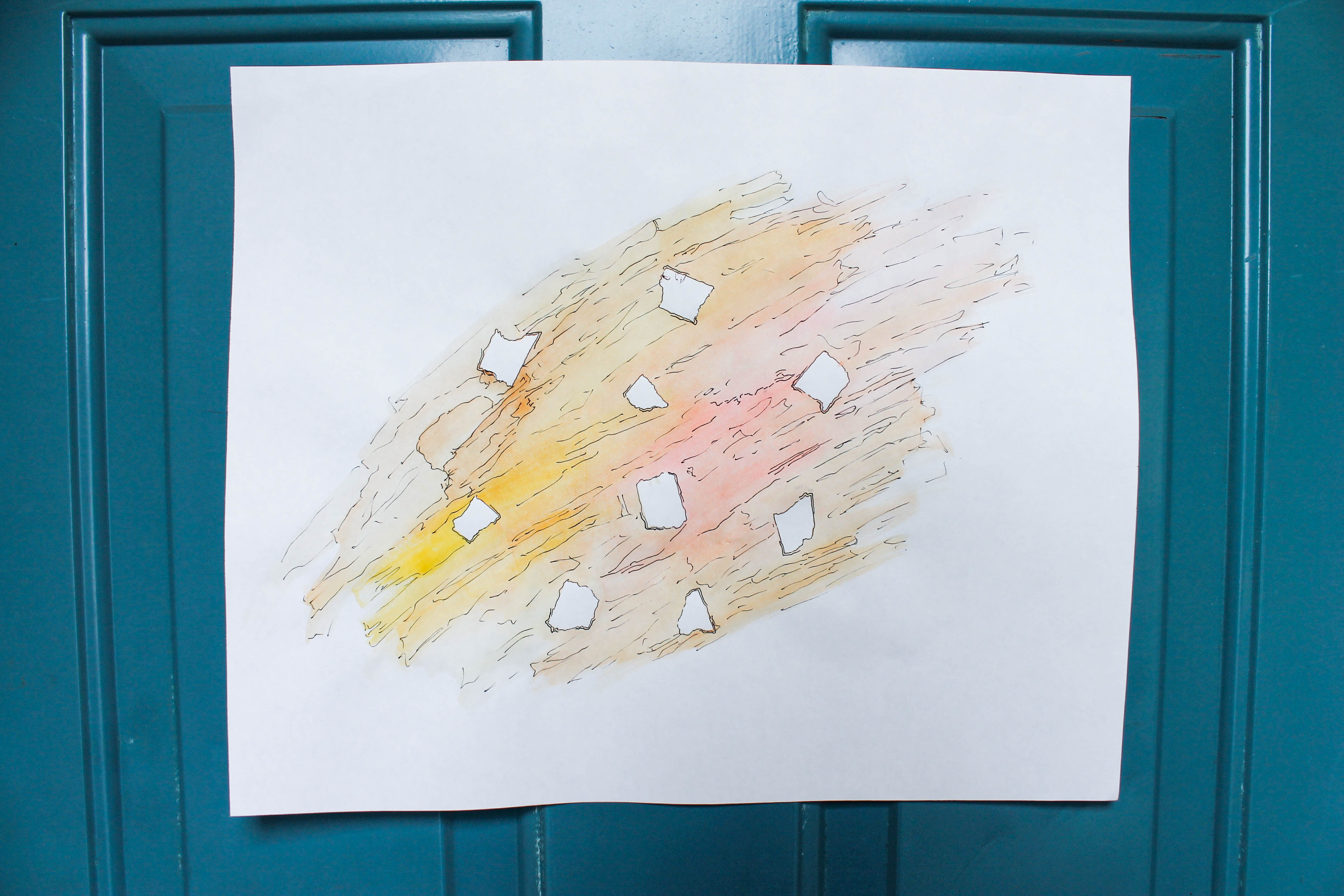
Warm Crash, 2015, watercolor and ink, 14 x 17

Lately I’ve been experimenting with process-based art. Here, this process is comprised of laying down small pieces of tape, painting over and around them, and then “outlining” the tape and areas of color. This piece was partly inspired by Jenn Hassin’s cartographic drawings, a form of art I was exposed to after working in her studio.

Maddie, 2015, graphite, 9" x 11"
Maddie, 2015, graphite, 9″ x 11″

I made this drawing recently in preparation for my final project in Painting I. The drawing is of my younger sister, Maddie. I really enjoy making quick portraits of people that are close to me, and applying the emotions I associate with those people into my work.  This here is a prime example of that interest.

Blog Post #8

All I could think was, I want to be this good. 

Rows upon rows upon countless rows of a young girl’s portrait lined the walls of the gallery. At first I thought they were prints of one hyper-realistic graphite drawing. Upon closer inspection, I realized there were minute differences between each one. Then I was even more impressed.

The artist of Drawing and Painting TIME is Fr. Martin Lam Nguyen, a Vietnamese-born priest of the Holy Cross religious order. He is currently a professor at Notre Dame. The exhibition includes two main bodies of work–the first being numerous rows of individual graphite drawings, while the other is comprised of 3 large white panels, adorned with rows of painted portraits. The style and method of display is similar in both and uniform within each work. The paintings, however, showcase a different individual in each portrait, rather than the same girl (in the drawings). Here we find greater diversity–gender, age, race, ethnicity, and pose all range widely in these panels.  While the drawings are just gray / black shades of graphite on warm-white rough sheets of bristol, colors range wildly in the paintings, to fit each uniquely individual portrait. A circle outlines each portrait in the paintings, so that each figure is given equal visual weight. Horizontal lines are spaced evenly throughout to further guarantee equality. The placement of the girl’s portrait on each individual sheet of paper in the drawings is uniform as well. The individual portraits contain space in the planes of their faces, but they are not placed in an environment with a clear fore-, middle-, or  background.

To me, the work overall is largely representative. I easily identified with most everything I saw–it made me feel as though I was looking out at a crowd of people moving in different directions at different times. Because of its small size, I felt compelled to go nearer the artwork, spending several minutes closely engaged with each individual portrait. The common elements of horizontal line, circles, and small-scale portraiture adds unity, while the different people painted for each individual portrait add variety. The solid white background serves as a backdrop that allows the portraits to stand out. There is an interesting contrast created here.

The paintings and drawings are about capturing time in a single portrait. Nguyen mentioned how today we take more photos on our smartphones in a single day than there were photographs taken in the entire 19th century. I feel a bit nostalgic looking at the piece, the painted portraits remind me a bit of the Norman Rockwell paintings I saw as a child. The young girl drawn over and over appears to be of Asian descent, like the artist. I can’t help but wonder if he knows this girl–perhaps a niece or a friend’s daughter. It almost seems as though these portraits serve as a way of capturing precious moments of fleeting youth.

My first impression changed upon spending further time with the works. As I touched upon in the very beginning, I originally thought the two bodies of work were interesting because portraits had been repeated over 1,000 times. When I drew closer to the portraits, however, and realized that each was a different drawing / painting, I found myself in awe. I believe this was a successful artwork because I had a definite emotional reaction to seeing the work. I found myself holding my breath. It is unique in its use of portraits. The portraits themselves are expertly rendered, but nothing new. What is interesting here is how Nguyen repeated this type of portraiture over and over and over again, over 1,000 times, to create something overwhelming. I believe this to be an accurate depiction of the artist’s skill, without a doubt. The craft here is excellent, and the style of painting / drawing is uniform throughout. I would like to possess this level of talent one day, with enough daily practice. The whole work felt overwhelmingly human to me– like looking out into a sea of faces. Without knowing the lives behind these faces, and seeing these strangers all held in equal regard, makes me feel connected to the work. I felt so comfortable in front of so many human faces. The artwork was incredibly well planned–I saw that each painted portrait displayed the year in which it was rendered — some dated back to ’95, the year I was born. You could’ve told me Nguyen had made all 3 panels this year and I’d believe you because they clearly all belong together. There was nothing half-done about any of it. If I had the space, I would no doubt purchase and hang these 3 panels in my apartment. They are absolutely gorgeous and so universal. After careful note of his brushstrokes, and the way he drew hair on the portraits, I feel like I’ve gained a small insight into creating better portraiture myself. I felt compelled to go home and draw the likeness of my roommate and her boyfriend, who were eating dinner at the time. Overall, I felt inspired to create and to keep patience in mind — this artist spent 20 years on a single body of work (and with an incredible result), so I’m feeling more encouraged to take my time with my own art.

Blog Post #7

Based on the notes you took during class, write a brief description and response to each of the Alumni presentations.

Nick Swift 

Nick graduated from St. Edward’s as an art major, and now owns his own business, Swift Single Malt, with his wife Amanda. He suggested networking at the university will help you later when beginning your career. As a small business with a new product on the market, he used connections at St. Ed’s to get a PR firm to get the word out about his whiskey. He’s also done research on his product by checking out the top-selling whiskey brands at Whole Foods. He also suggested fully researching the history of your product–which you can also do at the St. Ed’s library, as he did. This way, when you are with industry professionals, you can speak intelligently and get a foot in the door. His brand is run by a team of people–designers, concept developers, food photographers, web designers, event planners, etc. He stressed the critical importance of creatives to a business. And be patient. It will take a while to build up your name.

This was a surprise to me. As an art major, I would never have imagined that an art major from my school could develop and run a successful small business. This has definitely expanded my idea of how my degree will translate to the “real world.” I’ve begun realizing the possibilities of opening a pop-up shop after I graduate.

Rebecca Marino

Rebecca graduated from St. Edward’s in 2010 as a photocommunications major, and now serves as gallery director at Pump Project. She works in gallery–curating, collaborating with artists. She also does lots of grant-writing, event-planning, and meeting with new artists. She’s currently working on starting an artist residency program at Pump Project, with the ultimate goal of providing free studio space for artists. She wears many hats working at a nonprofit. She suggested dipping feet in different things to learn everything you don’t want to do. In addition to Pump Project, she also is an artist and photographer herself, and recently did a photo project at NASA. She also co-edits the online publication, Conflict of Interest.com, an ATX-based art/culture magazine.

I most related to Rebecca. This is my ideal job — running a gallery area with a lot of creative control, as well as multiple rotating side projects to continue working on and producing my own body of work.

Alex Roka

Alex is a graphic design alum from St. Edward’s who now works as a designer for Preacher, a creative agency in Austin, TX. He got his start at advertising agency GSD&M, as a paid intern his senior year. He learned lettering on the job there and began making simple marks and logos, badges, patches for major companies. He explained the importance of having a range of styles to be able to work for wide variety of companies. His most recent work was in redesigning SMASHPOP’s packaging.

The most valuable advice (for me) came from Alex’s presentation. Being flexible and working with others to produce an efficient design is a bit of a struggle for me. Relinquishing some of that control in order to be more successful and more effective on projects is a skill I am trying to develop now.

Taylor Browning

Taylor was an art major at St. Edward’s, and is now the assistant curator of education at ArtPace in San Antonio. She wears many hats in this role: media rep, studio tech, writer, curator, and educator. Her study abroad experience at St. Ed’s helped her in expanding her understanding of art and its role in culture. She stressed the importance of being dedicated to your major–coming in on Fridays, utilizing the studios. She had post-grad studio space at UP Collective and went to grad school at UT.

Blog Post #6

SKILLS INVENTORY

  1. My greatest strengths in Intro to Philosophy include: writing assignments, my grades are strong in this class.
  2. For greater success in this course, I need to: review notes after class to ensure a more full understanding of the topics covered.
  1. My greatest strengths in VISU I include: developing a concept for projects.
  2. For greater success in this course, I need to: spend more time on assignments, complete more thoughtfully.
  1. My greatest strengths in Foundations include: my craft in completing assignments, time management.
  2. For greater success in this course, I need to: read the articles more thoroughly.
  1. My greatest strengths in Painting I include: being bold in decisions, recognizing errors.
  2. For greater success in this course, I need to: spend more time outside class practicing painting techniques (basically, don’t be afraid to “waste” paint.)
  1. My greatest strengths in VISU 1100 include: actively listening / taking notes in class, putting thought / effort into class assignments (and finding meaning in the work).
  2. For greater success in this course, I need to: continue to self-reflect of my own volition–continue looking for / researching artists that inspire me, as well.
  1. My greatest strengths in American Dilemmas include: class participation, communication with my professor in/out of the classroom.
  2. For greater success in this course, I need to: complete assignments in a quieter environment (i.e. not with my friends Justin or Kenda, who just want to talk the entire time………) to finish in a timely manner.

Computer skills:

  1. My computer skills include: Adobe Creative Suite, Mac OS X
  2. I still need to learn: I’d like to improve my Photoshop caliber, and learn more about video programs (such as Maya).

Research & writing skills:

  1. My greatest strengths as a researcher/writer include: developing a thesis, laying out a clear structure in which to fill in information.
  2. I need to work on these aspects of research and writing: not getting so obsessed with the layout, focusing more on content.
  3. I learn best & accomplish most when: I am in an environment with some background noise (i.e. with music playing, a distant TV on, others present–but working also! Not with J or K!) during the morning / early afternoon.

ACTION PLAN

Visual Studies I

1. Rather than being discouraged at own work in comparison to others, allow comparison to inspire you to continue learning / growing.

2. Spend more time developing own style / aesthetic.

3. Don’t rush through assignments.

4. Don’t beat yourself up about “not finishing quickly enough.”

5. PRINT THE NIGHT BEFORE, LEXI.

6. Start on assignments the day they are assigned.

7. Communicate better with Bill / Tuan when confused on what’s wanted in an assignment.

8. Rework projects rather than just submitting the first one.

9. Remember to incorporate a balance of variety / unity to avoid chaotic projects.

10. Get inspired by others via Pinterest, artist websites, to help guide themes as you develop your own.

Blog Post #5

IMG_6305

The goal of this assignment was to create a linear, non-representational and non-functional sculpture inspired by a series of blind-contour drawings done in class. This sculpture was phase 02 of my Line Inventory Project (in Foundations with Alex). I went about this challenge by cutting up the cardboard back of an old drawing pad and adhering the strips together with strips of tape and black yarn.

The strongest aspect of this work was my ability to create a piece that was interesting from 360 degrees. This sculpture can be tossed in any direction, and will still appear different and eye-catching. The weakest aspect was my choice in washi tape for the final product, as it was not very sticky and I often had to re-wrap sections. Underneath, the piece is held together with a strong white painter’s tape. This form could be improved with a stronger choice in tape for a final layer (rather than the washi), and then perhaps painting the tape a glossy black. Conceptually, I could have considered why I chose yarn and glossy tape to contrast with the matte brown cardboard. Technically, I could have used a hot glue gun to better attach, and then cover with a different type of tape.

IMG_0018For this assignment (Visual Studies I with Tuan and Bill), I had to create a three-dimensional collage from photos I took on S Congress that demonstrated my view of this area of Austin. I went about this goal by taking a black and white image of a flyer-laden street post I’d taken, painting over it with red and yellow watercolors, cutting the painted image into strips, and rearranging hastily onto a piece of bristol as a support. I wanted to recreate the effect of old ripped posters on a street post (much like the image of posters on a street post), a sight common to S Congress (and most of Austin).

I think the strongest aspect of this work is the contrast in color, from harsh blacks to soft reddish-pinks. It makes the photo appear to be an eye-catching (yet faded) old poster. I think the weakest aspect is the backing. Looking back, it would be more interesting on something with a bit more texture (as old street posts have). Conceptually, I could perhaps have done a series of these, featuring different images (and color schemes) of poles in Austin. Technically, I would also have used less water in the paint, as it made it difficult to adhere. Overall, I wanted the work to be faded and rough, as if it had seen many days stapled to the street post.


Blog Post #4

Part 1:

Last Monday, 6 VISU majors at St. Edward’s gave presentations to my Visual Studies Seminar class. They talked about their work, upcoming projects, and gave some advice to the class of young artists. Below in this post, I have made some bullet points of major ideas expressed by each presenter.


Rachel Broussard — Art Major

– go see art around Austin (Harry Ransom Center, UT Landmarks, EAST, Pump Project, etc)

– inquire about Student Professional Development Funds, due Oct 1

– visit shows, on campus and off


Caelan Navarrete — Art Major

– Make outside work, and document your progress

– Experiment w different materials to find your own “style.”

– Make mistakes.

– Take all the classes you can — take advantage of the courses you take, and try new ones that interest you.


Shelby Savage — Graphic Design Major

– Influences help with creating a consistent design (hers include Wes Anderson, nostalgia, and old film)

– All visu majors (not just GDES) should go to Tuan’s workshops!

– She uses Illustrator, Photoshop, InDesign, etc to create her work


Paul Young IV — Graphic Design Major

– He’s currently making a book (inspired out of his love for typography)

– H did the music dept. posters and logo for first-year writing course

– Join the AIGA (Paul Barnes speaking at next meeting) and network with fellow graphic designers in Austin


Crissy Smith — Photocommunications Major

– Did a photo series with the Austin Fire Department, did a ride along (made documentary out of the experience)

– Photography has grown with lots of hours put in, patience, persistence

– Ask questions, talk to profs, make connections (learn outside classroom)


Juliana Ramirez — Photocommunications Major

– Sarted art collective (FiC) with some friends from UT, grew it into the Mom Gallery, where she is creative designer.

– Learn to talk about your work: what interests you? why do you do what you do?

– Constantly think about your portfolio

– Create something you wouldn’t normally — go outside your comfort zone

– Don’t be afraid of critiques, ask questions

– Utilize professors + sketchbooks (make lists, drawings)


Part 2: Post the links for four websites that you find compelling. Add a summary for each link explaining why you chose them.

http://byhula.com 

Hula (real name: Sean Yoro) is a painter that I came across very recently–he’s been in the media lately for his exquisite hyperrealist paintings done whilst standing on a paddle board. In addition to an appreciation for his work, I’m intrigued by his website due to its stark contrasts. The palate used in his site is sharp blacks and whites, which allows the paintings themselves to command attention.

http://justinwebbstudio.tumblr.com

I’m drawn to painter Justin Webb’s website mostly because of the type of scrolling experience one has while browsing the tumblr account. Unlike most other websites, one just scrolls to the right / left to view his playful indoor scenes. The whole experience is one of whimsy and nostalgia.

http://www.kinfolk.com

In a bit of a departure here, Kinfolk is a lifestyle magazine aimed at young creatives. It advocates a slow lifestyle of careful balance. I’m drawn to the typeface and inviting neutrals used on the site. The whole aesthetic is one of coziness–achieved in soft grays, dull blues, off-whites, and faded tans.

http://www.hauscollectivesa.com

This website belongs to an art collective / pop up shop in San Antonio that was started last year by a dear friend of mine. I love the color scheme used throughout site (which also translates to all of their physical materials–posters, cards, etc). The light pink, balanced by elegant black font and delicate black and white photographs, inspire me to utilize high contrast colors in my own work to add visual interest.

Blog Post #3

Allison_Diaz_Haunted_Mirror_1_250dpi
2011, Allison Diaz, collage on wood, 10 x 10


I’m inspired by collage artist Allison Diaz.  She’s a recent college grad from CA, whose process includes cutting old black and white portraits from magazines into diamond shapes, which are then rearranged.  Her collage series ‘Haunted Mirrors’ explores human perception and the rare neurological condition known as “face blindness.” She describes her current work as exploring ideas of shifting perspectives, identity and perception of reality. The result is, indeed, haunting. The breakdown of human faces in her work is disorienting and at times unnerving.  The viewer is put into the shoes of a prosopagnosia sufferer and forced to see the world through a different set of eyes.  Even deeper still, this breakdown of reality is further exaggerated by her fusion of masculinity and femininity in the works. The pieces themselves are complex in their varying shades of soft greys, blacks, and whites.  You can view more of her work on Bows & Arrows, the Sacramento-based gallery at which she is currently located.  Diaz’s work is of interest to me due to her method-based approach and use of repetition–aspects of art that fascinate and inspire me. The monochrome palatte also appeals to my own aesthetic.  Overall, her work is intriguing and unmistakably human.


2011, Allison Diaz, collage on wood, 16 x 16
2010 Allison Diaz, collage on wood, 12 x 12
Allison_Diaz_Haunted_Mirror_2_250dpi
2010, Allison Diaz, collage on wood, 16 x 20
Allison_Diaz_Haunted_Mirror_3_250dpi
2010, Allison Diaz, collage on wood, 12 x 12


Images via http://allisondiaz.blogspot.com

Time Tracker

Part 01

There are 168 hours in the week. This week (without classes on Monday, due to labor day) I spent my time in 9 major categories.

I spent 64 hours, 15 min sleeping. I got a lot of sleep this week.

I spent 30 hours, 35 min doing homework.

I spent 15 hours with my boyfriend, Luke.

I spent 14 hours cooking and eating this week.

I spent 13 hours in class. (Note: usually 19 hours, 15 min).

I spent 11 hours, 40 min with my friends and family.

I spent 8 hours running errands—filling up with gas, an oil change, HEB, driving…

I spent 7 hours working on illustrations for my Etsy shop.

And finally, *breaks* (i.e. me time: Netflix/workout/shower/bathroom): 4 hr, 30 m


Part 02

Over the summer, I began working on a series of pen (and occasionally graphite) drawings. Drawing both from life and images inspired from my Pinterest board, I’ve been practicing various shading and line techniques as I work to develop my own aesthetic. My subject matter consists mostly of bones, leaves, and insects. I’m currently in the process of establishing an Etsy account in which I’ll be selling various prints, stickers, journals, and the like.

Lefty, graphite on bristol vellum, 9" x 12", 2015
Lefty, graphite on bristol vellum, 9″ x 12″, 2015


VISU 1100: Blog Post 1

Part 1

1. Article 1, “What Entrepreneurs Can Learn From Artists” highlights twelve key points of artists and how entrepreneurs can embody these traits to become more successful. The idea in this article that its becoming all the more common in business to “think like an artist” in order to be successful. Article 2, on the other hand, entitled “Are Artists Entrepreneurs?” looks at the situation in reverse. Rather than telling entrepreneurs to think like artists, the article suggests artists think like entrepreneurs.

2. Artists can learn from their “entrepreneurial cousins” about building a network of experts to help build their artistic vision. Article 2 states that fulfilling a dream requires a “team effort” because it’s easier to row upstream when you have lots of people helping to row the boat. The article also calls for artists to start their career by appealing to the current trend in order to build up to their real dream, much like entrepreneurs do in order to achieve theirs.

3. I wholeheartedly agree that artists are entrepreneurs. While entrepreneurs are selling a product, artists are selling themselves as a label. Building up a successful body of works entails marketing yourself adequately, taking risks, and working with passion to achieve what many may call a “pipe dream.” Only the most dedicated entrepreneurs and artists will live to see their dreams accomplished.

4. I agree with most of the 12 points listed in Article 1. The points that most stuck to me personally were those numbered 1, 3, and 11. As a hopeful artist myself, I can most relate to the ideas of artists being inventors and reinventors, as I’m constantly doing that myself. And as stated in #3, it is indeed easiest for me to think and express ideas physically, whether through drawing or moodboard. Finally, number 11 descibes artists as being passionate about their work, to the point where it is inseparable from life. This is a statement that resonates with me the most fully when I think about art. It doesn’t feel like something that I have to do, rather it’s something that I need to do.

5. To this list, I would add “thinking outside the box.” As an art student, I often feel isolated from my peers in other disciplines, at times ostracized for my decision to be a working creative. This is no new phenomenon to me–and I’ve in fact found comfort in my emotional isolation from others as a way of benefitting my work. By not caring so much about what others are saying and/or thinking, it has become easier for me to pave my own path in art and create what hasn’t been created before. As a result, I am innovative in this way. This is an important skill for entrepreneurs to develop as well, because being brave enough to “think outside the box” and to do something totally new and drastic is what it takes to attract others to the new, the recent, the developing.

6. I thoroughly enjoyed reading both of these articles–it brought to my attention ideas about success as an artist that I had not considered. “Thinking like an entrepreneur” is a relatively new idea to me, and one that I will most certainly employ going forward both academically and professionally as an artist.

Part 2

1. I got a “grit score” of 4.75, which puts me in 90-99th percentile of test-takers. I find this not too surprising, given that I’ve never wanted to anything besides art. Ever. I’ve known since preschool that art was my life, it was what I was meant to do, despite how much it can drive me crazy at times.

2. Despite receiving a high score, there are some things I could do to raise my grit to a “5.” Putting my resume out there is a major must, and it is something I think hard about, get excited about, and then put off indefinitely due to some fear of rejection. Another idea that comes to mind is working every day on my art–not just a couple times a week in class. Both of these things will help me to become grittier.