Short Story Assignment

Write a reflection of both short stories, specifically address the mood of each and how they made you feel.

Nick Hornby’s “Nipple Jesus” is an account of a man named Dave who is tasked with guarding a controversial art work that’s just been released to the public. The short story takes the reader through Dave’s initial shock and disgust at the piece, to his growing interest in the work, to his eventual love for it (and hatred of those who dislike it). Reading the story was a bit shocking initially, and I was captivated by the numerous incidents that occurred following the painting’s release. Dave’s rough language and harsh worldview provided an interesting filter for reading this story. I felt like I was listening to a culturally-ignorant friend describe a work of art. It was very interesting to me, seeing Dave’s progression of understanding the work, only to hate it again when he feels “duped” at the very end. I felt a bit duped by the artist as well, after becoming so attached to the idea of something proper being made up of something considered improper. I developed this whole theory of Martha’s piece around this social statement, only to be told there was no social statement.

Raymond Carver’s “Cathedral” is an account of a man whose wife has a friend come to visit. The friend is blind, which makes the husband uncomfortable. He’s never met a blind person before, and has little patience or desire to engage with the man. Throughout the evening, the husband tries to find ways to entertain himself and feels awkward around the guest, due to his disability. It isn’t until the wife falls asleep in front of the TV that the husband is forced to engage with the man, and after interacting with him, finally becomes comfortable with him present. He actually enjoys the task of drawing the cathedral with the guest. I felt discomforted by the husband throughout the story, until the very end. His comments about the blind man made me cringe, and I felt angry at the husband for being uncomfortable. He seemed almost ignorant. His journey towards acceptance of something new to him reminds me of Dave’s journey with the shocking artwork. I felt a sense of relief at the end of this passage, that the issue between the husband and his discomfort around blindness had been resolved to an extent. It isn’t until he closes his eyes and puts himself in the man’s shoes that he can really begin to appreciate and understand the other, much like Dave had to do with the art–and as we all do when confronted by something new that makes us uncomfortable. At first.


Blog Post #7

Based on the notes you took during class, write a brief description and response to each of the Alumni presentations.

Nick Swift 

Nick graduated from St. Edward’s as an art major, and now owns his own business, Swift Single Malt, with his wife Amanda. He suggested networking at the university will help you later when beginning your career. As a small business with a new product on the market, he used connections at St. Ed’s to get a PR firm to get the word out about his whiskey. He’s also done research on his product by checking out the top-selling whiskey brands at Whole Foods. He also suggested fully researching the history of your product–which you can also do at the St. Ed’s library, as he did. This way, when you are with industry professionals, you can speak intelligently and get a foot in the door. His brand is run by a team of people–designers, concept developers, food photographers, web designers, event planners, etc. He stressed the critical importance of creatives to a business. And be patient. It will take a while to build up your name.

This was a surprise to me. As an art major, I would never have imagined that an art major from my school could develop and run a successful small business. This has definitely expanded my idea of how my degree will translate to the “real world.” I’ve begun realizing the possibilities of opening a pop-up shop after I graduate.

Rebecca Marino

Rebecca graduated from St. Edward’s in 2010 as a photocommunications major, and now serves as gallery director at Pump Project. She works in gallery–curating, collaborating with artists. She also does lots of grant-writing, event-planning, and meeting with new artists. She’s currently working on starting an artist residency program at Pump Project, with the ultimate goal of providing free studio space for artists. She wears many hats working at a nonprofit. She suggested dipping feet in different things to learn everything you don’t want to do. In addition to Pump Project, she also is an artist and photographer herself, and recently did a photo project at NASA. She also co-edits the online publication, Conflict of Interest.com, an ATX-based art/culture magazine.

I most related to Rebecca. This is my ideal job — running a gallery area with a lot of creative control, as well as multiple rotating side projects to continue working on and producing my own body of work.

Alex Roka

Alex is a graphic design alum from St. Edward’s who now works as a designer for Preacher, a creative agency in Austin, TX. He got his start at advertising agency GSD&M, as a paid intern his senior year. He learned lettering on the job there and began making simple marks and logos, badges, patches for major companies. He explained the importance of having a range of styles to be able to work for wide variety of companies. His most recent work was in redesigning SMASHPOP’s packaging.

The most valuable advice (for me) came from Alex’s presentation. Being flexible and working with others to produce an efficient design is a bit of a struggle for me. Relinquishing some of that control in order to be more successful and more effective on projects is a skill I am trying to develop now.

Taylor Browning

Taylor was an art major at St. Edward’s, and is now the assistant curator of education at ArtPace in San Antonio. She wears many hats in this role: media rep, studio tech, writer, curator, and educator. Her study abroad experience at St. Ed’s helped her in expanding her understanding of art and its role in culture. She stressed the importance of being dedicated to your major–coming in on Fridays, utilizing the studios. She had post-grad studio space at UP Collective and went to grad school at UT.

Mid Term Assessments

Change within yourself via expert hours?

There has been a massive change within me personally this semester. I’ve noticed that all of my free time is spent messing around on Photoshop, browsing design boards on Pinterest, and making ink drawings. It’s become a slight addiction. I’ve become so much more confident in my knowledge of programs and design principles–what makes “good” art has become clearer and easier for me to understand (and thus produce). As a result of this art addiction, my homework has felt less like work and more like fun. (Leading to me stressing whether or not that means I’m really “working”…but that’s a crisis for another time.) Working with design programs was something completely foreign to me until taking this class. Up until this point, I could see myself only in the “art world” in the strictest sense of the world — being a museum consultant, art historian, dealer, gallery director, etc. But after learning how addicting design is (not to mention how satisfying when a project really seems to “work”) it’s opened up my eyes to what other creative possibilities are out there. I’ve decided to pick up graphic design as a minor.

How I used practice time… I feel like I best fit under “I achieved my practice times very easily. 8 pts”

My largest regret thus far with this class is that I cannot seem to find more time in my week to rework assignments fully. Between my 5 other classes, internship, out-patient therapy, and 3 brand new kittens that my roommate decided to surprise me with (did I mention they have to be fed every 3 hours? Even during the night?) I felt as though I only had about 3-4 hours per week that I could dedicate to this class outside of the classroom. To make up for this, I ensured that I attended every class and actively listened to demo instructions and critiques to absorb as much information as I could in the time that I had. And despite these time constraints, I made sure to submit all assignments in a timely manner and to print out my assignments on good matte paper rather than “cheaping out” on copy paper to save time.

How I dealt with feedback… I feel like I best fit under “I understood crits of other students and knew how it applied to me and I constructively gave out plenty of it. I could teach this class if I had to. 10 pts”

I did my best to apply knowledge where I was able to, and warmly welcomed other’s knowledge in aiding me to be more successful. When working on critiques in groups, I often felt like the only one speaking. I’m not afraid of critiques–I thrive off of them. Without constructive feedback, I’d be sitting in the same lackluster spot I was in August. Critiques allowed me to recognize mistakes or areas I had not seen (or considered). Hearing multiple points of view helped me considerably in understanding how to work and re-work projects efficiently. I’ve begun using these different points of view in making my own personal projects better (I was recently inspired to open an Etsy shop).

The level of challenge I gave myself… I feel like I best fit under “I had to put some deodorant on.6 pts

I was rather ambitious in my project concepts / plans, and I often felt as though time constraints hindered my end results. (See earlier comment..) After seeing this in effect during the first photo project, I decided to stick with simpler ideas where I could spend more time on my craft to ensure it was well-done. I figured that hyper-attention to detail on a smaller project would present better than an awesome, out of the world….half-done project.

My inventory expert experiences… I feel like I best fit under “I experienced so much extra stuff. So hyped to put that energy into the projects! Even my classmates can feel my aura of enthusiasm! 10 pts

I went to all of Jenn Hassin’s workshops (and learned how to make paper, too!) and scored a paid internship with her along the way. I’ve spent time in her studio and have learned a lot about the business of studio art / commissioned art. I was able to take that high energy and feel inspired in my courses as a result. I also attended a few art talks around Austin and pursued a volunteer opportunity at Pump Project after Rebecca Marino’s talk in my VISU seminar. Nevertheless, it seems as though I’m now noticing design elements everywhere. The other day, I was in Trader Joe’s and it suddenly made sense to me why one of the tortilla chip bags looked “better” than the other–there was a complementary color scheme working effectively! The others were boring!! Mind. Blown.  In fact, I think I’m starting to bother my boyfriend, Luke, with all of my seemingly-constant “art talk.” (He’s a business major…) He kind of understood the tortilla chip situation, but oh well. It’s my addiction, not his. But this is an example of the kind of change I’ve had from all these expert experiences– I’m so pumped to start homework that it’s no longer feeling like work. I’m actually Instagramming a LOT of it.


Blog Post #6

SKILLS INVENTORY

  1. My greatest strengths in Intro to Philosophy include: writing assignments, my grades are strong in this class.
  2. For greater success in this course, I need to: review notes after class to ensure a more full understanding of the topics covered.
  1. My greatest strengths in VISU I include: developing a concept for projects.
  2. For greater success in this course, I need to: spend more time on assignments, complete more thoughtfully.
  1. My greatest strengths in Foundations include: my craft in completing assignments, time management.
  2. For greater success in this course, I need to: read the articles more thoroughly.
  1. My greatest strengths in Painting I include: being bold in decisions, recognizing errors.
  2. For greater success in this course, I need to: spend more time outside class practicing painting techniques (basically, don’t be afraid to “waste” paint.)
  1. My greatest strengths in VISU 1100 include: actively listening / taking notes in class, putting thought / effort into class assignments (and finding meaning in the work).
  2. For greater success in this course, I need to: continue to self-reflect of my own volition–continue looking for / researching artists that inspire me, as well.
  1. My greatest strengths in American Dilemmas include: class participation, communication with my professor in/out of the classroom.
  2. For greater success in this course, I need to: complete assignments in a quieter environment (i.e. not with my friends Justin or Kenda, who just want to talk the entire time………) to finish in a timely manner.

Computer skills:

  1. My computer skills include: Adobe Creative Suite, Mac OS X
  2. I still need to learn: I’d like to improve my Photoshop caliber, and learn more about video programs (such as Maya).

Research & writing skills:

  1. My greatest strengths as a researcher/writer include: developing a thesis, laying out a clear structure in which to fill in information.
  2. I need to work on these aspects of research and writing: not getting so obsessed with the layout, focusing more on content.
  3. I learn best & accomplish most when: I am in an environment with some background noise (i.e. with music playing, a distant TV on, others present–but working also! Not with J or K!) during the morning / early afternoon.

ACTION PLAN

Visual Studies I

1. Rather than being discouraged at own work in comparison to others, allow comparison to inspire you to continue learning / growing.

2. Spend more time developing own style / aesthetic.

3. Don’t rush through assignments.

4. Don’t beat yourself up about “not finishing quickly enough.”

5. PRINT THE NIGHT BEFORE, LEXI.

6. Start on assignments the day they are assigned.

7. Communicate better with Bill / Tuan when confused on what’s wanted in an assignment.

8. Rework projects rather than just submitting the first one.

9. Remember to incorporate a balance of variety / unity to avoid chaotic projects.

10. Get inspired by others via Pinterest, artist websites, to help guide themes as you develop your own.

ARTS 1311 Reading #2

Reading 2 | Mad Scientists!? 

1. Based upon the reading how are priorities set for specific projects? Or in other words, what is it that determines the guidelines for given projects?

In determining the guidelines for specific projects, concept is key. Before creating (or curating) a body of works, the concept must be there. It is only after this crucial step that the concept can then be explored through the works.

According to the interview on page 186 in Design and Art, the choice of the person making the works is also a crucial element to a project (whether it’s to be published or exhibited, etc). Here, Elliman explains that a greater freedom and exploration of an idea can be found in commissioning works by a particular person, rather than “editing down” from a large bag of works.


2. How does the artist/ designer approach decision making differently or do they?

Mathias Augustyniak claims that the designer has an easier time making decisions than the artist, who is “weighed down by the burdens of art history.” Design, on the other hand, has fewer constraints and can thus take on the idea of art with a sense of nonchalance. Åsa Nacking offers a different approach, arguing that he chooses to work as an artist to make creative decisions because of the freedom it offers. He, on the other hand, sees art as “a space in which to experiment, free from the bonds of convention.”


Personal Reflection

1. How do you make decisions? Are they based upon anything substantial? Why or why not?

I tend to make decisions based upon aesthetic. In this way, it could be said that I may lean more towards design than art. I enjoy creating works that are visually engaging and well-balanced. While these attributes can easily apply to both design and art, after reading these six articles I find myself identifying more with the concept-to-creation pattern of the designer. However, I don’t think I base my decisions off of anything meaningful or substantial. At the end of the day, I am still obsessed with style over artistic message. Finding meaning in my own work has always felt insincere. I create for personal and mass visual appeal.


2. How do you know when something is “good” or working?

I tend to feel like something is working, or “good”, when I begin to feel inspired by it. My process is often a building, a layering, that leads in directions I’m not initially aware of. Something will seem good to me when I can look at it and think “I want to keep going.” I get excited, and feel almost overwhelmed by the emotion of continuing. It often requires lots of starting, stopping, and restarting; a critical look at the balance between visual elements; and flipping the piece upside down to get a fresh perspective on form.

3. How do you rework projects to make them work?

I touched upon this earlier–my tendency in reworking projects is to view from different perspectives to create a more fuller experience. My initial approach is usually through my own eyes. I create for myself. That usually only goes so far, before I begin to hit a creative wall, so to speak. I then must force myself to stop, take a step back, and critically look at what is wrong. Once I can identify the “wrong(s)” of the project, I can edit back and continue to create. This process will continue until it works. If I still cannot seem to identify the issue, rotating the image and referring to the negative space has never failed me (yet).

Blog Post #5

IMG_6305

The goal of this assignment was to create a linear, non-representational and non-functional sculpture inspired by a series of blind-contour drawings done in class. This sculpture was phase 02 of my Line Inventory Project (in Foundations with Alex). I went about this challenge by cutting up the cardboard back of an old drawing pad and adhering the strips together with strips of tape and black yarn.

The strongest aspect of this work was my ability to create a piece that was interesting from 360 degrees. This sculpture can be tossed in any direction, and will still appear different and eye-catching. The weakest aspect was my choice in washi tape for the final product, as it was not very sticky and I often had to re-wrap sections. Underneath, the piece is held together with a strong white painter’s tape. This form could be improved with a stronger choice in tape for a final layer (rather than the washi), and then perhaps painting the tape a glossy black. Conceptually, I could have considered why I chose yarn and glossy tape to contrast with the matte brown cardboard. Technically, I could have used a hot glue gun to better attach, and then cover with a different type of tape.

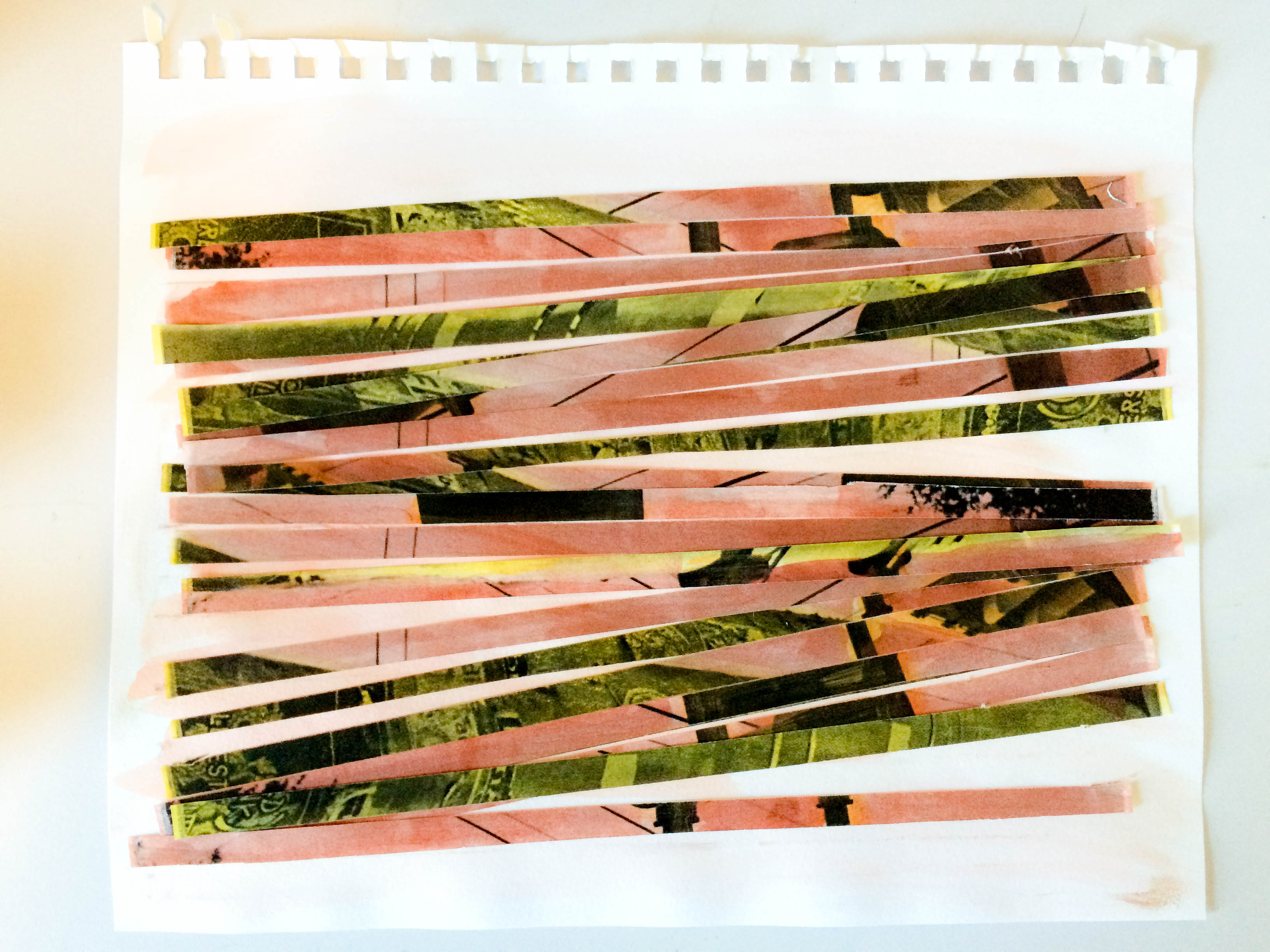
IMG_0018For this assignment (Visual Studies I with Tuan and Bill), I had to create a three-dimensional collage from photos I took on S Congress that demonstrated my view of this area of Austin. I went about this goal by taking a black and white image of a flyer-laden street post I’d taken, painting over it with red and yellow watercolors, cutting the painted image into strips, and rearranging hastily onto a piece of bristol as a support. I wanted to recreate the effect of old ripped posters on a street post (much like the image of posters on a street post), a sight common to S Congress (and most of Austin).

I think the strongest aspect of this work is the contrast in color, from harsh blacks to soft reddish-pinks. It makes the photo appear to be an eye-catching (yet faded) old poster. I think the weakest aspect is the backing. Looking back, it would be more interesting on something with a bit more texture (as old street posts have). Conceptually, I could perhaps have done a series of these, featuring different images (and color schemes) of poles in Austin. Technically, I would also have used less water in the paint, as it made it difficult to adhere. Overall, I wanted the work to be faded and rough, as if it had seen many days stapled to the street post.


Blog Post #4

Part 1:

Last Monday, 6 VISU majors at St. Edward’s gave presentations to my Visual Studies Seminar class. They talked about their work, upcoming projects, and gave some advice to the class of young artists. Below in this post, I have made some bullet points of major ideas expressed by each presenter.


Rachel Broussard — Art Major

– go see art around Austin (Harry Ransom Center, UT Landmarks, EAST, Pump Project, etc)

– inquire about Student Professional Development Funds, due Oct 1

– visit shows, on campus and off


Caelan Navarrete — Art Major

– Make outside work, and document your progress

– Experiment w different materials to find your own “style.”

– Make mistakes.

– Take all the classes you can — take advantage of the courses you take, and try new ones that interest you.


Shelby Savage — Graphic Design Major

– Influences help with creating a consistent design (hers include Wes Anderson, nostalgia, and old film)

– All visu majors (not just GDES) should go to Tuan’s workshops!

– She uses Illustrator, Photoshop, InDesign, etc to create her work


Paul Young IV — Graphic Design Major

– He’s currently making a book (inspired out of his love for typography)

– H did the music dept. posters and logo for first-year writing course

– Join the AIGA (Paul Barnes speaking at next meeting) and network with fellow graphic designers in Austin


Crissy Smith — Photocommunications Major

– Did a photo series with the Austin Fire Department, did a ride along (made documentary out of the experience)

– Photography has grown with lots of hours put in, patience, persistence

– Ask questions, talk to profs, make connections (learn outside classroom)


Juliana Ramirez — Photocommunications Major

– Sarted art collective (FiC) with some friends from UT, grew it into the Mom Gallery, where she is creative designer.

– Learn to talk about your work: what interests you? why do you do what you do?

– Constantly think about your portfolio

– Create something you wouldn’t normally — go outside your comfort zone

– Don’t be afraid of critiques, ask questions

– Utilize professors + sketchbooks (make lists, drawings)


Part 2: Post the links for four websites that you find compelling. Add a summary for each link explaining why you chose them.

http://byhula.com 

Hula (real name: Sean Yoro) is a painter that I came across very recently–he’s been in the media lately for his exquisite hyperrealist paintings done whilst standing on a paddle board. In addition to an appreciation for his work, I’m intrigued by his website due to its stark contrasts. The palate used in his site is sharp blacks and whites, which allows the paintings themselves to command attention.

http://justinwebbstudio.tumblr.com

I’m drawn to painter Justin Webb’s website mostly because of the type of scrolling experience one has while browsing the tumblr account. Unlike most other websites, one just scrolls to the right / left to view his playful indoor scenes. The whole experience is one of whimsy and nostalgia.

http://www.kinfolk.com

In a bit of a departure here, Kinfolk is a lifestyle magazine aimed at young creatives. It advocates a slow lifestyle of careful balance. I’m drawn to the typeface and inviting neutrals used on the site. The whole aesthetic is one of coziness–achieved in soft grays, dull blues, off-whites, and faded tans.

http://www.hauscollectivesa.com

This website belongs to an art collective / pop up shop in San Antonio that was started last year by a dear friend of mine. I love the color scheme used throughout site (which also translates to all of their physical materials–posters, cards, etc). The light pink, balanced by elegant black font and delicate black and white photographs, inspire me to utilize high contrast colors in my own work to add visual interest.

ARTS 1311: Visual Dictionary

Value - name
value – Katy

Our definition: Value is the variety of shades between light and dark.

Official definition: Value is the proportion of lights and darks.

unity / variety - name
unity / variety – Aly

Our definition: Unity and Variety is finding the balance between boredom and chaos in an artwork.

Official definition: Unity is similarity, oneness, togetherness, cohesion. Variety is visual diversity to avoid an unintended monotonous composition and hold the viewer’s interest.

time / motion - name
time / motion – Aly

Our definition: This is having a sense of movement, of energy flow, a sense of direction. Can also be four-dimensional.

Official definition: Actual and implied are two aspects of time.

texture - katy
texture – Katy

Our definition: Variety in a physical plane; tangible (whether actual or implied)

Official definition: Texture can be physical, it can be a visual illusion, or even invented.

symmetrical balance - lexi
symmetrical balance – Lexi

Our definition: A composition that has two sides that mirror each other.

Official definition: Visual or actual equilibrium of two halves of a composition mirroring each other in size/shape and placement of elements in art.

space - name
space – Aly

Our definition: The amount of depth; relation between objects in the fore-, middle-, and backgrounds.

Official definition: Space is the area within or around an area of substance: positive / negative, compression / expansion, activated, entering.

shape - name
shape – Katy

Our definition: Two-dimensional objects.

Official definition: Shape is a flattened enclosed area.

scale / proportion - lexi
scale / proportion – Lexi

Our definition: Having distinctions in size relative to multiple objects.

Official definition: Scale is the comparative size of an element of art or object in relation to other objects and expectations about what is normal. Proportion is the relationship of the size of parts to each other and to the whole artifact or image.

rhythm - lexi
rhythm – Lexi

Our definition: Repeated, implied motion in art that mimics the auditory sense.

Official definition: Rhythm is a sense of movement, whether regular, irregular, pattern, or grid.

radial balance - lexi
radial balance – Lexi

Our definition: A composition or object that mirrors itself from 360 degrees.

Official definition: Radial symmetry is equilibrium achieved by elements emanating from a point, usually the center of a composition.

plane - vivian?
plane – Vivian

Our definition: A linear surface that can be rotated 360 degrees.

Official definition: A plane is a 3D form that has length and width but with minimal thickness.

mass - name
mass – Vivian

Our definition: The density of an (actual or implied) object.

Official definition: Mass is a solid 3D form.

line - katy
line – Katy

Our definition: A building block that varies in thickness and quality.

Official definition: Line has quality (thick, thin, broken), can be implied or actual, and has linear networks (cross-contours, psychic line).

light - aly?
light – Aly

Our definition: How color hits an object; the casting of shadows.

Official definition: Light can enhance or obscure, affect emotions, entice us to enter, create mystery, can even be the sculptural medium.

emphasis - lexi
emphasis – Lexi

Our definition: A method used deliberately by the artist to draw the viewer’s eye towards one specific element.

Official definition: The arrangements of elements of art to make some areas the primary focus of a viewer’s attention.

color - name
color – Vivian

Our definition: Different shades on the visual spectrum.

Official definition: Color has hue, saturation and value. By adding white to a color, you achieve a tint. By adding gray, you achieve a tone. By adding black, you achieve a shade.

asymmetrical balance - lexi
asymmetrical balance – Lexi

Our definition: A design tactic in which elements of the piece are deliberately put into an unequal balance with each other.

Official definition: Asymmetry creates equilibrium among visual elements that do not mirror each other on either side of axis. (Depending, design can be quite dynamic or chaotic.)

Sculpture-by-the-Sea-509-Mark-Grey-Smith-within-2009
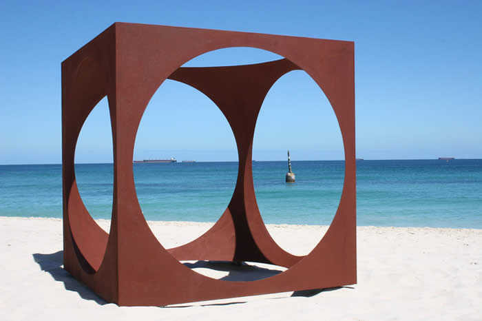
volume – Vivian


Our definition: a 3D object

Official definition: Volume refers to an enclosed area of 3D space.