For our Information Map project, we were tasked with organizing a year’s worth of credit card transactions completed by a fictional man named Tony Pierce. After organizing the data, we were to create a chart that marked specific trends in Tony’s purchasing habits. For my map, I chose to track every restaurant he used his credit card at in Texas. Over the year, Tony used his credit card at three Texas cities: Austin, El Paso, and Houston. I charted each restaurant in columns labeled for each city, and placed them in order of dollar amount spent.
Mapping Project: Artifact Map
For this map, we were tasked with creating a map that charted interactions on campus, at work, or at home. I decided to chart the heights of every building on campus, to determine the highest and lowest buildings at St. Edward’s. I organized the heights by number of floors on each building: 1 level, 2 levels, 3 levels, and 4+ levels. This assignment challenged us as designers to design something that would be useful and interactive for the viewer.
Symbol Methodology
For this assignment, we were tasked with creating three symbols that would represent a concept of our choosing. For mine, I decided to make symbols that could be used to indicate dangerous drug interactions with foods. My three symbols represent dangerous interactions of common SSRI medications with alcohol, caffeine, and grapefruit. We used a three-step process to abstract our concepts to create new icons that have new meaning entirely.
Grids and Spreads
Mads Nygaard Folkmann
Design Issues
Vol. 26, No. 1 (Winter, 2010), pp. 40-53
Type Specimen Poster
This type specimen poster (and original typeface design) was done as an assignment for my Typography course. I was inspired by restaurant Cafe No Sé’s interesting kerning on their brunch menu. I knew I wanted to create a display font in order to achieve maximum visual impact. To make the chart feel more cutting-edge, I added the colored triangle to add a dynamic quality to the “menu.”
Matchy-Match
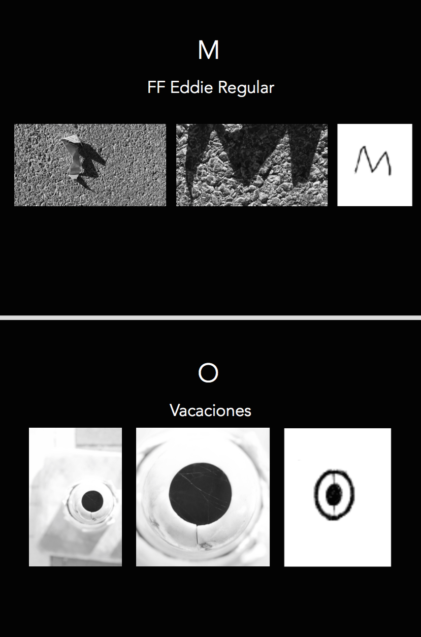
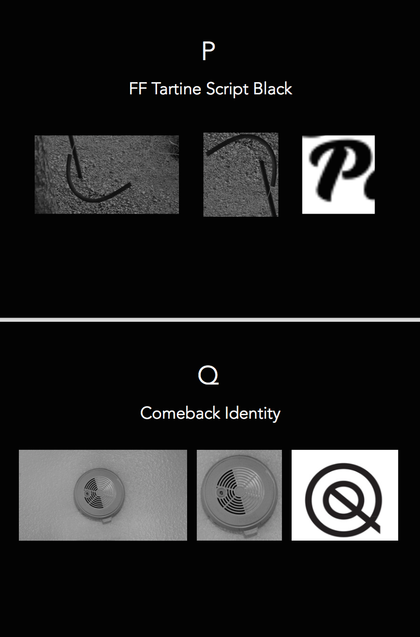
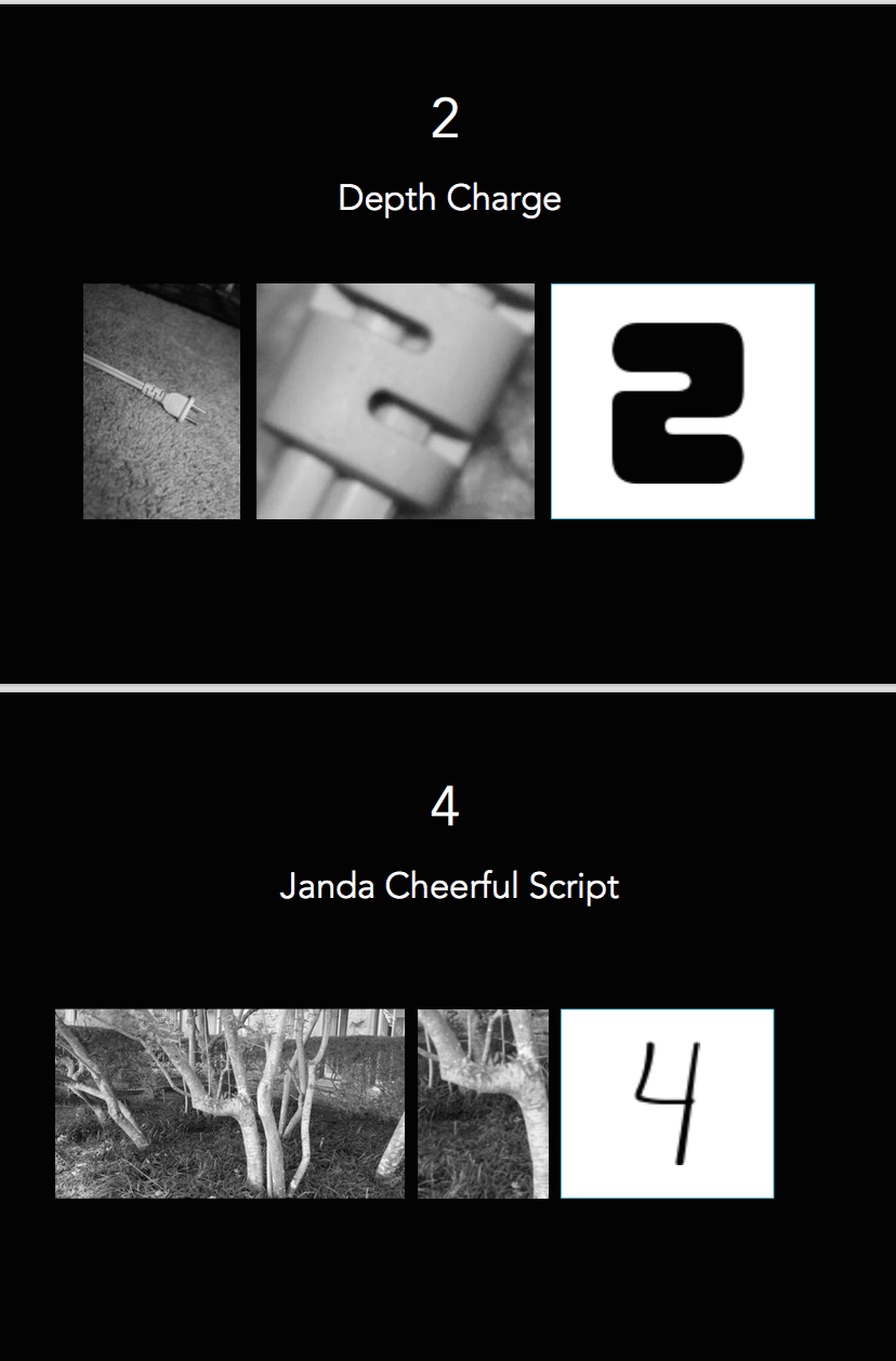
For this assignment, we were tasked with finding letterforms in both natural and man-made environments. Our intention was to find at least one example for each letter and number in the alphabet, as well as basic punctuation marks. This was a challenging assignment that forced me as a designer to stretch my understanding of what typefaces can look like.
We photographed these found-letterforms and matched them up with typefaces that looked similar, completed using an app called WhatTheFont. We then cropped the images and placed them into a powerpoint to analyze them side by side with the WhatTheFont typeface letterforms, and documented the name of the typeface at the top of each slide.
Letterform Scavenger Hunt
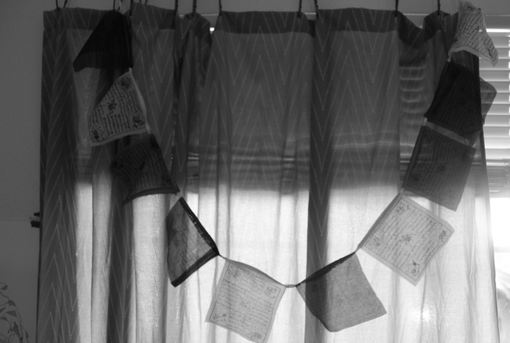
In this assisgment, we were asked to find and photograph various letterforms in natural and built environments. This was an interesting challenge for me as a designer to expand upon my own limited understanding of how letters can change and how we derive meaning from symbols. I was able to find most of the alphabet, as well as several numbers, all around me in the physical world.
Mid-Term Assessment Essay
1 Where are you in your hours that you declared earlier in the semester? Looking at your work now, are your current accumulated hours enough?
My goal for expert hours this semester that I set in January was 8 hours per week, which comes out to 120 hours total by the end of the semester. Thus far, I have blown past my midpoint goal of 60 hours, leading me to realize that I was conservative in my goal-setting. As of today, I have accumulated 154 hours. These hours were spent working outside of class on course projects (the Blue Squares project, LATCH, and Weather Report), attending gallery shows around Austin (three SEU Gallery shows, one at the Blanton, and two at the UT Visual Arts Center), watching After Effects tutorials on Youtube and Adobe, and gathering inspiration and ideas for animation visuals on Pinterest, Dribbble, and Instagram.
2 Has your definition of “sophisticated” work changed from last semester? If so, how so? What is sophisticated in your weather report?
Yes, I have a clearer idea of what is polished work, as opposed to last semester. This semester I was far more on-top of projects than I was last semester, and was thus able to yield greater results. Since my time management was better, I was able to experiment more with visual possibilities and push myself, rather than turning in just the “standard” type of work that could be expected from anyone. I feel that the streamlined elements and organizational qualities of my weather report are the most sophisticated part of my project. In particular, the map on my first LATCH sequence on the report, which included a map folding up out of thin air, was an ambitious goal that I spent a large amount of time honing so that it simulated a physical map. This was far more sophisticated than previous work I’ve done, in which I met the basic requirements but didn’t take any bold moves with projects.
3 Describe how the new things you’ve learned so far connect to what you already had coming into the semester.
I have a new tool under my belt in the form of After Effects, which has greatly changed the way I look at design. I’d previously thought of design as purely static, but I’ve now come to see that this is not always the case. Being able to create interactive elements, especially for the web and mobile platforms, is a major skill that allows the viewer to feel more engaged with the design. With this information in hand, and the prototyping skills I’ve developed with this semester’s projects thus far, I feel confident in pursuing a career in motion design. It’s piqued my interest and pushed my work in a way that I was unable to see as a possibility before being challenged with motion type. I have also learned about the LATCH acronym of visualizing data. Understanding these 5 principles of describing data will be useful for me going forward in my design projects. They serve as a reference point for organizing information in a way that is meaningful and useful. Looking back at projects in Design I, I can see how utilizing LATCH principles into my map projects would’ve greatly helped in how I attempted organizing data.
4 What are some things you are still unsure about in this project that you would like to know more about?
I would like to learn how to get more out of the After Effects program. I feel like I only scratched the surface with Ae on this project, and would like to learn more about how I can create elements within the program (instead of only manipulating/choreographing files I create in Ai and import to the program). I’d also like to learn about the range of tools motion designers use in their practice, and where After Effects falls. My understanding is that After Effects primarily functions as a prototyping tool, so I’m curious to find out what the professionals use to create the graphics used in animated films, video games, etc.
5 Assign a level of value to this project. Identify two other projects in your creative life and place this weather report relative to them. How close or far are they from one another? What qualities did each project have that the other’s didn’t that would rate them higher/lower?
Two other projects in my creative life at the moment are drawing explorations in Drawing II with Alex, and my branding project in Graphic Design II with Jimmy. All three projects feel as though they bear equal weight in terms of importance and relevance to my personal and professional goals, but they all serve to meet very different ends. If I were to relate their value one to another at the present moment, I would assign this project a value 7 (of 10) to Alex’s 5 and Jimmy’s 6. This project ranks higher than the other two due to three factors: 1) the deadlines were more pressing 2) it involved learning a new software and 3) it simply required more of my energy to make meaningful work. This project served to teach me choreography in motion design as well as a new technological skill, whereas my other two major projects served to advance my abilities within skills that have already been developed in my courses. My drawings serve to force us out of our comfort zones, and challenge us in how we approach drawing as a tool. My project for Jimmy’s class is a venture into identity branding, which, while it is a new type of design we’re exploring, relies on technology I’m already very familiar with.
6 Break down the percentages of what entities that create growth within the creative you. Am I part of it? Part of it is on you, right? Do you consider your classmates/friends as influencers on the course of your trajectory for success? At the end of the semester you will be evaluating me, but right now within your own pie piece, how much have you brought to the game? How did it end up that you brought that much?
I feel as though my growth development in this class was dependent upon many entities. My willingness to try new things and challenge myself was probably 50% of the process. Tuan was another 20%, as he was the one who assigned the parameters of the project that challenged me. My classmates and friends were the last 30%, as I got the most feedback along the way from them. My peers played a significant role in my trajectory for success, as I was able to watch their videos and learn from them as I worked on my own. I spent significant time in and out of class on this project, and do feel as though I’ve done my part in growing.
7 Ask me or express something, you feel like you can’t in class or even my office: http://tunarice.tumblr.com/ask (Links to an external site.)
(This paragraph will be on tumblr)
Feel free to add other dimension/criteria/rubric ratings that you deem important in the learning/changing process.
end term assessment essay
1 How many hours of practice time per week would you consider excessive? How many hours would not be enough to create sophisticated work? Where are you situated?
I would say that an ideal number of hours per week is between 8-10 hours per week. Ranging closer to 3-4 hours a week would not be enough, while 15-20 seems excessive. I hovered between 6-7, on average. I felt as though I went through fewer iterations with the mapping project than I did with the icon project.
2 What is “sophisticated” work? What is sophisticated in the designs of your maps?
Sophisticated work pushes past the default. In terms of the designs of my maps, I felt like i pushed past the default the most on the Tony Pierce map, while the other two were pushed less. I would like to continue to work and rework my maps, particularly the personal geography map. The decision map feels done to me, albeit simple. I hoped to achieve a clean, polished look with that map.
3 What was some meaningful feedback you received about the maps and what did you do with that feedback?
I received feedback about how to expand and integrate the information on my decision map, which I took to create a map that was far more interesting than a simple yes/no decision tree. I was able to have more than one decision lead to similar results, to make it more interesting.
4 Describe what level of challenge you encountered in the creation of your maps. What was the hardest part / what was the easiest part? What was the most enjoyable part of the process?
I was challenged by the personal geography map the most. I reached out to several people about trying to find the heights of buildings on campus — I contacted the city, the university, and the architectural companies SEU has used in the past to try and get some answers, but received no answers. So I had to change my concept a bit, and instead made a map based off of the levels of floors each building had. Still interesting, but it wasn’t as interesting as it could’ve been with more data. I was also challenged in trying to make a decision map — I had to research the busiest / least busy times for each of my favorite restaurants and then fit it into a cohesive flow chart. The easiest map (and most enjoyable for me) to create was the Tony Pierce map–the data was already provided, so I felt I had more time to be creative and make an interesting bar graph. I had a lot of fun creating that map.
5 Did you do anything else outside of class, extracurricular, related to art, design, or creativity?
I went to a couple of shows — EAST, Tammie Rubin’s show at de stijl gallery… I also worked on a couple of t-shirt designs for organizations on campus at my Stu Life job, which was interesting to work with balancing creative license within brand standards. I also made a piece for the Minute Gallery, which was a fun experiment in color optics.
6 Whether positively, negatively or neutrally, how has your life outside of school impacted your school work?
My life outside of school took a major hit this semester, and had a pretty large impact on my school attendance/performance. Some life-altering situations (read: personal behavior health crisis) happened, and getting my attention 100% on school was a challenge at times. That being said, I did my best to keep up with work and push my maps to the best they could be.
7 What does the most ideal classroom environment look/feel like to you? What does it mean to be part of a class? This semester, what was your part / role / contribution to this ideal vision?
I enjoyed the “round table”-style critiques and discussions. Being able to sit on the same level with my peers and professor made me feel far more comfortable with speaking up in class and voicing my ideas. I felt as though we were all equals, all learning together. I felt an important part in the process of not only my own icons and maps, but in helping everyone else to improve theirs as well (and vice versa). I especially enjoyed “swapping” maps with everyone, and getting written feedback really helped me to remember feedback later, after class had ended, when I was looking for ways to improve my designs.
feel free to add other dimension/criteria/rubric ratings that you deem important in the learning/changing process.
Overall, I feel like I’ve learned much more about the process of design, and what types of research methods go into creating graphics. I’ve learned that it’s not always just about the “look” of something–it’s the content itself. Something can look cool, sure, but if the information isn’t useful or accurate or productive, it’s not really a worthwhile design. So this has really changed the way I think as a designer. Not as just someone creative, but as someone who solves problems.
Portfolio Review
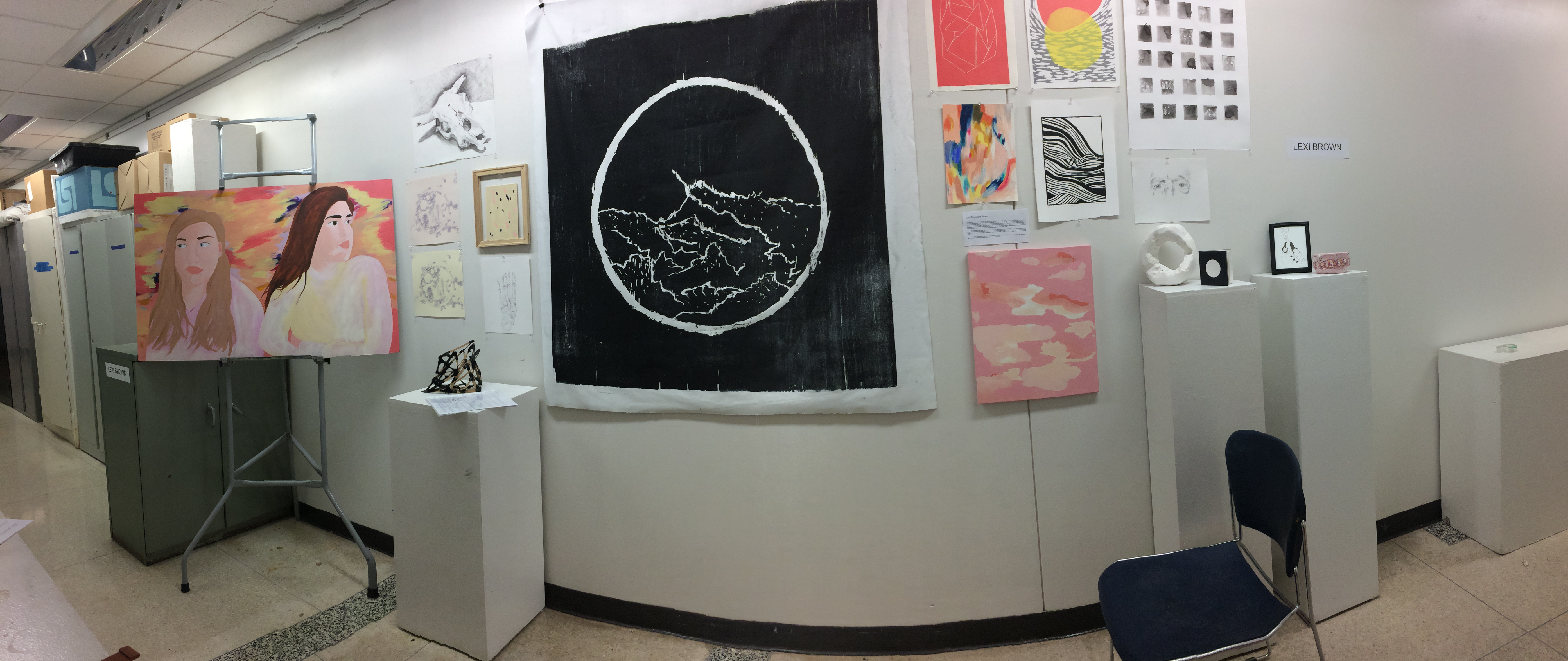
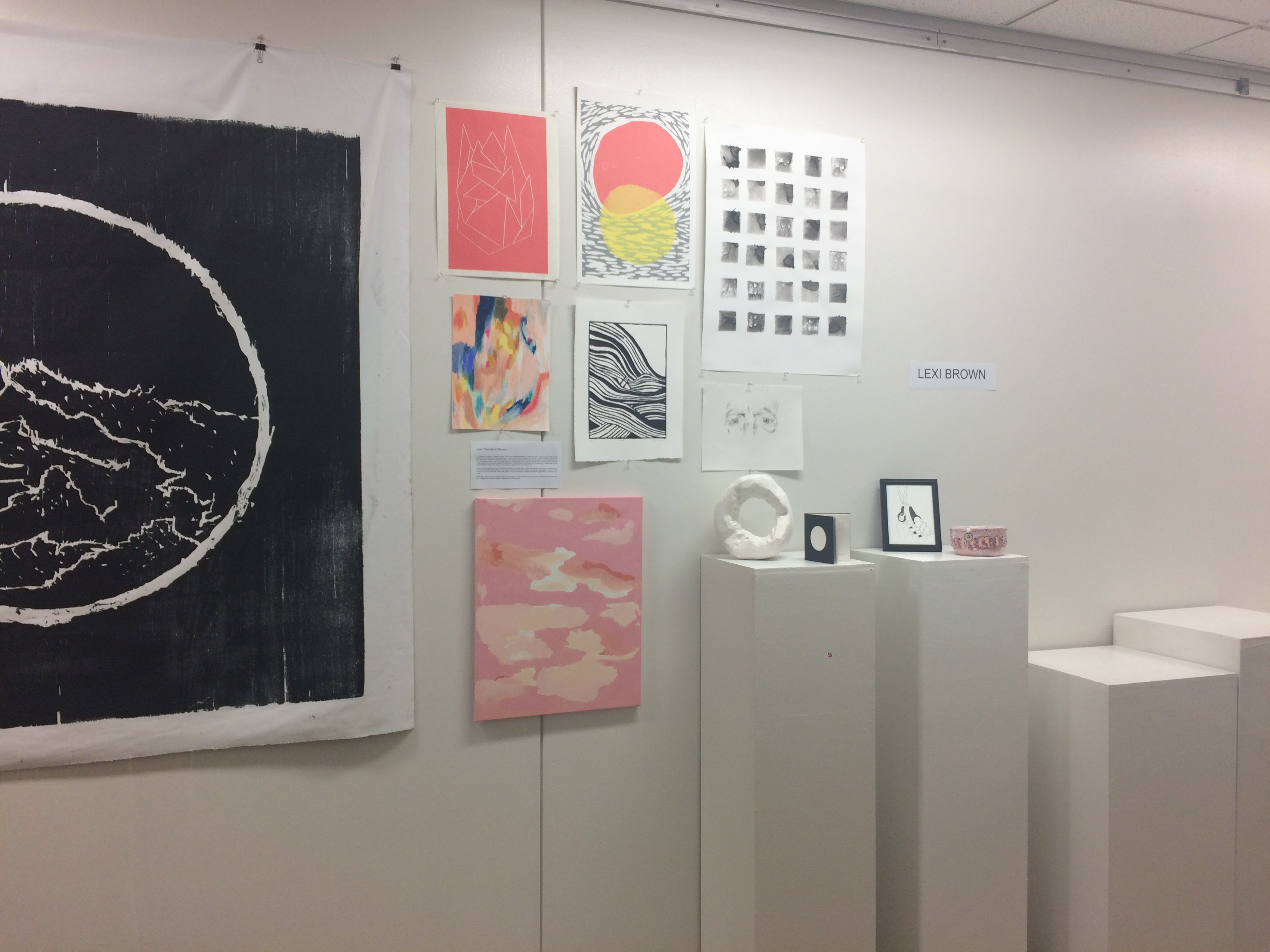
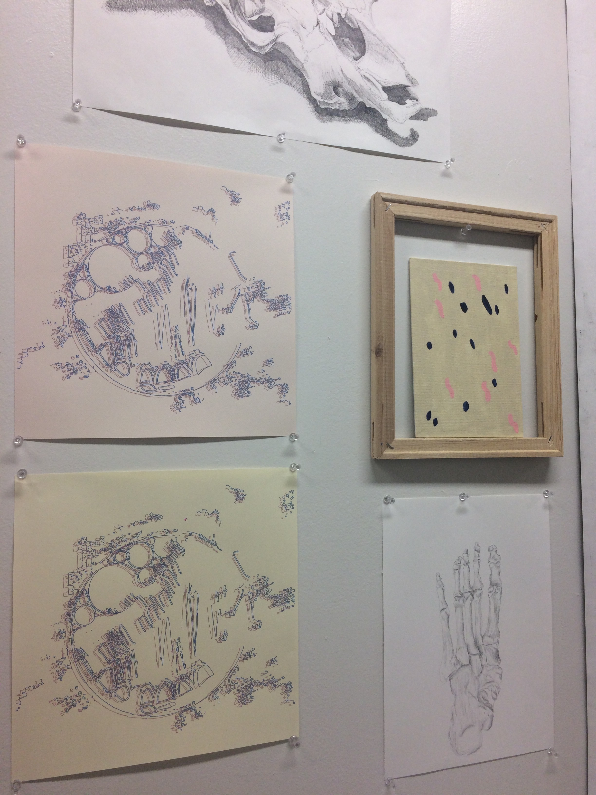
Lexi Brown
- 1 What resources do you use for your ideas?My primary resources that I use for my ideas are internet culture, fabric design, typography, interior and furniture design, and my sisters (both artists, an animator and a metalworker, respectively). I find my greatest resource is in talking with them about their recent work, their ideas, and bouncing off my own ideas with them in both casual and more serious conversation.
- 2 What motivates you to make art?I’m a physical learner. The only way I know how to “think” is by making. Memories of past trauma motivate much of my work. Additionally, I’m driven to make art that reflects my obsession with order, readability and efficiency. The latter bit is particularly motivating in my design work.
- 3 How do you use color, space, form, and other dynamics in your work?I find myself using pinks and neutral tonalities over and over again in my work. I find pleasure and release in the opening up of space and the calming effects these colors provide. Calming pinks, oranges, and off-whites that at the same time possess a sort of quiet energy in their warmth. I often balance our these colors with dark blues. Negative space, asymmetrical balance, repetition of shape, and visual rhythm also allow me to achieve similar effects in my work. The circle is a common theme for me as well, as a way of containing intense feelings of emotion.
I use pink as a representation of lost girlhood, loss of innocence, and reclamation of childhood. This is a theme present in my work—exposure to the adult world, something I grew up with amid my sister’s illness and my experience in treatment.
I’m also drawn to diagonals. There is a concept in Dialectical Behavioral Therapy (DBT for short) about emotional progress: you think it’s going to be an upward trend, but it’s often a chaotic, messy, up and then down, and then up again—while all the time generally progressing up—graph. As a perfectionist and stubborn client of DBT, I’m always looking for ways to incorporate and seek out the perfect (yet occasionally jagged) upward trend.
- 4 How do you view your craftsmanship?Craft is something I continue to work on — and I’ve found greater interest and success in the digital aspects of my work because I’m able to remove the fingerprints and “the hand” entirely. I find that this pushes the work. My personal aesthetic is clean and smooth— mechanical-looking, almost.
- 5 What do you consider to be your strengths?I consider my ability to implement criticism and progress in the iteration process my greatest strength. A core value for me is self-improvement, which lends itself nicely in my determination to improve my creative work. I also consider a strength to be my technical ability to execute concepts in a physical way.
- 6 Are there skills you feel need further development?Sticking to my concept is the hardest part for me, and often keeps me from making work. Because my work is typically based in heavy themes, the emotional drain often deters me. I also want to increase my skills in the 3D, as I’m currently taking my first clay and sculpture courses. I hope to improve this area and experiment more in this medium.
- 7 How does your work relate to art historical precedents and contemporary trends?I’m inspired by the flat forms and heavy contour of Gauguin and Matisse, as well as the color palette of the Fauves. I also find myself drawn to Tuesday Bassen’s work—her Americana girl-gang aesthetic is appealing to me, as well as the idea of “wearable art.” As an artist who also considers herself a designer, this merging of the two is inspiring to me.
- 8 What are your expectations / goals for yourself over the next five years?I plan to graduate in a year with my Major in Art, Minor in Graphic Design and get hired by a design firm or website to produce online creative content. I also plan to continue to side-hustle and improve my craft both in and out of the studio.
Artist Statement
I’m interested in charting my experiences with trauma from multiple perspectives: as a sister, daughter, human. My work is informed and inspired by family, illness, and girlhood. My work is colored by my firsthand experiences as a minor in an adult addiction clinic and my early exposure to my sister’s mental illness; these events shaped me and influenced my work considerably, as I was forced to grow up in a short period of time. A lot of my work deals with reclaiming lost bits of childhood, whether this be through playful design or compositional choices in painting. I tap into these feelings of “being 5, being 7, being 9 years old” and experiment in these emotions. The result is typically images of my sisters, primary shapes, abstracted forms, and shades of pink.
I convey these themes through order, rigorous documentation, and categorization. I chart these perspectives through the layering of color, all the while emphasizing the flatness of my surface. I represent emotions and feelings in a visual way, emphasizing the flatness of the surface to add to the “graph-like” effect. Open areas of color allow me space to breathe, while harsh, jagged marks represent times of stress.
Additionally, I enjoy producing work that blends art with design. I’m in love with both and hope to find and make work that combines the two — whether it be vectorized drawings, text-based art, or textile design.


