MID-TERM ASSESSMENT ESSAY

What specific level I believe I’m at (in terms of)…


1) My expert hours in relationship to my use of practice time

“Consistent” seems to me to be a slow, consistent level / quality of work. Tea doesn’t really cause large spikes in energy, rather it provides a steady and regulated amount of energy.

“Uneven” is a bit more energetic, yet less predictable. The average cup of coffee has 100 mg of caffeine (twice that of a cup of black tea). More caffeine leads to larger caffeine crashes and withdrawals, which may result in less predictable work.

“Sporadic” is a drink used for all-nighters. This type of work was put off to the very last minute, and thrown together in the midst of chaotic energy. Very unreliable. They sometimes came to class, sometimes did homework, and sometimes spoke up.

I believe I was a solidly “Consistent” level.

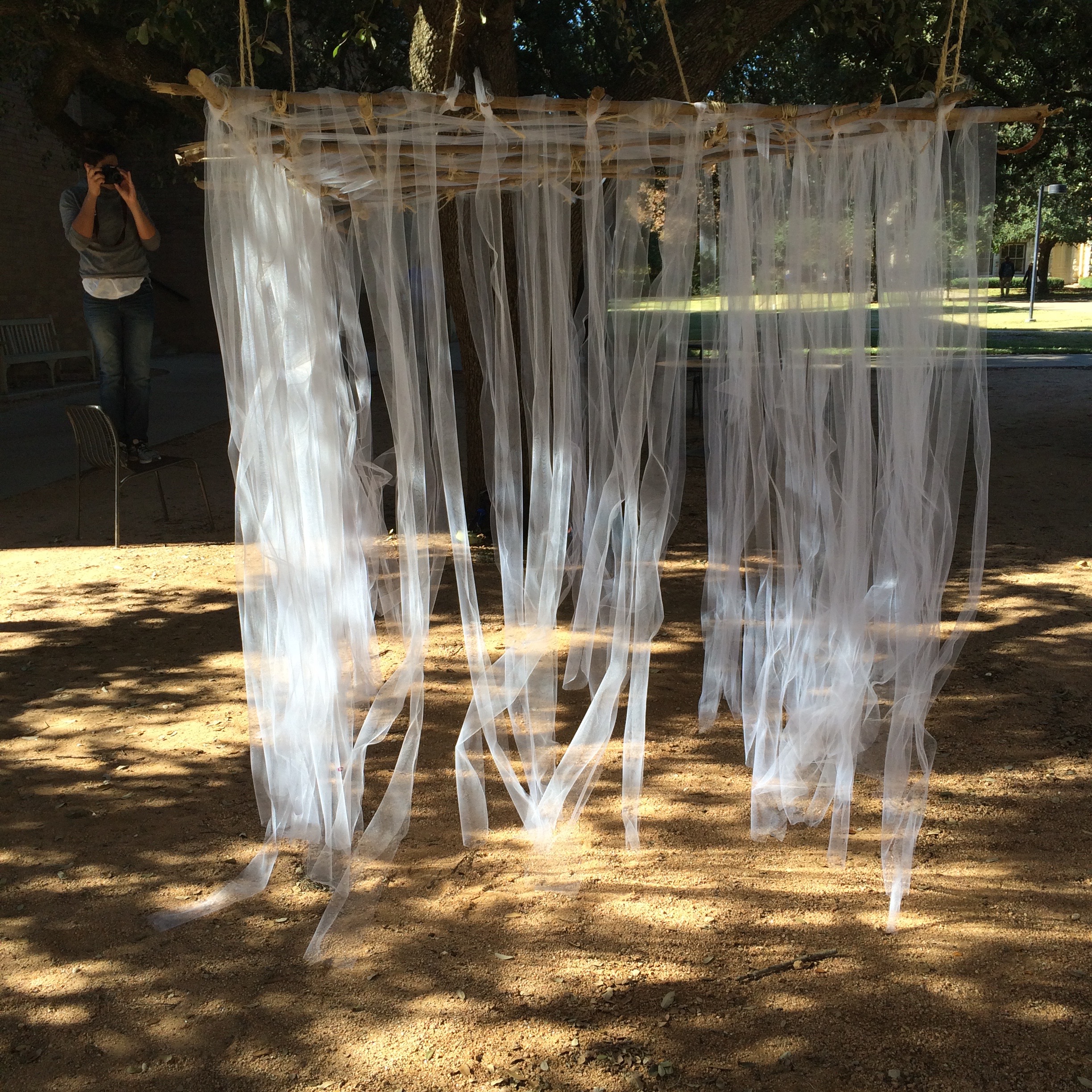
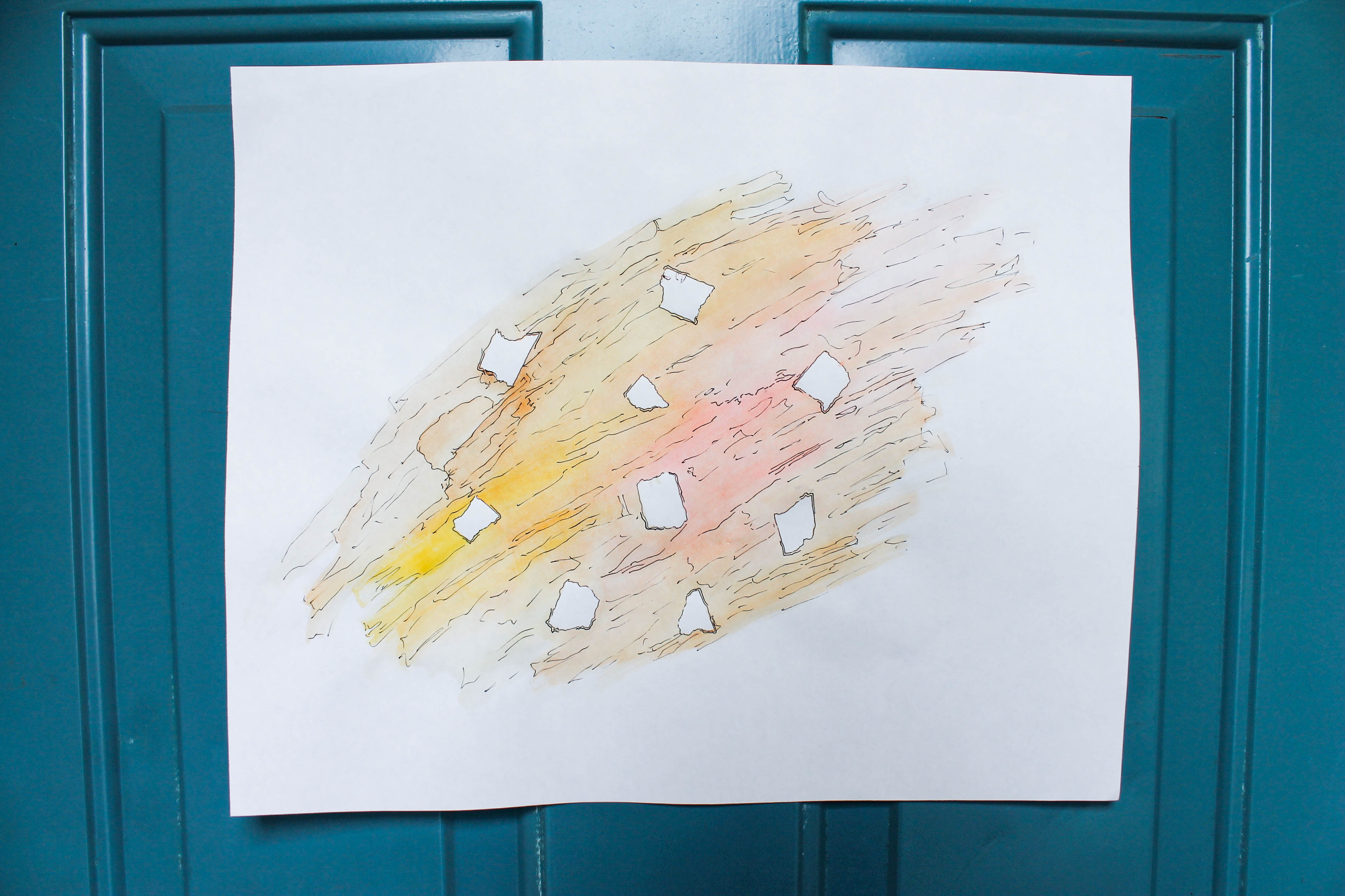
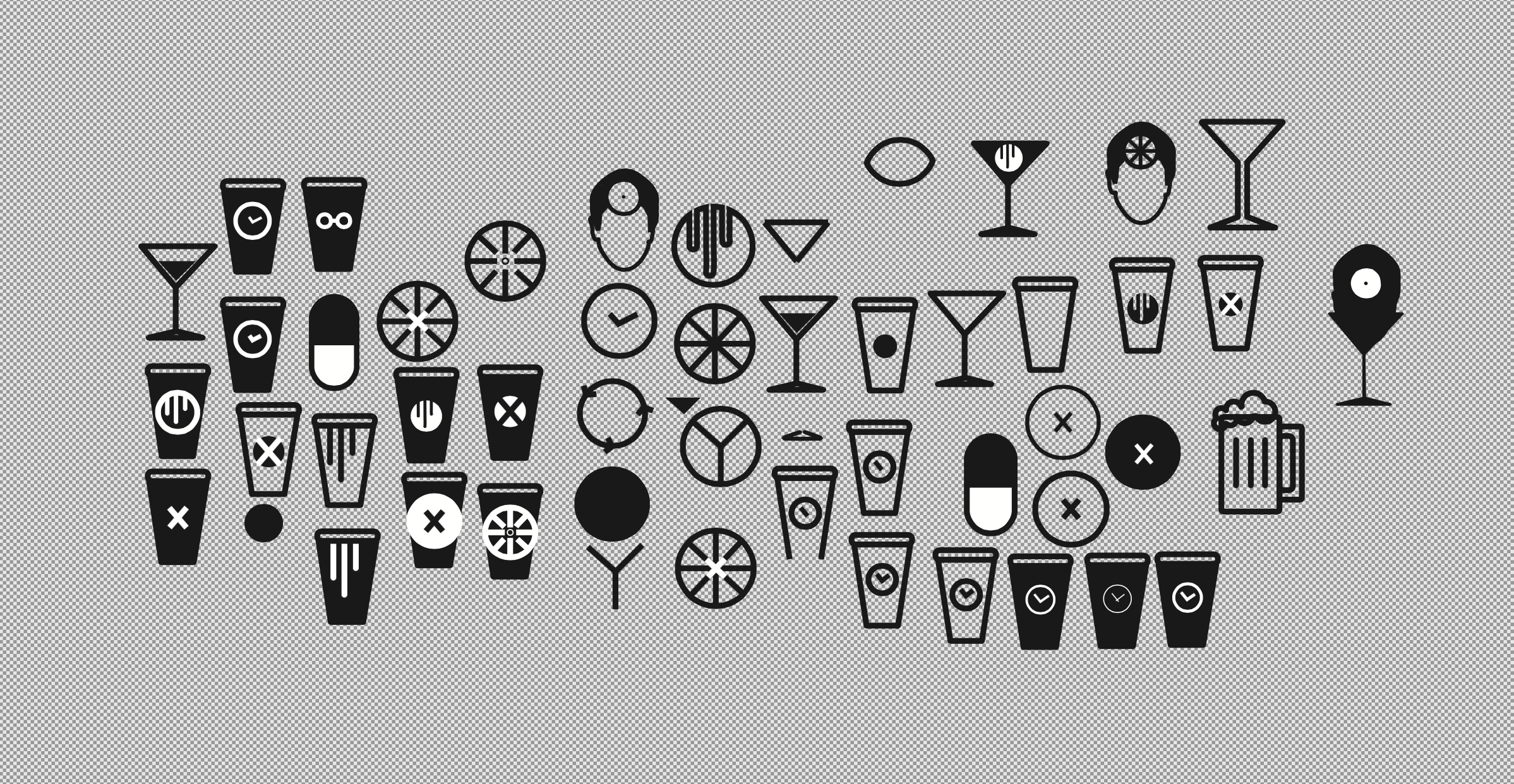
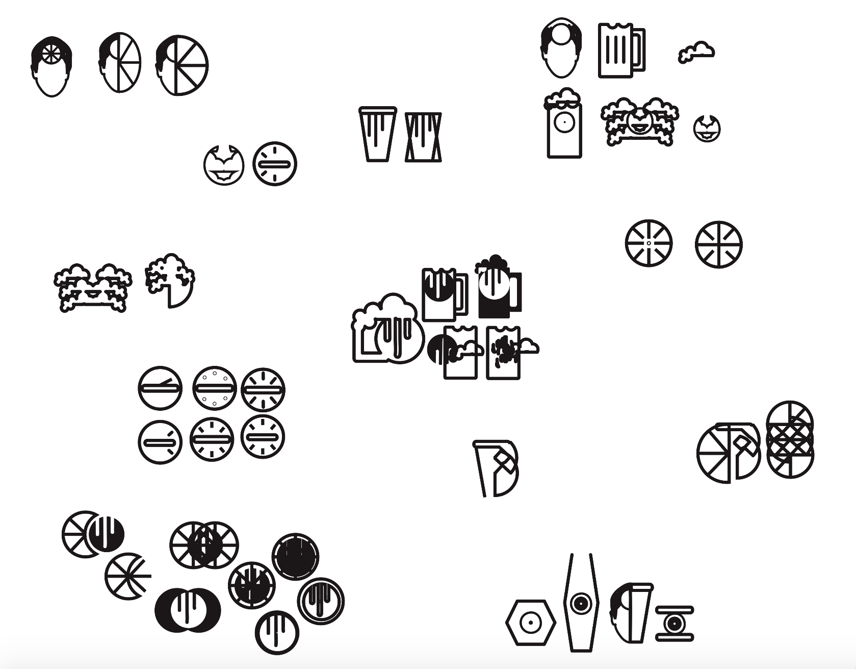
I consistently sought out opportunities to increase my expert hours this semester thus far, both through my use of practice time and outside (of the classroom) activities. I spent 11-12 hours a week outside of class in “practice time” for the symbol project. I developed a strategy in iterating my work to evolve and refine my symbols. As I worked, I would create on a large artboard so that I could make dozens of iterations as I worked. Often I would make small changes and copy and paste each iteration on the board so that I could a) see my progress and b) go back and work my iterations more. I would end up with between 20-30 “mini” versions, all with very slight changes, of each symbols — enough choices to inform me whether what I was doing was heading in the right direction or not. Critique in class really helped me to see “why” I was headed in the right direction or not. Additionally, working in small bursts and coming back after short breaks with “fresh eyes” really helped me to see what was going right (or not) and led me to develop even more new ideas.

2) The sophistication of my work

“High” seems to me to mean someone who was able to identify things that worked / weren’t working in their projects.

“Medium” seems to me to mean someone who can tell if something is generally working or not, but not necessarily understand why.

“Low” seems to me to mean someone who is totally lost, not understanding at all why their symbols simply aren’t working.

I believe I was somewhere between “High” and “Medium.”

I brought in symbols for pin-up for every critique we had and improved my grouping with each meeting. Additionally, I hit the criteria for looking at overall visual weight, equal line weights, kink-free lines, and making something that no longer was representative. I pushed my symbols past the “default” to make something unique that no other designer could make. However, where I feel I was more “Aware” is that I do wish I could continue to push my symbols further, because it was a little more difficult to understand the why than the what. I could understand that some things worked more than others, but I often relied on critique for my peers to help me understand with fresh eyes why some symbols were working better than others.

My final 3 symbols

3) How I dealt with feedback

“Meaningful” in this case, seems to mean someone who truly experienced a massive amount of growth and positive change in their symbol iterations.

“Useful” in this case, seems to mean someone who made large changes, but not to the level of growth that ‘Transformative’ entails.

“Trivial” in this case, seems to mean someone who did the bare minimum, who made small changes but stopped there, and didn’t push the work.

I believe I was between “Meaningful” and “Useful.”

While I made significant process on my symbols, and am on the whole satisfied with my final results, I would still like to go back and rework my third symbol.

i responded fully to feedback, and truly tested and implemented every piece of advice and critical feedback given to me as I went through iterations of my symbols. I looked forward to critique because I was able to see my symbols in a new light from my peers’ perspectives. It felt invaluable to me in my iterative process.

Original 3 symbols
Early stages, pre-outlines
Outlined and Pushed Further
Final stages for non-representational symbols, after responding to feedback to push the work further

4) The level of challenge I gave myself

“Intense” reflects the person who went above and beyond the asked criteria, beyond the parameters of the assignment.

“Medium” reflects the person who challenged themselves.

“Mild” reflects the person who copped out, who chose an easy topic to speed through the project.

I believe my level of challenge was Intense / Medium (but more on the Intense side).

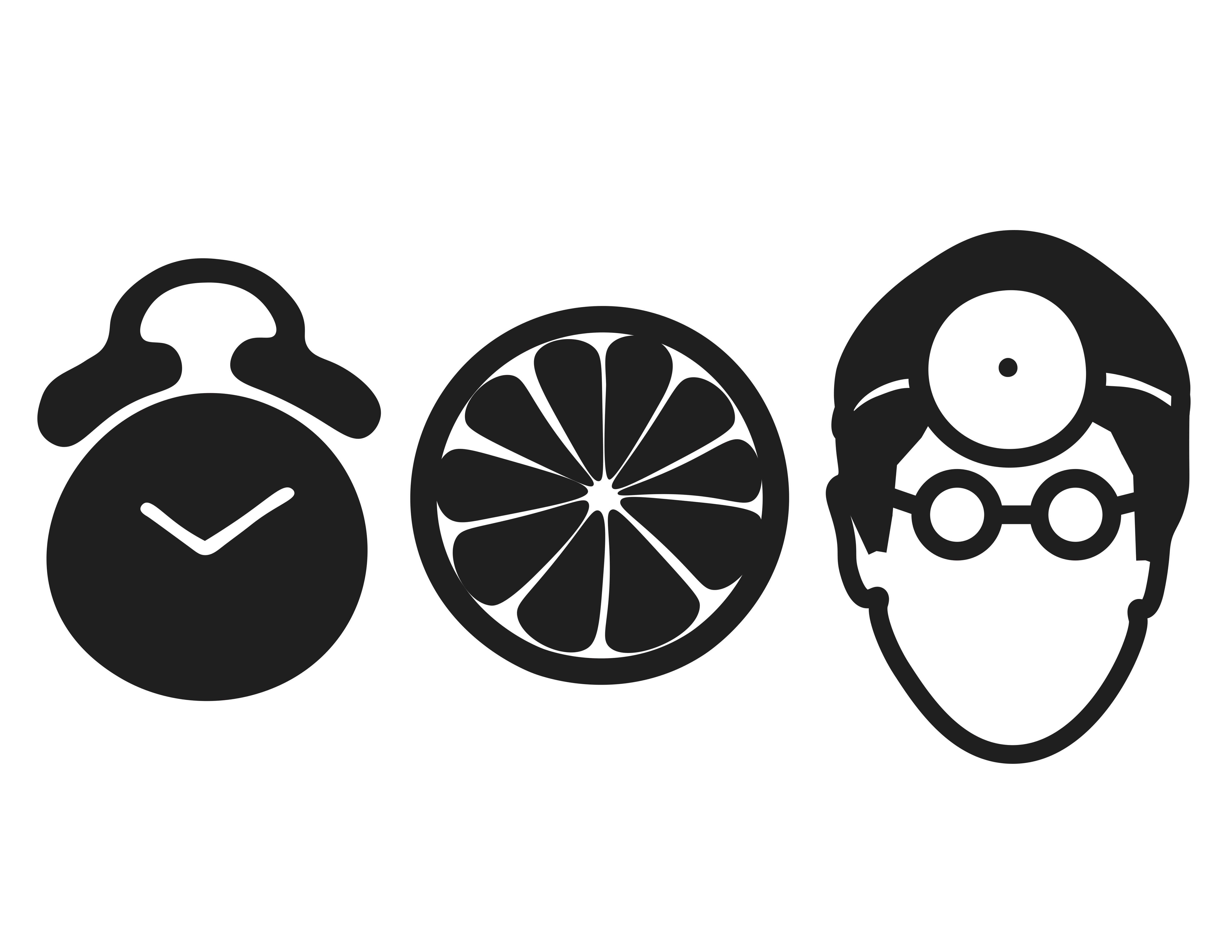
My original idea was to simply reinvent the “vegetarian”, “gluten-free”, and “paleo” stickers seen on food and menus, but felt this wasn’t going to be challenging enough for me. So I instead decided to try making food and drug interaction stickers. This felt like a significant step-up in terms of difficulty, and also seemed like a type of symbol set that didn’t already exist. And as a person who takes medications that cause me to avoid certain foods, it was doubly significant.

5) Other expert experiences

“Lots of Extra Stuff” means that the person gained expert hours in a variety of ways, both in testing new skills and observing others (i.e. “masters” at the craft).

“Just the Class Assignments” means that the person gained expert hours solely in their completion of homework assignments for this class.

“Other ‘Stuff'” means that the person gained few expert hours, whether relevant or not.

I truly believe I’ve earned the Lots of Extra Stuff rating.

I sought out countless opportunities outside of class thus far this semester. I’ve been learning technical and professional skills as a Senior Designer in Student Life. I received 3D printer training to work in the on-campus design labs. I attended the faculty art show and the Me, Myself and I show. I was asked to make a piece for the Minute Gallery–my project, a vectorized and manipulated image of an original pen and ink drawing, was an opportunity for skill development that directly helped me with this symbol project, both in terms of time management and the Illustrator tools that I gained far greater mastery with. I went to the Blanton exhibit on Xu Bing’s text-based work, Book from the Sky. I had my first professional art opening at the Bob Bullock Museum for the Butterfly Project, in which I was a full member in the project’s design, tests, and implementation.

6) Social emotional development

“Mature” means the student was on top of all assignments.

“Young” means the student was overwhelmed by the assignments, and the work started to rule them.

“Adolescent” means the student was completely owned by the work, and wasn’t able to push the work or take charge of the work.

I felt very in-control of my project. (Mature rating)

I made every deadline, participated in every critique, and missed only one class (due to a family emergency). The project, while challenging, was something I successfully stayed on top of, and was thus able to truly give it my all, give it my full attention, and feel proud of my final result. I was able to really enjoy the process (and the lessons it brought) by staying in control of my symbols (rather than letting the symbols control me). Additionally, my outside experiences at my design lab job, Student Life Job, and Butterfly opening have taught me the importance of maintaining both professional and positive attitudes. This has directly affected my classroom attitude, of remaining both appropriately professional and constructive when dealing with others in group and individual construction. I’ve gained a larger design vocabulary and felt able to implement these ideas into critique more so than I was able to in previous classes (or even the beginning of this class).

7) And my contribution to the classroom climate

“Warm” was the student who fully participated in critique, asked questions, and provided relevant and constructive feedback. They did their work and helped to cultivate a healthy and productive work room environment.

“Room Temp” was the student who occasionally spoke up when called upon directly, and usually stayed on task during critique and workdays.

“Cold” was the student who never spoke up in critique (or didn’t show up), was not an active participant in classroom discussions, and didn’t foster a productive vibe in the room for others to feed off of.

I believe I was an influential (warm) contribution to the classroom climate.

I made active effort to provide helpful and constructive feedback, and felt like I was always a voice heard in the classroom, always with the hand up and ready to share. I feel as though I gave meaningful feedback both vocally in critique as well as in the written feedback we provided each other in the final stages of the project. Additionally, I contributed to the climate in a positive way in the conversations I had with both Helaine and Magdalena outside of critique during workdays. I was able to receive and give constructive criticism in talking with both of them about our symbol progress.

Shelter Project Reflection

IMG_0733IMG_0677 IMG_0680 IMG_0682

1. How did your group approach the concept of shelter?  Was it successful? Why?

My group saw shelter as being tied to childhood. As a child, you often play with materials you find around your home and backyard–sticks, branches, string, fabric. We built a hanging shelter reminiscent of a child’s fort. We used transparent tulle because it is delicate, gentle, and tangles easily. These attributes all seemed to fit childhood, as well. The fabric gives the person inside a sense of being protected, while still being soft and easy to rearrange. We felt it was successful after multiple people had approached us about the project. Many told us it reminded them of a blanket fort they’d built as children, or a treehouse because of the wooden “roof” we hung from the tree in front of Moody Hall.

2. What was the group budget for the project? Where did you source your materials and how did they cost?

We were given a max budget of $30 and were able to stay under it. We bought two spools of tulle from Michaels for $5 each and twine from Home Depot for $3.50. The branches were sourced for free from Blunn Creek. We spent a total of $13.50 on our shelter.

 3. Was the workload equal? Explain. 

It was mostly equal. I spent $10 on the two spools of tulle, while another group member spent $3.50 on twin, and the third did not purchase anything. I sourced the branches alone. We all worked together equally on constructing the roof with twine lashings, and equally on hanging it. About 50% of the work hanging the tulle was shared equally by all three of us, and the final 50% was done by me alone as my group members had to bail at the last minute for other things when we agreed to meet up.

4. What was the strength that you added to the group, your weakness?

My strength was in organizing us all together, assigning roles for who would construct what, and driving us all to purchase materials. My weakness was not speaking up when I was left alone to finish our project.

5. What role did you find you played in the group dynamic?

I felt like the organizer / leader of the group. I had to steer both group members away from a lot of add-ons they wanted that were going to be too expensive and too time-consuming for our time frame.

6. What advice would you give to the next group that must complete this project?

Clearly define your concept first, and then begin building. We found our concept along the way after deciding on materials, and we would’ve saved a lot of time if we’d had our clear idea from the get-go.


visu end term assessment

write a blog reflection containing 6 paragraphs:

1) about what changed within yourself from mid semester till now via expert hours.

I think the biggest change within myself from mid semester till now has been my willingness to try, and try again, and try some more. I’ve accepted the reality of design as a process–where you have to create multiple versions, multiple times, of a project until it’s just right. And even then, there will always still be room for improvement. While I previously saw this as “wasting time,” being frustrated that I couldn’t complete assignments as quickly as I felt it could be done (in a perfect world) I now understand that it’s the only method towards improvement. I’ve spent long nights in the design labs playing around with InDesign, the inkjets, and the various book-making equipment available learning as much as I can to understand this process better. And despite the long period of time I spent trying, failing, and retrying, I had so much joy creating the book and found myself enjoying what I learned from my mistakes, because I wouldn’t have learned any other way than by failing. In the end, I am very satisfied with my book. (And still see some things to change to improve it).

2) how you used practice time.

I spent practice time more effectively as the semester went on. I learned that I get distracted in my apartment, and distracted around others. Around midterm, as I was reflecting on my progress in the class, I realized I needed to make some changes. I found that in working in solitude (either in the “quiet section” of the library, or in an empty lab room (usually around 8 am on weekdays, where I would work before classes began at 9) really made leaps and bounds in my effectiveness during practice time. Rather than having to retrace my notes, have the lab monitor basically print out for me, and feeling all-around aimless, I’ve become more confident. This is directly due to my actually learning skills rather than memorizing the steps. Simple things, like actually learning what the different tabs on the print button mean, really aided my overall understanding. My practice time definitely improved.

3) how you dealt with feedback / how you gave feedback.

I took all feedback to heart, truly. I printed my book out five times until I finally got it “right.” I wouldn’t have been able to reach that point without listening to and implementing feedback I received from both professors and peers. In giving feedback, I really tried to stay away from the word “like” as a standalone descriptor. This has been a big change since the beginning of the semester. I strove to explain why I liked what someone made, or why I didn’t like it, as a way of constructively giving them a new idea to work with. I found that when I received this type of feedback, I was able to really improve. So I made sure to provide this level of feedback for others in the class.

4) example of the level of love in your work.

I kind of want to change my major to GDES. I don’t think I’m able to do that at this point,  so I’m instead spending all my free time learning about design. I really enjoyed learning how to use the Adobe Suite programs. This is something that I’d like to pursue in my professional adult life.

5) and your inventory of external “expert” experiences.

I went to Martin Nguyen’s TIME opening, as well as Donal’s Thin  opening on campus. I’ve logged nearly 50 hours in the studio with Jenn Hassin, and I’ve logged pretty much all my free time setting up an Etsy hand-lettering shop, Braun Haus. I spent both weekends of EAST at Canopy working and networking with artists. I designed all of Jenn’s posters for EAST this year, and taught myself to use Illustrator. I’ve spent a lot of hours watching YouTube tutorials and browsing Pinterest art & design boards.  Plus all the hours spent in the labs on Lightroom, Photoshop, InDesign, and printing, scanning, folding, cutting and stapling.

6) sum this all up with what points/gradePreview the documentView in a new window you’d give yourself.

Use of practice time: I’d give myself a B (8 pts). I gave this class as much time as I could, and definitely sacrificed nights out with friends (as well as Netflix) to finish up my projects well. I didn’t miss a single class this semester, and worked on the book project both in and out of the classroom.

How I dealt with feedback: I feel I deserve an A (10 pts) because I implemented every word of advice given to me by Tuan, Bill, and my classmates. I also gave plenty of feedback via impromptu critiques with Alexa, Jin Ha & Amanda both in and out of class to help each other produce the best books we could.

Level of love in my work: Definitely an A. I loved making this book, and seeing a concept go from digital to physical. It was an incredibly satisfying process for me, and I feel quite happy with my final book.

Your inventory of expert experiences: I would say an A, because I truly did put in extra effort in this class and out of it. I worked on some other digital projects for Jenn, have done a ton of research on digital art, and spent most of my free time browsing design portfolios on Pinterest and Behance. Additionally, I helped several students with printing out their final books after becoming so used to using the printers. I feel I’ve definitely grown in both my technical understanding of the inkjets and Adobe programs we used as well as in my artistic skills when it comes to digital design. I’ve gotten better at using them, and my projects have looked better, too.

Within each paragraph support your assessment with evidence from the semester. We will assess your: successful completion of exercises, both in and outside of class, successful on-time completion of the assignment, work quality, your attitude, attendance and participation.


Blog Post #12

Part 1: Based on the notes you took during class, write a brief description and response to each of the Faculty presentations.

Kim Garza

Kim spent 14 years as a graphic designer before becoming a professor. She’s currently working on two projects: an app and an experimental film. The app, Eventurist, was created for client FareCompare, by company Handsome. She was the UX designer on this project. She conducted 15 interviews with people who loved travel. She made a journey map and found a pattern people tend to go through when traveling. She then identified some “personas” of people who’d be motivated to travel, which kept the user in mind. She came up with 15 ideas presented to the client, and this led to 4 prototyped ideas. Then, some wireframes were made of Paid Time Off (PTO). These 4 prototypes were then user-tested with 8 individuals to see which made the most sense. The app went into production in Russia, and is now in the App Store. Her film project is an ongoing project she’s worked on for six years with her husband, who is a singer / songwriter. Her husband wrote original scores for the movie Til the Clouds Roll By and she created new footage for the music.

Tammie Rubins

Tammie is a ceramic sculptor. She thinks about chimera in art–a thing that is hoped / wished for, but is in fact illusionary. Her work is this idea between real and the imagined. She’s from Chicago, an urban grid-like environment (thus has a very managed relationship to the outdoors). She often uses cake piping tools to create her intricate works, the most recent being a series of cone-like shapes, implying communication (much like children do with tin-can telephones).

James Lam Scheuren

James is a photo professor at St. Edwards’ and went to grad school at UT. He’s interested in what people do without aesthetic intention, and created a photo series exploring this idea called Objects of the Lazy. He likes to think of his photographs as spandles. He uses a 4 x 5 field camera, as it produces a very large negative. He often photographs remnants of things — like many hands created something over time. He also uses pink, black lights to create more interesting images. In a recent gallery exhibition, his photographs were installed in a modular fashion to seem as if they were able to move (and were doing so). He doesn’t really plan out his photos–instead, he uses his iPhone to “sketch things out” and comes back with his camera when he finds something interesting.


Part 2: Reflection on this semester and course. Feel free to write any and all comments here. We want and appreciate your feedback (both positive and critical).

I really enjoyed this class–I found it very helpful to hear from current creative professionals what they were doing and how they “got there.” It’s made me consider my options as an art student much more widely and I feel I’ve made some solid connections outside of this class with the lecturers who made an appearance throughout the semester.

ARTS1311 Reading #4

Reading 4 | Nothing to Lose

1. How is Warhol able to turn in “off” and based upon the article does he not care about the work?

Warhol explains that he can turn it “off” while reading–when perusing magazines, for example, he says that he merely looks at the pictures and words without actually reading or understanding it. He lets it just happen. He explains further, “There’s no meaning to the words, I just feel the shapes with my eye” (149).  The longer you look at something, he adds, the less meaning you get from it. This ability to turn it “off” also directly applies to his painting. He explains how he’s read about himself in magazines where his “machine method of silk-screen copying and painting [are described as] ‘A bold and audacious solution!'” (149). However, he felt his work was much less planned, more accidental than critics felt it was. On page 145 Warhol explains how with “factory” assistants, he was actually working far less than people would assume. Fame or glory was never important for him, and recognition makes him feel no different. After reading this, it’s fair that Warhol could be seen to not care about his own work, especially in how careless his approach seems to be towards his paintings at times. He says that it’s too difficult to care, to be close to things and other people, even his own paintings. It is precisely because he doesn’t like to touch things that he feels so distant from his own work.

2. Why is the article relevant to the last project?

To me, this article is relevant to the last project in that The Factory required multiple hands to build and create and “crank things out every day”, similar to The Shelter Project, which requires multiples sets of hands to build a physical structure in a short amount of time. He writes that he just makes the plans, and they’re carried out by someone else, much like our project. One person’s design was chosen, and now it is being carried out by a team of people.

Personal Reflection

1. Do you become self-conscious of your ideas?

I do–I become self-conscious of my ideas because I’m often not as great as explaining them out loud than I am to myself. In my own head, an idea will sound great and feasible, but out loud it often loses some of that quality. It’s an issue I’m working on.

2. What do you think of the nothing-to-lose attitude? What are it’s pros and cons?

To me, the idea of having The Factory, is both good and bad. It’s good in that it is extremely efficient, and it’s a way of creating money with relative ease. However, with a “factory” environment you also get the sense of disconnect from your own work, as Warhol mentions in the article. It seems to become less “yours” and more “ours.” So aside from loss of ownership over an idea, you also have a loss of purpose and meaning. When you are simple “cranking out” sculptures, paintings, and movies every day, what are you really saying? The message seems to be a lack of care and importance–that a project isn’t worth it to you to spend careful time in creating.

Blog Post #11

Part 1: Based on the notes you took during class, write a brief description and response to each of the Faculty presentations.

Tuan

Some of Tuan’s previous projects include 500 Doodles, designs for moving boxes, and branding for his dad’s various companies (Vietnamese restaurant, tea business, rice business, another tea business…). He also designed a few election posters in 2008, and then did some stuff for friends, including a coloring book for a friend’s kid. He also made some posters with a friend, put them on tote bags. He’s done a lot of screen printing with fellow designer friends, including some paper bags for gift bags as well as a book design for a friend’s photo project. He even made a design for Jimmy’s gradient book, and designed a tattoo for a student. Recently, he created 30 posters for the Food Bank Show, as well as the SOURCE art posters for 2015 (commemorative posters), and the expert hours posters all over the art building. He’s made gift tags, valentine’s day card, some hand-lettering, the card for last year’s VISU party, and various posters for the department.

Hollis

Hollis is currently making a graphic novel about herself, called Blanket of Fog. A quote that has inspired her is “Memory is a complicated thing, a relative to truth, but not its twin” (Barbara Kingsolver). Hollis is very interested in memory, and makes a lot of work about natural disasters based off her own memories — landfills, consumerist / disposable culture. Her work is process-driven, collected pieces. She did a series of drawings called Beautiful Monsters. Her work has always been very narrative; storytelling. She sees drawing as being a medium for telling the truth. It’s directly from your hand, you can’t hide own imperfections (especially when using ink). She’s obsessively making idealized things. She enjoys literally obliterating drawings to create smoke-like images. She’s also interested in sculptural drawing–using wood to make drawings. One is now in the lobby of a design firm in town. There’s a graphic influence on her work: stark / dramatic outlines, incredible amounts of detail. Blanket of Fog was in Women and their Work gallery in ATX — piece plays with a comic book narrative style. This piece, like many of her others, focuses on collective consciousness — constantly stealing things off of social media, then putting them together in other ways. One image will remind her of a real place / time / memory, then she creates a collage and projects it large, and draws it. But sometimes she draws w/o references, and just works it out conceptually. It’s playful, illustrative. She was greatly influenced by Tim Hawkinson. Every new piece by him is a new experiment / new experience.

Bill

Bill uses work to describe ideas — he lets the ideas lead him. Lately he’s become interested in quantum mechanics — the idea that life is not linear. Quantum mechanics clearly demonstrates that it’s all an illusion. He was trained for photojournalism, which has a set of skills to master for specific role. He worked for the newspaper, learned he hated it. He then came back to grad school to study photography. There, he emulated, copied, stole ideas to become great / original. He took black and white photos of Texas Prison Rodeo in grad school. He was really interested in large format black / white photography of the outdoors. He wanted to be the next Ansel Adams, realized it wasn’t easy. These landscapes led to doing portraits. He began approaching people on the street, asked to do their portraits. He photographed boxers on S. 1st, which led to photographing people with cancer. Both groups of people were hyper-aware of their own bodies, self-awareness. Exhibition of the portraits led to commercial work (editorial portraiture). This lasted for about 16 years. He maintained a full-time commercial business as a part-time professor at St. Ed’s until 2004, when he became a professor full-time. He photographed Michael Dell for Fortune Magazine, where he was only given 7 minutes. He also photographed for Rolling Stone, etc. He was making $7,000 in 7 minutes, and was all done for the day. It was a cool lifestyle, but he realized he didn’t like it very much. Although he was making a lot of money, at the end of the day he felt like he was creating landfill. The photos were temporarily important, but there was no real meaning behind it. To balance it out, he started photographing moving water in north New Mexico. He focused on how to turn control of process over to landscape–time as a variable. His work is becoming increasingly minimal + abstract. He’s become interested in tantric painting as well–used as a focal point for your personal meditative practice. Then he took work in a different direction — he could manipulate and take apart images, became inspired to learn more about art history.

Part 2: Create a 5-year plan. What are your long term goals beyond college? What do you need to do to accomplish those goals?

In the long-term, I have a few different ideas about what I’d like to be doing. I want to work as both an artist and a designer. I see myself opening a store-front with handmade, hand-designed goods. To accomplish this goal, I’ve started conceptualizing the store and crafting an online presence. After numerous requests from friends and friends of friends, I opened an Etsy shop where people can buy my illustrations. I’d like to expand from just illustrations to screen-printed t-shirts / bags / hats, stickers, stationery, and the like. To get there, I’ll need further classes in design (and some business, as well!) to be successful post-grad.

Blog Post #10

Warm Crash, 2015, watercolor and ink, 14 x 17

Lately I’ve been experimenting with process-based art. Here, this process is comprised of laying down small pieces of tape, painting over and around them, and then “outlining” the tape and areas of color. This piece was partly inspired by Jenn Hassin’s cartographic drawings, a form of art I was exposed to after working in her studio.

Maddie, 2015, graphite, 9" x 11"
Maddie, 2015, graphite, 9″ x 11″

I made this drawing recently in preparation for my final project in Painting I. The drawing is of my younger sister, Maddie. I really enjoy making quick portraits of people that are close to me, and applying the emotions I associate with those people into my work.  This here is a prime example of that interest.

ARTS1311 Reading #3

Reading 3 | Design Noun/Verb

1.  Based upon the readings the word design comes with many definitions. Across all the readings what are some examples of these differences?

Clement Greenberg sees design as standing in the way of art. Artists become so driven by what is “good design” that sculpture and painting become depressed. Rand Paul, on the other hand, explains that design is “a problem-solving activity [that] provides a means of clarifying, synthesizing and dramatizing a word, a picture, a product, or an event.” Vilém Flusser argues that design is the bridge between art and technology, a separate culture of deception. He says that “design, machine, technology, ars and art are closely related to one another, one term being unthinkable without the others.” Hal Foster’s definition of design is similar to that of Flusser’s–he sees design as being a mixing of utility and aesthetic. He cites Art Nouveau as an example of such beginnings of “total design”, as he calls it. The Bauhaus is another example of where art meets utility to create everyday objects. It’s this idea of “perfect, overarching design” in all aspects of daily living. Design has become inflated in recent years, and capitalism and mass-consumerism is a driver of this.

2. How does misunderstanding or rather multiple definitions of a singular word effect how we perceive design? Be sure to reference the four articles.

As a result of having so many different understandings of a single word, the term “design” has a perception of being multifaceted, complex, and ever-changing. It can be a tool for advancement and destruction, and the way in which it is expressed varies widely. Today, design can be seen in print ads, digital form such as social media sites, corporate logos, even the t-shirts we wear. “Good Design” as Greenberg puts it, is striven for above all else. Companies seek out creative / design agencies to be constantly improving their image through design to attract and retain their customer base. Foster, too, talks about the idea of total design, a concept that is ringing ever truer in the age of IKEA and other modern / minimal stores that now fill the homes of people seeking for sleek, forward-looking items. Design can be found everywhere, even in your bookshelf. Design has multiple sides to it, as Flusser explains–it cannot exist without art and technology. Paul sees it as an improvement measure across multiple fields as well. Design is complex and so interdependently connected to other fields that it is often difficult to explain. Even designers disagree on an exact definition, as made evident by these four articles.

Personal Reflection:

1. How do you suppose you could better prepare yourself as a maker of aesthetic objects/ideas?

I think that the most effective way to better prepare myself as a maker of aesthetic objects / ideas is to educate and expose myself to different types of design. I have an interest in color theory, and how colors work together (or don’t) to further an aesthetic appeal. Studying basic rules of type, layout, and other subtleties will assist me greatly in my preparation.

2. What are things you currently do to practice your creative muscle?

Currently, I enjoy copying and experimenting with new techniques. I find it useful to visit galleries with a notebook and pen to study and practice different line techniques and formal arrangements that appeal to me. In doing so, I’ve found many new ways of approaching art that I wouldn’t have otherwise. After testing out new formal techniques, I often become inspired to use them in new and unprecedented ways. I’ve gotten onto a kick of lettering humorous or inspiring phrases I hear throughout my day, and model the letter styles after similar ideas seen via artists on social media.

Blog Post #9

PART 1

Lynné Bowman Cravens

Lynné studied Photocommunications at St. Ed’s, then went to grad school at UNT. She is now a professor in Dallas as well as a photographer. While in undergrad, she studied abroad for 7 weeks in China with Joe Vitone. She suggested to us to keep using your college blogs when a professional, because you can see your old work for reference. She works out of her living room, random places for her personal photography. She took a 3 year gap between undergrad and grad school, which she suggests. Grad school is much freer, with less restraints, so she suggests getting some work experience first to get inspired to go back to school. She also mentioned thinking outside of your medium (in her case, photography) to make it in terms of art, mix ideas.

I felt inspired looking at Lynné’s work. She has successfully found a way to pursue exactly what she loves and fund her passion as a professor during the day. As a student without money for studio space (or much space at all, really), I felt encouraged when she said she often works out of her living room. Taking a break between grad school and undergrad wasn’t a path I had really thought about before, and this information felt valuable to me as well. It also makes me realize that working in the “real world” will allow me to decide if I’m happy where I am (and don’t need another degree) or if I’d like to move up or learn more in a different field, and then apply to grad school. This way, I’ll have a better understanding of what I really need academically to achieve my career goals.


Miranda Petrosky

Miranda was a graphic design major, art minor at St. Ed’s in 2013. She’s now an interactive designer at Bakery, where she mostly does UI and product design. She designed the app Muncher, which was not released. She also worked on UI website mock-ups (can’t release info yet because of NDA). She is also a hobby screen and relief printer. Her path was as a student worker on campus, then an intern at Bakery (2012, fall junior year), then a junior designer (2013), and interactive designer as of 2014. Her next path? She could be a lead designer, art director, creative director, etc… lots of paths. She also described what design is– it can be digital or print. Industry design can take the form of ad agencies, design agencies, product shops, standalone projects / apps, print shops, and more. Overall, the design field is diverse and growing. Tools and approaches change regularly, so creativity / adaptability are highly valued. There are advantages to both specializing and having range, so it’s really up to the designer. Only industry constants are the basics: layout, type, hierarchy, color theory, etc. Also, fun fact: she learned coding in middle school via codecademy.

Watching Miranda’s presentation really made me reconsider what I’d like to do when I finish school. I never really considered graphic design as an option for me, but I’ve since gotten inspired to learn HTML and CSS via Khan Academy. I think that broadening my scope as a creative will really aid me in achieving the goals I have career-wise. I felt hopeful as a creative, seeing how she landed a job immediately in a field she loves (because she got “in” via an internship her junior year).


Dustin Meyer

Dustin was a photo communications major at St. Ed’s, now does wedding and portrait photography. He worked for Bill and his partner, Jennifer Lindberg, right after graduation. He’s worked for lots of celebrity / politician weddings, but Bill had to let him go due to budget constraints. He then worked at another place, occasionally picking up random photo jobs. He learned enough from all these places that he began his own company. He’s been published in USA Today, The Knot, Kodak, etc. He’s been shooting weddings now for over 10 years. He’s an official Nikon Fellowship Instructor, an instructor at Imaging USA and WPPI, and a Precision Camera Workshop Educator. He suggested staying friends with all your classmates, because you never know when you’ll need a connection later. He also said to take advantage of Lightroom, because bulk editing is essential. Other things to learn include posing, camera settings, lighting, composition, marketing and pricing. His final word of advice was to not put out ads, because they are expensive, and word of mouth often goes much further (and is more effective.)

I enjoyed Dustin’s presentation. While I am not a photography major, I found his no-nonsense business advice very helpful. It seems like he learned a lot about starting a business by working and collaborating with other (and thus learning from them). His advice about maintaining connections made in school was quite valuable insight to me. It made me realize that everyone in the VISU department will be working professionals one day, too, and keeping contact will help me network much easier down the road. I’m already finding this now. I just opened an online store, and am already building a small team of graphic design and photo people from St. Ed’s that are helping me sell my prints!


PART 2

This semester I began an internship with artist Jenn Hassin. So far, I’ve learned quite a bit about working in the studio as an artist, and balancing commissions with personally-driven projects. Three other potential internships that I am curious about are:

http://mmaustin.com/downloads/Intern2013.pdf

Internships

http://blantonmuseum.org/get_involved/intern/

http://www.austincreativealliance.org/internopportunity/


Blog Post #8

All I could think was, I want to be this good. 

Rows upon rows upon countless rows of a young girl’s portrait lined the walls of the gallery. At first I thought they were prints of one hyper-realistic graphite drawing. Upon closer inspection, I realized there were minute differences between each one. Then I was even more impressed.

The artist of Drawing and Painting TIME is Fr. Martin Lam Nguyen, a Vietnamese-born priest of the Holy Cross religious order. He is currently a professor at Notre Dame. The exhibition includes two main bodies of work–the first being numerous rows of individual graphite drawings, while the other is comprised of 3 large white panels, adorned with rows of painted portraits. The style and method of display is similar in both and uniform within each work. The paintings, however, showcase a different individual in each portrait, rather than the same girl (in the drawings). Here we find greater diversity–gender, age, race, ethnicity, and pose all range widely in these panels.  While the drawings are just gray / black shades of graphite on warm-white rough sheets of bristol, colors range wildly in the paintings, to fit each uniquely individual portrait. A circle outlines each portrait in the paintings, so that each figure is given equal visual weight. Horizontal lines are spaced evenly throughout to further guarantee equality. The placement of the girl’s portrait on each individual sheet of paper in the drawings is uniform as well. The individual portraits contain space in the planes of their faces, but they are not placed in an environment with a clear fore-, middle-, or  background.

To me, the work overall is largely representative. I easily identified with most everything I saw–it made me feel as though I was looking out at a crowd of people moving in different directions at different times. Because of its small size, I felt compelled to go nearer the artwork, spending several minutes closely engaged with each individual portrait. The common elements of horizontal line, circles, and small-scale portraiture adds unity, while the different people painted for each individual portrait add variety. The solid white background serves as a backdrop that allows the portraits to stand out. There is an interesting contrast created here.

The paintings and drawings are about capturing time in a single portrait. Nguyen mentioned how today we take more photos on our smartphones in a single day than there were photographs taken in the entire 19th century. I feel a bit nostalgic looking at the piece, the painted portraits remind me a bit of the Norman Rockwell paintings I saw as a child. The young girl drawn over and over appears to be of Asian descent, like the artist. I can’t help but wonder if he knows this girl–perhaps a niece or a friend’s daughter. It almost seems as though these portraits serve as a way of capturing precious moments of fleeting youth.

My first impression changed upon spending further time with the works. As I touched upon in the very beginning, I originally thought the two bodies of work were interesting because portraits had been repeated over 1,000 times. When I drew closer to the portraits, however, and realized that each was a different drawing / painting, I found myself in awe. I believe this was a successful artwork because I had a definite emotional reaction to seeing the work. I found myself holding my breath. It is unique in its use of portraits. The portraits themselves are expertly rendered, but nothing new. What is interesting here is how Nguyen repeated this type of portraiture over and over and over again, over 1,000 times, to create something overwhelming. I believe this to be an accurate depiction of the artist’s skill, without a doubt. The craft here is excellent, and the style of painting / drawing is uniform throughout. I would like to possess this level of talent one day, with enough daily practice. The whole work felt overwhelmingly human to me– like looking out into a sea of faces. Without knowing the lives behind these faces, and seeing these strangers all held in equal regard, makes me feel connected to the work. I felt so comfortable in front of so many human faces. The artwork was incredibly well planned–I saw that each painted portrait displayed the year in which it was rendered — some dated back to ’95, the year I was born. You could’ve told me Nguyen had made all 3 panels this year and I’d believe you because they clearly all belong together. There was nothing half-done about any of it. If I had the space, I would no doubt purchase and hang these 3 panels in my apartment. They are absolutely gorgeous and so universal. After careful note of his brushstrokes, and the way he drew hair on the portraits, I feel like I’ve gained a small insight into creating better portraiture myself. I felt compelled to go home and draw the likeness of my roommate and her boyfriend, who were eating dinner at the time. Overall, I felt inspired to create and to keep patience in mind — this artist spent 20 years on a single body of work (and with an incredible result), so I’m feeling more encouraged to take my time with my own art.