After applying a series of Gestalt principles to my photo-taking ventures, I noticed immediately a marked improvement in all the shots I took. It almost seemed a guaranteed outcome of balance and aesthetic appeal in my photo results. I strove for a careful combination of unity and variety in each of the six photos taken and edited for my second blog post assignment. Overall, there is a theme of foliage and an earth tone palate in my compositions.
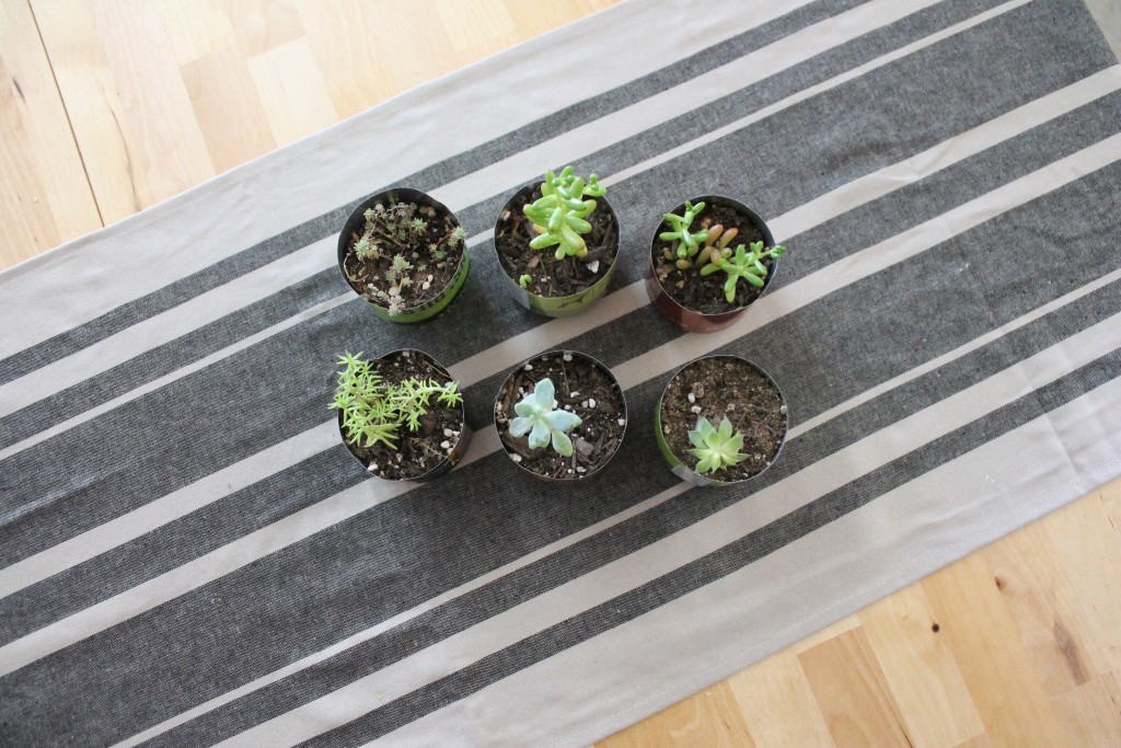
In the first image, we encounter the law of containment. The tablecloth serves as a natural frame for the composition, and the diagonal lines are dynamic, adding interest to the piece. They highlight opposing corners and draw attention to the exposed wood grain in the opposite two corners. There is unity to be found in two rows of equal numbers of succulents, yet variety in types of succulents.
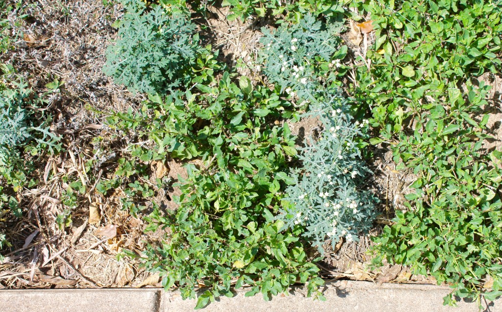
Here we see the law of similarity in this grouping of different grasses in one composition. At first glance, our eye thinks “grass” but upon closer inspection, it’s found to be a grouping of weeds, dirt, grass, clover, and small white flowers.
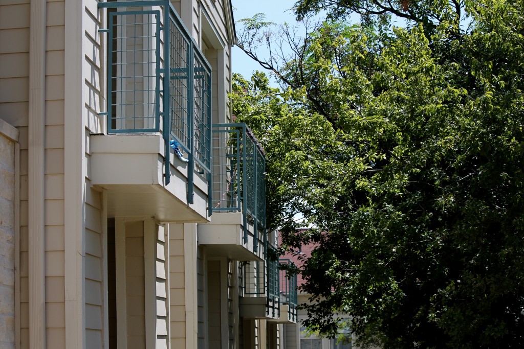
This view of my apartment complex showcases the law of continuity; the tree is brushed up against the second balcony, and although it is intersecting the wire fence surrounding the balcony, it is still distinctly separate from the balcony. There’s a sense of repetition in form here, yet the tree brings in some variety here to avoid monotony. We find a gentle balance between nature and building, creating a subtle diagonal. The diagonal here also provides dynamism in composition.
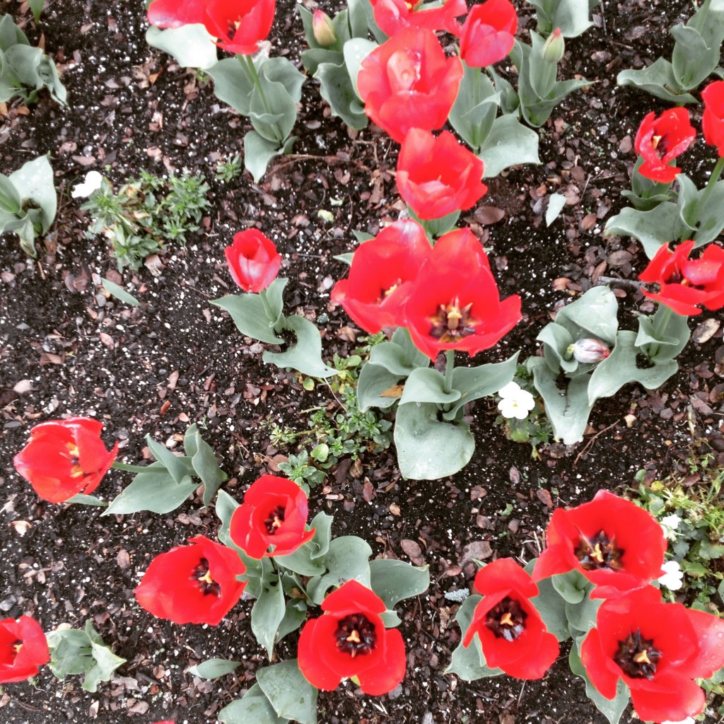
In this image, we see the law of closure at work. While some of the flowers are photographed completely, others have been “cut off” at the petals and leaves. But rather than seeing these as being chunks of red flowers, the eye interprets these as being full flowers, based on past experience with viewing healthy living flowers. It is thus more engaging visually.
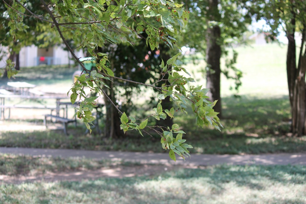
This focused image of a tree branch illustrates the law of figure-ground. The tree branch seems “separate” from other trees, fuzzier than those in background. Its importance in this photograph is thus being highlighted. Despite the entire image containing shades of green and an abundance of leaf-like shapes, this tree branch can clearly be identified from the rest, due to this Gestalt principle.
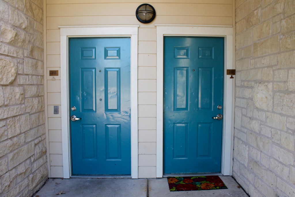
This final image uses the law of symmetry. Two glossy blue doors are reflected in this photograph, each with doorknobs, locks and numbers that mirror each other. Two white brick walls play to this effect as well. Variety is achieved in the different patterns of dings reflected in each door panel, as well as the placement of single flower-patterned rug at the foot of the right-hand door. The wooden frame around the two doors also serves as a sort of frame, which contains the picture. The striking blue color draws the eye towards the center, bringing attention to the white surrounding areas of negative space.
