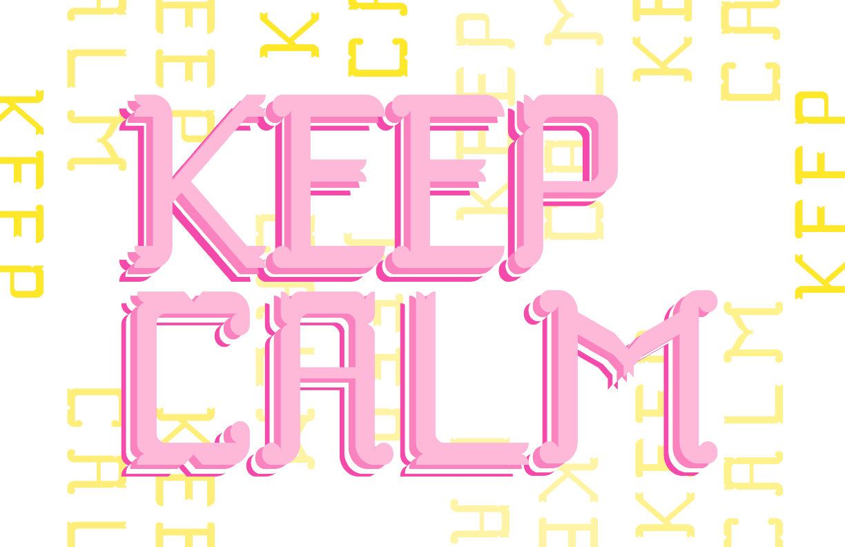
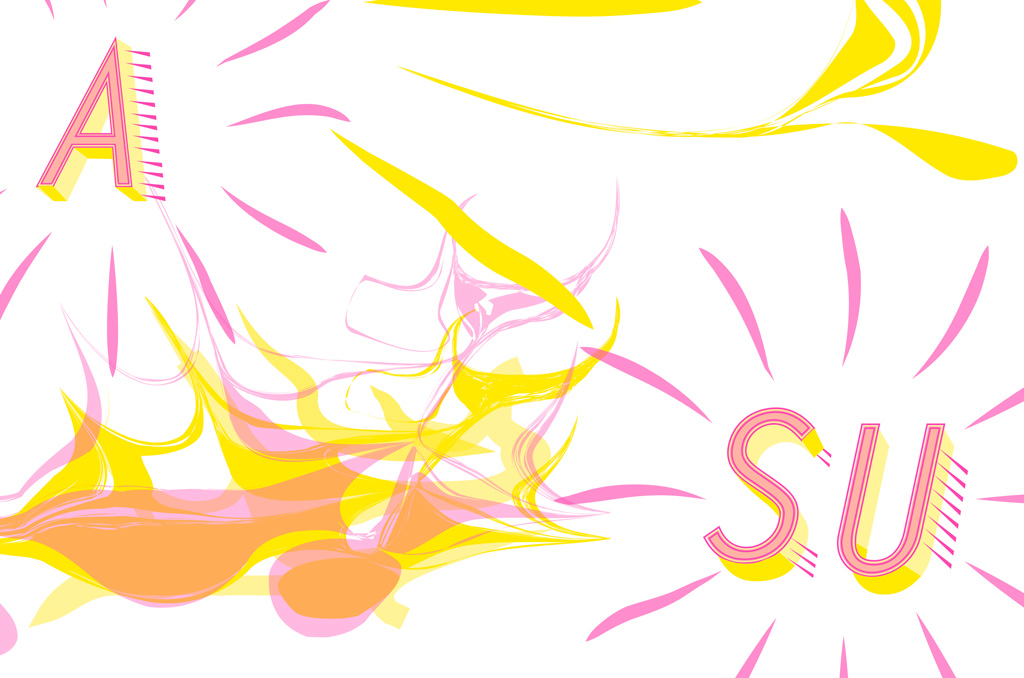
I chose to highlight these projects due to how visible my growth appears. The facets of design that I think I can use very effectively are color and layout. Not only am I the most comfortable with these elements of design but I feel like they come to me in a natural way. The type specimen posters were made in my freshman year when I designed my own typeface, granted, while using a program with limitations it is still pretty evident that I kept most of my work very clean and simple at the beginning of my graphic design career but through the comparison with the Zine, my skills have really bloomed and I have become less afraid to design projects in a way that are out of my comfort zone. My eye for detail and complexity has become sharper and this is also shown through the complexity of the chromatic typeface I made for the zine. My Symbols show the more illustrative side of my design skills; these really captivate how my work generally is simple/minimalistic with a little complexity into how it’s made to add more detail.
I believe that my strengths in these projects includes the layout design. My type specimen posters are very unique to the way the letters are placed on the page. I feel like this design choice really completed my posters, as well as made them all look like they belong together as a set. The cut-off effect of the letters makes the eye follow the letter off the page and adds a little more visual pleasure to the viewer instead of being abruptly cut off by a border. In the zine project, I also incorporated this technique because I really enjoy how it all flowed together which was one of my main concepts for the zine. I think that there is definitely room for improvement in my work. Something I would include in the things I want to improve on is variability. I think I have a certain style that I always resort to when designing but I want to be more universal with the way I design.
Some concepts I have learned about design that have really changed the way I approach design are the ideas of identity, visual language, and the process. Most of which relate to each other but these three in specific always come to mind when I start any design project. I use to just go in and start designing what I personally believed resonated with the topic without doing any research or real deep thinking about the project and who its’ desired audience was. Now as a more educated designer I have a specific process that I follow in order to fully understand what I am designing, for whom and for what reason, which is really important to designing effectively and having a successful project.
Highlighted Projects


Type Specimen Poster

Symbol Methodology


Zine Lesson