Target hours: 150 hrs. Current expert hours: 122hrs. from class Expert experiences: East Austin Studio Tour, Arts and Rec. Studio Tour, Graphic Design Senior Presentations, helping VISU and Digital Projects make books. Social/emotional development: My social and emotion development for … Continue reading
symbols process
Reply
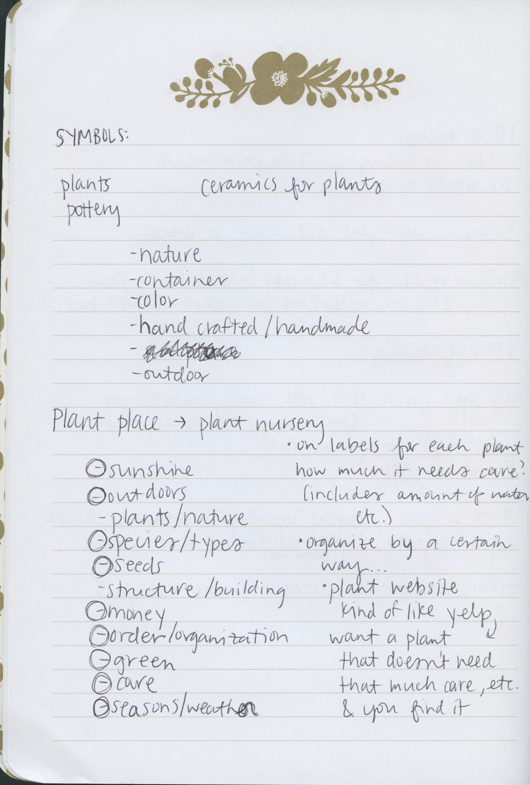
I began my process by trying to figure out my umbrella topic. The first image shows my initial brainstorming of my umbrella topic and then the words that would go into each category of the symbols. My decision on where to put my nine words was really based on what I thought would be the easiest in each situation. For example, care would be easy as an abstract symbol because there isn’t really an image that I could think of that would represent care. Then once I got those organized into their categories, our next step was to create a symbol for the first six (the three traced and three stylized symbols).
In the second image this is where I started with the symbol of the sun. I choose to look at different words that the sun could mean because I didn’t know if I wanted to go as simple as a circle with lines coming from it or if I wanted to elaborate more. 
Here in the third image are some of my early designs for the symbol of the sun. I played around with sun giving food and how would i represent that. I also played around with how simple the triangles coming from it were.

After I finished all of my six images we presented them in class and went over basic standards for our symbols. It helped printing out my symbols to see them at such a small scale and removed from the screen. It helped me see what need to be changed and all of the feed back from everyone else helped. Next we came up with our three abstract symbols which out of all of the nine were probably my favorite to design. I think this was because of the freedom the abstractness offered us. We didn’t have to design something that looked like a thing we already knew. With this new freedom the possibilities are essentially endless, but it helped to make a symbol that had qualities that lend itself to the word. For example, my green symbol (the one on top right) came about from finding other words that described green. So for my version of green it was about nature and plant like shapes and qualities in the actual symbol, so I focused on these when I created my symbol.

After these were done and we did a critique on these we had all of our nine symbols that we then used to combine with each other to form twelve new symbols. The criteria for these abstract symbols was very similar to the other six symbols were previous made and I made sure to keep this criteria in the back of my mind when creating them as to make a better symbol.

To start with the hybridized symbols I made a list (in the image below) of what combinations I wanted to do. I based off the combinations with what sounded kind of correct together (like it could actually be something new) and in my mind what would maybe look the most interesting together. Towards the end of the list I just tried them with different ones just because I hadn’t before and you never know what you are going to get unless you try, so I tried.

Here is an example of one my working methods of creating a hybridized symbol. In this image I combined the symbol for sun and seed together to see what I would get. At first I was just placing them next to each other, and then when I got bold enough, I cut them up and tried to mesh them together so they utilized the principles of design and they would look nice. Here I think some of my combinations worked really well and it was easier for me to mesh them together because of the initial parts of the original symbols.

After this came the choosing of the favorite three and then three iterations of them, with one of the iterations as simple as possible. I think I choose my final three based on how well I executed them and how much I liked to work with them. Also, it helped that I think I spent the most time on these and I saw more possibilities with these three than the other combinations. The image below is of my final three and iterations.

From here we had to choose our final one and make it the best it can be. Here I was having a bit of a tough time narrowing it down and deciding on what the symbol should actually look like so I went back to the drawing board and started to sketch them. Sketching them helped immensely as I wasn’t distracted on the computer and the interface and program of Illustrator wasn’t a hinderance to me. I could easily and quickly get my ideas out on the paper.


Then from here was the polishing up of the symbols. These are my final three symbols.

I think as the process went on, my work improved greatly, not only in quality but also I used my time more wisely. Towards the end I think was more excited that I was so close to finishing that I was excited to work on the project and get it finished. My work at the beginning is alright. I think I could have done better with my original nine symbols. They just don’t look good by themselves. Im not immensely proud of those symbols. As time passed and we worked on the hybrids I liked the project more and became more invested in it. At times it was frustrating because I could easily do something in my head but I couldn’t do it so easily on the computer. I think towards the end, with the feedback and critiques, I learned what we were suppose to have and really tried to make that criteria present in each of my final symbols. I was more conscious of what was going on instead of at the beginning where I just went a little blindly into it trying my best from what I already knew.
If I had to create a rubric for this project it would include on the vertical: quantity (did you have all of what the basic requirements were/ enough symbols?), effort (did you put in enough effort into them?), quality (are they overall appealing/ follow the basic design principles?) and on the horizontal: exceeds expectations, satisfactory, and needs improvement. This is still a rough draft for the rubric but I believe these aspects are important for this project and maybe would have helped me get my butt into gear and make better work.
I think my final symbols were considered a sophomore “A” and maybe some of my initial hybridized symbols, but other than that I think the rest were below that, maybe around a “B”. I think I fit in the spectrum of “it needs a lot of help” and “this is the best thing ever” around half way. My early work would be towards the lower end and my later work would be towards the higher end. Overall, I think this whole project was about growing and getting over that first learning step on how to use Illustrator and how to think more like graphic designer.
Hello world!
Welcome to your brand new blog at St. Edwards University Sites.
To get started, simply log in, edit or delete this post and check out all the other options available to you.
For assistance, visit our comprehensive support site, check out our Edublogs User Guide guide or stop by The Edublogs Forums to chat with other edubloggers.
You can also subscribe to our brilliant free publication, The Edublogger, which is jammed with helpful tips, ideas and more.