Throughout this process of compiling all my work from previous years, I am starting to recognize the growth I have made as a designer. As a Graphic Design minor, I always struggled (and still do) to consider myself worthy of the title “designer.” What began as mostly a hobby, I am really starting to understand and enjoy. I picked three pieces of my work that I think show my growth just over these last two and a half years. I am actually a junior, I just did not start taking Graphic Design courses until my sophomore year. I picked the very first project I made in Type I, my Typeface Design, my Cognitive map for Graphic Design II, and something I created during class in Graphic Design II to critically analyze.
My Typeface Design was the first project I completed as a Graphic Design minor at St. Edward’s, and I remember being proud of myself when it was finally finished. I think at the time I was more proud of myself for completing the project rather than the actual work I produced. I remember specifically Jimmy telling us that we were going to look back at this first project and hate the work we produced because we knew if we created it again it would be better. At the time, I didn’t see how this was possible! I thought I was exploring every facet of my creativity to design these letters. I think one of my strengths in this piece is the cohesion of the concept and the design. My concept was to create an architectural typeface, and I think Density (my typeface) is bold, bulky, and architectural. This being said, there is room for immense improvement. I mentioned in my blog post that I should have pushed the boundaries of what I could create in Fonstruct. I think I saw the guidelines of Fontstruct as my framework for my design, and chose to play it safe without touching any of the corners in the box. I enjoy looking back at this project, somewhat chuckling to myself, as I do just what Jimmy said we all would. I know if given the same project, I would create something different – and better; however, I appreciate my typeface the way it is now because it reminds me of the growth I have made.
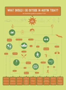
My next landmark piece was constructed in Graphic Design I with Tuan one year later. We created three different maps, but the Cognitive (directional) map was the most important to me. We created each map one by one and my confidence grew a little with the completion of each one. For our last maps, I created a cognitive decision map for the question “What Should I Do Outside in Austin Today?” and used a series of symbols to categorize each question. I think my strengths of this piece are the color choice, hierarchy, legibility, and use of symbols. This was the first project where I was really proud of the work I produced. Up until that point, I really struggled with my confidence as a designer. I knew I was more knowledgeable than the average person about design techniques, but I didn’t think I could compete against so many talented classmates. I enjoy looking at this piece because I don’t cringe, much like I do when I look at my older work. This piece defined my revelation that I have the potential to be a great designer if I continue to put in the work. Although there is still room for improvement, as there is room for improvement in any project, I think this was the first project where something clicked, and I “got it.” I understood how to tie the concept to the design and enhance the concept with a creative design.
My last piece I chose is not really a completed piece at all, but rather something we did in class just this week on Monday in Graphic Design II. We are currently discussing the history of letter forms, reviewing how to stack letters successfully, and creating our own type-heavy pieces. Jimmy asked us to actually cut up some of our classmates work with scissors, move it around on sheet of 11×17, and paste it down. When we brought our work to class on Monday, he was incredibly disappointed in our ability to think outside the box. Almost every piece looked exactly like it did prior to the exercise. He had us get on the computers and create 10 artboards with the text center aligned in a way no one in the class had used before. I was only able to complete 3, but this was the first time I started to realize how you could bend the rules of design. For the first half of the module, I limited myself to what I thought were the boundaries of center aligned text. It wasn’t until this exercise that I realized I had been so close-minded to even consider thinking outside of the box. The work I produced during class on Monday is not complete and is very unpolished, but I appreciate it more for the idea behind the work. My strengths in completing this project were that I did think outside of the boundaries and I am confident I will continue to do so in further projects. There is definitely room for improvement, as I only spent about an hour total on this project, but in regards to the ideas, they are fairly solid.
From the work presented here, I think I am able to effectively use color, line, text, and hierarchy. Although I am nowhere near a master of each facet, I think I have a solid framework for continued growth upon each one in the future. As someone who only worked in black and white prior to attending St. Edward’s, I am pleased that I have some idea of how to coordinate colors to work with my designs. Looking back across my design journey, I think the most important thing I have learned is to trust yourself and your ideas, but be willing to accept criticism from others. Critiques in classes have been the most useful in helping me every project. Sometimes it isn’t always what you want to hear, but it is almost always what you need to hear. I also have to tell myself not to get down if I don’t produce work I am proud of. Rather, I should use it as a means to improve. Lastly, with this last exercise in Graphic Design II, I learned to think outside the box. Bend the rules! Most of our projects are very open ended, so I hope to push the boundaries on what I can do when approaching projects. Moreover, I am pleased with the growth I have made as a designer, and am excited to continue building both my confidence as well as expertise in Adobe.


