Lexi Hensley's Blog

Just another St. Edwards University Sites site

Month: October 2017

Sequence Reflection 1

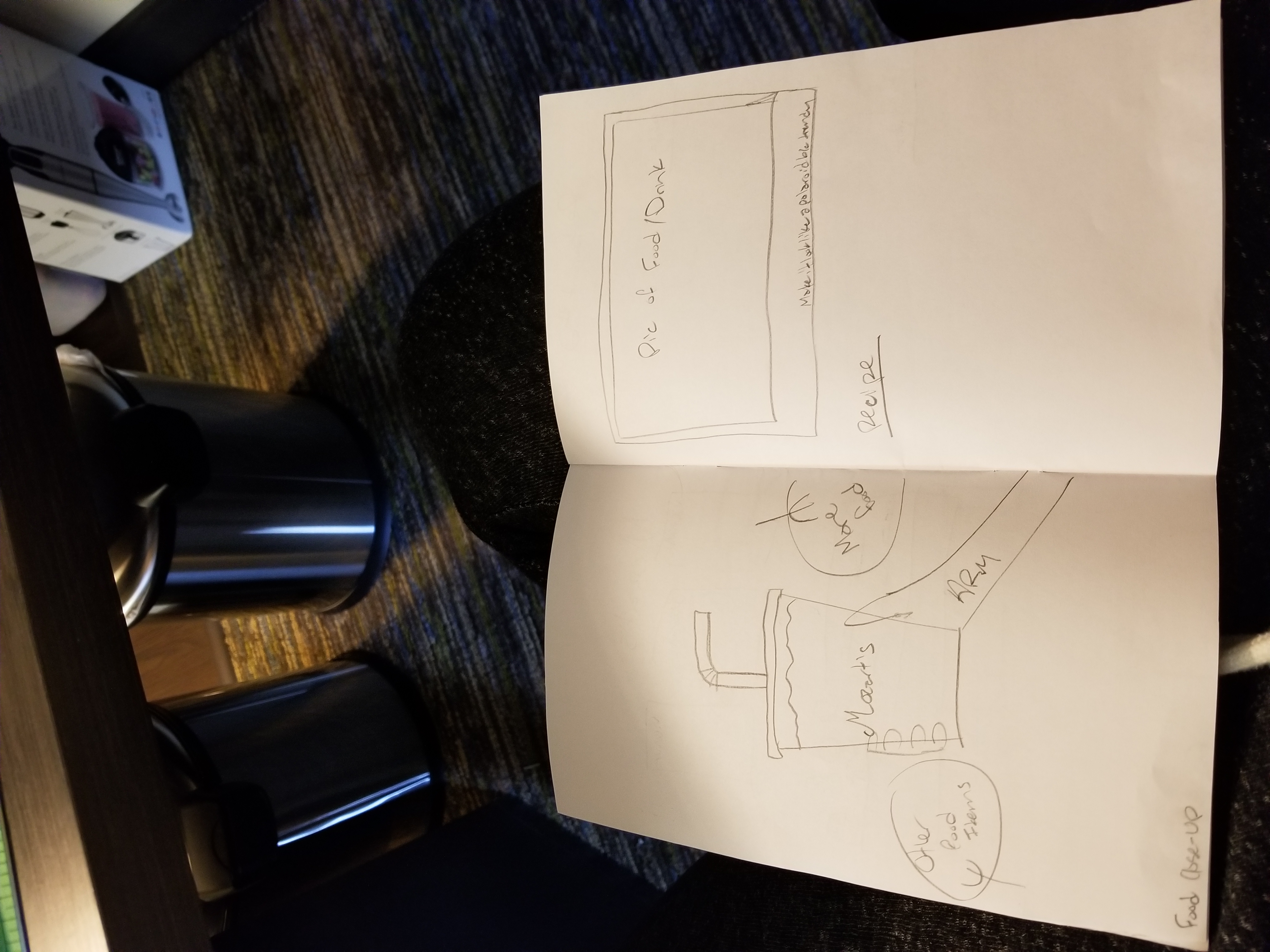
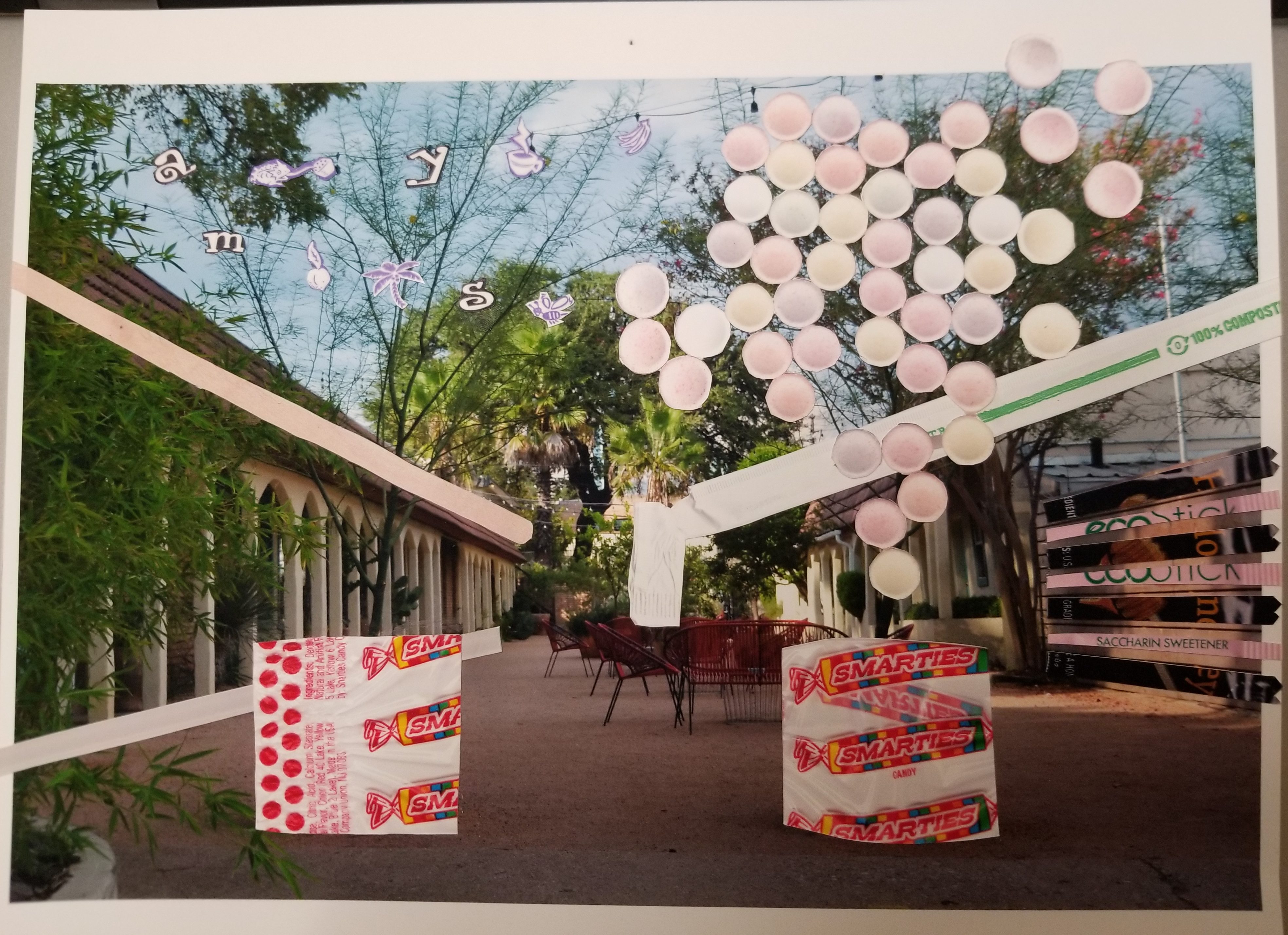
I went to Mozart’s the other day and decided to bring my camera. I took a lot of pictures of the surrounding areas and decided I could use that as part of my book project. I’m kind of a foodie so I thought perhaps I could make a food “magazine”. My idea was to create a book that has 4 locations, with 6 pages dedicated to each. I figured I could utilize sequence by starting in North Austin and traveling south, making it geographically sequential, and also because the 6 pages per restaurant are going to start from the outside of the restaurant and work inwards. The first 3 pages of the book are reserved for the title, a blank page (or maybe a foreword), and a map of Austin with the places I’m going to, respectively.  Then I’ll go into detail of my first restaurant, which has the setup shown sequentially below (starting with the third image). All 4 restaurants will be represented with this same layout to keep some consistency and visual appeal. I wanted to add a copycat recipe from each restaurant  to show that while these are great restaurants, the food is easily accessible, and if you want the product at home you can make it for yourself. This will also allow for a visual and conceptual break, creating a more appealing final product. I will end up with 3 pages at the end available, which I’m unsure what to use for, but I think that’s ok for right now because it allows me some leeway in case I decide to change routes a little bit. The final page will have a simple statement written. When books/ magazines have a large amount of imagery, I find an abundance of text can clog up the feeling of the book as a whole, so that’s why I’m trying to minimize text some and keep white space.

I’m unsure of my current book’s dimensions. It seems too narrow to present appealing images on, unless I decide to turn it horizontally and have it flip upward or make the book wider than it is tall. I’ll have to compare to other books and decide how I want the final layout to be. I’m also realizing now that my sketches don’t have borders, which is an element I want for the images, so I’ll have to take that into consideration for my later drafts as well.


PreSequence Reflection

The movie I watched was Run Lola Run. Looking at the vocabulary from both the Barrett and Stewart excerpts, I can relate pretty much every technical concept back to that movie, but I’ll stick to some of  the more evident/ interesting ones. I thought the wipe transitions were interesting because they were really long. I think that it did a good job of conveying the continuum of time and emphasises the duration of time that Lola is running.  It strengthens the feeling of anxiety that Lola is feeling and the distance she’s running. If the transitions were really quick then it wouldn’t give as strong a sense of urgency and it would weaken the  sense of tempo, because everything would seem like it was happening at a faster pace than 60 bpm.  They also did a good job of  creating a smooth recorded motion, using several different techniques, like tracking and panning shots. These two shots create a better sense of Lola’s speed and the distance she has gone, respectively. The animated sections did a really good job of showing implied motion between the shots of her leaving her apartment and her running out of the apartment building. When she is tripped and when she gets away from the dog really stand out to me because the size of her head/ mouth grows so much in such a short amount of time that it really emphasises the speed and the intensity of the actions as they happen. The shifts in chronology with very slight changes and inclusions of the “extras'” lives unfolding differently during each round forces the viewer to pay much more attention to every detail that’s happening to see what’s going to change during the next round, and makes the viewer want there to be another round. All of these elements have created a really strong movie.

Harmony Reflection 3

This project was a challenge for me due to my spatial limitations. I’m not very good at drawing (or cutting) objects to scale and certain shapes, so it took me a really long time to cut out shapes that were like the ones I made in photoshop. Both of my collages I made digitally first and then glued other things onto. the one on the left was supposed to be a triforce shape (Legend of Zelda nerd moment) with earth tones and blue, but because I couldn’t cut out a triangle that matched the other two I just glued other triangles on top of it to hide it some. I also messed around with the gradient tool to make the brick and window triangles fade, so that it would make the rust and greenery stand out more, but that isn’t really evident since I changed directions due to my lack of shape-cutting ability. The second collage I played around with creating a background and overlaying another image of the same thing to bring out the bird. These are two images taken at the same time, but one was with flash and the other is overexposed, so they look like they were taken at completely different times. I liked that juxtaposition and I think by combining both images it creates a better whole than both individually. Overall, I think these look ok from far away, but when you look up close there are a lot of mistakes I need to work on.

Harmony Reflection 2

I had a lot of fun with this project. I’m really glad that the guidelines changed from being a certain amount of cuts to a minimum time for work, because it allowed me to worry less about making sure I had enough, and allowed me to focus more on the content. The one with the blue is the first one I did, and I tried to focus more on lines and shapes. I spent about 5 hours working on this one. I had something very specific in my mind that I wanted to make, but I couldn’t find the right pictures to make it, so I ended up going  completely different route than I wanted to. I layered a few pictures in the background to create the texture and give the colors I wanted, then I layered the lines and shapes. I don’t like the color of the lines a whole lot, but no matter what I tried, I couldn’t find something that worked right, so I decided to move on to something else. The second and third collages I spent about an hour on, and I really like them. I used close-up pictures of fruit and vegetables, and cut them into organic shapes to create a flower shape. I layered them and put some lines in the background to ground it some. Even though they are almost completely the same, I included them both because I liked how making such a small change can really change the look of the final product. The last collage I spent about an hour on, and I combined a bunch of buildings together to create this weird shape.  I liked that all the colors were subdued earthtones and there was continuity in the brick patterns, but overall it seems lopsided and I’m not sure why.

Harmony Reflection 1

This project was definitely a challenge. The reason I take photos is because it’s easier for me to come up with something creative based off of things that are already in the shot than it is to start with a blank sheet of paper and add stuff to it. Anytime I’m making something (like a collage,  a drawing, or a painting) I always either add too much or not enough. I think that’s made evident in my collages.

I originally planned to pick up black and white objects with a spattering of red to try and minimize the color and focus more on the patterns and textures. I ended up in a bit of a rush and just got the first 10 items I could think of. I ended up with smarties wrappers, smarties, a straw and straw wrapper, a cup lid, a coffee stirrer, a plastic bag, an Amy’s ice cream cup, and packets of honey and sweetener. The colors are all over the place and the only continuity I can find is in the geometric shapes of the items.

The first collage pictured is the first one I made. I used one of my gestalt pictures as the background and tried to emphasise certain shapes or lines using the objects I found. I really wasn’t sure what I wanted to do, other than meet the requirements of the project, so that’s all I did. I also made the mistake of using objects that were really hard for me to cut out using an x-acto knife (I’m surprised I still have 10 fingers), so by the time I cut out all the objects, I was indifferent about how they looked on paper.

The second collage I made, I only had the cup lid and plastic bag left on my list of items to use. I had a lot of scrap paper lying around and thought I could create something cool using round shapes and focusing on color (or lack thereof) and texture. I think if I had made this collage on a vintage-looking yellow paper that it would look better because of the color triad and it would allow the gray/ “clear” elements to stand out more.

Overall I think my knife skills have improved but I need to work more on composition.

© 2024 Lexi Hensley's Blog

Theme by Anders NorenUp ↑

Skip to toolbar