Angers, France Travel Journals
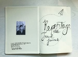


The most important aspect of studying abroad, besides the experience itself, is being able to document and understand the cultures in which you are living. During my stay in Angers, France, I have been keeping a weekly journal, documenting everyday life, my travel experiences, and the memories I am making here. In each journal entry, I include pictures, drawings, writing, and souvenirs that I can fit into my journal. The journal has helped me with going more in depth into the many different cultures that I am experiencing, but also allow me to personally document my travels while being a creative outlet for me to continue designing and exercising my creative freedom.
Pollination or Pollution?


Pollination or Pollution? by Shelby Charette
In bee hives, each and every bee has a certain job and a place in the colony, and when one bee or one issue arises, it throws the entire hive off. Along with the gifs, I wrote in depth a book about the gentrification in East Austin. Comparing the neighborhood to that of a bee hive. I integrated my bee and bee hive design throughout the book to keep my reader interested in both the story and in the design work and keep the audience wanting to read more. I used the typefaces _ and _ which are playful, yet also serious to keep it light as the book discusses a rather serious topic. The color palette I chose was lighter hues of pink paired with a darker gray purple, which is also used, like the typefaces, to have elements of light and dark. Written by me with information from my intensive research, photos, designs, and Japanese stab bound all by my own hand. I believe this book was successful in allowing me, as a designer, to express creative freedom while expressing an issue that I believe in. This book was a process of trial and error, of revising and editing, and it overall taught me the importance of pushing myself as a designer to be able to write and create something great.
East Cesar Chavez.gifs


https://gdes3315.tumblr.com/image/165739833805


https://gdes3315.tumblr.com/image/165566760740


https://gdes3315.tumblr.com/image/165566750120


https://gdes3315.tumblr.com/image/165491623340


https://www.tumblr.com/blog/gdes3315
New buildings stark in contrast against the old. When exploring East Cesar Chavez, one cannot help but notice the immense differences between the old and the new. In this project, this was a phase in figuring out the identity in which I wanted to take my project, and after exploring East Cesar Chavez I decided in creating these 5 gifs to highlight the hidden treasures, along with bringing to light the gentrification of the area. For this project, I used Adobe Illustrator to create some of the text and images and Photoshop to bring the gifs to life.
Fulbright Conference Pamphlet


When thinking of Fulbright, a scholarship and educational foundation, I think of a passion for higher learning. So, I chose to create an abstract design like the shape of a flame, paired with very bright and vivid colors to mimic the intense colors of fire. I chose 2 sans serif typefaces; Geometos and Sofia Pro. Geometos I mainly used for titles, numbers in the schedule, and page numbers. Sofia Pro I chose because it was legible in small print, and it paired nicely with Geometos. The Sofia Pro font has many styles to it, which benefit me while making such a large book with many layers of text. Overall, the design is very modern with a touch of whimsical. In this project, I used Photoshop for photo editing, Adobe Illustrator for shapes, and Indesign to align all of the text. When given the assignment, we were told to not exceed a certain page limit but we had to include all of the information given, which was a large amount of text, information, and photos. Doing this assignment helped me as a designer to be able to work with what I am given and to be able to adapt my work to be able to fit the parameters of the assignment that a client has given.
Weekend in Japan-Weather Report
This project was a 50-second-long After Effects movie of a hypothetical weekend weather map of 4 cities in Japan. This project has exponentially increased my skills in After Effects and Adobe Illustrator. The weather report project implemented many facets of design into the final product, including illustration, type, principles of design, and After Effects. I learned how to work efficiently and organize my files well.
Visual Identity
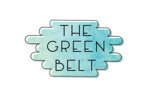
The mark I created is representative of the identity I chose to give to the Green Belt. I chose to appeal to an audience that is very common in Austin, which are the college kids and young adults. The Green Belt is a place that stressed out millennials can go to let go. The mark I created has a watercolor background with the colors blue and green to represent the blue waters and greenery that make up the Green Belt. Paired along with a fun, thin typeface that reflects the modernity of the new generation, with an outline of the watercolor shape that matches the font. This project challenged me to use my skills in design, along with my identity of the Green Belt to create an effective and clear mark to represent the Green Belt.
Process Work and Research

I chose to show the swatch I made for my research. I researched the Green Belt, and to get a better understanding of the place, I made a swatch using two photos that I took and made a color swatch from the photos. This is just part of the long process that took place in order to figure out an identity for the Green Belt. The process that took place was long, although it helped me get a better understanding of what and who I will be designing for and will be useful to me in my future career because I know that in order to design something effective, I will need to research and know who my audience is.
User Interface
The Interface Lesson was the beginning of my work in After Effects. I went into this project knowing nothing about the program, but shortly figured it out. The interface is of a hypothetical portfolio app that I fully designed in Adobe Illustrator and made it move as if it was being operated by someone. This was a challenging project, although it helped in getting my foot in the door with After Effects and challenged me to overcome the obstacles the program threw at me.
Plotter Designs


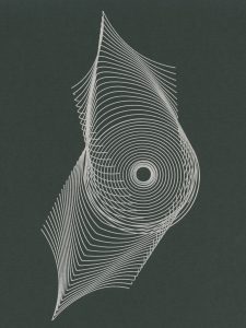


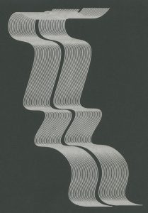
The Plotter project was definitely a process of trial and error, mostly because it was difficult to let go of control. In this project, the goal was to make something that we couldn’t force, by making broad rules to follow that would guide our designs, but not control them. My rules were that I would create one line, then create another and blend the two objects together in order to create a sort of movement across the page. I found this extremely difficult to just relinquish control, but in the end, the designs came out very well and work fantastic as a set.
Zine


My zine was about a truism that I wrote, “loving yourself depends on circumstance,” in which I describe that loving yourself is based on where you are in your life, and a more developed and happy person is more likely to love themselves than someone who is unhappy in their life and circumstances. Along with the truism, I designed an abstract set of patterns and a chromatic type to compliment my truism. This project was created to touch on multiple design elements, pushing me to create a unique chromatic type, work on an abstract design, all while working on printing with the risograph printer and in the end, folding all 25 zines in a certain manner. The project challenged me because there were so many elements that went into the design, such as design itself, typography and craft. In the end, I believe the project helped make me a better designer by making me use so many design elements all on one project.
Style


This project was about integrating two different contrasting styles to make a successful design. My class was given a preppy clothing style, and had to choose another style, so we chose bohemian. We took certain elements from both and added them together to try to create a new, cohesive style.
Matchbook


This lesson was more about blending in, than standing out. I hand designed and created a matchbook prop to fit in the background of the movie I chose, Lost in Translation. The movie is set in Japan in the 90’s. I chose a scene that the characters went to a Japanese club and designed my matchbook to fit in with the scene. I learned in this project just how important design is, even if it is in the background of a movie. The prop makes the movie seem more believable and realistic.
Decisions, Decisions

The cognitive map I created was a flow chart to help a girl choose the right shoes to wear based on what they are looking for. In this project, my biggest challenge was to fit all of the information on the page so that it would not look so cluttered. I also had the chance to work more in depth on my illustration skills, and saw some extreme improvements on my illustration work. Overall, this map taught me to challenge myself and work out of my comfort zone.
Map Project Information

For this map, I was given the chance to make a graph map for a made up alias who I was given an Excel document with all of the purchases he made on his credit card. We were expected to make graphs on Adobe Illustrator of some of his purchases with an overall theme. I chose to focus on the amount of money he paid in bills compared to the amount of money he spent on leisure activities. I chose to use bright colors to portray a feeling of fun, seeing as I wanted to emphasize it to sort of convince him to “treat himself.” This project had me work with the graph tool in Adobe Illustrator and challenged me to research through over 300 items to gather my information. This taught me the importance of research, all while implementing my knowledge of design and type into a map.
Map Project Personal Geography
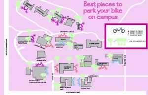
For my artifact map, I chose to create one that would benefit people on campus who ride bikes. The map shows the school campus and where all the bike racks are, and the shaded areas that surround them. This was made to benefit the students to show them where the can lock their bike that is closest to their class with the most room on the bike racks and with the most shade. In this project, we had to collect information in order to make the map while also designing with an audience in mind. This project will be a benefit to me because it shows the importance of gathering information and being able to put that information to good use.
12