Archive of ‘Portfolio’ category
Branding and Teaching
My boardwalk brand book aims to not only explain the structure of my public places brand but the emotions behind it. With my brand book, I don’t just so the reader my brand’s logos and styles I teach them how to use and implement them into a useful system of color, graphics, feeling, and culture.
The book its self-serves as a tribute to the identity of the Boardwalk. The accordion style gives flow and pace to the booklet along with a unique experience for each reader. There’s no true front and back so you may open to the large picture spread or information guild. One can fully extend the book or flip pages. The inside practices what it preaches as the design is shown implemented not only in the example city bus wraps but in the typefaces, the color, and the use of the wave pattern.
The text explain and expresses the uses and the reason behind each element helping the read connect more to the brand and the Boardwalk.
See Pictures Here

The Fulbright Challenge
The Fulbright annual conference is a meeting and sharing of ideas; there was a lot going on. The goal was to not only envision and execute a theme fitting the Fulbright image but also keeping the page count down. It was a real challenge to keep the program visually appealing, legible and condensed but overall the experience was eye opening.
The theme for 2016 was “Meeting new challenges” and drive of Fulbright is to challenge and educate bold, innovative ideas. My program design is constructed to reflect the sturdy and bold idealism of Fulbright. My design features a strong graphic present that is pulled from the leading typeface. The angled rectangle shape works well to organize and hold u the information for the conference. Using this style, I could fit a lot of information onto one page while making it easy to find information and avoiding having a wall of text. The style of the graphics is carried throughout the booklet to express a cohesive unity. The map is placed on the back for ease of use when using it between panels. The column styled round tables and schedule help the attendee quickly scan titles and name or look for more details on the event. The colors and page numbers are bold and appealing but don’t distract the reader from the information. My booklet is layered out for easy navigation while still expressing the nature of the Fulbright organization.
View PDF > Robin_Book-pmtf1m


Weather report
While working on this weather report I learned more about color, type, and space. Once again the constraints of the project forced me out of my comfort zone, in returned I feel like I ended up with a design that slowly became more refined as it progressed.
I wish I had more experience with Aftereffects to be able to more fully utilize the program. I also had some areas I wanted to fix in the project but was unsure on how to go back into the timeline and move objects around within the time frame and without messing up other parts.
Boardwalk Mark
After collecting and processing all the collected information I moved on to trying to create a mark that represents the identity I wanted to express. My identity changed many time as I narrowed it done. By the end I decided that the boardwalk is a constant friend for those looking to escape the crowds and static of the city. This nature surrounded walkway invites all who walk her to enjoy the views, the quiet, and themselves.
The boardwalk mark created represents the structure and movement of the path with the scripted, but bold, type face that flows across like the waves underneath. The way the letters partly melt into the iconic skyline in the back represents how the boardwalk has been adopted into the city. The use of foreground and background eludes to the location of the path being across the water from downtown. Over all the mark invites the viewer to come see for themselves the simple beauty of the boardwalk, away from the crowds and noise.

The Boardwalk
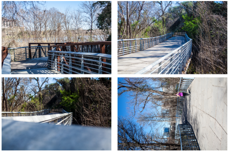
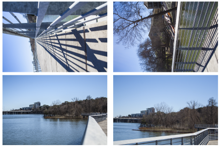
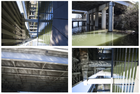
The beginning steps to creating my Boardwalk identity felt strange and out of place when I first started working on them but I soon realized how important they were to me. The photo taking really helped to stop and look at the design that was already there, the sound bites made me listen to the atmosphere, and the writings helped me analyze and put those acquired feelings into words. The techniques I used here carried through to the next phases and will be used in future projects.


App Animation
Working on the animation below was my first taste of Adobe after effects and the concept of design in motion. I really enjoyed this project for its simple introduction to the program but also because of the way it made me think about the concept of a portfolio being a design statement in itself. Over all I am very pleased with its design and flow, made to have a unique flair, but having worked on other projects and gained more knowledge on After effects itself I realized there are areas that could use refinment. For example, motion blur to the moving pieces, clean up of some stray parts and more organized transitions.
Plotter
I was very excited to start the plotter project after reading about conditional design. My plan of action for each of my plotters was:
- Pick a shape
- repeat the shape 3 times
- use the 3 shapes as a pattern brush to apply onto the lines
- plot with color
Unfortunately, the pens I was using at the start died half way through and I was forced to use a different type to complete the project on time. If I were to re-do my plots I’d like to make sure I use the same type of pen on all pieces, restrict the color use (example: switch color every 10 secs), and maybe more constraints with the recreation of the shape. Other than those changes however the overall experience with this project was one I rather learned from and enjoyed.
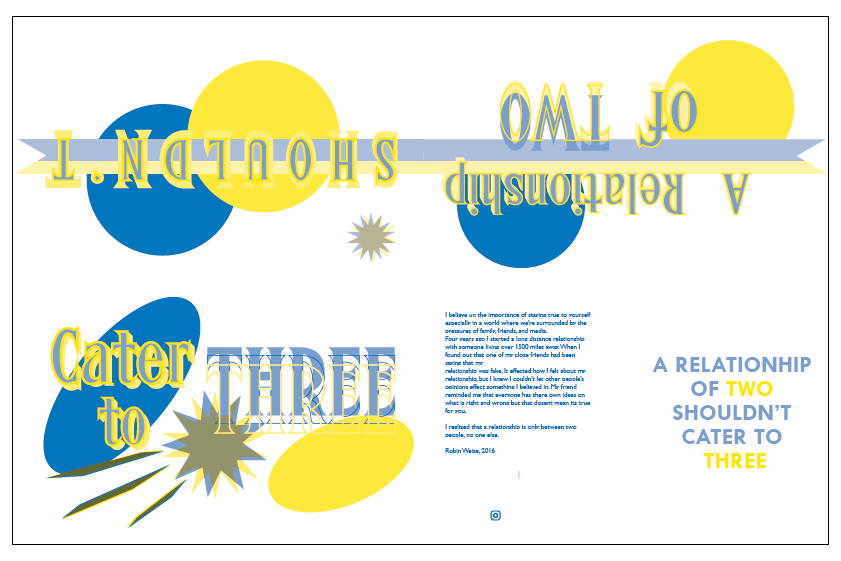
Zine
This was a very personal project for me as the process we went through to create our quotes was a series of person writings. There were two main things that challenged me in this project; getting personal with my work and thinking more abstract. I have a tendency to think more mechanical and literal when it comes to designing but with this project I needed to do almost the oposite.
The abstract design I came up with at the end I really enjoyed and it taught me the benefits of saying more with less. The two circles represent two people in a relationship, of any kind, they come together peacefully but get distorted and blown apart with a third element is introduced. The ribbon moving across the scene represents the movement of time and continuity which is then seen as lost at the end.

Style
The style project was a very interesting project for me as not only did I learn a lot about photography but also a better understanding of how designers can express ideas without spelling them out. I was hard at first to separate myself from the ideas of the styles already pressed upon me to create more true to original styles.
Matchbox:
When a movie is designed very little detail must be considered. This project for me really challenged me to continue to think on how I can further an idea and notice little details. I started my planning but analyzing the movies overall schemes then narrowing it down to characters and single location. I took screen shots from the movie and read a few reviews before starting my design. The typeface (Archer) was an easy place to start because the film itself uses a very distinct font for the hotel, my location of choice. Same situation with color. The Grand Budapest is unique hotel as its employees all wear royal purple. Being a place for the wealthy I decided that id one was needing a light (or match) they would be served upon so the matches needed to match the workers.
After this point however it became more difficult to take the simple elements and refine them to a point of great detail. by the end project I was very proud of my design, at the time my only regret was the color stretching at the folds of the paper but even that became a happy accident as the slight used look reminded me of the the main characters needs to be perfect despite himself.