App Animation
Working on the animation below was my first taste of Adobe after effects and the concept of design in motion. I really enjoyed this project for its simple introduction to the program but also because of the way it made me think about the concept of a portfolio being a design statement in itself. Over all I am very pleased with its design and flow, made to have a unique flair, but having worked on other projects and gained more knowledge on After effects itself I realized there are areas that could use refinment. For example, motion blur to the moving pieces, clean up of some stray parts and more organized transitions.
Plotter
I was very excited to start the plotter project after reading about conditional design. My plan of action for each of my plotters was:
- Pick a shape
- repeat the shape 3 times
- use the 3 shapes as a pattern brush to apply onto the lines
- plot with color
Unfortunately, the pens I was using at the start died half way through and I was forced to use a different type to complete the project on time. If I were to re-do my plots I’d like to make sure I use the same type of pen on all pieces, restrict the color use (example: switch color every 10 secs), and maybe more constraints with the recreation of the shape. Other than those changes however the overall experience with this project was one I rather learned from and enjoyed.
Zine
This was a very personal project for me as the process we went through to create our quotes was a series of person writings. There were two main things that challenged me in this project; getting personal with my work and thinking more abstract. I have a tendency to think more mechanical and literal when it comes to designing but with this project I needed to do almost the oposite.
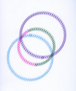
The abstract design I came up with at the end I really enjoyed and it taught me the benefits of saying more with less. The two circles represent two people in a relationship, of any kind, they come together peacefully but get distorted and blown apart with a third element is introduced. The ribbon moving across the scene represents the movement of time and continuity which is then seen as lost at the end.

Style
The style project was a very interesting project for me as not only did I learn a lot about photography but also a better understanding of how designers can express ideas without spelling them out. I was hard at first to separate myself from the ideas of the styles already pressed upon me to create more true to original styles.
Matchbox:
When a movie is designed very little detail must be considered. This project for me really challenged me to continue to think on how I can further an idea and notice little details. I started my planning but analyzing the movies overall schemes then narrowing it down to characters and single location. I took screen shots from the movie and read a few reviews before starting my design. The typeface (Archer) was an easy place to start because the film itself uses a very distinct font for the hotel, my location of choice. Same situation with color. The Grand Budapest is unique hotel as its employees all wear royal purple. Being a place for the wealthy I decided that id one was needing a light (or match) they would be served upon so the matches needed to match the workers.
After this point however it became more difficult to take the simple elements and refine them to a point of great detail. by the end project I was very proud of my design, at the time my only regret was the color stretching at the folds of the paper but even that became a happy accident as the slight used look reminded me of the the main characters needs to be perfect despite himself.