Plotter
I was very excited to start the plotter project after reading about conditional design. My plan of action for each of my plotters was:
- Pick a shape
- repeat the shape 3 times
- use the 3 shapes as a pattern brush to apply onto the lines
- plot with color
Unfortunately, the pens I was using at the start died half way through and I was forced to use a different type to complete the project on time. If I were to re-do my plots I’d like to make sure I use the same type of pen on all pieces, restrict the color use (example: switch color every 10 secs), and maybe more constraints with the recreation of the shape. Other than those changes however the overall experience with this project was one I rather learned from and enjoyed.
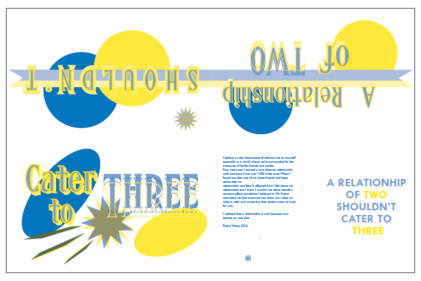
Zine
This was a very personal project for me as the process we went through to create our quotes was a series of person writings. There were two main things that challenged me in this project; getting personal with my work and thinking more abstract. I have a tendency to think more mechanical and literal when it comes to designing but with this project I needed to do almost the oposite.
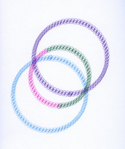
The abstract design I came up with at the end I really enjoyed and it taught me the benefits of saying more with less. The two circles represent two people in a relationship, of any kind, they come together peacefully but get distorted and blown apart with a third element is introduced. The ribbon moving across the scene represents the movement of time and continuity which is then seen as lost at the end.

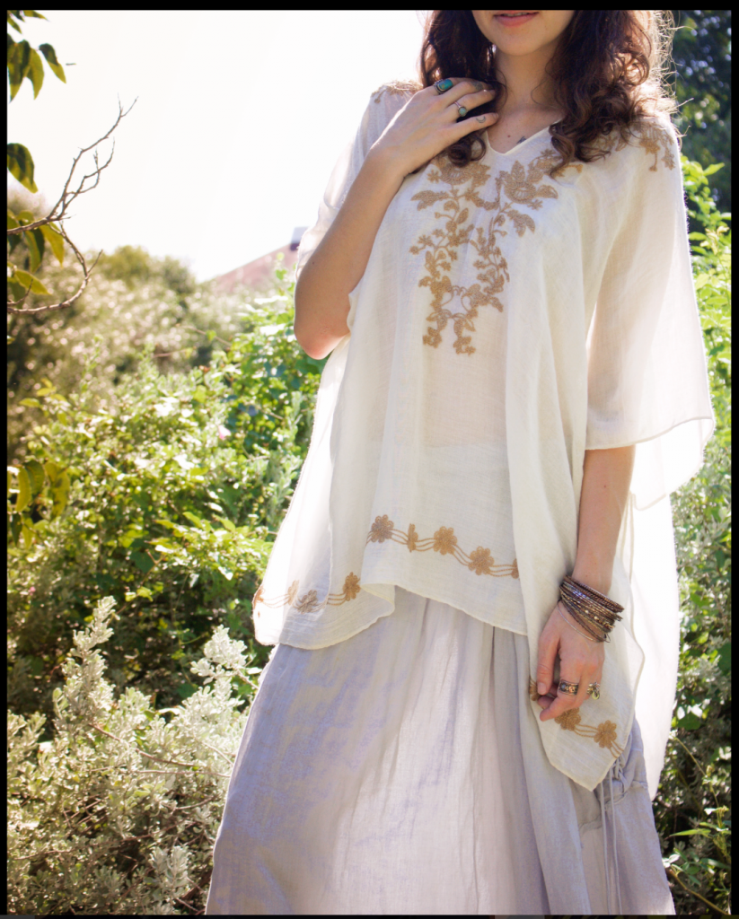
Style
The style project was a very interesting project for me as not only did I learn a lot about photography but also a better understanding of how designers can express ideas without spelling them out. I was hard at first to separate myself from the ideas of the styles already pressed upon me to create more true to original styles.
Matchbox:
When a movie is designed very little detail must be considered. This project for me really challenged me to continue to think on how I can further an idea and notice little details. I started my planning but analyzing the movies overall schemes then narrowing it down to characters and single location. I took screen shots from the movie and read a few reviews before starting my design. The typeface (Archer) was an easy place to start because the film itself uses a very distinct font for the hotel, my location of choice. Same situation with color. The Grand Budapest is unique hotel as its employees all wear royal purple. Being a place for the wealthy I decided that id one was needing a light (or match) they would be served upon so the matches needed to match the workers.
After this point however it became more difficult to take the simple elements and refine them to a point of great detail. by the end project I was very proud of my design, at the time my only regret was the color stretching at the folds of the paper but even that became a happy accident as the slight used look reminded me of the the main characters needs to be perfect despite himself.
Wiki Reader
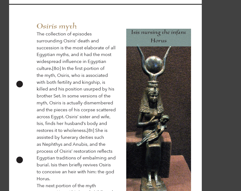
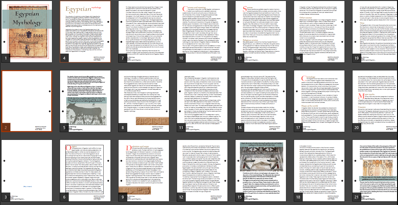
Creating a multi-page reader was definitely an eye opener on how typography is way more complicated than one may think. In the creation of my Egyptian wiki book I learned something new every day from seeking information, organizing and de-formatting, moving it into InDesign, then re-formating. In its creation I learned a lot about the tools of InDesign but many tips I wish I had figured out at the beginning instead of at the end. Overall I’m pleased with the designs cohesiveness and structure but as I look back can find many things I wished were refined. Areas like typeface, grid layout, and photo implications.
Graduation Booklet
working on the graduation booklet was a real insight on the complexity and abilities of Indesign and designing text heavy booklets.
I wish when I was working on this project I’d pushed myself a little harder to create something more unique. While working on the project I was more worried about the text and its properties that I neglected the design element that goes along with it.
(below pictures have some type errors due to old file capability)
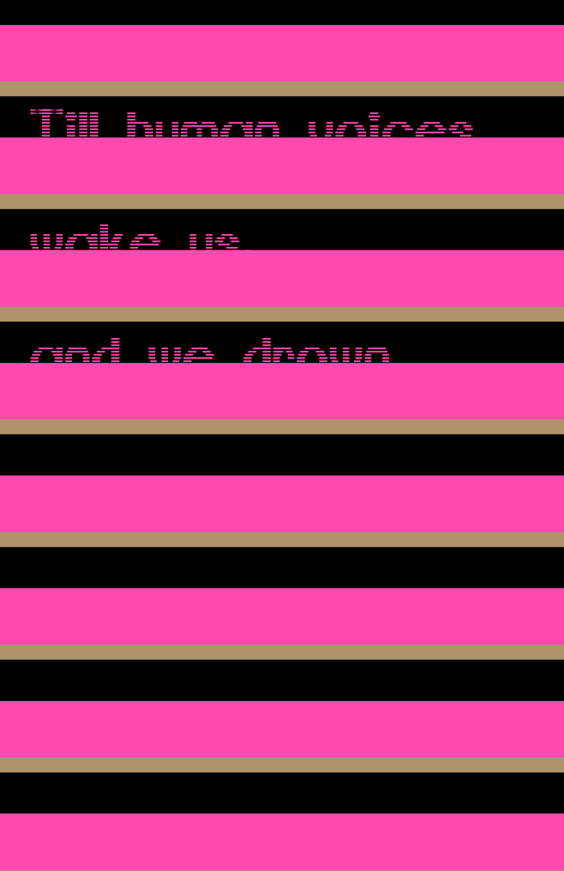
Type Posters
It’s one thing to make a typeface and it’s another to use it for design, both equally hard and require unique approaches. In taking my typeface I had a lot of design direction challenges. In the end I chose to pine back to it’s original inspiration, a quote from T.S. Eliot’s The Love Song of J. Alfred Prufrock.
From here I pulled out quotes found near the end of the lengthy poem and from there designed two sets. The high contrast is meant as a symbolic to my personal impression of the poem. The love song is a long rather encrypted story. While reading it I found it hard to really hard to find a single story running all the way through but instead it felt pieced together. However, the style and mood confirmed that it was in fact, a single piece.
My posters were designed to take on this idea. Seemingly two separate pairs at first are actually a full set pulled together by the typeface and color. I do wish that I had refined on the design more. With this project I began to learn just how important time management is and my lack of time left me feeling like my posters lacked.
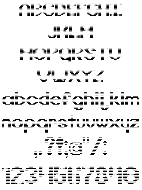
Custom Typeface
The creating of my own type face was a very interesting and informative experience. Given the quote “do I dare disturb the universe,” I had a lot of ideas on how to interpret it into a designed typeface. I ended with the type design I called GraySpace. The design stems from wanting to take the normal and mess it up, or “disturbed” the natural order
Monogram
The creation of my monogram design started off frustrating. The tight restriction and limited pallet really forced me to be creative in new ways. while working I had to find a new way to create from my usually from scratch, unlimited possibilities, strategy. My first few attempts at the project left me unsatisfied and so I kept reinventing.
The most rewarding part of this project was at the end. Being one of the first design project, I was having to face I didn’t know what to expect from myself or others in my class. Upon revealing our works to the class I realized just how far and different everyone’s creative viewpoints were. Despite feeling throughout the project that the design was highly limited and that most peoples would look the same, everyone was completely different. This project reviled to me that there is always multiple ways to accomplish a design and on top of that you can always push it further.
At around 50 hours a week is when I’d say you may be spending an excessive amount of time practicing on your work. Why? because at that point I believe that you are spending to much time in your work and not enough time gathering new experiences to turn into inspiration. That being said only spending around 20 hours on your work a week can prevent you from sharpening the skills and styles you already have. Personally I vary on this chart but mostly find myself on the bottom end and I can usually see it in my work when I haven’t been putting s much time as I should be into a piece.
Sophisticated work is work that, may not be perfect, but represents a high understanding of the media used and the fine details that help the piece achieve its goal. In typography what I think is sophisticated about my work is that I also look to see what other ways I can present the content even if I’m content with what I have. Including mostly different layouts to keep it from becoming static and elements to make the whole piece cohesive.
Some feedback I’v been given that’s helped me a lot is comments on the font choices and point size. I often forget that the image on the screen isn’t a life-size representation and leave the font to big so that when its printed the font looks too bold and loud. With this feedback in mind, I now try to remember to print out copies as I go to see what looks good and what I should fix.
The creation of my booklet was a simple task on the surface but with the finer details in mind became much more of a challenge. Getting all the text to fit how it should and work with the pictures and page counts was by far the hardest part. Such details were often believed to be fix then upon printing of a copy I realized that there were new problems. The easiest part was the initial pasting in of the text and bringing formats and styles.
outside of school I use my skills for more personal reasons. I help design some logo work for a gaming community some friends are a part of and then a tear flyer for my elf to promote my side job of dog walking and petting sitting.

Full Gate 17 Logo

Gate 17 Simple Logo
Living 40mins away from campus has made school life a little troublesome in the fact that the accessibility of the labs and resources of the school aren’t always there. balancing school and a part time job is already hard but I found that it was much worst when away from the resources I needed during the week.
I really enjoyed the environment of our type classroom. The structure mixed with the time and space to do what you wanted and needed really help not only my imagination and creativity during the projects but after as well, when I got to see how everyone else interpreted the assignment. I also enjoyed the flexibility to be an active, outspoken member of the class, or more of a quiet observer. We would all be working on the same project but because of a unique twist we each had (i.e. quotes in making a font, or wiki subject) we weren’t in competition but merely just learning together.