declare your goal expert hours
categories: Uncategorized
Expert Hours
how much a week = 15
what should be the mid-term total = 113
what should be the semester total = 225
Blog and Portfolio
Expert Hours
how much a week = 15
what should be the mid-term total = 113
what should be the semester total = 225


 ^Front
  ^Back (Acts as flap when folded)


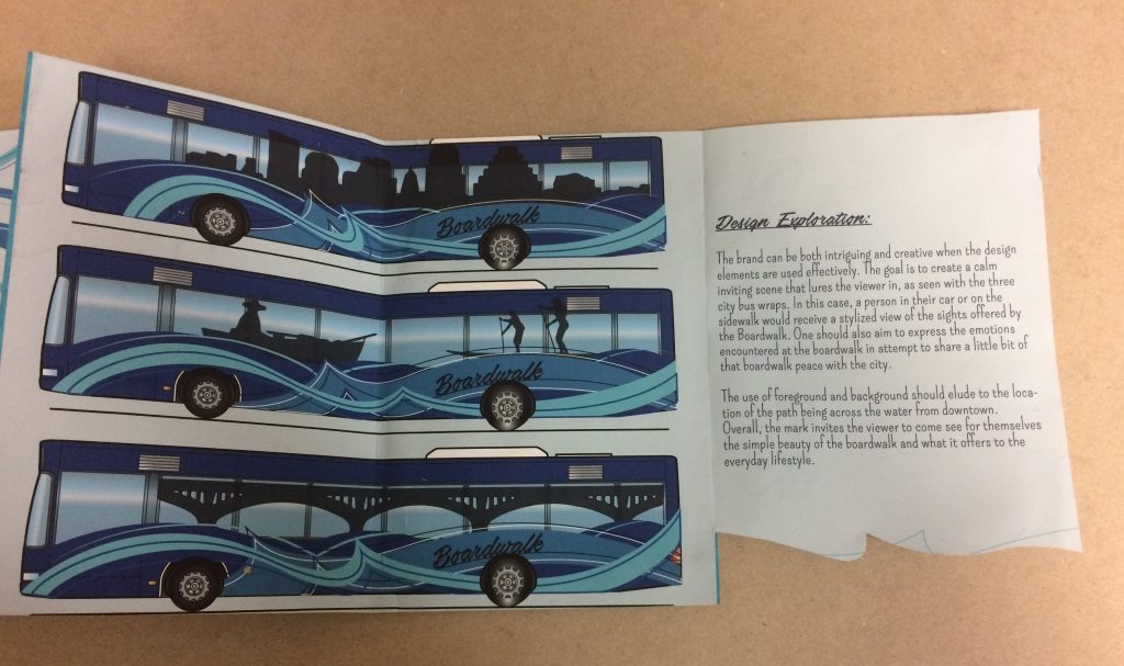

My boardwalk brand book aims to not only explain the structure of my public places brand but the emotions behind it. With my brand book, I don’t just so the reader my brand’s logos and styles I teach them how to use and implement them into a useful system of color, graphics, feeling, and culture.
The book its self-serves as a tribute to the identity of the Boardwalk. The accordion style gives flow and pace to the booklet along with a unique experience for each reader. There’s no true front and back so you may open to the large picture spread or information guild. One can fully extend the book or flip pages. The inside practices what it preaches as the design is shown implemented not only in the example city bus wraps but in the typefaces, the color, and the use of the wave pattern.
The text explain and expresses the uses and the reason behind each element helping the read connect more to the brand and the Boardwalk.
When it comes to working on my projects in typography or others my most critical point on myself is always on realizing my ideas. I feel like for a lot of projects I have a “cool” idea I want to try but either my experience of bias eye leads to the idea falling short of a what It could be and ends up feeling awkward and noncohesive with the original theme. In order to help improve my ideas rather than trashing them I try to get more opinions and critiques so I can better evolve my designs.
An example with my Fullbright project is the page count. I really like the idea of the bold but offset numbers but the more I played with placement the more I felt the idea didnt hold much merit.
The Fulbright annual conference is a meeting and sharing of ideas; there was a lot going on. The goal was to not only envision and execute a theme fitting the Fulbright image but also keeping the page count down. It was a real challenge to keep the program visually appealing, legible and condensed but overall the experience was eye opening.
The theme for 2016 was “Meeting new challenges” and drive of Fulbright is to challenge and educate bold, innovative ideas. My program design is constructed to reflect the sturdy and bold idealism of Fulbright. My design features a strong graphic present that is pulled from the leading typeface. The angled rectangle shape works well to organize and hold u the information for the conference. Using this style, I could fit a lot of information onto one page while making it easy to find information and avoiding having a wall of text. The style of the graphics is carried throughout the booklet to express a cohesive unity. The map is placed on the back for ease of use when using it between panels. The column styled round tables and schedule help the attendee quickly scan titles and name or look for more details on the event. The colors and page numbers are bold and appealing but don’t distract the reader from the information. My booklet is layered out for easy navigation while still expressing the nature of the Fulbright organization.
View PDF > Robin_Book-pmtf1m


1 Where are you in your hours that you declared earlier in the semester? Looking at your work now, are your current accumulated hours enough?
Looking at the hours I set at the beginning I believe Iv kept to close that many hours if not maybe more. I also believe that the time I put into my work is efficient time to create “sophisticated” work.
2 Has your definition of “sophisticated” work changed from last semester? If so, how so? What is sophisticated in your weather report?
I originally said that sophisticated work as work that, may not be perfect, but represents a high understanding of the media used and the fine details that help the piece achieve its goal. I still believe this to be a good standard. In my weather report, I believe the most sophisticated parts are the cohesiveness of the overall design and the movements. I put a lot of thought and worked hard to give those two parts a refined and professional look that I could see being used in an application today.
3 Describe how the new things you’ve learned so far connect to what you already had coming into the semester.
I used a lot of the information and experience from last semester in the designing of my project but I had to take concepts, like hierarchy, another step when motion became involved and opened new possibilities.
4 What are some things you are still unsure about in this project that you would like to know more about?
I mostly wish I had more experience with Aftereffects to be able to more fully utilize the program. I also had some areas I wanted to fix in the project but was unsure on how to go back into the timeline and move objects around within the time frame and without messing up other parts.
5 Assign a level of value to this project. Identify two other projects in your creative life and place this weather report relative to them. How close or far are they from one another? What qualities did each project have that the other’s didn’t that would rate them higher/lower?
I’d give this project 10/10 value for what it taught me. two other projects I could compare this one two would my typeface posters and my public location logo. When I first started working with my typeface to create posters I put a lot of work into it but I didn’t really know how to refine and polish the look I was trying to express. Working on the weather report I learned more about color, type, and space. These Ideas I took over while working on my logo for the boardwalk and in returned ended with a design that slowly became more refined as it progressed
6 Break down the percentages of what entities are responsible for creating growth within the creative you. Am I part of it? Part of it is on you, right? Do you consider your classmates/friends as influences on the course of your trajectory for success? At the end of the semester you will be evaluating me, but right now within your own pie piece, how much have you brought to the game? How did it end up that you brought that much?
Some of the biggest factors helping me grow as a creative mind would be my peers and my instructors. When I look at my classmates work and compare it my own I’m able to see where I’v gone wrong, gone differently, or maybe what I feel I did right. Often when looking at my work before I feel its pretty refined and well made but often when I get to compare, even with work that is on the same level as mine, I can see how others approached the challenges and see ideas I would like to run off of/ use to refine my own. An example would be color pallet. Often I’ll have a pallet I like but then seeing the wide range of the class, from dark, light, contrast, muted, I may decide to lighted my background. On the other hand the restricting and challenging components of my class work forces me to think out side my comfort zone and explore new ways of designing.
While working on this weather report I learned more about color, type, and space. Once again the constraints of the project forced me out of my comfort zone, in returned I feel like I ended up with a design that slowly became more refined as it progressed.
I wish I had more experience with Aftereffects to be able to more fully utilize the program. I also had some areas I wanted to fix in the project but was unsure on how to go back into the timeline and move objects around within the time frame and without messing up other parts.
Boardwalk Mark
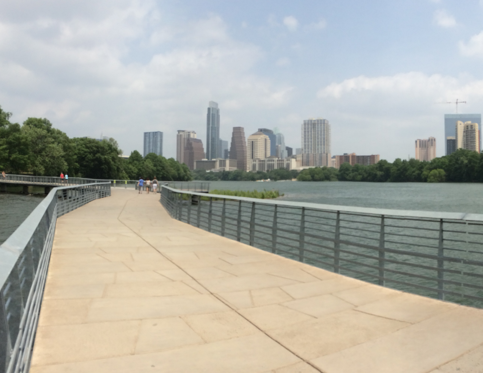
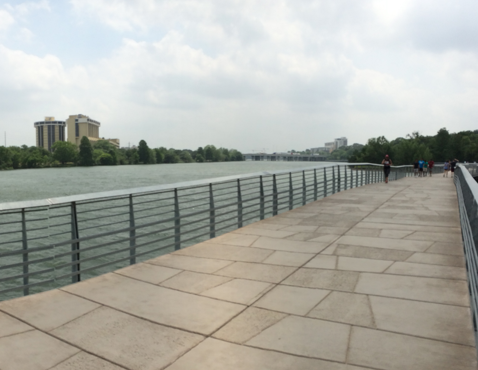
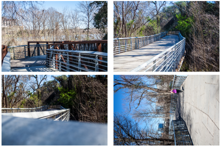
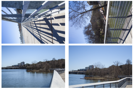
After collecting and processing all the collected information I moved on to trying to create a mark that represents the identity I wanted to express. My identity changed many time as I narrowed it done. By the end I decided that the boardwalk is a constant friend for those looking to escape the crowds and static of the city. This nature surrounded walkway invites all who walk her to enjoy the views, the quiet, and themselves.
The boardwalk mark created represents the structure and movement of the path with the scripted, but bold, type face that flows across like the waves underneath. The way the letters partly melt into the iconic skyline in the back represents how the boardwalk has been adopted into the city. The use of foreground and background eludes to the location of the path being across the water from downtown. Over all the mark invites the viewer to come see for themselves the simple beauty of the boardwalk, away from the crowds and noise.

The beginning steps to creating my Boardwalk identity felt strange and out of place when I first started working on them but I soon realized how important they were to me. The photo taking really helped to stop and look at the design that was already there, the sound bites made me listen to the atmosphere, and the writings helped me analyze and put those acquired feelings into words. The techniques I used here carried through to the next phases and will be used in future projects.

Working on the animation below was my first taste of Adobe after effects and the concept of design in motion. I really enjoyed this project for its simple introduction to the program but also because of the way it made me think about the concept of a portfolio being a design statement in itself. Over all I am very pleased with its design and flow, made to have a unique flair, but having worked on other projects and gained more knowledge on After effects itself I realized there are areas that could use refinment. For example, motion blur to the moving pieces, clean up of some stray parts and more organized transitions.