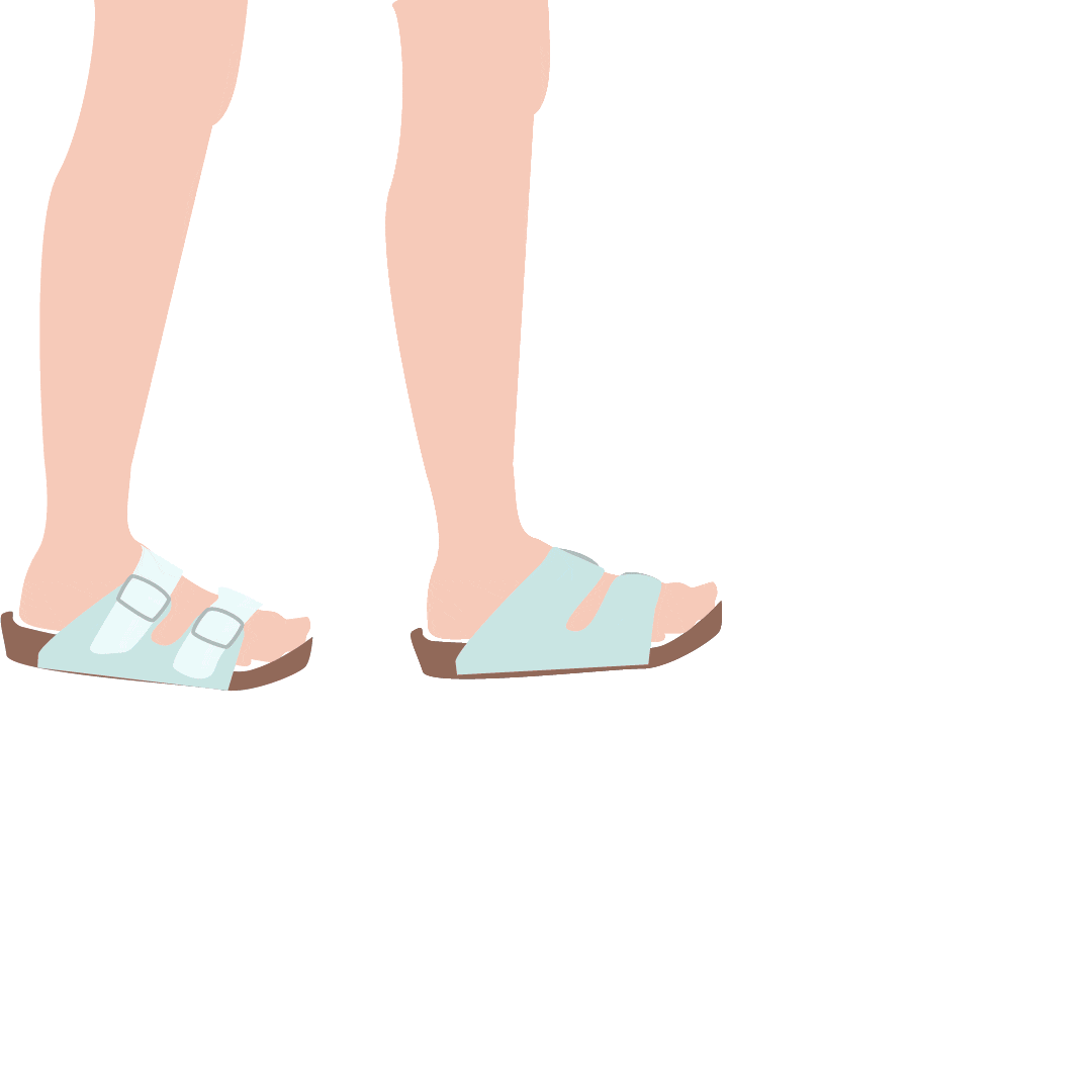
In this book I continued my research on the East Side of Austin. I wanted to focus in on the personal identity of the Eastsider. Stepping away from gentrification, my goal was to take a look at their connection to the neighborhood, their personal cultural practices. Private life is usually so secret so the idea of discovering what people are like through this project was very interesting to me. My goal was to collect images and interviews from residents in the east side of Austin, however this was actually very difficult to accomplish because people are not very willing to share their personal lives, which is understandable. I was lucky to find one resident, so I decided to add more content and share my own personal story with the audience.
Reina Gonzales
Portfolio
Category: Uncategorized (page 1 of 4)


(click images to see gif)
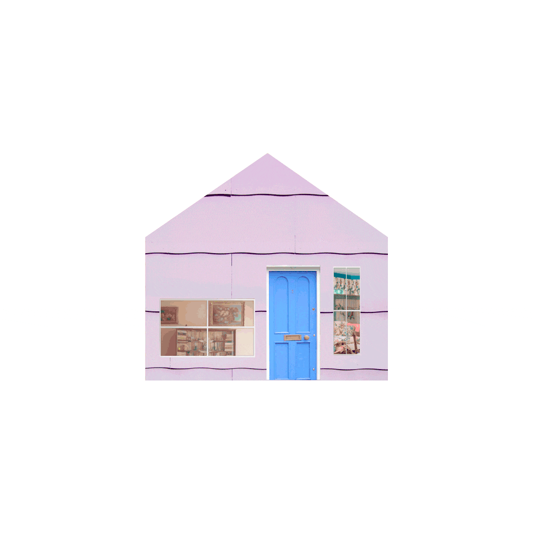
After researching the East Austin neighborhood around Cesar Chavez and I-35, and conducting a field survey of the homes, I created gifs inspired by the sentiments I saw from the community. I was most drawn to the experience of each person who was directly affected and I wanted to illustrate how the local population in the neighborhood experiencing the gentrification must feel. In my gifs I tried to play with a mix of illustration and images. I felt like the idea of collage and mixing elements would be a good representation of realistic sentiments and my personal observations. The main ideas presented in each gif are the effects of gentrification and how it can destroy homes and communities.
My concept for the Source Conference was to create a brand identity that represented the a flow of energy. I took inspiration from the flow of water and the flow of electricity in order to show a flow of ideas. In order to link to the past conferences I created the main logo around the S.
Ann & Roy Hike & Bike. Reina Gonzales-.mp4-1y4hul8
The Ann and Roy Butler Hike and Bike Trail is a public possession, a shared space by everyone in the Austin community. Through this video, I want the viewer to think of the trail as a converging point, a place where multiple worlds come together. A place where the natural meets the urban world, and people from all walks of life can create a common space. The trail is a moving energy it ebbs and flows and it is made up of the environment and the memories of the people and animals who use it, it’s important to preserve this experience in order for everyone to have the opportunity to use this shared space.

Art & Creativity has always been a part of my life. Since I was a young child I have had the opportunity to create work in a variety of styles of art forms. From drawing, photography, sewing, creative writing, acting, singing, to stilt walking, I have been extremely fortunate to have the opportunity to try so many things that I love. Though I love Graphic design in itself, I find that my passion stems more from a passion to create, and Graphic Design is one medium that I use to do this.
Because I love so many different mediums it can sometime be easy to get bored with a certain style. I think that this is when being critical on myself is important for me. Sometimes I have to tell myself to work through a design block, and this can only be done when I am critical of myself, and my choices, this allows me to be more productive and focused in my. Often I get discouraged, and feel like my work is not creative enough, in these cases it is also important for me to be critical on my design decisions, and eliminate or modify what needs to be changed to make my work more coherent, and inventive.
I believe that it is critical to be critical of yourself because without being critical there is no way you can truly improve. The thing I am most critical about myself, in terms of design, is the way I spend my time. I wish I had more time, and motivation to research, and work on my own. Only because I am aware of this weakness can I fix what needs to be solved. Over this summer my goal is to spend at least 7 hours a week working on design. Though this may not seem to much, comparatively to past summers this would be a very sharp increase. I find that I work best when I have a deadline or assigned project, so I will try to assign myself deadlines and projects that allow me to practice using design tools and foster my creativity. My goal is try and make designs that I can post on Redbubble, which is a site where people can upload their work to sell on different types of mediums, from T-shirts to duvets covers. I will try to ask one person a week what they wish they could have on a coffee mug or poster of, and then make it. This way not only am I getting practice with design tools, and designing random topics, but also I could be adding to my list of potential customers. However, my first self imposed assignment will be to continue editing my SOURCE work. By the end of the summer I am excited to see how I improve in my designing, if at all.
Organization, the way information is conveyed to the viewer is one of most important concepts of design. Not only must information be visually appealing and cohesive, but most importantly the viewer must be able to understand the message. In my Weather Report Video, I created a simulation of what weather reporting may look like in the future by using the LATCH organizational principles in after effects and illustrator. I wanted to create an animation where the interface felt as if it was being holographically projected in front of the user. In the video the user uses commands to ask the program where the best place to travel that weekend would be. The program then uses three of the LATCH principles, location, category, and hierarchy, to organize the information. Simple lines and a somewhat monochromatic color scheme are established to create a futuristic vibe, while maneuvers like motion blur and easing in After Effects are implemented to create a smooth and realistic appearance in the interface.
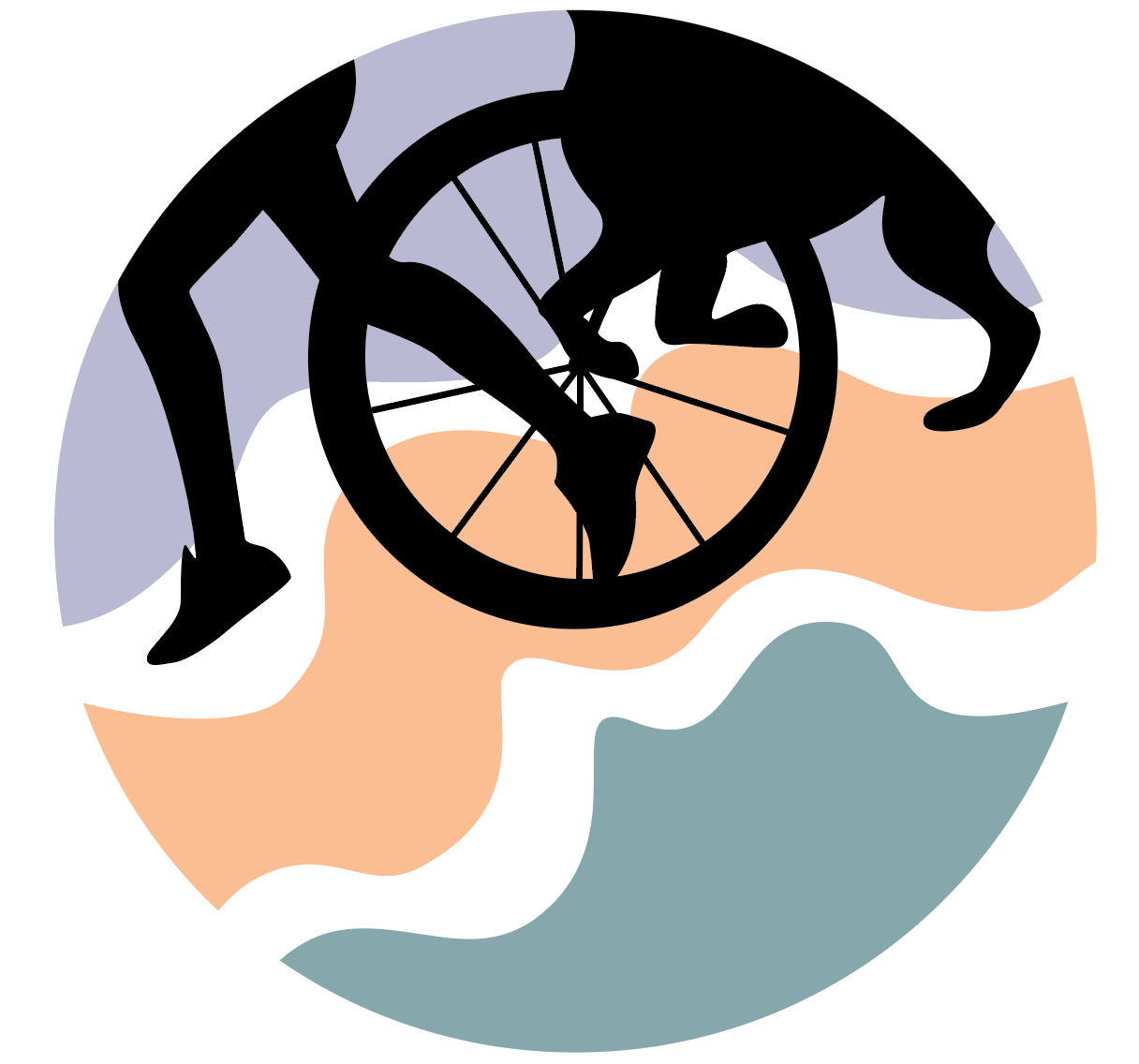
The Ann and Roy Hike and Bike Trail is a park that has become a representation of Austin’s diversity and culture. I took a literal approach in creating my mark for this. I wanted to represent the people who actually use the park, therefore I put a jogger, a bike and a dog running into my mark. I chose this approach because I felt that it could be very successful as a system. My goal was to represent all the different people who use the trail. My process for this project was rooted in the collecting, comparing and defining the information aspect of this project. I took what I have learned throughout this semester about the trail to create the concept for the design. An example being the colors I chose in my mark which have been taken from the trail itself. During the initial research phase I was able to capture some very interesting photos. In Indesign, I then selected the colors swatches from these photos that I felt created a clear perception of what the park looks like. During my observations and reflection of the trail it became obvious that the rhythm movement and patterns of movement on the trail was extremely important part of conveying what the trail is. So, I used flowing lines to illustrate the movement of the trail as well as using figures in action that again creates the perception of movement.

When creating any design, research and process work is the way that you can best understand and embody the representation for what a client or yourself want from your design. Through my research and process work over the Ann and Roy Hike and Bike Trail I have gained a better understanding of the park. I now know that diversity and activity are the most important concepts that the park represents. Through this preliminary work I have taken photos, recorded sound, written a reflective essay, and much more in order to understand and create the visual identity of the trail. One example is the reflective essay which has helped me to understand the direction and aspects of the park: activity and diversity. I will use these aspects in order to highlight my future work.
Creating a cohesive and understandable design for mediums other than print is important when exploring Graphic Design careers. Though I did not make an actual app, using After Effects to mock up what my portfolio app might look like was an experience that allowed me to understand that designing an interface is not just about the information, but also the way the information is read. Initially, I had to plan the way I wanted my interface to move using paper prototyping. This allowed me to understand what movements and directions made the most sense for my interface. Then in Photoshop and Illustrator I created the visual. The colorful visual information, the smooth movements, and the direction in which information moved were then transferred into After Effects using different techniques and settings.


My goal in this project was to create a rule set that produces a different outcome each time it is used while still being aesthetically pleasing. The beauty in this work is the randomness, and the possibilities contained within the constraints. Once the rule set was created I used the Plotter to draw my vector lines. This added yet another layer of intrigue to my work. The repetitiveness of the production of the set of 12 created a rhythm that is echoed within each drawing. From my rule set I wanted to create a list of restraints that would create drawings that varied and used lots of lines. I chose to go in this direction because it is a style I find very fascinating.
© 2024 Reina Gonzales
Theme by Anders Noren — Up ↑