Reina Gonzales

Portfolio

Author: rgonza16 (page 2 of 4)

Image Methodology Zine Lesson

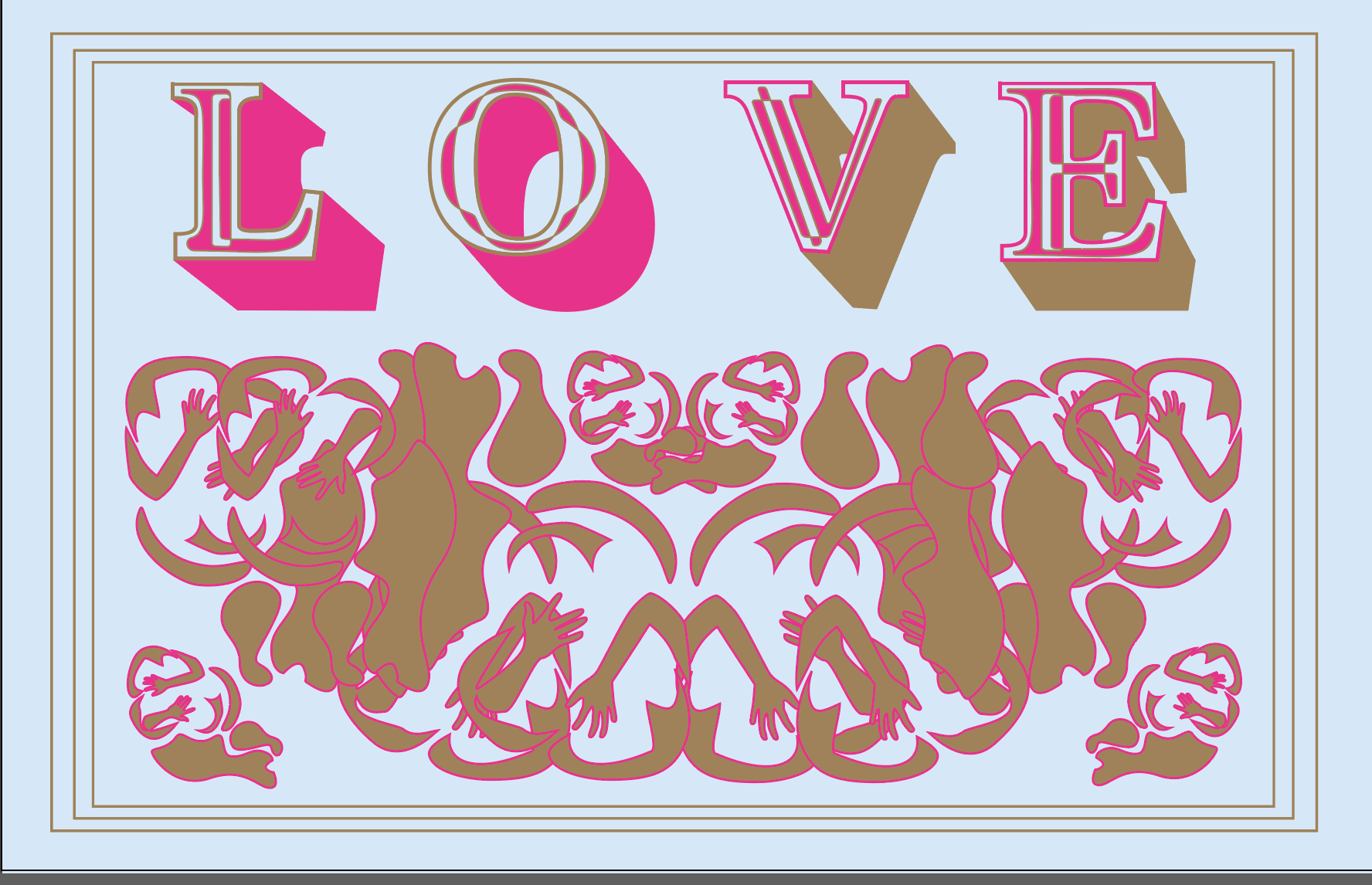
Global and community awareness, understanding different perspectives, and compassion are values I hold to a high regard. When creating this zine I wanted to let these personal truths shine through. I used my design to illustrate my beliefs. The format of a zine is very important as well because it is a production that is meant to be shared with others. The act of sharing one of my personal truths is what makes this zine important to me. In order to highlight my personal truth I created a display typeface and background design that would reflect my positive message by using flowing curves and bright pink and gold ink.
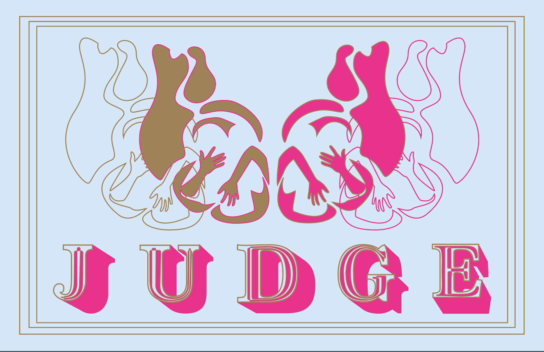
 

Image Methodology Style Lesson


It is not often thought about, but style is extremely curated. On a daily basis a person subconsciously or consciously decides how they want to be viewed by the world. This exercise in combining two very distinct styles to create a hybrid style, illustrates how graphic design is constructed to be viewed by the world. Through the photograph I was able to represent both a Hippy and Preppy style, creating a combination style Preppie. Through this process I chose outfits and poses for the models, then set props and angles for photographs themselves. Each photo was highly designed to fit the aesthetic of the designate style.

Image Methodology Object Lesson

Understanding the Environment of Design is an important concept when making sure your design is cohesive with the environment it will be placed in, especially if that environment is highly designed. After analyzing the film, The Fall, I created a matchbox that would fit within the story and aesthetics of the movie. Through research over the era and the movie is in and understanding the art style of that period, I designed a match box image that emulated travel posters and graphics of that time period. I named the matches Monarch Matches in reference to the film and the butterfly in the story line. Symbolism and foreshadowing is prominent with in the film, so I tried to create a match box that when placed within the movie would do just that. 

Graphic Design I Mapping Project: Cognitive Map

Illustrating conceptual ideas is an important task to understand in order successfully communicate a message. I had the opportunity to illustrate the conceptual idea of decision making in my cognitive map. Decisions are often decided in many different styles or techniques, for instance you could flip a coin or weigh the pros and cons. Comparing, and contrasting, asking an expert, and were all the decisions I used in my cognitive map. My map is a visual representation of the internal question I often ask myself, “What should I do with the rest of my life?” I used a cloud or thought bubble style to reference my internal decisions, then used graphic shapes, smooth lines, and slightly muted colors to portray the style of design I find aesthetically pleasing.     

Graphic Design I Mapping Project: Information Map

In an information map it is obviously important that viewer can understand the information that is being conveyed in the design. For my map I took Tony Pierces’ (a fictional character) spending  information from 2016 and analyzed it to create infographic map that would Illustrate “Tony Pierce’s Favorites.” The information was based on what most of Tony Pierce paycheck went towards, I did this by creating a large pie chart. I then divided the graph into categories in order to represent the “favorites” in each category. The most challenging aspect other then analyzing the data was deciding on a theme that would tie the design and data together cohesively. In end I decided on making a sketchbook to illustrate Tony Pierce’s Favorites.  

Graphic Design I Mapping Project: Artifact Map

After deciding to track the location of “fancy water fountains,” meant specifically for water fountains on campus, I created an artifact map to represent where they are located on campus. In my design I created 2 Icons to represent the two different types of water fountains on campus. I then created a map of campus that not only shows relative placements of buildings but also the levels on which the water bottles are locates.

Graphic Design I Symbol Methodology

For this assignment I created 3 symbol designs that represented the concept of love. My symbols were meant to be used as a way to notify your significant other that you appreciate an action or you like a certain thing. I believed that life would be much easier if your significant other could read your mind about what you like and dislike, so I felt that my symbols could be very helpful to notify an oblivious partner. I started by creating 9 variations using 3 different styles of execution, realistic, stylized, non-objective, then I combined these symbols to create the 3 final symbol designs. I used the image of a heart or a couple in each drawing to represent the importance of understanding a significant others needs.  

Typography I Wikipedia Reader

National Geographic Magazine have fascinated me ever since I inherited my grandmother’s collection of over 100 magazines when she passed away. For my Wikipedia Reader I wanted to choose a Wikipedia article that not only interested me, but was also sentimental. Once I found the Wikipedia article, I chose a typeface that fit the theme of National Geographic Magazine, and then created a grid system for my booklet. Through my design I was inspired by the magazine itself, and I took inspiration from the magazine for many elements in the reader, like the type and column text layout, from the magazine.  

Typography I Proportional Grid booklet

Often when we find a design that is aesthetically pleasing it is because of the layout of the piece. Creating a grids is one way to ensure that a design will have a satisfying layout. After choosing an inspiring graduation speech, I chose a typeface that best matched the motivational but still formal tone of the speech. I chose a san serif fount that I felt best reflected the message. Then I created a grid and booklet size that would be comfortable to read and understand. From there I placed the text within the grid making sure the book was legible and the design was easy to follow. Printing the booklet and further editing was an essential task in assuring that the booklet felt good in the readers hands and fit the content within.


Typography I Type Specimen poster

During the design process for the Type Specimen Poster, I created and edited several different variations of the posters for the typeface Strange Creatures, for example several variations highlighted a single letter while others illustrated the alphabet. The goal was to illustrate how the typeface could be dynamically used. I narrowed the variations and continued to edit until I settled on the final 2 designs. These posters are designed to be printed on risograph printer and I therefore used the printable colors that I felt best reflected the vibe of my Strange Creatures typeface.

Older posts Newer posts

© 2024 Reina Gonzales

Theme by Anders NorenUp ↑

Skip to toolbar