Part 1: Your written response to seeing upperclassmen work. Based on your in class notes, please comment on each of the student presenters and their work.
Overall I really enjoyed the senior presentation. It was interesting to imagine what It would like if Ii was the one giving the presentation of 2 years from now. The Photography major was the first girl to present at the seminar. What i found most interesting about her experiences was that she was able to use her study abroad experience to develop her portfolio by taking advantage of the unique and beautiful places around her in europe. The second to present was the art major. I really liked seeing how her portfolio shifted and transformed as she progressed through her time at St. Ed’s. One thing she mentioned that I think is really important for me to research the Mexican American Cultural Arts Center. I have worked with a similar organization in san antonio and it would be awesome to work at a place that mixes both my passion for art and design as well as my passion for latin american studies. The third presenter was a graphic design major. I thought it was really interesting to see her work and compare it with what I have done so far at St. Ed’s in the GDES program. It was also a sneak peek at some of the future assignment I may be working on. I also thought that her experience in Mexico City was extremely interesting. I hope that I am able to be part of a similar project or experience. Last but not least was the Interactive Game Studies major, for me this was the least interesting major just because anything video game goes right over my head. But I did appreciate her description of the difficulties of getting a job in the industry and strategies of how to compete in this field, I think for everyone found this advice very helpful.
Part 2: Each of you will develop your own website in the future, that will act as a showcase for your portfolio. With this in mind, find at least four websites that you find compelling. Insert a link for each site, and add a short summary for each link explaining why you chose them.


A trend that I am noticing with all the websites I have chosen is that they are very similar. They all have a lot of pictures which are the main focal point of each website, they have a mainly white background, and it’s obvious that simplicity is the look each website is going for.
http://www.cruzortizart.net/: I like this website because it’s simplistic yet still has a lot of personality. I like the title of each web page because they add humor to website.
http://www.markmenjivar.com/:I think this is my least favorite out of all 4 websites but I do like The size of the photos. I think that the type is a bit weird but overall the webpage looks well put together.
http://www.hansje.net/:This one is the most interesting ones I love all the pictures and the way they are organized in the grid. I like that each photo is a link that leads the viewer to her work.
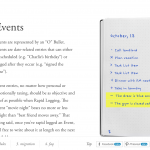
http://bulletjournal.com/get-started/: For the last website I could not think of an artist to chose so I ended up selecting this bullet journal webiste because of how well designed I think it is. My favorite part is that the image of the journal follows the viewer through the pages and I think it a very interesting effect that was done very well on this website.
Leave a Reply