Projects that highlight my designing skills are Mapping Project: Cognitive, NY Times Pamphlet and the Display Typeface. I effectively planned these projects and their final version had well balanced space, creative layouts and appropriately formatted content to fit the median.
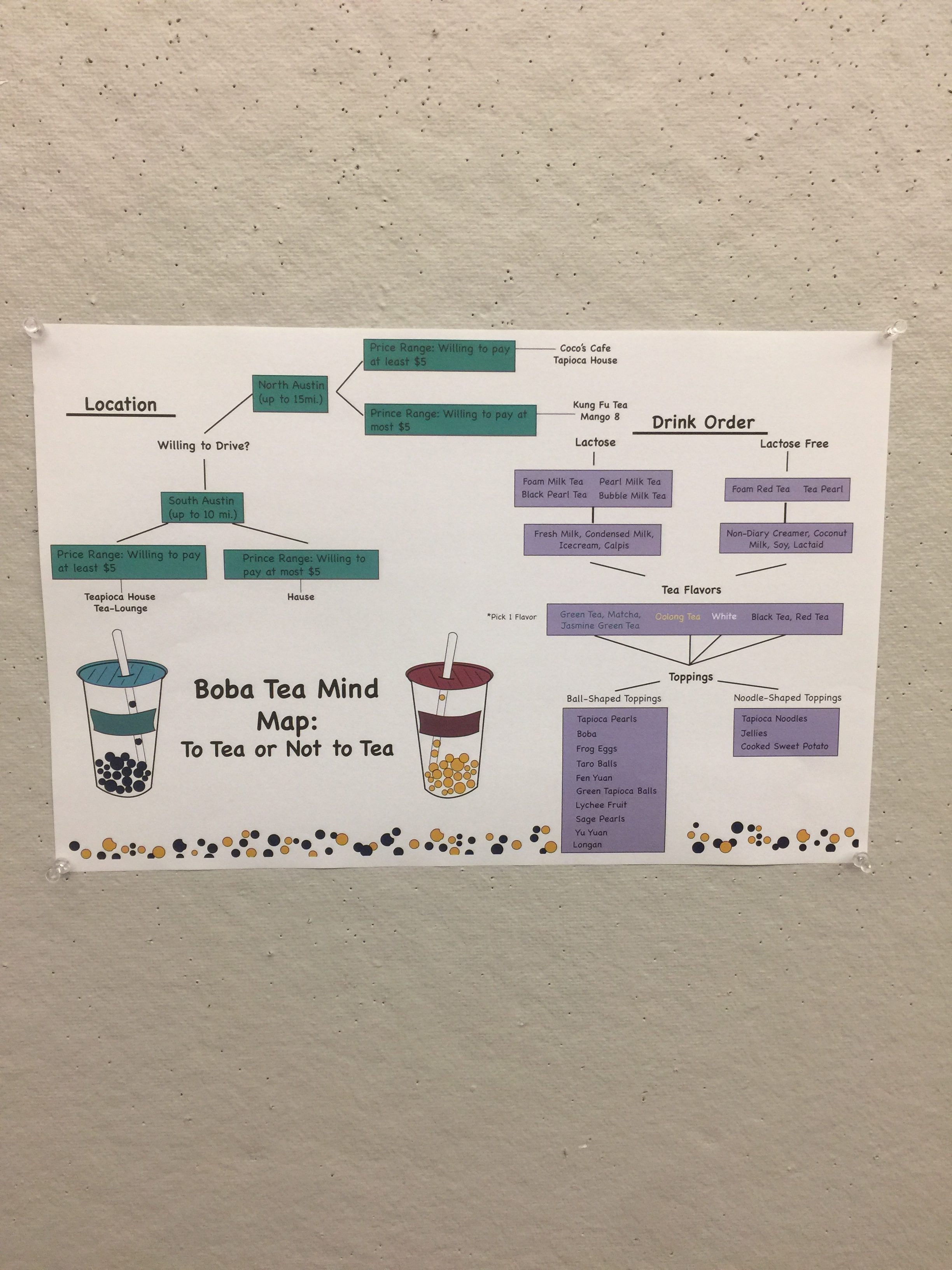
The Mapping Project tracked the decision process of ordering boba tea. I associate coffee and tea shops with colorful sitting areas and modern furniture so I wanted my tea map to represent that but also aim to create a playful mood. The color scheme is eye catching without being tacky, the light green and purple with accents of yellow create a playful mood and ties the separate flow charts together. The tea and tapioca icons were more sophisticated than previous symbol making projects. The different stroke weights gives the images dimension and the poster looks less flat now, since the icons were placed to balance the negative space. The content itself is easy to follow, pick a shop based on location and price, then order boba tea and see all the combinations that are available to make the drink.
The Display Typeface I created named, New Dream helped me learn about the anatomy of letters as well as think about different uses for different styles of font. My typeface incorporates negative space as most of the “fill” but is balanced by a simple stroke that internally outlines each letter. The typeface is blockish with a few choice letters that depend on non-block segments for support. It was important that all characters looked stable and firm but overall all letters look like they were designed in the same style even if some have stand out features that vary from the main theme.
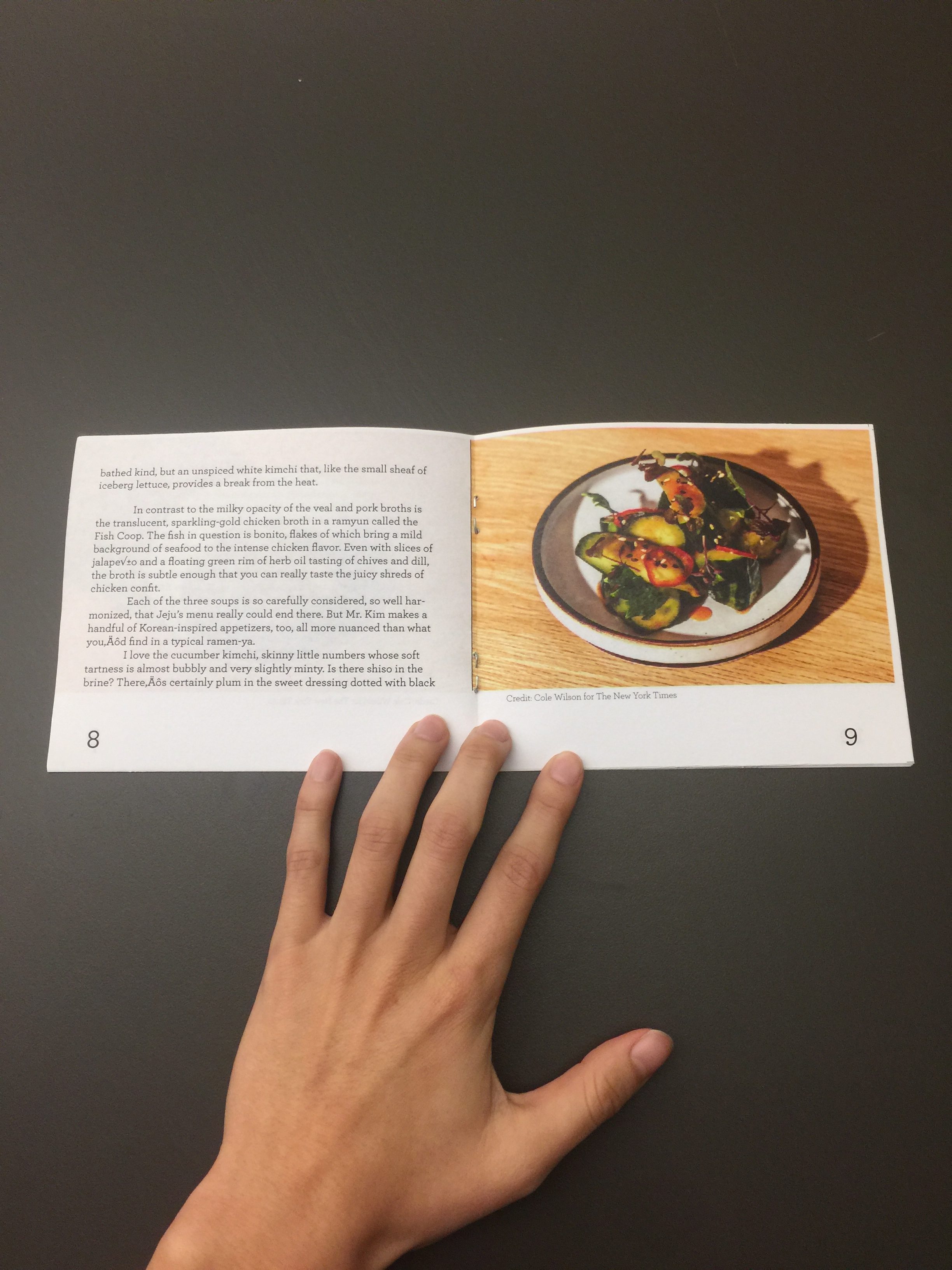
The NY Times Pamphlets have been my favorite design project at St. Edward’s, it helped teach me how to use proportional grid systems effectively and think about the design that goes into printed works. I like the dimensions I picked for each pamphlet, all are different from one another but they do look like modern restaurant pamphlets that belong to the same collection. I used different typefaces for each pamphlet and choice conservative styles that are traditionally used for close-fitted text so that the booklets are easy to read as well as look stylish.
The process of sketching designs, critiquing elements of neatness, placement, weight, balance, dimension and color schemes depend on the purpose you want your work to serve and the median displaying your work. I think recognizing mistakes before critiques is a strength I have and recognizing which elements of design I should emphasize based on the median have helped me grow as a designer. I will continue to try to improve my work by practicing neatness and pushing the abstract concepts of my designs more when they are too literal.


https://sites.stedwards.edu/ngalind1/2017/12/02/mapping-project-cognitive-map/


https://sites.stedwards.edu/ngalind1/2017/09/17/display-typeface/


https://sites.stedwards.edu/ngalind1/2017/12/03/ny-times-pamphlets/