Weather Report


I spent a great deal of time working and learning for this project. My first experience with after affect wasn’t that easy. So, this time I made sure that I spend enough time learning and practicing how to use each features in the app. For this project I focused  more about how to move icons and the colors that I should use and learn new things such as how to use “mask”.

Visual Identity: Mark


I want me design mark to reflect my experience in my Boardwalk. I chose the shoes shape because I saw many people go their to take a walk. And I used neon colors because a lot of sport clothes use these kind of colors. The small dotes present the lights’ building and stars in the sky.

Process Work/Research


It was interesting how can you have a different experience in one place. I went to Boardwalk many times in different times and each time I went there I discovered new things. Collecting information about one place by using 4 different methods was a interesting  experience because each time you use a new method you put yourself in new point of view.

Interface lesson ( portfolio app )

this is the last project for Image methodology class. After we finished all of the projects we were asked to design a portfolio app by using after effect that shows two of our projects that we did for this class. It was a new and stressful experience for me, because I had no chance before this interface lesson project to work with after effect. The time that we had to learn how to use the app and to come up with a design was too short and it was during finals. Developing final results took me very long time. I had no idea about how each feature work or how should I correct my mistakes. Furthermore, the app crashed twice while I was working on! The night before the due date was so stressful. In the end I turned in the assignment but it was not look the way that I wanted to be. The elements movements did not work as I wanted, and the design looked different than what I had in my mind.

Plotter Lesson

For this project we had to come up with a set of rules that we must follow for the 16 designs. My rules were to use same paper color and use one pen for all the plotter lessons. I like straight structure lines that look like as architecture lines. So, All my 16 plotters lesson have that sense of architecture lines.

Zine Lesson

In the beginning of the assignment we asked to write about a truism based on an important lesson that we have learned in your lives or a belief that we hold that has served us. Then, we had to design a two-color Risograph zine using the truism.
In my Zine design I wrote about an experience that I had back home when I was in high school. I chose an Islamic designed because I wanted the designed to be related to the place where I had the experience. We did not have a lot of colors options, so I tried to choose the most two similar colors to the Islamic designed. I chose black and gold. The paper that I chose also looked like an old yellow paper. The reason behind choosing this kind of paper is because most of old Arabic books used it. So I wanted my designed to look like an old Arabic books.

Style lesson

In this project we took a personality test to find our matches or partners that can go with our personalities. After that, we had to pick up two different styles and try to come up with third style, a hybrid one. My partner and I chose preppy style and Arabic women traditional style “ Abayah”. One of the styles had to shout in the studio and the other one outside. In order to take advantage of the natural light we chose to go to a place near to Mozart’s café that has an open area and beautiful view. For the third style we mixed preppy style and Abayah in a way that looks a top for the first look and as a cloak in the second look.

Object lesson (Matchbook)

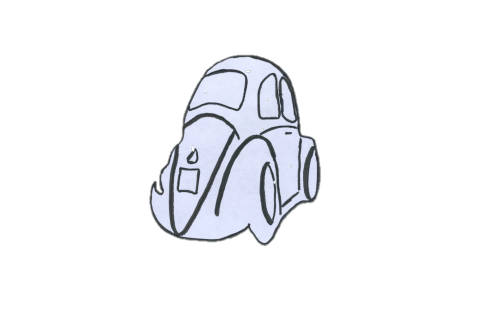
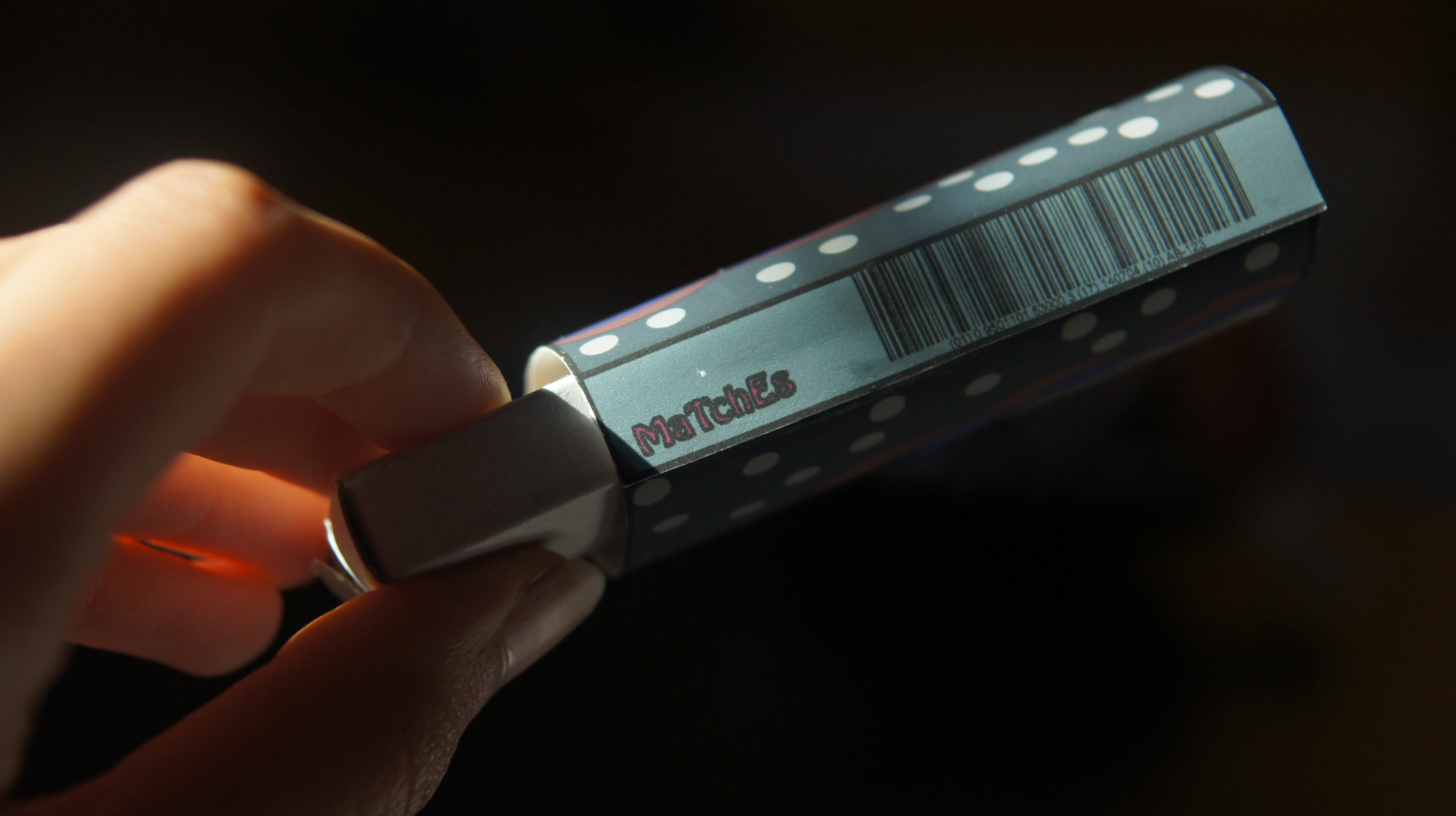
Fall 2016 was my first semester for me as a graphic designer. My beginning in design was not that easy, I had to put a lot of effort to teach myself how to use designing apps, because I had littlie knowledge in how to use these apps. I had no designing class back in high school. I started my journey as a designer in university from zero. The first assignment that I was asked to do was designing a matchbook based on our observation. We were asked to watch a movie, I watched “ A Single Man”. Then, we were asked to choose one of the characters in that movies and study his/her lifestyle, how he/she dress? How his/her house looks like? And many other details that related to this character that we chose. Before the final critique we were asked to turn a first draft of our designing. I felt like I was in real trouble because I had no idea how to use Illustrator or any other apps designing. I had to come up with a solution to turn something for the mid point critique. So, I used Microsoft Word! I found a picture of a car that the character I chose has. I deleted the background of that picture by using a feature in Microsoft Word. Then, I added some affect on that image by using different filters. And I chose my palettes colors reliance on the movie colors. The final result looked miserable, I should admit that. But, later on, and after I took couples more classes in Graphic Design1 and watched some YouTube tutorials I was finally able to use illustrator in my design. The finals result was so different; it looked more professional comparing to the first draft. I used illustrator in all my design.

First draft:

Final draft:

Cognitive Map

I made this map for my two little cousins, Layan and Reem. They both like eating ice-cream, and each time they ask to go and get an ice-cream it takes me longtime to search or to find a new place to go.  However, this map saves my time and helps to find a place very quickly. I used different colors and icons so both Layan and Reem can use the map so they can help me to make a decision. I printed out several copies as well and I gave them to my friends who have verities prefers. Some of them, have allergy from dairy products and othesr like to eat only organic food.

Information Map


Analyzing data and transfer it to graphs was the most important skill to have for this project. As a designer we need to have such a skill. Most of our designing that we do based on information or data  that we collect and transfer into something visual.