For this assignment we had to find at least three examples around the Fine Arts Building of the Elements of Art and the Principles of Design.
ELEMENTS OF ART
Line: quality (thick, thin, broken), implied line, actual line,
linear networks: cross-contours, psychic line.
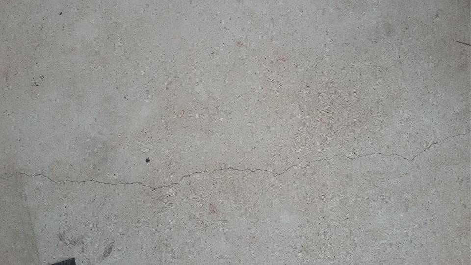
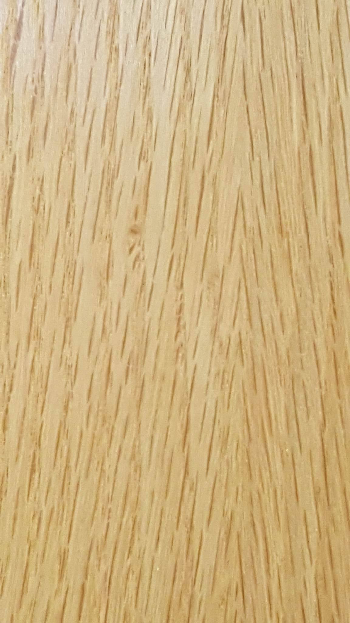
Line – Linda Sanchez

Line – Linda Sanchez

Line- Linda Sanchez
With line, Linda found some great examples in the tiling, as well as the line where a corner forms on the ceiling. My favorite is the crack in the concrete. It is very distinct and unique compared to the other two.
Shape: is a flattened enclosed area.
The boundary of a shape can be created by enclosing an area with a continuous line or implied line, filling an area with solid color/ texture, broken color texture

Shape – Linda Sanchez

Shape – Linda Sanchez

Shape – Linda Sanchez
Shape was found in the way the roots and leaves of a plant give it a certain form. It was also found from the folds of a bag and how it creates and interesting shape. Lastly, the sharp edges of a cigarette bin create some more distinct shapes.
Texture: physical, visual (illusion), invented texture

Texture – Linda Sanchez
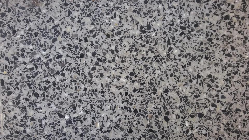
Texture – Linda Sanchez

Texture – Linda Sanchez
Texture was plentiful around the Fine Arts Building. I like the similarities and differences between the first two pictures. While the first one has texture from 3D bumps and ridges, the second seemingly has texture from the contrast in values. The last one is a great example of texture because it is so rough and unsmooth.
Value: Contrast, value distribution (proportion of lights and darks)

Value – Linda Sanchez

Value – Linda Sanchez

Value – Linda Sanchez
The first picture shows value in different areas of shadow and where light directly hits the wall. The second also uses light and shadow to create value. The last one is interesting because of the lines that have different values to them themselves, as well as the surface they are on.
Color has: HUE< SATURATION< VALUE
plus WHITE = TINT
plus GRAY = TONE
plus BLACK = SHADE

Color – Linda Sanchez

Color – Linda Sanchez

Color – Linda Sanchez
Color was certainly easily to find.Color was found in ceiling wires, in work from other students, and left of paint outside.
Plane: 3-d form that has length and width but with minimal thickness.

Plane – Marcos Ramirez

Plane – Marcos Ramirez

Plane – Marcos Ramirez
Planes are anything that are pretty much flat. There is the see-through plane of the plastic covering the men’s bathroom, as well as the planes that make up the blinds in the classroom. There is also, of course, the papers that student art is on.
Volume: refers to enclosed area of 3-d space

Volume – Marcos Ramirez

Volume – Marcos Ramirez

Volume – Marcos Ramirez
These objects were chosen to show an enclosed area. They are all some form of a container. The watter bottle holds both water and air, for example. The other two containers are relatively empty, on the other hand.
Mass: solid 3-d form

Mass – Marcos Ramirez

Mass – Marcos Ramirez
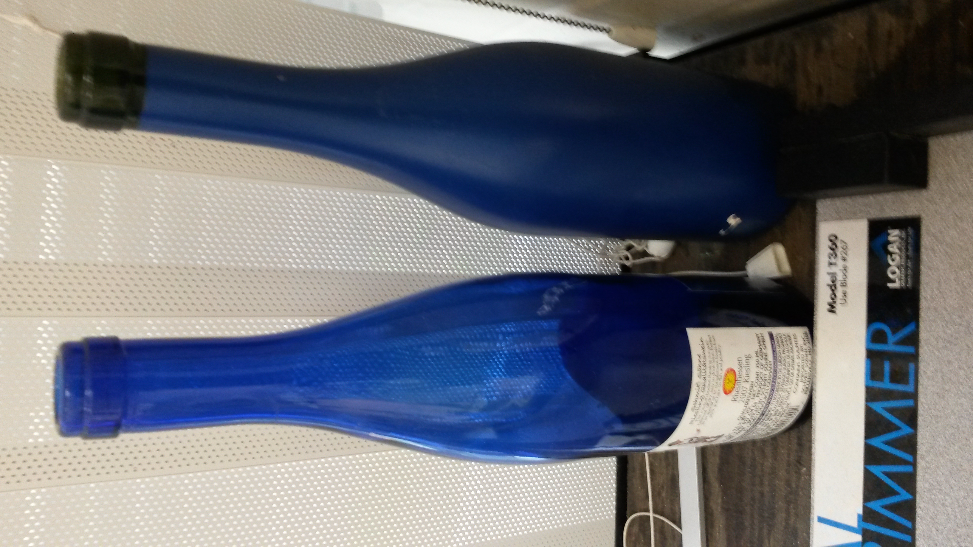
Mass – Marcos Ramirez
Mass was an 3D solid, so I chose some interesting objects around the building. First I found some model houses, a 3d object made of planes. Then I found some rectangular pylons that seemed pretty standard. The glass bottles create an interesting 3D shape, but a 3D shape nonetheless.
Space: area within or around an area of substance: positive/negative, compression/expansion, activated, entering.

Space – Marcos Ramirez

Space – Marcos Ramirez

Space – Marcos Ramirez
For Space, I chose pictures that showed an area and how objects/people were placed/ reacted to the enviornment.
Light: can enhance or obscure, affect emotions, entice us to enter, create mystery, can even be the sculptural medium

Light – Marcos Ramirez

Light – Marcos Ramirez

Light – Marcos Ramirez
Light can be seen in the way it shines against the wall, in the way it creates distinct shadows, and in the way is shines through a translucent object.
Time/motion: actual and implied are two aspects of time.

Motion – Marcos Ramirez

Motion – Marcos Ramirez

Motion – Marcos Ramirez
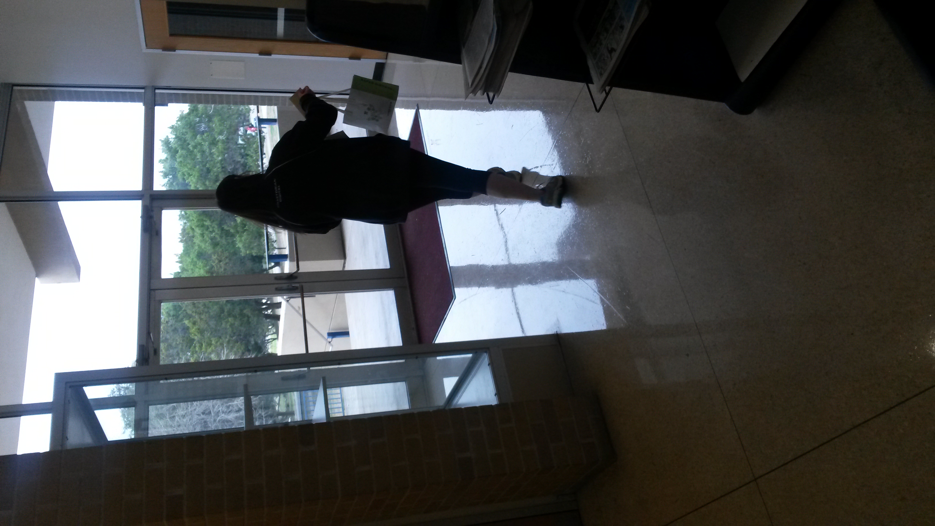
Motion – Marcos Ramirez
Motion was a bit more difficult to capture in a still image, so I chose things that implied movement frozen in time. The first was water coming from a fountain. The second was a door closing. The last was a girl mid step.
PRINCIPLES OF DESIGN
unity | harmony: similarity, oneness, togetherness, cohesion
variety: visual diversity to avoid an unintended monotonous composition and to hold the viewer’s interest.

Unity/ Variety – Maria Addison

Unity/ Variety – Maria Addison

Unity/ Variety – Maria Addison

Unity/ Variety – Maria Addison
These first two pictures are great examples of unity, as they all look visually the same and together. The last two images show unity and variety at the same time. While they have the same shape and/or design, each individual might look different from the other.
balance:
Symmetry/approximate symmetry: visual or actual equilibrium of two halves of a composition mirroring each other in size/shape and placement of elements of art.
Asymmetry: creates equilibrium among visual elements that do not mirror each other on either side of axis. (Depending, design can be quite dynamic or chaotic
Radial symmetry: equilibrium achieved by elements emanating from a point, usually the center of a composition

Balance – Maria Addison

Balance – Maria Addison

Balance – Maria Addison
The first image is a perfectly symmetrical design. The door shows balance inits shape and in the distribution of light/dark wood segments. The bathroom sign shows both symmetry and asymmetry in each character.
scale: comparative size of an element of art or object in relation to other
objects and expectations about what is normal. Ex. Human scale
proportion: relationship of the size of parts to each other and to the whole

Scale/Proportion – Maria Addison

Scale/ Proportion – Maria Addison

Scale/Proportion – Maria Addison
For scale and proportion, Maria found things that were adjacent to the same object of a different size.
rhythm: sense of movement – regular, irregular, pattern, grid

Rhythm – Maria Addison
Rhythm – Maria Addison

Rhythm – Maria Addison
These images show different examples of rhythm. while the first and last images have more random rhytms, the second image has more linear and pattern-like rhythm.
emphasis: arrangements of elements of art to make some areas the primary focus of a viewer’s attention

Emphasis – Maria Addison

Emphasis – Maria Addison
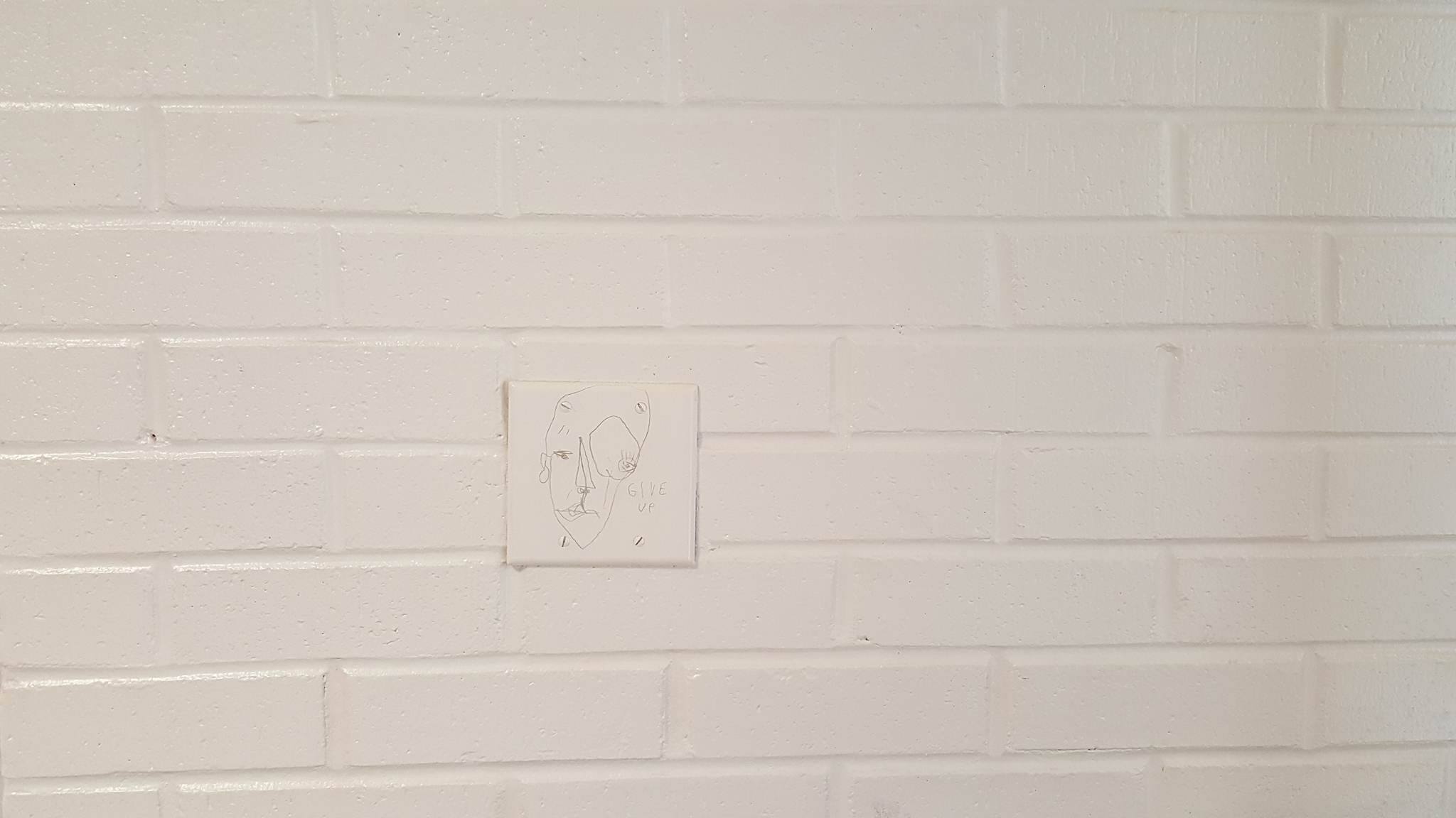
Emphasis – Maria Addison
Maria Addison was incredibly clever to find emphasis in objects that serve a safety function around the building. They were designed with the explicit purpose to call our attention in the event of an emergency. The red lettering of both the exit sign and the fire extinguisher are obvious examples of emphasis. The last example of the map shows emphasis in the way it breaks the pattern of the wall. Against such a plain surface, the map stands out.