Interface Lesson
The interface app project was my first experience animating with After Effects. For this project, I used the deconstructed parts of the application UI package for Apple’s iPhone 6 and my own class work to create a simulation video of a portfolio app for my work in Image Methodology to that point. I put together “pages” (first as paper prototypes and then later in Photoshop) using the provided UI elements and photographs of my previous classwork, and then I brought them into After Effects to be animated as a pitch for how the app would work. I was able to make four screens (as required by the assignment) that were personalized to the function, color scheme, and overall design that I wanted, and then exported the After Effects file as a QuickTime video.
Plotter Lesson
The plotter assignment was my second time using the vinyl cutter, but with a different purpose. I was introduced to a pen plotting method for this assignment and used techniques in Illustrator to create interesting line drawings that the plotter could reproduce. Additionally, this project emphasized the use of creating rules before the finished product to make them more spontaneous. My rules consisted of listening to Christmas music on the radio, and creating lines that could represent the rhythm of each song. I blended the lines to create the final shape that was to be plotted through the vinyl cutter. However, I took my assignment a step farther by plotting on fabric with metallic fabric paint pens rather than using paper and ballpoint or gel pens. I felt that using a different material would enhance the idea behind my plotters as holiday gifts, because I get very excited about the Christmas/winter holiday season and wanted my plotter designs to serve an additional purpose beyond decorative posters. The plot featured below represents Tchaikovsky’s Nutcracker Suite.
Zine Lesson
The zine project was created through a unique truism that has positively impacted my life, and potentially the lives of others. My truism is based on my family’s way of always having a positive outcome whenever there are challenges that we face, whether as individuals or as the family as a whole. Additionally, as a side-assignment to the zine, I created chromatic-type styled lettering of the words that made up the truism my zine featured. I created a hierarchy through the positioning and scale of the words to emphasize parts of the phrase that I considered more important visually for the truism. Like the specimen posters in Typography 1, these zines were printed on the Risograph and then hand cut and folded to turn into small booklets.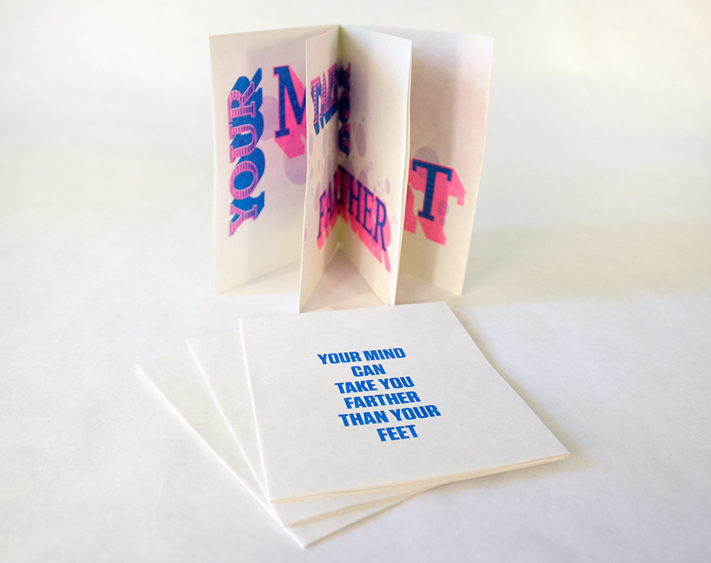
-

- Cover Pages
-

- Spread 1
-

- Spread 2
-

- Spread 3
Style Lesson
The style lesson was used to creatively interpret various aspects of “style”, such as what creates a style and why a certain style might be important. For this assignment, I was part of a group of three, and we were assigned the task of creating portraits that resembled three individual styles, one of which had to resemble the “preppy” style of the 1980s, one that was of our choosing, and the last would be a blend of the two. My group members and I decided to imitate a “bohemian” style alongside the “preppy” style. To do so, we focused on fabrics and patterns. The preppy fashion we studied was primarily made up of solid colors and similar fabrics, whereas bohemian fashion was heavily reliant upon patterns, earthy tones, and varying fabrics. We used those aspects of each style to put together outfits and photograph them, and I was the member who dressed in the “bohemian” style. A studio was chosen for the preppy style because it is often very refined and sterile, influenced more by status than things, my group felt, whereas bohemian fashion is more influenced by nature and physical objects.
Object Lesson
For the object lesson, I watched a film and then attempted to create a matchbook, or matchbox, design that could perhaps have been part of the props on set. The matchbook design is intended to be a reflection of the film and set design, as well as having potential to be an actual product of the time and setting of the film that I chose to study. For my particular matchbook, I watched the film Snowpiercer and observed the setting that most of the film revolves around: the sharp divide between the rear train cars and the front train cars. The digital design of my matchbook was simple, and I instead relied upon physical properties to give it interest and make it fit into the setting that I chose. I recreated the logo of the industry that built and funded the train, and printed it on silver paper that was representational of the elite class for which the train was originally furnished. I printed two copies to reflect a “before and after” of the product; a free novelty item to boarding passengers versus a utilitarian possession to those who need the warmth it provides.

