Visual Identity: Mark
The mark project required me to make a logo for the public space that I had researched, and be able to represent a preexisting or new idea about the space through the mark. The final mark that I ended up with for this project is a reflection of my impression of the Greenbelt through the lens of both able-bodied individuals and those who have trouble traversing such difficult terrain as what the Greenbelt offered in many places. I sought to create a mark that could signal a change in this challenge. This mark represents a (hypothetically) improved Barton Creek Greenbelt with accessible trail options for people who don’t want to, or physically cannot, tackle more natural terrain. It puts inaccessible and accessible trail options on equal, shared ground and becomes an invitation for everyone to visit the Greenbelt. When integrated as a system, the objects within the mark (in this instance, the trail) can be replaced with other objects to represent other landmarks of the Greenbelt trail, such as side paths that lead to the water, or trails that lead one back out to the main road/entrance.

Main mark/Rough Terrain
-

- Creek Access
-
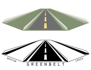
- Main Road/Access Point
-

- Smooth Terrain
Process Work/Research
For this assignment, I chose to study the Barton Creek Greenbelt in Austin. One of the five methods for collecting research on a public space in Austin was to collect existing maps of the space, and then create a unique map of my own to represent a new idea, or update a previous one. When I visited the Greenbelt, I went with my family. I thought it would be a great way to spend the day in fantastic weather while getting homework done at the same time. It quickly struck me that although I, and other able-bodied individuals, enjoyed what the Greenbelt had to offer, my sister, who is wheelchair-bound, could not. I chose to make a map that highlighted which parts of the trail that I covered would be accessible and which parts wouldn’t be. I divided the Greenbelt’s terrain into three categories for feasibility of access: easy, difficult, and nearly impossible. Then I proceeded to assign these categories to the main trails that I walked over throughout my several visits to the trail, and added in other landmarks to the map for readability. 
-

- Official Map
-

- Minimalist Map
-

- Access Points
-
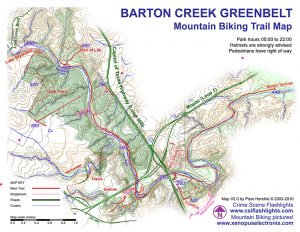
- Mountain Biking Trails
Branching Out – Decisions, Decisions
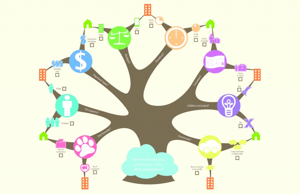
Finally, this last map derives from a decision map that blends preference trees (no pun intended!) with pros-and-cons and satisficing decision techniques. The general question for this map is one that relates to me personally, as I currently live at home and have about a half hour commute to school. I’ve wondered frequently where I’ll end up living once I graduate from college, and so I found it calming to be able to draft out the major categories, or decisions, I would face, and the paths that each choice would take me to.
This map is presented in a fun “checklist” manner, where you assess each sub-decision individually, and at the end compare how many of the apartment avenues were checked compared to the houses.
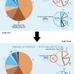
Needs versus Wants – Visualizing Information
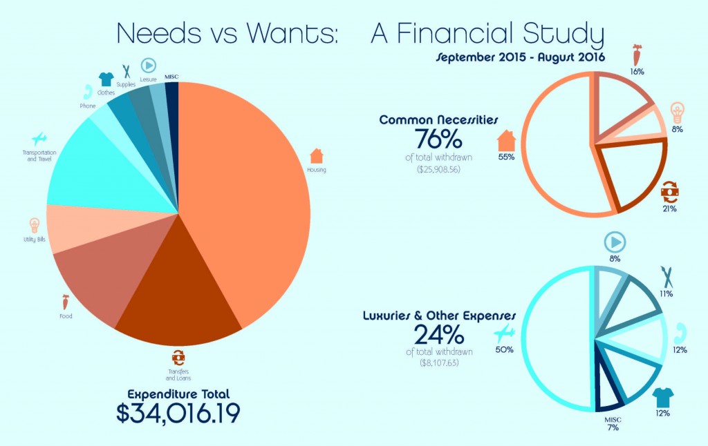
Needs versus Wants is a map that reflects a financial study on Tony Pierce’s bill statement from September 2015 to August 2016. It is meant as a spread in a book, and this particular spread divides several categories of expenses into two broad categories: necessities and luxuries. then, those categories are divided in subcategories so that Tony Pierce can see at a glance what his largest, and smallest, expenses are should he need to start managing his finances!
The most enjoyable part of this particular map was the icons, and the color scheme. I find that blue and orange color schemes are easily recognizable and subtle enough to draw the audience’s attention in, and I was proud with my ability to make distinct icons that are unique from one another and clear representations of their categories.
Good Reads – Personal Geography
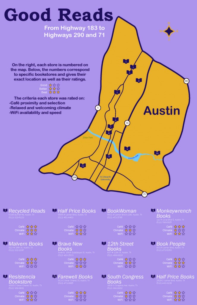
This map is a compilation of the local bookstores in south Austin. By local, I restricted the geography to where highways 183, 290, and 71 intersect, since I don’t like going places in Austin without knowing where I’m headed, and I like to stay close to places I know I can navigate easy, such as SoCo near St. Edward’s, and I-35.
For each of the twelve nearby locations, I visited each and considered online reviews to give them ratings on three criteria. The first was whether or not they had a cafe, and what the selections were like. While I don’t drink coffee, I do enjoy other cafe selections and the smell of coffee brewing, and having a cafe is such a classic cliche for bookstores that I love. My second criteria was what the environment, or atmosphere, of the store was like. I wasn’t going to want to repeatedly visit a bookstore that is loud and crowded with staff that don’t know much about what they’re selling. I prefer the quiet, laid-back ones with friendly knowledgeable staff who really know their books. And, lastly, I rated the stores on whether or not they had WiFi and how quick it was, for surfing, streaming, or studying.
GDES 2313 End-Term Assessment
I think that putting in nearly 40, or more than 40, hours a week on practice (more than six hours a day) is excessive, but I think that setting aside less than two hours a day is not enough time to dedicate to improvement. Practicing is essential to improving one’s level of sophistication in their artwork because through practice you learn to troubleshoot technical problems, or you learn shortcuts that can help you later. I’d say that between four and five hours per day of practice time (which can be spent on multiple projects throughout the day, not necessarily a single project in a single time period!) is how much time people should attempt to make to work on practicing and learning new ways to make work, and this is where I’d say I’m at, around four hours a day on various projects, whether they’re individual work or assignments for class.
To me, sophisticated work is careful work. And by this, I mean that sophisticated work has been scrutinized since the first draft by the artist, and has been improved as a result of personal feedback and intuition, but also from critiques from peers. It pays attention to design choices and elements that require an equal balance to be effective. I would say that my maps are sophisticated in the fact that I carefully took into consideration the critiques of my classmates as positive feedback toward improving my designs and making them clean and direct in their readability by the audience. Specifically I paid close attention to color schemes and icons and how to best utilize these elements for emphasis of certain areas of the maps, rather than simply “decoration”.
As stated above, I especially appreciated my peers’ feedback on my icons. I knew that I liked the icons I had done, but I was worried about how they worked in combination with text, and so I really valued the feedback and suggestions that my classmates gave for resolving the issues that I had with balancing my icons and text on my maps. With this feedback I received, I was able to pinpoint specific problems in the maps and make iterations that improved upon and resolved the problems. These critiques/feedback were especially helpful in my second map, as seen below (click to enlarge).
I’d say that the challenges I faced were minor to intermediate; I didn’t really face any extreme difficulties that I couldn’t work around or that caused me to start over on a map. I think the most challenging part of my maps was picking interesting fonts to use that are not default fonts, but rather fonts that are more fitting for the map and information they go with. But once I picked some I liked, I had some peers help me figure out which font(s) would be the most interesting, fitting, and readable for the maps I was doing, so now I have a better idea of the criteria to think about when picking fonts. The easiest and most enjoyable part of my maps was the icons by far. I love to mock up icons and symbols, so those were the most enjoyable for me to do and to fit into my maps.
Outside of class, I do a few other things that do relate to design. Specifically I am interested in mocking up logos for friends, and I also like to design aerial maps of properties, so I liked how the symbol and map assignments we did in class can help me think about design choices for the logos and maps that I’ve already enjoyed doing. I also enjoy creating digital portraits of pets for friends, as far as other extracurricular art projects go. Below are two examples of the most recent portraits I’ve done in two different styles.
-

-
©2016, Loren Gamez
Jade Portrait
Digital painting, 5″ x 5″
-

-
©2016, Loren Gamez
Tug-Tug Portrait
Digital painting, 5″ x 5″
As far as my life outside of school affecting my schoolwork, I’d say I’m somewhere between neutral and positive. I always make sure that my schoolwork comes first and that it is finished before I do anything with friends or family, but I also make sure that I do make time for others so that I can relieve any school-related stress. In addition to that, my family and friends are always super supportive of my artwork and even help to offer critiques themselves so that I can receive feedback from non-designer people, as I might if I were presenting a work-in-progress project to a client, so I really appreciate that.
The most ideal version of a class setting, at least for art classes, to me, is one that is fairly individual-based but the overall mood should be relaxed and welcoming, which is how I felt that this class was. By this I mean that students are expected to work in class for the whole class, but they have the opportunity to get answers, feedback, and other suggestions from peers or the professor throughout the class and not just on critique days. I never felt stressed coming to class, because I knew that if I was facing any roadblocks in my work, there were multiple people to get feedback from, or give feedback to. To be a part of class means to be one of these students that can give and receive feedback to peers and to be there to give positive critiques and suggestions where requested. I’d say that I was definitely part of this ideal vision as someone who gave feedback to my peers to help them resolve issues in their projects, and also took any critiques to heart to improve my own work.
Below are my final maps!
Map 1 – Good Reads
Map 2 – Needs versus Wants
Map 3 – Branching Out
GDES 2313 Mid-term Assessment
In my opinion, the first meta skill correlates to the “ten thousand hours” that were brought up at the beginning of the class. Experience in general, of anything that relates to what we do in class, or anything that makes use of learning from the programs that are used and will be used for graphic design. This meta skill evaluates just how much practice one has made time for and used for improvement. On this skill I would give myself a consistent rating. I use programs like Photoshop and Illustrator nearly every day, and I’m constantly finding new ways to perform a task, such as finding and using shortcuts and “cleaner” methods.
I believe that the second meta skill evaluates how involved the creator is with the work. By this, I mean that here is where iterations are critical in producing the best possible outcome of a project through repetition, and smoothing out any “kinks”, physically or metaphorically, in the piece. For this skill, I would give myself a medium rating. I don’t often like to do iterations, but I understand how important they are in the production of a final piece.
The third meta skill regards feedback; to me, this is asking how much consideration I gave the feedback. It means that if I made good use of the feedback, I was able to explore more options to the process of my work rather than simply “tweaking” a few things here and there. On this skill, I would give myself a meaningful rating. I made sure that I recalled any “issues” that my peers had with my work during critiques and thought about several options to changing it. Not only did I just simply amend the problems, I used that as a reflection for figuring out how else the piece could be improved or changed. Often times when I went back to change something, I made changes from the critique first, but then I improved upon them by making other changes that needed to be fixed as a consequence of my first edits.
I believe that the fourth meta skill deals with my mentality throughout the entire creation process. It regards whether or not I did the project just to have it done, or if I did it because I was truly engaged with the process and the end result. On this skill I would give myself a medium rating. I would have given myself an intense rating except that I do not feel as though I engaged every single facet of the project and pushed it to it’s limits. As I stated above, I do not iterate often enough to say that I have gone above and beyond on challenging myself.
The fifth meta skill also regards the “ten thousand hours” like the first. However, this one is different because it does not just regard practice time of the projects in class; this one also includes other projects for other classes or for personal work. In a way, this meta skill regards a wider range of practice hours than the first meta skill. On this skill I would give myself a rating for “lots of other stuff”. I am constantly working in Photoshop and Illustrator for personal artwork or things for other classes that are not necessarily centered around my major.
To me, the sixth meta skill evaluates to my growth as a student pursuing graphic design and how I have learned and developed from my experiences in the classroom. It evaluates how I have reacted to problem-solving and critiques and practice time for myself and for my peers. For this skill, I would give myself a mature rating. I feel as though I have certainly learned new things and have developed through this course, benefiting from crits (both those on my own work and from others, I feel like I was able to use those to think differently about my own projects) and having to problem solve.
Lastly, I believe that the seventh meta skill solely regards my relationship to my peers. It evaluates how helpful and constructive my suggestions might have been in critiques. On this skill I would give myself a room temp rating. I would hope that I have given helpful suggestions for my peers to help them problem solve or think about something differently to work around an issue, but I honestly don’t think that anything I said would be more “mind-blowing” or complex than feedback any of my other peers could have given.
Current and Projected Expert hours – Loren
Before taking this class, I had already begun to learn to use Adobe programs for graphic design in high school. My first class using Adobe programs was freshman year, and it was an introductory course to several programs, including Photoshop, Illustrator, Flash, and Dreamweaver. In my sophomore year I took a more advanced graphic design course and used Photoshop and Illustrator. I repeated this class as an elective course senior year. And before all of that, I took several years of art classes in middle school.
Of course, none of this includes various hours (and days, to my parents’ chagrin) that I spent on my home computer exploring open source programs similar to these Adobe programs. The ones I used most were GIMP and Inkscape, the open source equivalents of Photoshop and Illustrator. I began using these before my high school courses, and have been continuing to use those (and the Adobe programs once I acquired them for myself) both in and out of school.
All in all, I’d say below is a rough estimate of my time spent practicing various graphic design aspects (both illustrative and symbolic):
3 hrs/day x 5 days/week x 36 weeks x 5 years = 2700 hrs
4 hrs/day x 7 days/week x 9 weeks x 6 years = 1512 hrs
Overall, my total number of practice/expert hours is around 4200.
Mapping Project: Cognitive Map
The last map was a decision map reflective of an important decision that I have made or will have to make. The focal point of my map is deciding where to live once I graduate college and begin to pursue a career. Currently, I live at home, but once I graduate, I’ll need to find my own place. This decision map served to visualize the major questions that I’ll have to consider before choosing a place, and gives two options for each. The information is structured as a combination of decision map structures, but particularly pulls influence from “pros-and-cons”, “preference trees”, and “elimination by aspects” structures. This map relied heavily on creating universal symbols to represent my choices, and I really enjoyed the process of translating text into images.
Mapping Project: Information Map
The second map I did turned a set of raw data (a yearly bank statement) into more easily visualized categories. To do this, I divided the information by category of spending (necessities versus leisure activities, bills versus food, et cetera) and displayed the monetary totals of this information as pie graphs. I was able to create symbols to represent these categories of expenses to avoid cluttering the poster with too much text, or text that would be too small to read from a longer distance. The map is organized as a two-page spread, able to display all of the expenses in one graph, or divided between necessity and leisure.
Mapping Project: Artifact Map
This first map was a personal geography map. Rather than making a map showing the viewer my route from home to school, I made the subject of the poster more useful for me. My commute to school would have been quite ineffective and boring to create and display, so I wanted something more engaging for myself and anybody viewing it. The final map shows twelve of the closest bookstores to St. Edward’s, within the boundaries of Highways 71, 290, and 183. Because I don’t spend much of my time in Austin (and even less time north of the river), I wanted to be able to figure out the best places to go to unwind, and for me, I love taking sporadic trips to bookstores. So I decided to make a map that could indicate which places would be the best to go to. 
Symbol Methodology
The symbol assignment was a way to practice iterating a final idea through the use of an umbrella concept and sub-categories. My inspirations for the symbol assignment were different natural environments. My umbrella concept, was “biomes”. Each of my nine initial iterations of symbols was an interpretation of a different biome, and two of the final symbols were then a unique combination of multiple biomes. The non-objective symbols were the most difficult for me to create because I often think very literally about my work and tend to see an end goal and work toward it rather than the other way around, so coming up with a method to draft form before assigning an idea to it seemed backward, and still does. Eventually, though, I was able to create forms that blended multiple biomes while still being unique.