VISU 1100: Blog Post #10
Below are the two most recent works I’ve done; assignments for my Visual Studies 1311 class.
©2015, Loren Gamez
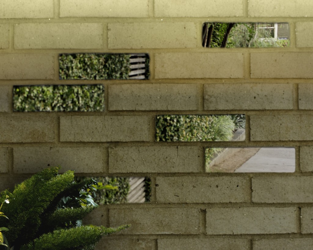
Harmony 1 of 5
Digital collage, 10″ x 8″
©2015, Loren Gamez
Harmony 2 of 5
Digital collage, 8″ x 10″
These two images are part of a collection of five digital collages that I created for the second project, “Harmony”, in my other Visual Studies class. Out of the five collages I did, I think I liked these the most because of the overall effect they had. My theme for the project was “portals”, and I felt that these two images conveyed that idea the best. Below are links to the other collage images and their descriptions:
-Collage 3
-Collage 4
-Collage 5
Project 2 Screen Captures
Below are the screen captures for importing my photos into Lightroom as Joe showed us to do. I have a screen capture of importing the photos I had thought of using for the final collages. There is also a screen capture of my imported scans, but none of them were actually used in the final collages; the scans were taken before I had settled on my collage “theme”.


VISU 1311 Project #2 Collage 5: Loren Gamez
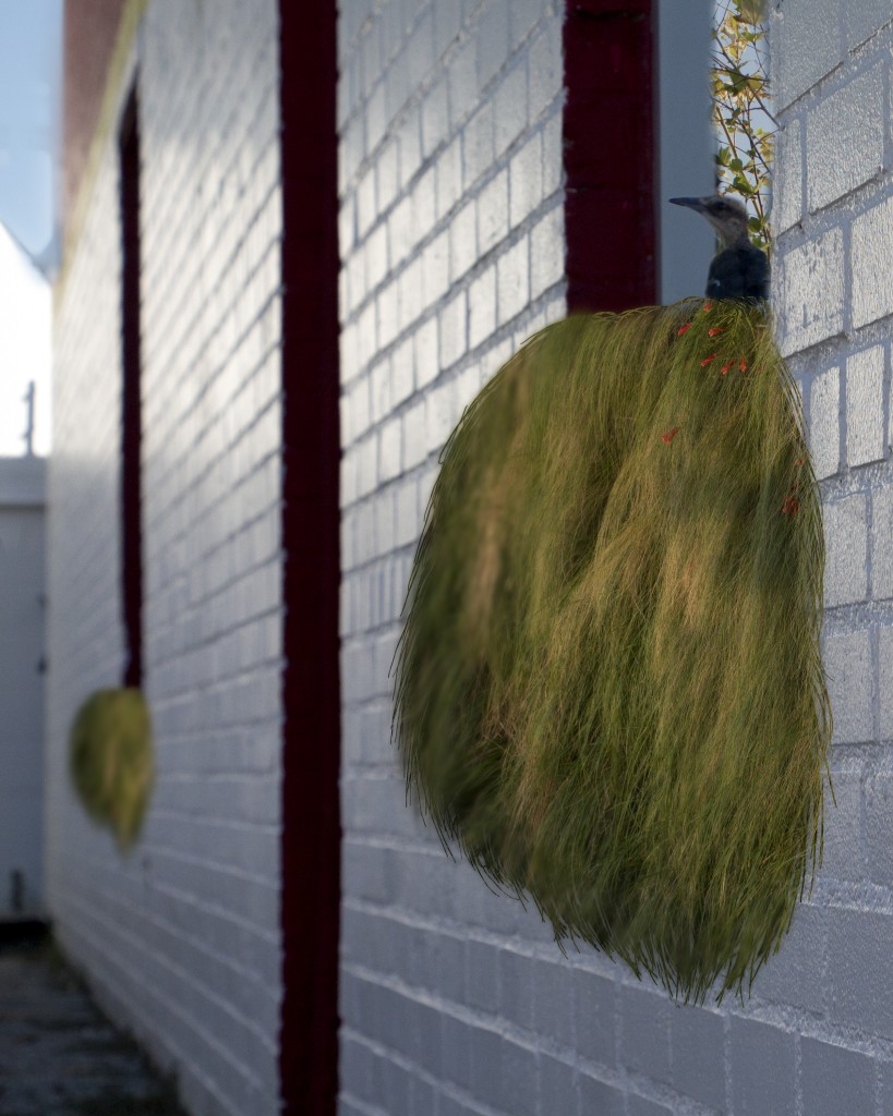
©2015, Loren Gamez
Harmony 5 of 5
Digital collage, 8″ x 10″
Last of the five final collages that I created for this project, and this one played around with the idea of being on the inside of one of the portals. However, it can also be seen as though objects from the portal (in this instance, a window) are extending their reach across both destinations. One might look at the collage and see a bird that has flown into the portal and this is where it ended up, or this may look like the end of a journey back from the mysterious portal destination. I also liked matching the blurriness of the plant on the left to the original blurriness of the larger brick wall to give it a more seamless feel, as though the plant was there originally, even though it wasn’t.
VISU 1311 Project #2 Collage 4: Loren Gamez
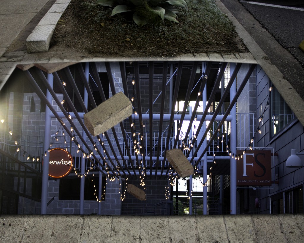
©2015, Loren Gamez
Harmony 4 of 5
Digital collage, 10″ x 8″
Fourth of my five collages, this was actually the first collage that I began working on when I was playing around with my idea of “portals”. In this one, I like how the various sizes of the bricks creates a movement as if the portal had just opened and the bricks are falling inside. This collage was fun because I actually created the bricks out of various paving stones that I had cut out from the original image, and transformed them to make 3 sides of each brick visible instead of the top.
VISU 1311 Project #2 Collage 3: Loren Gamez
©2015, Loren Gamez
Harmony 3 of 5
Digital collage, 10″ x 8″
This was the third out of my digital collages that I was considering to use as the final collages. This collage, rather than a “portal” that leads to a different area, this collage acts as a more literal barrier between one setting and the next and creates a sense of transparency in a brick wall that we normally perceive as always being solid.
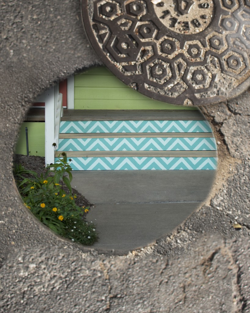
VISU 1311 Project #2 Collage 2: Loren Gamez
©2015, Loren Gamez
Harmony 2 of 5
Digital collage, 8″ x 10″
My second collage, and one of the two final collages that I used for my critique, this image also focuses on a portal, but has a different destination. In this collage, a sewer entry that one might pass by and ignore every day was turned into a “doorway” that might lead to a home.
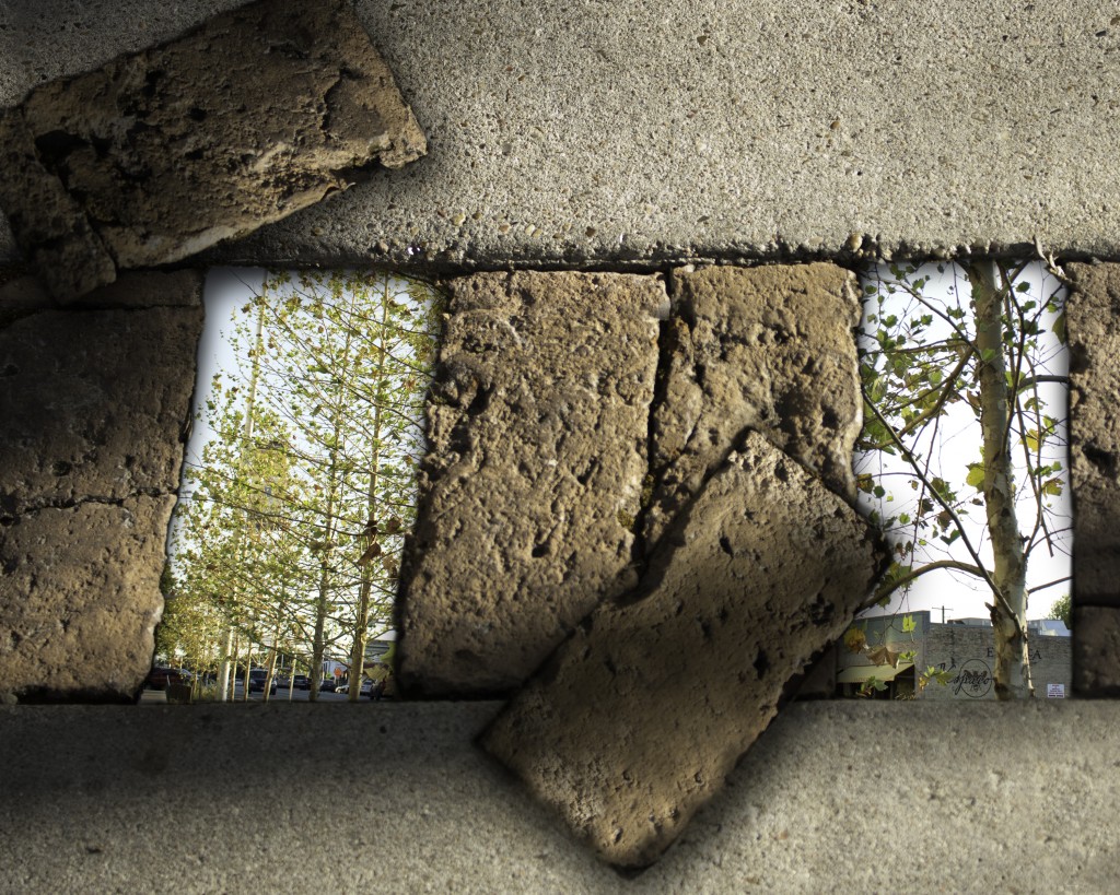
VISU 1311 Project #2 Collage 1: Loren Gamez
©2015, Loren Gamez
Harmony 1 of 5
Digital collage, 10″ x 8″
This is my first collage, and one of the two final collages that I used for my critique. For my collages, I was interested in the idea of “portals”; a hidden place that could be hidden in plain sight in a mundane location like as a busy street such as South Congress. In this particular collage, the pavements on a walkway are the hidden site of a portal that leads to another part of the city.
VISU 1311: Creativity Blog Post #9
I really enjoyed the film Memento. It was both confusing and captivating. The use of a split, reverse relation of time within the film’s storyline (half of the scenes leading up to the ending from the beginning, and half of them receding from the ending to the beginning) helps the viewers to see things through the main character’s point of view, as if they also only had an ability of seeing scenes in a short time period before things changed. It adds a sense of mystery that keeps the viewer interested until the resolution, or at least it did for me.
Additionally, the choice that was made in regard to the sequence of which scenes would go first was an interesting one that is unlike pretty much any other film I’ve seen. While it is split/reversed, the scenes don’t feel “choppy”, and viewers don’t really feel as though they’re missing anything. Instead, I felt as if I were putting together the same puzzle that the main character was putting together. There was an interactive feeling to the film which was unique and intriguing.
Lastly, the narrative of the film was also unique, as was the way it impacted the story overall. The main character was telling the story from two different time periods, although his reflection of events in the black/white scenes seemed to be the dominant story-telling method.
Not to be cliche, but I think I would definitely watch this film again, or have my friends watch it. As confusing as the story line can be to follow, and as frustrating as the main character’s struggling is to witness, the way that the film was constructed was really what captivated me and kept me watching it.
VISU 1100: Blog Post #9
-Part 1-
Lynne: I enjoyed Lynne’s presentation of her photography, and I liked her point that it is important to figure out how to make your work in your everyday life. I liked how true this was, because we can’t be college students with free time for the rest of our lives, so its important to get into the habit of finding ways to work while you’re busy and how to balance your work life with your art life.
Miranda: I loved Miranda’s “diagram” kind of outlook on graphic design careers. As a graphic design major, I thought it was extremely helpful, and she helped to answer some of the questions I’d been having as far as what kind of career I might pick up with my major.
Dustin: I loved Dustin’s photography, and his powerpoint with diagrams of lighting was also very helpful as a visual. His insight on wedding photography, and photography careers in general, was very interesting to hear. I like his idea of word of mouth referrals and its something I could see myself using.
-Part 2-
Internship #1: http://www.internships.com/graphic-design/Graphic-Designer-I9989357
Internship #2: http://hire.jobvite.com/CompanyJobs/Careers.aspx?k=Job&c=q419VfwT&j=oNOY1fwk&s=Indeed
Internship #3: http://www.glassdoor.com/job-listing/graphic-design-intern-sage-environmental-holdings-JV_IC1139761_KO0,21_KE22,49.htm?jl=1566535808
VISU 1100: Blog Post #8
It might be nerdy, yes, but as the Tenth Doctor once remarked: “People assume that time is a strict progression of cause to effect, but actually from a non-linear, non-subjective viewpoint, it’s more like a big ball of wibbly wobbly…timey wimey…stuff.” Sure, that was a statement in a work of fiction, but perhaps the Doctor (or the writers of the show??) were on to something. To the Vietnamese language, time doesn’t really exist at all. There are no verb conjugations for time the way there are in languages like Spanish, or Russian. Instead, time is only gleaned from context of the conversation.
It was this idea that sparked Father Martin Nguyen’s interest in his latest art exhibit, Drawing/Painting TIME (using portraits). Father Nguyen is an associate professor at the University of Notre Dame, but also an artist. He has a few exhibits in Indiana, California, and now he has a temporary exhibit here at St. Edward’s. I stopped by this exhibit this morning after my first visual studies class, and was simply astonished by the amount of portraits that Nguyen had completed for the exhibit. There were many faces, hundreds, and each one was strikingly unique, as people are. Every shade of skin was highlighted throughout the exhibit, and every color of hair (or lack thereof, in some cases). Additionally, some of the portraits were completed in grayscale. There was also a related set of images that were all depicting a single young girl over the course of a year; there were exactly 365 portraits of this girl.
I think the thing that stood out the most when I saw these pieces was the uniqueness. Unlike the precise, identical nature of machine works, you could truly see Nguyen’s work as an individualized piece, and if you get close enough, you can see the thoughtful brushstrokes. I think it made it more real, in a way. I think the natural shape of each portrait’s facial structure is common, but only in a way that it is used to guide your eye around the whole face and separate each one from another. They are all related because of their “snapshot” sense of time, and yet each is unique because of the person that they represent. The variety of each portrait depends primarily on genetics, through skin tone and the color of each person’s hair. However, to me this wasn’t at all distracting. As I stated before, it makes the portraits, and exhibit, seem more real. The grid-like rhythm of the portraits’ spacing between one and the next is consistent, and adds to the overall balance of the exhibit as a whole.
While the title of the exhibit alludes to a study of the progression of time, I think it is more than that beneath the surface. It’s about people. I am an introvert, and I’d rather be alone than in a crowded room socializing with people. But that doesn’t mean that I don’t appreciate each person individually. In some ways, I feel that this exhibit is similar. Nguyen has focused on each portrait individually; they have each had their own “fifteen minutes of fame” (although I’m sure it took much longer to paint each portrait). But together, the effect is quite different and yet also admirable. As for the portraits of the single young girl, I found them intriguing because I also found them comical. In my mind, I was creating a story from the young girl’s point of view and from her expressions in each of the images. I can only imagine that she would have become very bored or annoyed to have her portrait drawn over and over again, at least once a day (or at the very least, having her picture taken every day). I feel as though I would have had similar expressions to the ones that the young girl had if I were the subject of such a lengthy process of working. Similarly, every single image that Nguyen created has a different expression. Some faces are even turned to the side, or hidden completely. It fascinates me at the vast range of expression that we as humans are capable of, and I admired the way that Nguyen was able to capture so many.
Initially, I honestly did not think that I would be so drawn to Nguyen’s artwork. My first impression was it’s just a bunch of portraits over time. What’s the big deal? Now, though, I look back on that impression as laughable. I think that going to the exhibit in person allowed me to open my mind and really admire the work. And of course, I realized that there’s no way that I would probably have the patience to do something like Nguyen, and definitely not with the skill that he had. While I might not hang one of these portraits in my home, I don’t think that that was Nguyen’s purpose, and it doesn’t cause me to like the work any less. As stated before, I personally admire Father Nguyen’s exhibit primarily because of its element of uniqueness and personalization. Additionally, I like the parallel that while you can see the subjects’ passage of time, especially with the pencil portraits of the one young girl, you can also see the dedication of time that Nguyen himself had (and the patience) to make his artwork possible in the first place.
Word count: 897
VISU 1100: Blog Post #7
I enjoyed Nick’s presentation because I was able to see where my college education can take me, and that my college education and personal experiences can turn into a great endeavor. It got me thinking about the different ways I can use my graphic design major, such as packaging design.
I enjoyed Rebecca’s presentation because of her emphasis on internships and to keep trying. I agree that it’s important to be able to use internships to explore your options and see what you do and don’t like, and I can’t wait to get started with doing that myself.
I enjoyed Alex’s presentation because what he does is perhaps the closest to what I want to do with my degree; independent graphic design work. I liked his comment on using what designs are selling well on the shelves, and to use that knowledge to influence your own work so that it can be ahead because of its recognizable appearance.
I enjoyed Taylor’s presentation because, like Rebecca, she stressed that internships (and volunteer opportunities for that matter) are essential for experience. I also look forward to opportunities to study abroad.
I feel like I most related to Alex, because I agree that knowing what is already doing well in the markets helps with design choices for future things, and that a graphic designer should be versatile in their style. I don’t know who I was most surprised by…maybe Nick, because while his career doesn’t relate directly to his degree, it still influenced what he did. I think the most valuable piece of advice I heard was Taylor’s advice to take accounting/business related classes as something to fall back on if it becomes necessary.
VISU 1311_Project #1 Reflection_Loren Gamez
After hearing the critiques from all of the projects, there are three major things that I feel that I could have done differently for a stronger collection of images, in addition to smaller composition changes.
1) Visit South Congress more times. While I visited South Congress three times, I don’t feel that it was enough. I don’t think that I let myself really explore all of the little niches. As a naturally shy person, I think I just felt awkward taking pictures in a very public place; I’d much rather take the pictures at home or along a secluded nature trail. The hustle of the city just doesn’t interest me as much for photography.
2) Selected more images in my composition. I think I just felt very overwhelmed by the project and trying to relate my images to the Gestalt principles that I didn’t give myself enough time to enjoy the task of taking the pictures, and thus I felt limited in the images I could choose from in the final selection.
3) Take pictures as interesting subjects rather than subjects composed of Gestalt. I think I limited myself in general by trying to force the Gestalt principles onto my images, and I let that dominate what I saw through the camera. I didn’t take pictures for the sake of them having an interesting composition.
Additionally, the technical presentation of my images wasn’t the way that I had wanted it to be. Ideally, the images would have been seen horizontally, so that the viewers could see the continuity that united the images, instead of them being viewed vertically. I suppose my shy personality came into play here because I didn’t ask anybody if they knew of a way to make this possible in the blog. The image composition has been changed below to better reflect the continuity of the curve.

VISU 1100: Blog Post #6
For each class ask yourself the following:
VISU 1311
- My greatest strengths in this course include: Following directions and taking notes
- For greater success in this course, I need to: Open myself to be more “creative” and loose with my blog posts/assignment interpretations
VISU 1100
- My greatest strengths in this course include: Finishing blog posts early and listening attentively to class discussions
- For greater success in this course, I need to: Take more notes, maybe
FSTY (R&C)
- My greatest strengths in this course include: Taking notes and getting essays done (mostly) on time; making sure that my essays are “professional” and free of errors.
- For greater success in this course, I need to: Procrastinate less and get eassays done earlier
FSTY (60s)
- My greatest strengths in this course include: Taking good notes, attending required films, and reading required readings
- For greater success in this course, I need to: Study more for test material
ARTS 1316
- My greatest strengths in this course include: Drawing straight lines and making shapes proportional
- For greater success in this course, I need to: Work on darker line quality
Computer skills:
- My computer skills include: Advanced in Photoshop and Illustrator, as well as most Microsoft Office programs
- I still need to learn: Become more familiar with Mac/Apple computers/programs; I prefer PC/Microsoft
Research & writing skills:
- My greatest strengths as a researcher/writer include: Being able to write sufficiently and professionally about my topic
- I need to work on these aspects of research and writing: More thorough research; finding solid research sources
- I learn best & accomplish most when: I know more about my research topic, when I have a quiet room to brainstorm/write in
Action Plan
In my VISU 1311 class, I can improve my performance by:
1) Being more creative
2) Giving myself project guidelines
3) Set deadlines
4) Don’t procrastinate
5) Think outside the box
6) Go outside comfort zone
7) Be open to new ideas
8) Use a sketchbook to brainstorm project ideas
9) Spend more time on composing a project
10) Buy a digital camera so that I don’t limit the images I can get
VISU 1100: Blog Post #5
-Part 1-
© 2015, Loren Gamez
Space Awaits Us
Digital painting, 612 x 792px

© 2015, Loren Gamez
Sound the Sirens
Digital painting, 612 x 792px
1) The goal of these assignment were to create a “Future” themed poster design and a “Fairy Tale” themed t-shirt design, as part of contests that Command G is having in the fall (poster) and spring (t-shirt).
2) For the first, I had no clue what I wanted to do. I started playing around with geometric shapes. Then I heard on the news that there was possibly evidence of water on Mars, so I turned Mars into the focus of my image, with its habitation being the future aspect. For the second, I knew that I wanted to do mermaids, because I find them fascinating (the darker, eviller ones, that is). So I started playing around with some ideas, and came up with a silhouette, underwater version.
-Part 2- (critique on the Sound the Sirens piece)
1) I think the strongest aspect of this piece is the illusion of depth given by the different opacity of the figures, and the change of opacity of the background.
2) I think the mid-section “fins” on the mermaids detracts from the image because when I look at the image from a distance, there seems to be an illusion that they have two sets of arms, or two sets of tail fins. This will probably be removed in the final piece before submission to the contest.
3) As stated above, the composition can be improved by editing the mermaid figures to be smoother around their mid-sections. Additionally, I might play around with the opacity of the image to see if darker opacity improves the illusion of depth.
4) Conceptually, I might play around with the mermaids’ poses and proximity to see how to improve the illusion of movement and depth. I might also see how it looks in different colors, like a dark blue/green.
5) Technically, I might edit the mermaids’ forms to see in what ways their shapes can be transformed so that each is unique.
6) No additional notes.