Semester Wrap up

mind map-21kyj11

I am personally critical of my work because of my designs and how I do not feel I take them far enough so that they come across successfully. I think you would wonder why I make certain decisions like color or type. I also think you would wonder why I did not do as much advance type as I should of.


overview:

My theme when designing the Fulbright Conference program was to mimic “order”, “connectivity”, and “hardworking”. The graphics are all based off of hexagon geometric shapes like that found in honeycombs. The hexagons then all connected at different angles with lines or right next to one another. The graphics were to symbolize the structure of the program with the connectivity that the reach of the program provides to the world and the hard work of the researchers. The colors chosen were a yellow with a blue and red as accent colors to highlight needed information or outline designs for clearer effects.

I designed the cover to be an introduction to the theme with both corners having a starting location that branched out through the hexagon shape and lines. Throughout the program the theme is continued with structure and connection of the graphics visible.

The context used for the book is nice and orderly with a clear path that leads the reading onto the next section. All the information is clean and easy to comprehend. Usability and organization allows for the easier interaction with the read so that they obtain the needed information in the fastest manner.


Type is Space

Kasey Liehr-type is space-1maqlvd


This project was a lot of fun because we got to mess around with different words and changing them physically. A big this was to focus on the word and see if the word itself made you think of a specific use of space or a disruption of the space that was already presented.  At first it was a struggle to see the words  and space as anything other than the word in order in the structure that we are use to but as time went on, it became a lot easier to mess around and get a little funky with the space or lack of.

Neighborhood Process Work/Research

Tarrytown_texture-192c6xq

template_wordmark-11mkp6p


We did a lot of research for the identity neighborhood project. Some of the things that we did to start was working on the fonts and colors that we wanted to use for the town. These were greatly based off of our trips into the town and taking photos of the area. The hard part was taking what we saw in the area and transferring it to a specific design element such as font or texture.

Neighborhood Visual Identity

symbol_Tarrytown-wy9hc1

The visual identity that I created for Tarrytown was a safe haven for families to raise and praise their kids in an inclusive environment.  Because of this, a lot of my identity came from kids designs.  The biggest struggle with the identity was making it seem like more than just kids scribbles. I feel that my book about the Tarrytown did a little better job at presenting this idea of safe haven for kids because of the photos that I could add with children themselves.

Locating Place: Book

Environmental Stuggles in East Austin-1zuybsz


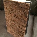
This project was super fun and personal to me. As an Environmental Scientist it was fascinating (and saddening) to see how East Austin had been negatively impacted by environmental racism. I enjoyed being able to bring together the information that I had found about East Austin and providing it in a book that allows for people so see a quick overview of the suffering (and wins) that East Austin has had  over the years. One of the struggle of the book was finding all of the data/information that needed to be in the book. A lot of negative things such as environmental racism is not very well documented and thus I had to really dig and search for some of the information. Another thing that was a struggle for me was making the actual book itself. I struggled with making the binding of the book tight enough so that the book would hold together.

Neighborhood Brand Book

Tarrytown_book_Final-1pd4bne


Doing this book was a struggle. Our class had to present a theme or identity to the city but at the same time, we were also seeing two other people who were also doing the city that I had.  It was hard to not want to change or drift away from my personal identity when I would see the other girls work.  I spent a large amount of time printing and making sure that the final colors looked good.

Locating Place: Animated GIFs


The gifs were a fun and interesting way to look at the East Austin area in specific ways. I got to see where I wanted my designs and my project to go based off of what I tried to focus on in these gifs.  I had to be aware of what theme I was trying to present while making the gifs. I found that the more gifs I did the more I was able to focus on my theme or environment and land destruction.

The Mystery

What the project is?

The Fulbright Association is having a conference. We are promoting before and providing things for the actual day of the event.

What needs to be make?

Conference Poster, Timeline layout of the day, presenters (talker’s) poster/introduction pamphlets about the person, round table locations, map of conference with location specific events. Possibly video (after effects) slideshow of the event/ times of events.

In what order should things be developed?

The conference poster should be made first. You want to have a solid image by the time its done for anything else you create. Next you would want to work on presenter introductions or  presenter boards to place at the entrance of the conference. After we need maps done to give out to the audience so they know where they going. Lastly you would do a video if you wanted to. If you did, you would either create it with old photos/videos or a creative presentation of the information being discussed in the future or create a video as the conference goes on.


Midterm-Assignment Essay

1 Where are you in your hours that you declared earlier in the semester? Looking at your work now, are your current accumulated hours enough?

I think that I have around 72 hours since the beginning of the semester ( 722 total). I am bit behind from what I expected to be and I do feel that it is showing in my work that I have created. I think that I need to put a few more hours into my work or just going to see others work for inspirations.

2 Has your definition of “sophisticated” work changed from last semester? If so, how so? What is sophisticated in your weather report?

Sophisticated, to me, means our knowledge of others work. How it does or does not actually work for the design and purpose and how I can use their mistakes or success to better my designs. I feel that as far as the weather report, the idea of sophistication means looking at my other classmates projects and considering how their projects were working and listening when they would ask questions about specific techniques that I could possibly use.

3 Describe how the new things you’ve learned so far connect to what you already had coming into the semester.

I feel that the idea of motion and understanding the flow of a project can greatly influence the project. This can mean on a movie or on a project like a poster and stickers. How I choose to design one part of a project first may change the other components of the rest of the project. This means that I need to be aware of how and the path that I choose in designing a project.

4 What are somethings you are still unsure about in this project that you would like to know more about?

I was still struggling with the transitions of the latches and how after I was finished with the latch and I would go back to check the whole video, the images in the front would have moved. It was very frustrating and it only happened at the end of the project time. Is there a way to fix this or do I just need to be aware of this in the future for this program.

5 Assign a level of value to this project. Identify two other projects in your creative life and place this weather report relative to them. How close or far are they from one another? What qualities did each project have that the other’s didn’t that would rate them higher/lower?

I feel that the level of value for this project is a 3 out of 5. Two other projects that I have done are the Zine and the Interface project. I feel that these two projects also about 4s on a value level.  I feel that the ending overall project were better crafted and would/ could have been used or presented in an actual world setting where as the weather project still needs a lot more work.

6 Break down the percentages of what entities are responsible for creating growth within the creative you. Am I part of it? Part of it is on you, right? Do you consider your classmates/friends as influencers on the course of your trajectory for success? At the end of the semester you will be evaluating me, but right now within your own pie piece, how much have you brought to the game? How did it end up that you brought that much?   (make a pie chart to visualize)

I think that I bring 45%, my classmates bring 15%, my professors (Tuan) brings 20%, Family and friends bring 10%, and other designs/designers bring 10%. I feel that the designs that I make are about 45% influence and created by me. I think that I cam quite influenced by others and I take a lot of what others say into account.

7 Ask me or express something, you feel like you can’t in class.

I think I would just like a few more classmate critique opportunities during projects.
Weather


We had to go through and decide on a type that would go with the style that we wanted and that the type was readable for the animation that we did. I wanted/needed to make sure that the text chosen was readable on different scales but also not to overpowering (bold). We had to work on the animation of the latch that allowed of a change between the first category and the second. For me, it was a struggle to decide how I wanted to rearrange things that so that the movement wasn’t cluttered. The transitions between the different compositions was also important. I was ok with this at the beginning but within the last few days of the project, the location of all the frames shifted and it was a struggle to not get irritated at the program because I was not moving any of the first key points. In the end, I still did not fix it so that the transitions are fully fluent and it still drives me crazy but…. I ran out of time. The time of the motion of all of the latches together need to feel like they go together. I know for mine, the third latch feels like it is a different composition because it is a much faster pace between frames. This changes the feel of the latch and the whole video. The final presentation is also important because you get to look at the video as a whole. You see if the speeds of the the three latches together and if they feel like they all go together. I know that my last latch feels different because it is a bit faster. Also I choose to add a photo but I am unsure about my decision of the photo. I ended up playing with a lot of different backgrounds and the cliff was the best of the options. The struggle with the background is that because it is a photo there are places where the image is lighter/darker and so I had to change a lot of the black text/lines to white lines so as to make them visible.