Type is Space

Kasey Liehr-type is space-1maqlvd


This project was a lot of fun because we got to mess around with different words and changing them physically. A big this was to focus on the word and see if the word itself made you think of a specific use of space or a disruption of the space that was already presented.  At first it was a struggle to see the words  and space as anything other than the word in order in the structure that we are use to but as time went on, it became a lot easier to mess around and get a little funky with the space or lack of.
Neighborhood Process Work/Research

Tarrytown_texture-192c6xq

template_wordmark-11mkp6p


We did a lot of research for the identity neighborhood project. Some of the things that we did to start was working on the fonts and colors that we wanted to use for the town. These were greatly based off of our trips into the town and taking photos of the area. The hard part was taking what we saw in the area and transferring it to a specific design element such as font or texture.

Neighborhood Visual Identity

symbol_Tarrytown-wy9hc1

The visual identity that I created for Tarrytown was a safe haven for families to raise and praise their kids in an inclusive environment.  Because of this, a lot of my identity came from kids designs.  The biggest struggle with the identity was making it seem like more than just kids scribbles. I feel that my book about the Tarrytown did a little better job at presenting this idea of safe haven for kids because of the photos that I could add with children themselves.

Locating Place: Book

Environmental Stuggles in East Austin-1zuybsz


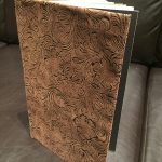
This project was super fun and personal to me. As an Environmental Scientist it was fascinating (and saddening) to see how East Austin had been negatively impacted by environmental racism. I enjoyed being able to bring together the information that I had found about East Austin and providing it in a book that allows for people so see a quick overview of the suffering (and wins) that East Austin has had  over the years. One of the struggle of the book was finding all of the data/information that needed to be in the book. A lot of negative things such as environmental racism is not very well documented and thus I had to really dig and search for some of the information. Another thing that was a struggle for me was making the actual book itself. I struggled with making the binding of the book tight enough so that the book would hold together.

Neighborhood Brand Book

Tarrytown_book_Final-1pd4bne


Doing this book was a struggle. Our class had to present a theme or identity to the city but at the same time, we were also seeing two other people who were also doing the city that I had.  It was hard to not want to change or drift away from my personal identity when I would see the other girls work.  I spent a large amount of time printing and making sure that the final colors looked good.

Locating Place: Animated GIFs


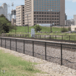
The gifs were a fun and interesting way to look at the East Austin area in specific ways. I got to see where I wanted my designs and my project to go based off of what I tried to focus on in these gifs.  I had to be aware of what theme I was trying to present while making the gifs. I found that the more gifs I did the more I was able to focus on my theme or environment and land destruction.