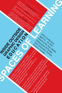
This poster was an intro into the use of space, angling, and text that could be used to draw in an audience. I focused a lot on hierarchy and color selection for this project. I used the size and weight of text to emphasize the importance of the content. I decided to do this so as to make the poster easy to read from far away but to find out more specific details you would have to come closer. I also worked with color and ways to highlight different areas that I “marked off” for the “less” important information that you would have to come closer to see.
