May 11, 2017

Adv Type Semester Wrap Up


I think that one thing especially that you make wonder about me is what affected my performance in the latter half of this semester. I know that design is especially an intimate field of study at Steds and that the professors pay close attention to each student’s progress. This semester has been extremely difficult for me to manage this class because of the nature of its structure and taking on an overwhelming work load.

March 21, 2017

Mystery Assignment

I see this information being used for a conference—that seems fairly obvious. Perhaps this information could be used as a data based as a digital archive to clearly display the viewpoints, missions and goal of this organization and its member for future reference

March 20, 2017

Adv Type Midterm Essay

Earlier this semester I declared that about six hours a week should suffice when designing for this class, but I was strongly mistaken when working with typography in space-time. In reality I was working 7-10 hours a week creating and working with so many elements on screen while also trying to push myself to learn new things about after effects that I could potential incorporate into this project.

I think my definition of sophisticated definitely has changed from last semester to this one. As an emerging designer I believe that context is key to good design—often asking myself “where does this belong”. I see that my design choices are gearing away from such overtly obvious cues for context and my work is more able to communicate what I want it to without such overt cues. My work just seems all around more sleek as well.

Again I learned the issues of time. I wouldn’t say at all I procrastinated but I realized this semester that time will slip away if I don’t have a scheduled plan. A futuristic weather report could manifest itself in many different ways and I wanted to research enough so that I will be able to have a concrete vision of what my future would look like and I also tried to research after effects techniques that could make that happen…then issues of actually doing all that tedious work emerged. So I feel like I’m more christened to my process and how I work so I will be better able to make a schedule for myself. Other than that I learned about hierarchy and choreography with typography and reducing the amount of stress on the eyes even though there were a lot of points on screen.

I really want to know how to animate type beyond the basic motions but morphing type or other elements or have a tool belt of ground level skills so that perhaps I can experiment with that myself.

I think this project is very important given that we’re dealing with animation. I think that sets this project apart from anything we did before with type just for the mere fact that this is dealing with time, but I don’t weigh this project as important as the identity one we’re doing with Jimmy now because the weather report doesn’t have an intention of use. It may be a start to something but the contextual basis is in the air.

I take it upon myself for grow. That’s really the main contributor for grow. I see that other people can help you but it’s through your own initiative. I appreciate to have a professor to guide and help me to see direction because I think a mentor of some sort is important, in anything, unless if your a pioneer in what you do. I value my classmates in the sense where I see where I am in comparison to other people at the same level of development as I am and how they approach prompts, but besides that I view them as competitors.

December 14, 2016

GDES I END TERM REFLECTION

Mali Tribune


  1. How many hours of practice time per week would you consider excessive? How many hours would not be enough to create sophisticated work? Where are you situated?


It’s all relative towards your goals or needs of course. In this stage of my life and given that I practically a liberal studies major as well, I would say anything more than 10-12 hours a week might be quite excessive just because other studies need attention to. A lot of the time the techniques that I am trying to learn or get used to isn’t so hard but studying for a different subject is a different story. I would say if I was doing this full time that 10 hours isn’t nearly enough but I’m still yet a student. How many hours would not be enough to create sophisticated work? I don’t know. Some people classify sophisticated differently; people learn differently. For me, I need around 4 hours on something in order for it to start getting somewhere. For my definition of excessive, I exceed excessiveness but it’s not always for school so maybe I’m overworking myself.


  1. What is “sophisticated” work? What is sophisticated in the designs of your maps?


Sophisticated work is work that is purposeful. It’s work that is designed with the intent to be place somewhere where it will thrive without much explanation—looks like it belongs there. But still yet sophistication is a relative to the person. I would say that I tried strongly to suggest some type of personality with my maps. It’s hard for me not to include any type of personality or character.


  1. What was some meaningful feedback you received about the maps and what did you do with that feedback?


I got the majority of my feedback from your desk crits because I really didn’t show my progress. I was working on too many things at once and wasn’t exactly on the same projectile as most of my classmates. But I did receive some good insights about placement, color, and different relationships between things on the page.


  1. Describe what level of challenge you encountered in the creation of your maps. What was the hardest part / what was the easiest part? What was the most enjoyable part of the process?


The most challenging part about this project was just doing a map, plain and simple. I always try and spice it up a bit. I always want to make work that I feel like is worth taking some time to observe. It is very difficult for me to sort of do something and then move on, which brings me to my second point. I don’t know when to stop, at least in this setting. I felt like only one of my maps (out of 2) could stand alone just because it seemed the most finished. You could say that that map, the Tony Pierce one, is all three wrapped in one. It shows me deducing to figure out where Tony Pierce lives (process) , it has an example of a topographical map that has some depth to it, and it has graphs on it. The most fun thing about this project was figure out where Tony Pierce lives. It was almost obsessive.


  1. Did you do anything else outside of class, extracurricular, related to art, design, or creativity?


Yessir. I did a few things. I am a graphic designer and stylist for the fashion magazine on campus, CABRA. I am also on the creative team for a music promotional team on campus called New Waves. I basically take photos and videos of our events and makes logos, posters, and designs for merchandise. I guess I do the same for CABRA as well. I also help artists setup at ATM gallery studios. I also took a theatre class this semester so I had to do 30 hours of work outside of class hanging lighting fixtures 18 feet able everyone’s head (which was pretty cool) and help design sets for the shows. Plus a did a couple things for money, attend shows, and watch how people on YouTube approach different creative crafts.


  1. Whether positively, negatively or neutrally, how has your life outside of school impacted your school work?


I definitely think I try to do too much at once just because I have an urge to be working and being involved with my community. I seen a lot of growth in my work because I have been making an effort to live breathe and think in terms of design. I have exponentially gotten a bit better but I’m hungry for more. The maps in this class just felt like a formality assignment that’s why I tried to make it more interesting with my Tony Pierce map, but when it came down to working on my other two, it was quite difficult because of the time crunch. I lost many many many hours of sleep. I also got other classes too which made my life a living hell.


  1. What does the most ideal classroom environment look/feel like to you? What does it mean to be part of a class? This semester, what was your part / role / contribution to this ideal vision?


My perfect classroom environment probably has more of an open forum and discussion. I feel like when people are willing to express their viewpoints and ideas all the students can learn from various different points of view, but I learned that it takes some level of maturity to speak up and seek being corrected if wrong. I tried to break the silence in our classroom by doing that. I only wish that more people would be expressive about their process and their mindset.


October 17, 2016

GDES 1 Midterm

Consistent/Uneven. I worked quite diligently at my work. I’m not sure that my consistency was the best though. Of course, since design is quite a process, I don’t expect to finish my work in one setting, but it is very difficult for me to want to design in small increments. Sometimes I feel like I’m too aware of how much time we have left in class to work and really don’t focus on working on my work as much. Outside of class though I try to allow enough time to get plenty of work done. I would say that I am in between consistent and uneven with my use of practice time.


High. I think with this project, I wanted to be too sophisticated, to the point where I aggressively restylized many of my initial designs so that my logos achieved this modern professional quality. Of course, this took a lot out of me (sleep) but I was very pleased with my final outcome. I would say that I was consciously aware of the decisions I made in order to get a sophisticated trio of logos.


Useful. I think it is hard for me to measure how well I received feedback because I was a little behind in pinups and didn’t really get too much feedback. I was really my own worse critic in this project but when I did get critiques I did make sure that I tweaked my work in a way that I thought made sense. I have a tendency to be quite hubris in my work but try to diminish that ego in order to further improve my work. I’ve come quite a long way.


Intense. I challenged myself quite a bit. I really am my own worst enemy. I think I am quite sadomasochistic towards myself—I enjoy punishing myself. I beat myself up harshly trying to be good. I don’t allow myself to take the easy road, which I suppose is not bad but I think I often bite more than I can chew. I spent many long hours up at night trying to find a way to get a good product. It was quite taxing.


Lots of Extra Stuff. I am friends with the owners of a gallery and a studio so I get pretty involved with the work that they do. I hang out with a few of them to see how they work and practice their crafts. I do some modeling for this studio and I am really good friends with the professionals of that studio and I get to hang out with them, party with them, go to their workshops, and watch their creative process. I really aspire to work with them regularly. They recently found out that I am a graphic design major so I think I opened that door a bit. I also am trying to work on my own identity, but school (especially liberal arts school) doesn’t make that easy for me. I want to get into graffiti but I just do not have the time. I’m also working on making videos but time is not on my side.


Mature. I think for the amount of hours I’m taking and my activity within the organizations I’m involved with, I’m doing a pretty good job at managing my time. The only thing is I feel as though I may have some sort of bipolar trait I’m trying to work with. I don’t take medication and I have to work really hard to stay grounded but I feel that I coping with these emotional influxes well enough so that I can produce work. But I tend to live in extremes.


Warm. As for the climate, I feel like I’m talkative enough to contribute to the atmosphere. I really cannot say too much about this, I’m kind of oblivious to the impact that I have on a class.

February 23, 2016

Line Inventory

Line Inventory

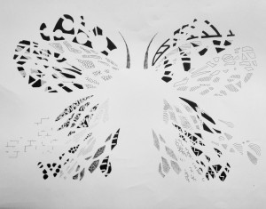
In the reading, the author, talks about what defines a good design, and he seems to establish parameters around this concept. However, as an inspiring designer, the prompt regularly passes through my thoughts. I come to realize that I would probably define a good design by its ability to communicate or function at a high level using the least amount of elements. We live in a minimalist society, and I am really attracted to function. A butterfly is so beautiful due to its structure—a structure that allows it to function quite well in its environment.

December 1, 2015

X-tra Blog Post: Keith Haring

The 80s seemed like a very crucial time for America., especially in New York. Here, there were plenty of commentary from groups and demographics that did not seem to have a voice in America. The loud and proud 70s mentality seemed to bleed over into the unapologetic era of the 80s . The feminist movement in America grew more powerful in the 1980s alongside with LGBTQ voices that wanted the same rights as heterosexual citizens in America. And still yet… there was racism that needed to addressed during this era. The art world in the 80s still had this very stark diverge from more colloquial art. However artists were changing that–artists from the streets of New York.

Keith Haring was a street artist after he dropped out and became integrated back into the art world, which is very interesting. He was dealt with political issues. He worked with motion lines and bright primitive shapes and colors.

November 30, 2015

X-tra Blog Post 1

As I anticipated the release of Rihanna’s new soon to be release album, Anti, I came across a very intriguing artist named Roy Nachum. He is the artist behind the album cover of this upcoming album, and I was very stunned by actual artwork placed on an album cover. Word on the street is that Rihanna was in an apartment owned by the very famous couple, Jay-z and Beyonce, and some of Nachum’s work was hanging on their wall, which is caused Rihanna to reach out to the artist so that he may design her album cover.

He is an artist born in Jerusalem but went to Copper Union School of Art in New York City where he currently resides. He is classified as a painter, sculptor and an installation artist. He is known to want his audience to also touch his work. He experimented with braille and now it is apart of his aesthetic. He wishes to communicate to not only through sight but also through hearing and touching. He deals with human perception and his work seeks to open people’s eyes. “The whole idea behind the braille is that people who have sight are sometimes the people who are blindest,” Rihanna.

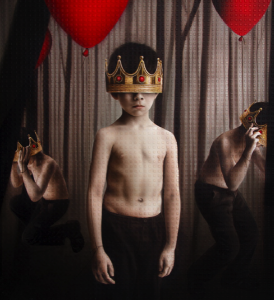
I was really intrigued by the use of color. It was like a new take on regality and monarchy–a more modern simple way of conveying royalty. But that is not his focus. In the piece “If They Let Us”, he talks about his work not in regard to regality but liberation. This piece is Rihanna’s album cover and he depicted her as a child holding a balloon to represent the freedom a child feels–the freedom of a balloon filled with helium air.

If They Let Us If They Let Us

Taishi Hosokawa


untitled


sources:

https://news.artnet.com/people/rihanna-album-art-roy-nachum-339032

https://en.wikipedia.org/wiki/Roy_Nachum

https://www.roynachum.com