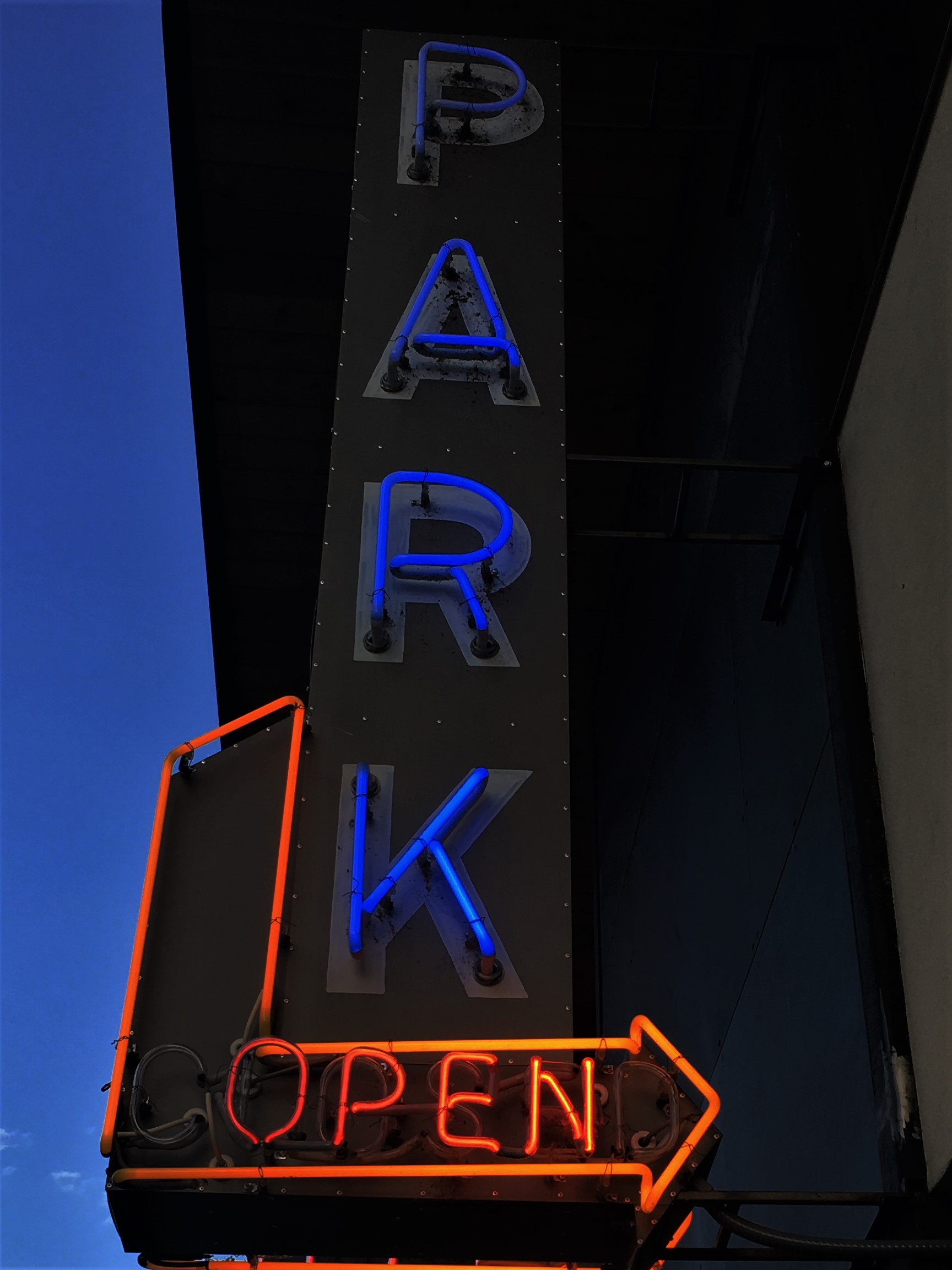

These pictures were used in our visual studies program to teach us how to take photos with certain requirements (on south congress and between Oltorf and the river).
On the first picture, I wish I wouldn’t have edited the blue of the sign to be as dark as it is. I wanted to have the contrast5 between the blue and the red to be more apparent. On the second picture I wish that I had understood the rules of the assignment, as this picture was take on Oltorf on South Congress.